Updated May 23, 2023

Introduction to React Native Form
The following article provides an outline for React Native Form. In this current era of Data, Forms are one of the important parts of any application or website. Forms can be used to take surveys, and data collection, which can be helpful for specific requirements. If we don’t create good and responsive layouts, it will be pretty tricky for the users to submit the information correctly. It supports creating Forms in an application quite impressively.
Syntax:
import Form from 'react-native-form'
<Form ref="form">
<View>
<View>
<TextInput type="TextInput" name="myTextInput" />
</View>
</View>
<Switch type="Switch" name="mySwitch"/>
<Slider type="Slider" name="mySlider"/>
<DatePickerIOS type="DatePickerIOS" name="myBirthday" />
<Picker type="Picker" name="myPicker" />
<PickerIOS type="PickerIOS" name="pickers[ios]" />
</Form>
Examples of React Native Form
Given below are the examples mentioned:
Example #1 – Simple Form
Components inside src folder:
- index.js
- styles.css
a. index.js
import React from "react";
import ReactDOM from "react-dom";
import useForm from "react-hook-form";
import "./styles.css";
function App()
{ const { register
, handleSubmit } = useForm({
nativeValidation: true
});
constonSubmit
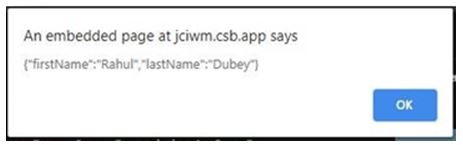
= async data =>{ alert(JSON.stringify(data));
};
return (
<form onSubmit={handleSubmit(onSubmit)}>
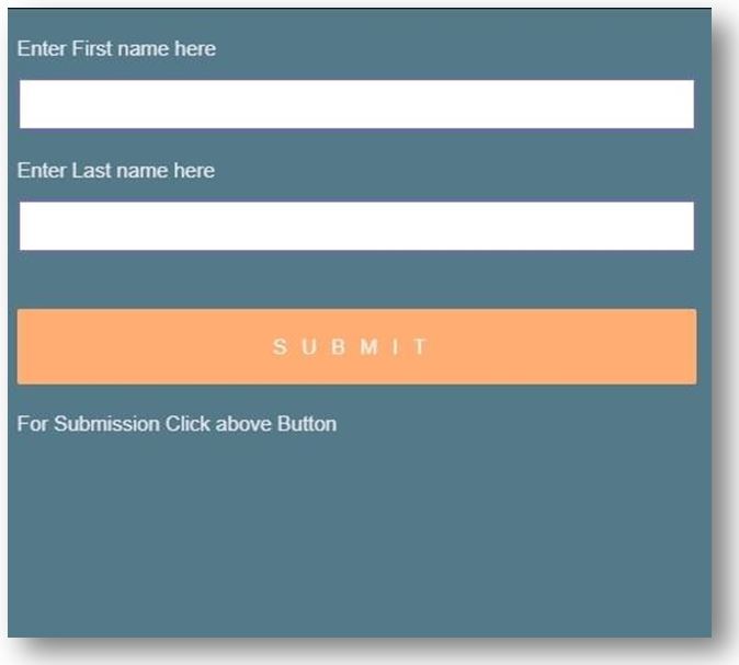
<label>Enter First name here</label>
<input
name="firstName"
ref={register({ required: "Please enter your first name." })}
/>
<label>Enter Last name here</label>
<input
name="lastName"
ref={register({ required: "Please enter your last name." })}
/>
<input type="submit" />
<label> For Submission Click aboveButton</label>
</form>
);
}
constrootElement = document.getElementById("root");
ReactDOM.render(<App />, rootElement);b. styles.css
body {
background: #547a8a;
font-family: sans-serif
, "Helvetica Neue"
,"Helvetica Neue"
, "Droid Sans"
,"Fira Sans"
, "Cantarell"
,"Ubuntu"
,"Oxygen"
,"Roboto"
, "Segoe UI"
, BlinkMacSystemFont
,  -apple-system
;
}
form {
max-width: 501px;
margin: 0 auto;
}
h1 {
font-weight: 99;
color: #f0f3f5;
text-align: center;
padding-bottom: 11px;
border-bottom: 1.5px solid #bfeb81;
}
.form {
background: #1b1c1b;
max-width: 399px;
margin: 0 auto;
}
p {
color: #d43360;
}
p::before {
display: inline;
content: "⚠";
}
input {
display: block;
box-sizing: border-box;
width: 99%;
border-radius: 2px;
border: 2px solid #6f6db3;
padding: 9px16px;
margin-bottom: 9px;
font-size: 15px;
}
label {
line-height: 1;
text-align: left;
display:block;
margin-bottom: 14px;
margin-top: 21px;
color:#e6e6ed;
font-size: 15px;
font-weight: 201;
}
button[type="submit"],
input[type="submit"]
{background: #ffad73;
color: #faf7f5;
text-transform: uppercase;
border: none;
margin-top: 41px;
padding: 19px;
font-size: 15px;
font-weight: 101;
letter-spacing: 11px;
}
button[type="submit"]:hover,
input[type="submit"]:hover {
background: #c772ed;
}
button[type="submit"]:active,
input[type="button"]:active,
input[type="submit"]:active {
transition: 0.2s all;
transform: translateY(2px);
border: 2px solid transparent;
opacity:0.7;
}
input:disabled{
opacity:0.3;
}
input[type="button"]:hover { transition: 0.2s all;
}
button[type="submit"],
input[type="button"],
input[type="submit"] {
-webkit-appearance: none;
}
.App {
max-width: 601px;
margin: 0 auto;
}
button[type="button"]
{ display: block;
appearance: none;
background: #fc5b91;
color: #f5f2f3;
border: none;
text-transform:uppercase;
padding: 11px21px;
border-radius:5px;
}
hr {
margin-top: 31px;
}
button {
display: block;
appearance: none;
margin-top: 41px;
border: 1px solid #fc5b91;
margin-bottom: 21px;
text-transform:uppercase;
padding: 11px21px;
border-radius:3px;
}
Output:
Example #2 – Hook Form with Reset Button
Components inside src folder:
- index.js
- styles.css
a. index.js
import React, { useEffect } from "react";
import ReactDOM from "react-dom";
import { useForm, Controller } from "react-hook-form";
import "./styles.css";
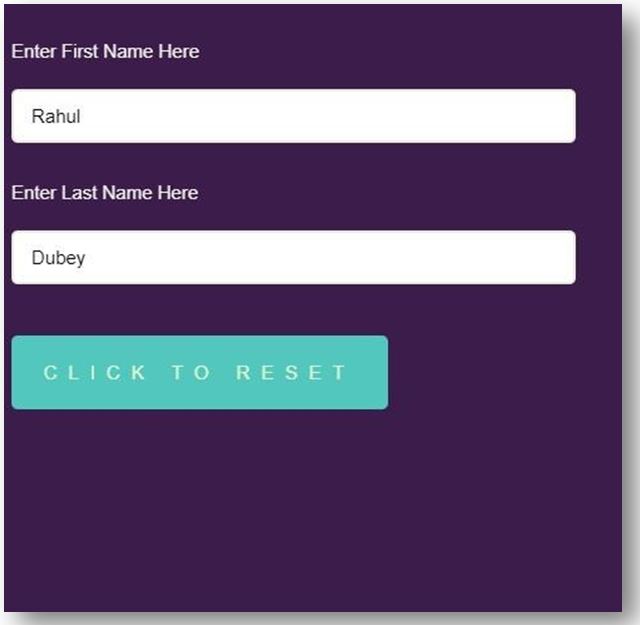
constdefaultValues = {
firstName: "Rahul",
lastName: "Dubey"
};
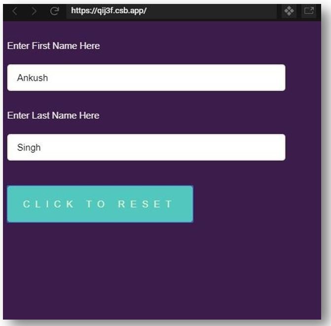
constmodfiedValues = {
firstName: "Ankush",
lastName: "Singh"
};
export default function App() {
const{ register, reset, watch, setValue, control } = useForm({ defaultValues
});
const values = watch();
useEffect(() => {
register({ name: "firstName" }, { required: true });
register({ name: "lastName" });
}, [register]);
return(
<form>
<label>Enter First Name Here</label>
<Controller
name="firstName"
as={<input placeholder="First Name" />}
control={control}
/>
<label>Enter Last Name Here</label>
<Controller
name="lastName"
as={<input placeholder="Last Name" />
} control={control}
/>
<button
type="button"
onClick={() => {
reset(modfiedValues);
setValue("firstName", "Ankush");
setValue("lastName", "Singh");
}}
>
Click to Reset
</button>
</form>
);
}
constrootElement = document.getElementById("root");
ReactDOM.render(<App />, rootElement);b. styles.css
body {
background: #3b1c4a;
font-family: sans-serif
, "Helvetica Neue"
,"Helvetica Neue"
, "Droid Sans"
,"Fira Sans"
, "Cantarell"
,"Ubuntu"
,"Oxygen"
,"Roboo"
, "Segoe UI"
, BlinkMacSystemFont
,  -apple-system
;
}
form {
max-width: 501px;
margin: 0 auto;
}
h1 {
font-weight: 101;
color: #dedae0;
text-align: center;
padding-bottom: 11px;
border-bottom: 2px solid #9cd669;
}
.form {
background: #381a24;
max-width: 401px;
margin: 0 auto;
}
p {
color: #9fbf54;
}
p::before { display: inline;
content: "⚠";
}
input {
display: block;
box-sizing: border-box;
width: 90%;
border-radius: 5px;
border: 2px solid #e7edd8;
padding: 11px14px;
margin-bottom: 11px;
font-size: 15px;
}
label {
line-height: 2.5;
text-align: left;
display: block;
margin-bottom: 12px;
margin-top: 21px;
color: #f0f2eb;
font-size: 15px;
font-weight: 201;
}
button,
input[type="submit"] {
background: #52c7bd;
color: #e9f7cd;
text-transform: uppercase;
border: none;
margin-top: 41px;
padding: 21px;
font-size: 15px;
font-weight: 101;
letter-spacing: 9px;
}
button {
display: block;
appearance: center;
border-radius: 5px;
width: 60%;
}
input[type="submit"]:hover {
background: #71d184;
}
input[type="button"]:active,
input[type="submit"]:active {
transition: 0.2s all;
transform: translateY(4px);
border: 2px solid transparent;
opacity:0.9;
}
input:disabled{
opacity:0.5;
}
input[type="button"]:hover {
transition: 0.4s all;
}
input[type="button"],
input[type="submit"] {
-webkit-appearance: none;
}
.App {
max-width: 601px;
margin: 0 auto;
}
Output:
Example #3 – Advance Form
Components inside src folder:
- RegistrationForm.jsx
- index.js
- styles.css
- validation-messages.js
- validation-rules.js
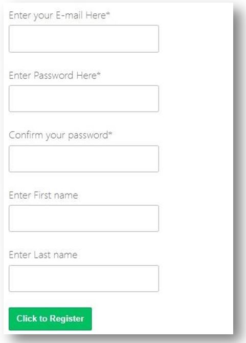
a. RegistrationForm.jsx
import React from 'react'
import { Form, Field } from 'react-advanced-form'
import { Input, Button } from 'react-advanced-form-addons'
export default class RegistrationForm extends React.Component {
registerUser = ({ serialized, fields, form }) => { return fetch('https://backend.dev', {
body: JSON.stringify(serialized)
})
}
render() {
return (
<Form
action={this.registerUser}
onSubmitStart={this.props.onSubmitStart}>
<Field.Group name="primaryInfo">
<Input
name="userEmail"
type="email"
label="Enter your E-mail Here" required />
</Field.Group>
<Input
name="userPassword"
type="password"
label="Enter Password Here"
required/>
<Input
name="confirmPassword"
type="password"
label="Confirm your password"
required
skip />
<Field.Group name="primaryInfo">
<Input
name="firstName"
label="Enter First name"
required={({ get }) => {
return !!get(['primaryInfo'
, 'lastName'
, 'value'])
}} />
<Input
name="lastName"
label="Enter Last name"
required={({ get }) => {
return !!get(['primaryInfo'
, 'firstName'
, 'value'])
}} />
</Field.Group>
<Button primary>Click to Register</Button>
</Form>
);
}
}
b. index.js
import Preview from 'react-data-preview'
import { FormProvider } from 'react-advanced-form'
import rules from './validation-rules'
import messages from './validation-messages'
import RegistrationForm from './RegistrationForm'
class App extends React.Component{
state = {
serialized: null
}
handleSubmitStart
= ({ serialized }) => {
this.setState({ serialized })
}
render() { return (
<FormProvider rules={rules} messages={messages}>
<div className="flex">
<RegistrationFormonSubmitStart={this.handleSubmitStart} />
<Preview data={this.state.serialized} />
</div>
</FormProvider>
)
}
}
ReactDOM.render(<App />, document.getElementById('root'))
c. styles.css
body {
font-family: -apple-system
, BlinkMacSystemFont
, "Segoe UI"
,Roboto
,Oxygen
,Ubuntu
, Cantarell
, "Open Sans"
, "Helvetica Neue"
, sans-serif
}
.flex {
display: flex;
}
.flex> * { flex: 1;
}
d. validation-messages.js
export default {
general: {
missing: 'Kindly provide the required field',
invalid: 'Mentioned value is invalid'
},
type: {
email: {
missing: 'Kindly provide an e-mail',
invalid: 'The e-mail mentioned by you is invalid'
},
password: {
rule: {
capitalLetter: 'Kindly include at least one capital letter',
oneNumber: 'Kindly include at least one number',
minLength: 'Length of Password must be at least 8 characters'
}
}
},
name: {
confirmPassword: {
rule: {
matches: 'The mentioned passwords do not match'
}
}
}
}
e. validation-rules.js
import isEmail from 'validator/lib/isEmail'
export default {
type: {
email: ({ value }) =>isEmail(value),
password: {
capitalLetter: ({ value }) => /[A-Z]/.test(value),
oneNumber: ({ value }) => /[0-9]/.test(value),
minLength: ({ value }) =>value.length> 7
}
},
name: {
confirmPassword: {
matches:
({ value, get }) => {
return value === get(['userPassword', 'value'])
}
}
}
}
Output:
Conclusion
On the basis of the above examples, we saw how to create Forms for our applications where users can submit the required information, which can be used for surveys, data collection, etc. In the first example, we saw how to create a basic Form, then we created a hook form with a Reset button as well in the second example, and the last one was quite advanced and fetched a good amount of information from the user.
Recommended Articles
This is a guide to React Native Form. Here we discuss the introduction and syntax along with programming examples, respectively. You may also have a look at the following articles to learn more –

