Updated June 20, 2023

Introduction to React Format
Displaying a number on a webpage or an application is an easier task, but when it comes to formatting it, it becomes hectic. This hectic work has been simplified in this article. The format is the best way to represent a number so that it can have some meaning and provide more information to the user. By using appropriate formatting, we can enhance the readability and usability of numeric data. The article’s objective is to illustrate different approaches for formatting numbers to convey their intended meaning effectively. The examples would represent the concept more simply for the reader so that they can apply the same in their work.
Syntax:
- Number Format Syntax
import NumberFormat from 'react-number-format'- Currency Format Syntax
import MaskedInput from 'react-text-mask'Working of React Format
The above syntaxes can convert numerical digits into numbers or a currency format. The library “NumberFormat” can be imported for formatting the digits into a meaningful numbers, and MaskedInput can be used for currency formatting.
Examples
Lets us discuss the examples:
Example #1 – Basic
In the example below, we have used ‘react-number-format’ to import the Number format in the code. A basic example of a Number Format is displayed below.
The files used in the example are:
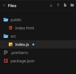
[i] index.js
import React
, {Component} from 'react'
import {render} from 'react-dom'
import NumberFormat from 'react-number-format'
import AutosizeInput from 'react-input-autosize'
export class App extends Component {
state = {n: '0'}
render() {
return (
<div>
<h2>Welcome to React Number Format Example</h2>
<NumberFormat
customInput={AutosizeInput}
isNumericString={true}
allowNegative={false}
decimalSeparator="."
decimalScale={3}
value={this.state.n}
onChange={s => this.setState({n: s.value})}
/>
<h3>***Thank You***</h3>
</div>
)
}
}
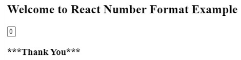
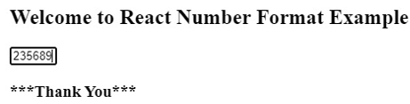
render(<App />, document.getElementById('root'))Output:
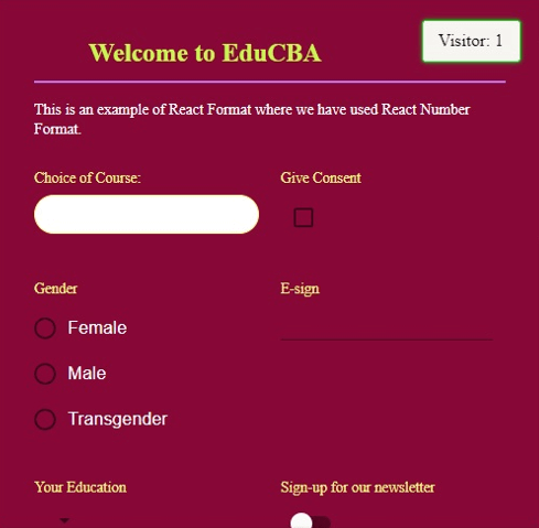
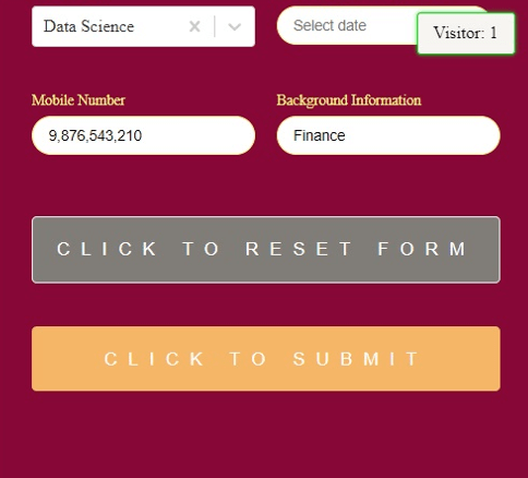
Example #2 – Advance
In the example below, we have created a form where we have used React Number format along with various other formats like date picker, controller, slider, etc.
For implementing the code, the files used are:
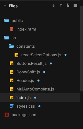
[i] reactSelectOptions.js
export default [
{ value: "data analysis"
, label: "Data Analysis" },
{ value: "data engineering"
, label: "Data Engineering" },
{ value: "data science"
, label: "Data Science" }
];
[ii] ButtonsResult.js
import React from "react";
export default ({ data, reset, defaultValues }) => (
<>
{data && (
<pre style={{ textAlign: "left", color: "white" }}>
{JSON.stringify(data, null, 2)}
</pre>
)}
<button
className="button buttonBlack"
type="button"
onClick={() => {
reset(defaultValues);
}}
>
Click to Reset Form
</button>
<button className="button">Click to Submit</button>
</>
);
[iii] DonwShift.js
import React from "react";
import Downshift from "downshift";
const items = ["Finance", "IT", "Consultant", "Research", "Other"];
export default ({ value, onChange }) => (
<Downshift
initialInputValue={value}
onChange={onChange}
itemToString={item => (item ? item : "")}
>
{({
getInputProps,
getItemProps,
getLabelProps,
getMenuProps,
isOpen,
inputValue,
highlightedIndex,
selectedItem
}) => (
<div>
<label {...getLabelProps()} className="label">
Background Information
</label>
<input
{...getInputProps()}
className="input"
placeholder="Enter your background"
/>
<ul {...getMenuProps()}>
{isOpen
? items
.filter(item => !inputValue || item.includes(inputValue))
.map((item, index) => (
<li
{...getItemProps({
key: item,
index,
item,
style: {
backgroundColor:
highlightedIndex === index ? "lightgray" : null,
fontWeight: selectedItem === item ? "bold" : "normal"
}
})}
>
{item}
</li>
))
: null}
</ul>
</div>
)}
</Downshift>
);
[iv] Header.js
import React from "react";
export default ({ renderCount }) => (
<>
<span className="counter">Visitor: {renderCount}</span>
<h1 className="h1">
<svg
width="40px"
height="40px"
viewBox="0 0 150 150"
style={{ top: 9, position: "relative", marginRight: 10 }}
>
<defs />
</svg>
Welcome to EduCBA
</h1>
<p style={{ fontSize: 14, lineHeight: 1.3 }}>
This is an example of React Format where we have used React Number Format.
</p>
</>
);
[v] MuiAutoComplete.js
import React from "react";
import TextField from "@material-ui/core/TextField";
import Autocomplete from "@material-ui/lab/Autocomplete";
import { Controller } from "react-hook-form";
export default function CountrySelect({ onChange, control }) {
return (
<Controller
as={
<Autocomplete
options={countries}
getOptionLabel={option => option.label}
renderOption={option => (
<span>
{countryToFlag(option.code)}
{option.label}
</span>
)}
renderInput={params => (
<TextField
{...params}
label="Choose a country"
variant="outlined"
/>
)}
/>
}
onChange={([, data]) => data}
name="country"
control={control}
defaultValue={{ code: "IN"
, label: "India"
, phone: "91" }}
/>
);
}
function countryToFlag(isoCode) {
return typeof String.fromCodePoint !== "undefined"
? isoCode
.toUpperCase()
.replace(/./g, char =>
String.fromCodePoint(char.charCodeAt(0) + 127397)
)
: isoCode;
}
const countries = [
{ code: "CA"
, label: "Canada"
, phone: "1"
, suggested: true },
{ code: "GB"
, label: "United Kingdom"
, phone: "44" },
{ code: "IN"
, label: "India"
, phone: "91" },
{ code: "JP"
, label: "Japan"
, phone: "81"
, suggested: true },
{ code: "US"
, label: "United States"
, phone: "1"
, suggested: true },
];
[vi] index.js
import React
, { useState } from "react";
import ReactDOM from "react-dom";
import { useForm
, Controller } from "react-hook-form";
import Header from "./Header";
import ReactDatePicker from "react-datepicker";
import NumberFormat from "react-number-format";
import ReactSelect from "react-select";
import options from "./constants/reactSelectOptions";
import {
TextField
, Checkbox
, Select
, MenuItem
, Switch
, RadioGroup
, FormControlLabel
, ThemeProvider
, Radio
, createMuiTheme
, Slider
} from "@material-ui/core";
import MuiAutoComplete from "./MuiAutoComplete";
import "react-datepicker/dist/react-datepicker.css";
import "./styles.css";
import ButtonsResult from "./ButtonsResult";
import DonwShift from "./DonwShift";
let renderCount = 0;
const theme = createMuiTheme({
palette: {
type: "light"
}
});
const defaultValues = {
Native: "",
TextField: "",
Select: "",
ReactSelect: { value: "data science"
, label: "Data Science" },
Checkbox: false,
switch: false,
RadioGroup: "",
numberFormat: 9876543210,
downShift: "Finance"
};
function App() {
const { handleSubmit, register, reset, control } = useForm({ defaultValues });
const [data, setData] = useState(null);
renderCount++;
return (
<ThemeProvider theme={theme}>
<form onSubmit={handleSubmit(data => setData(data))} className="form">
<Header renderCount={renderCount} />
<div className="container">
<section>
<label>Choice of Course:</label>
<input name="Native" className="input" ref={register} />
</section>
<section>
<label>Give Consent</label>
<Controller
as={Checkbox}
name="Checkbox"
type="checkbox"
control={control}
/>
</section>
<section>
<label>Gender</label>
<Controller
as={
<RadioGroup aria-label="gender">
<FormControlLabel
value="female"
control={<Radio />}
label="Female"
/>
<FormControlLabel
value="male"
control={<Radio />}
label="Male"
/>
<FormControlLabel
value="transgender"
control={<Radio />}
label="Transgender"
/>
</RadioGroup>
}
name="RadioGroup"
control={control}
/>
</section>
<section>
<label>E-sign</label>
<Controller as={TextField} name="TextField" control={control} />
</section>
<section>
<label>Your Education</label>
<Controller
as={
<Select>
<MenuItem value={10}>High School</MenuItem>
<MenuItem value={20}>Bachelors</MenuItem>
<MenuItem value={30}>Masters</MenuItem>
<MenuItem value={40}>PhD</MenuItem>
</Select>
}
name="Select"
control={control}
/>
</section>
<section>
<label>Sign-up for our newsletter</label>
<Controller
as={Switch}
type="checkbox"
name="switch"
control={control}
/>
</section>
<section>
<label>Proficiency in Programming</label>
<Controller
name="MUI_Slider"
control={control}
defaultValue={[0, 10]}
onChange={([, value]) => value}
as={<Slider valueLabelDisplay="auto" max={10} step={1} />}
/>
</section>
<section>
<label>Country of Residence</label>
<MuiAutoComplete control={control} />
</section>
<section>
<label>React Select</label>
<Controller
as={ReactSelect}
options={options}
name="ReactSelect"
isClearable
control={control}
/>
</section>
<section>
<label>Want to Start Training From</label>
<Controller
as={ReactDatePicker}
control={control}
valueName="selected"
onChange={([selected]) => selected}
name="ReactDatepicker"
className="input"
placeholderText="Select date"
/>
</section>
<section>
<label>Mobile Number</label>
<Controller
as={NumberFormat}
thousandSeparator
name="numberFormat"
className="input"
control={control}
/>
</section>
<section>
<Controller as={DonwShift} control={control} name="downShift" />
</section>
</div>
<ButtonsResult {...{ data, reset, defaultValues }} />
</form>
</ThemeProvider>
);
}
const rootElement = document.getElementById("root");
ReactDOM.render(<App />, rootElement);
[vii] styles.css
body {
background: #870837;
font-family: 'Times New Roman'
, Times
, serif;
color: white;
padding: 0 25px 110px;
}
.h1 {
margin-top: 75px;
color: #c8f54e;
font-size: 23.5px;
padding-bottom: 12px;
border-bottom: 2px solid #c078eb;
}
.form {
max-width: px;
margin: 0 auto;
}
.p {
color: #cbe043;
text-align: center;
}
.input {
display: block;
box-sizing: border-box;
width: 100%;
border-radius: 50px;
border: 1px solid #faf287;
padding: 9.5px 14.5px;
margin-bottom: 9.5px;
font-size: 13.5px;
}
.label,
section > label {
line-height: 0.5;
text-align: left;
display: block;
margin-bottom: 11.5px;
margin-top: 19.5px;
color: #faf287;
font-size: 13.5px;
font-weight: 199;
}
.button {
background: #f5b767;
color: #fcfbfa;
text-transform: uppercase;
border: none;
margin-top: 40.5px;
padding: 20.5px;
font-size: 16.5px;
font-weight: 100;
letter-spacing: 10.5px;
display: block;
appearance: none;
border-radius: 4.5px;
width: 100%;
}
.buttonBlack {
background: #807c78;
border: 1px solid #f7f5f2;
}
.App {
max-width: 605px;
margin: 0 auto;
}
.container {
display: grid;
grid-template-columns: 1fr 1fr;
grid-gap: 19.5px;
}
.counter {
font-weight: 400;
background: #f7f5f2;
color: #0a0a09;
padding: 9.5px 14.5px;
border-radius: 3.5px;
position: fixed;
top: 19.5px;
right: 19.5px;
z-index: 9999999;
border: 1px solid #1dd120;
box-shadow: 0 0 4px #1dd120;
}
Output:

Conclusion
This article explains how to use Format in different situations according to the requirement of the webpage or application. We hope this article has made the concept simpler for the developers.
Recommended Articles
This is a guide to React Format. Here we discuss the introduction, Working of React Format with proper examples and coding. You can also go through our other related articles to learn more –

