Updated June 23, 2023

Introduction to Radial Gradient in CSS
The Radial Gradient is a predefined CSS function. This is defined as to set or adding the gradient colors as any background of the image. Gradient color is the facility to add multiple colors at a time. This radial gradient starts at a single point and is applied even outward of the image. As per CSS’s default radial-gradient feature, the first or initial color starts at the center position of the HTML element. Then it faded the color towards the end of the edge corner of the element. Faded off, the color distributes equals throughout the image until we specify some value in the function. We can add multiple colors to the image with a faded feature.
Syntax
Here is the syntax as follows:
img
{
background-image: radial-gradient( shape, size, position, start-color, ..., last-color );//we can as many colors as we want in place of ....
}
Parameters
- Shape: This parameter defines the shape of the gradient.
- Possible Values: ellipse (default), circle
- Size: This declares the size of the gradient.
- Possible Values: farthest-corner (default), closest-side, closest-corner, farthest-side
- Position: This declares the position of the gradient.
- Possible Values: Center() Default
- start-color, …, last-color: This provides color value and its stop value (optional)
- Possible values: 0 to 100%, 0 to 100% with color name
Examples of Implement Radial Gradient
Here are some examples mentioned:
Example #1 – Different colors
Code:
<!DOCTYPE html>
<html>
<head>
<title>CSS Gradients</title>
<style>
.evenRadGrad {
height: 270px;
width: 620px;
background-image: radial-gradient(green, white, brown); /*GIves you background image with 3 different colors*/
}
.edu { /* provides styles content of inner side image*/
text-align:center;
font-size:48px;
font-weight:bold;
color: navy;
padding-top:81px;
}
.it { /* provides styles content of inner side image*/
font-size:18px;
text-align:center;
font-weight:bold;
color: maroon;
}
.content
{
border: solid 3px brown;
color: green;
font-size: 25px;
}
h1
{
text-align: center;
color: blue;
}
</style>
</head>
<body>
<div class="content">
<h1>Introduction of Radial Gradient function in CSS</h1>
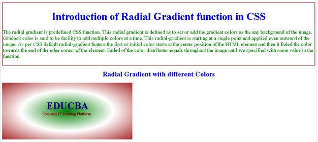
<p>The radial gradient is predefined CSS function. This is defined as to set or add the gradient colors as the any background of the image. Gradient color is said to be facility to add multiple colors at a time. This radial-gradient is starting at a single point and applied even outward of the image. As per default radial-gradient feature the first or initial color starts at the center position of the HTML element and then it faded the color towards the end of the edge corner of the element. Faded of the color distributes equals throughout the image until we specified with some value in the function.</p>
</div>
<h1>Radial Gradient with different Colors</h1>
<div class="evenRadGrad">
<div class = "edu">EDUCBA</div>
<div class = "it">Reputed IT Training Platform</div>
</div>
</body>
</html>Output:
Example #2 – Circle shape
Code:
<!DOCTYPE html>
<html>
<head>
<title>CSS Gradients</title>
<style>
.evenRadGrad {
height: 400px;
width: 620px;
background-image: radial-gradient(circle,navy, white, skyblue); /*GIves you background image with circle shape and 3 different colors*/
}
.edu { /* provides styles content of inner side image*/
text-align:center;
font-size:48px;
font-weight:bold;
color: fuchsia;
padding-top:81px;
}
.it { /* provides styles content of inner side image*/
font-size:18px;
text-align:center;
font-weight:bold;
color: purple;
}
.content
{
border: double 5px pink;
color: red;
font-size: 25px;
}
h1
{
text-align: center;
color: green;
}
</style>
</head>
<body>
<div class="content">
<h1>Background of Radial Gradient function in CSS</h1>
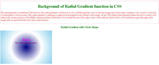
<p>The radial gradient is predefined function. This is defined as to set or add the gradient colors as the any background of the image. Gradient color is said to be facility to add multiple colors at a time. This is starting at a single point and applied even outward of the image. As per CSS default radial-gradient feature the first or initial color starts at the center position of the HTML element and then it faded the color towards the end of the edge corner of the element. Faded of the color distributes equals throughout the image until we specified with some value in the function.</p>
</div>
<h1>Radial Gradient with Circle Shape</h1>
<div class="evenRadGrad">
<div class = "edu">Java</div>
<div class = "it">Easy to learn and design a project</div>
</div>
</body>
</html>Output:
Example #3 – Different sizes
Code:
<!DOCTYPE html>
<html>
<head>
<title>CSS Gradients</title>
<style>
h1
{
color: green;
text-align: center;
}
h2
{
color: brown;
}
.cs {
height: 200px;
width: 200px;
background-image: radial-gradient(closest-side at 60% 55%,pink,brown,white,navy);
}
.fs {
height: 200px;
width: 200px;
background-image: radial-gradient(farthest-side at 60% 55%,pink,brown,white,navy);
}
.cc {
height: 200px;
width: 200px;
background-image: radial-gradient(closest-corner at 60% 55%,pink,brown,white,navy);
}
.fc {
height: 200px;
width: 200px;
background-image: radial-gradient(farthest-corner at 60% 55%,pink,brown,white,navy);
}
</style>
</head>
<body>
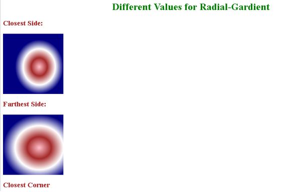
<h1>Different Values for Radial-Gardient</h1>
<h2>Closest Side:</strong></h2>
<div class="cs"></div>
<h2>Farthest Side:</h2>
<div class="fs"></div>
<h2>Closest Corner</h2>
<div class="cc"></div>
<h2>Farthest Corner</h2>
<div class="fc"></div>
</body>
</html>Output:

Conclusion
The background image of the HTML element allows for the application of different colors and shapes. We can use any shape to apply these colors to that element. The color of the inner side’s deepest point to the outer side’s highest point becomes faded.
Recommended Articles
We hope that this EDUCBA information on “Radial Gradient in CSS” was beneficial to you. You can view EDUCBA’s recommended articles for more information.

