Updated May 29, 2023
What is Excel Power View?
Power View is a Visualization tool present in Excel with the help of which you can create visually appealing graphs and charts, dashboards of your own for management, and reports that can be sent daily, weekly, and monthly. This tool is considered a Reporting tool under Microsoft Excel 2013 and is available for all the latest versions, including Office 365. Whenever we think of Microsoft Excel, we think of different tools such as Formulae, which makes life easier for an analyst, PivotTables, which can allow the user to analyze the data spread across a large number of columns and rows, Analytical Tool-pack, which almost covers all the important statistical predictions methods for forecasting, graph library which is as reach as any other programming language could provide, PowerPivot which allows you to take data from various other sources and work on it under excel. In this article, we will study the same tool, Power View.
How to Enable Power View under Microsoft Excel?
To enable the Power View tool for interactive reports and dashboards, you first need to enable it under Excel.
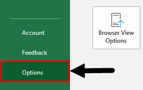
Step 1: Navigate to the File menu and select Options by clicking on it. Follow the steps below:
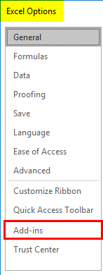
Step 2: An Excel Options window will pop up with various options. Click on the Add-ins option to access all the add-in options available.
Step 3: Inside Add-ins, you can see an option called Manage: which has all the Excel add-ins as a dropdown. Select COM Add-ins inside Manage: option and click on the Go button.
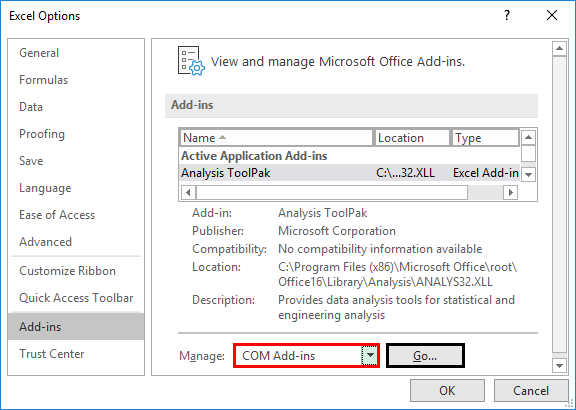
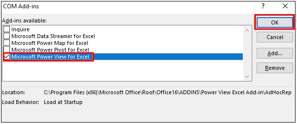
Step 4: Select the Microsoft Power View for Excel option under the list of COM Add-ins and press the OK option.
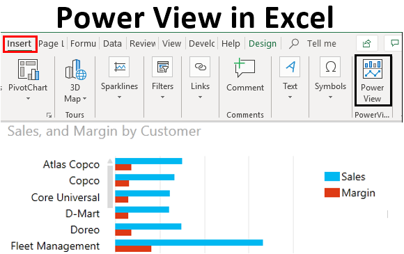
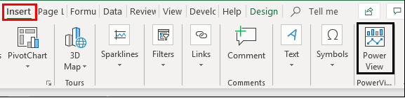
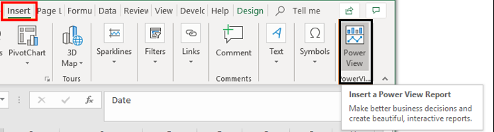
This will enable the Power View option in your Excel. You can access the same under the Insert tab. Please find the screenshot below:
Example – Power View Usage in Excel
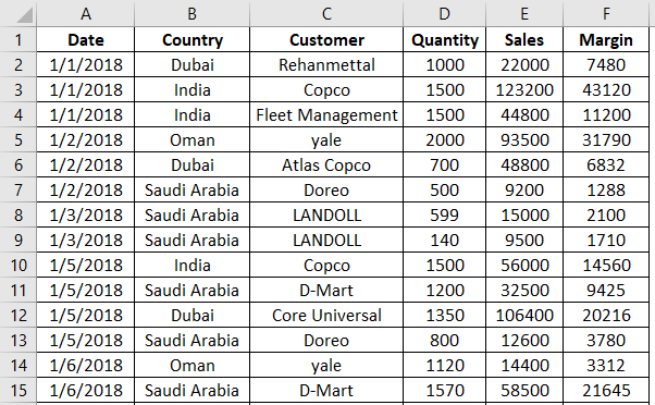
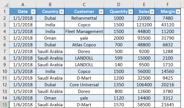
Suppose we have sales data for different customers in different countries. We would like a dashboard based on this data under Power View. Follow the steps below:
Step 1: First, insert a table for this data in Excel. Press CTRL+T to insert the table under the given data, and press OK.
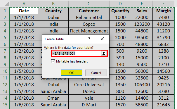
Your table should look like the one shown in the screenshot below:
Step 2: Navigate towards the Insert tab on the Excel ribbon and click on the Power View option at the end of the list.
Step 3: When you click on the Power View option, it will load and generate a power view report within the same workbook. Loading the power view layout may take some time, so have some patience. You will have a power view report as shown in the screenshot below:
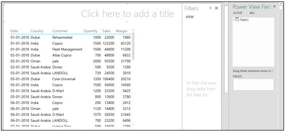
This report layout has a table inside the main report template, filters besides that, and finally, the Power View Field list the same as that we see inside PivotTables at the rightmost corner. Here, we can slice and dice the report data using filters or a Power View Field list.
Step 4: Click on the Table1 dropdown inside Power View Fields and select the Country and Margin Columns, respectively. You can see the Quantity, Sales, and Margin columns sign. It is there because those are the columns that have numeric data present in them and can have a summation.
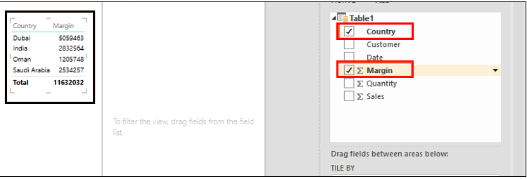
You can see a new layout will be created under the same Power View Report.
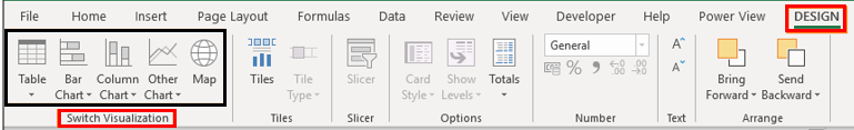
Step 5: Now, we will add a graph for this country-wise data. Navigate to the Design tab, which appears at the top of the ribbon, and you can see different design options under Power View Report sheet. Out of those, one is Switch Visualization. This option enables you to add graphs under the Power View Report.
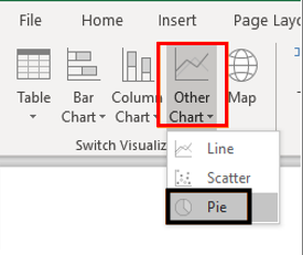
Step 6: Click on the Other Chart dropdown and select the Pie option, which allows you to insert a pie chart for the country-wise data.
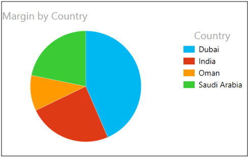
Your chart should look like the one shown below:
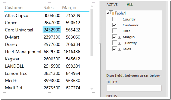
Step 7: Select the Customer column, Sales, and Margin as data.
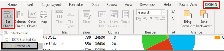
Step 8: Navigate to the Design tab again and select Clustered Bar option under the Bar Chart dropdown inside the Switch Visualization menu.
This option will enable you to visualize the Sales and Margin for all customers in a single chart. See the screenshot below:
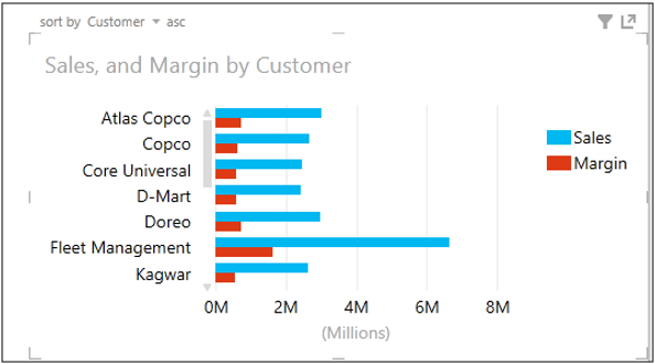
This graph allows us to check the key customers regarding sales and the margin amount. You have a scroll bar to scroll down until the last customer. Also, you can sort the chart data by customer, Sales, or Margin wise.
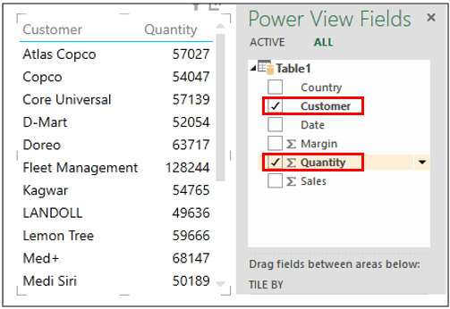
Step 9: Follow similar steps; however, we will now run the chart option for Customer and Quantity. Select those two columns under Power View Fields.
Step 10: Follow the same procedure as in step 8 to see the bar chart of customer-wise quantity sold. The graph should look like the one in the screenshot below:
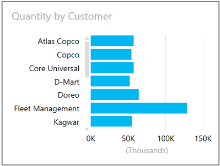
This graph lets us visualize which customers we have sold most of the item quantities to.
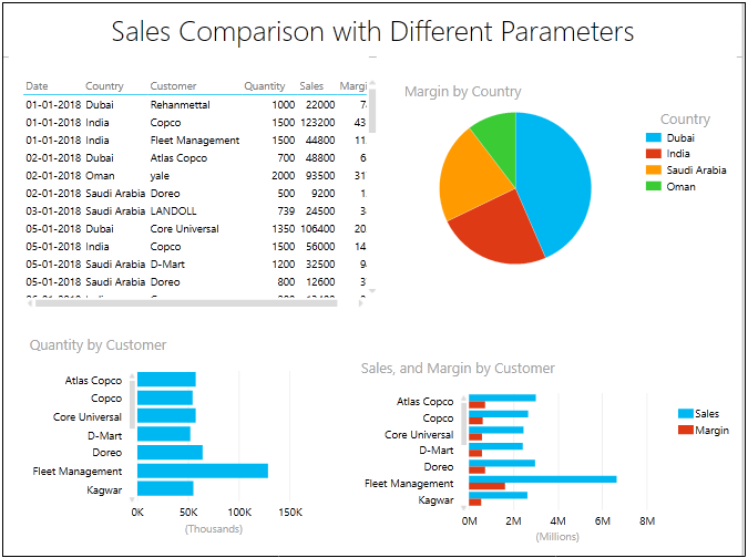
Step 11: Now, our report is complete. Please add the title to this report as “Sales Comparison with Different Parameters”.
The final Layout of our Power View Report would look like this in the screenshot given below:
This is it from this article. Let’s wrap things up with some points to be remembered:
Things to Remember
- Having the data cleaned before you insert Power View on the same is mandatory. No blank spaces between cells, no blank cells, etc., should be checked well before.
- You can also export the Power View Dashboards and Reports into formats such as PDF.
- Power View is disabled by Microsoft due to license purposes. Therefore, whenever you are about to launch and use it for the first time, you need to check for certain licensing parameters. The instructions are beyond the scope of this article.
- If you have downloaded the worksheet and cannot see the power view report created, the possible error is that you did not have Microsoft Silverlight preinstalled in your system.
Recommended Articles
This is a guide to Power View in Excel. Here we discuss how to use Power View in Excel el, practical examples, and a downloadable Excel template. You can also go through our other suggested articles –
