Updated May 29, 2023
Pivot Table Slicer (Table of Contents)
Introduction to Pivot Table Slicer
Slicers in Excel is an interactive tool or visual filter that lets you see what items are filtered within a Pivot Table. In dashboards and summary reports, users most commonly utilize Pivot Table Slicer. Slicers have an advantage over pivot table filters because they can connect to multiple tables and charts. From Excel 2013 version onwards, the slicer tool can be applied to a data table, pivot table & charts.
In Excel, the slicer is a filter that is used to filter the available data in the Pivot table based on the connections established between the slicer and Pivot Table. To apply Slicer in Pivot Table, first, we need to create a pivot table. Then from the Insert menu tab, click the Slicer icon under the Filter section. It will give us the list of all the fields in the Pivot table. Select the fields which we want to see in Slicer. Choose the report connection from the right-click menu to connect the slicers with the pivot table.
How to Create a Pivot Table Slicer in Excel?
Let’s understand how to add or create a Slicer in Excel using a Pivot Table with a few examples.
Example #1 – Sales Performance Report
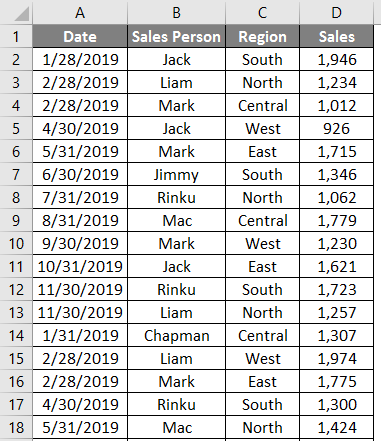
With the help of the Pivot table & Chart, let’s add a Slicer object to summarize sales data for each representative & region. Below mentioned data contains a compilation of sales information by date, salesperson, and region.
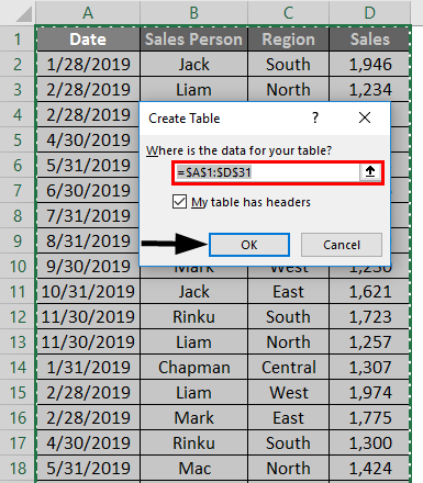
To convert the data set into a table object, click inside the data set, click the Insert tab in the Home tab, and select the table option. A create table popup appears, where it shows the date range & headers, and click OK.
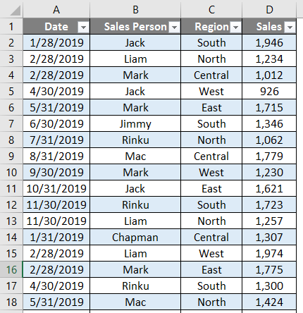
Once the table object is created, it appears as shown below.
We need to summarize sales data for each representative by region wise & quarterly for this tabular data.
Therefore, we need to create two Pivot Tables.
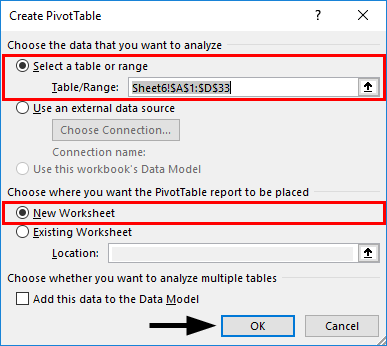
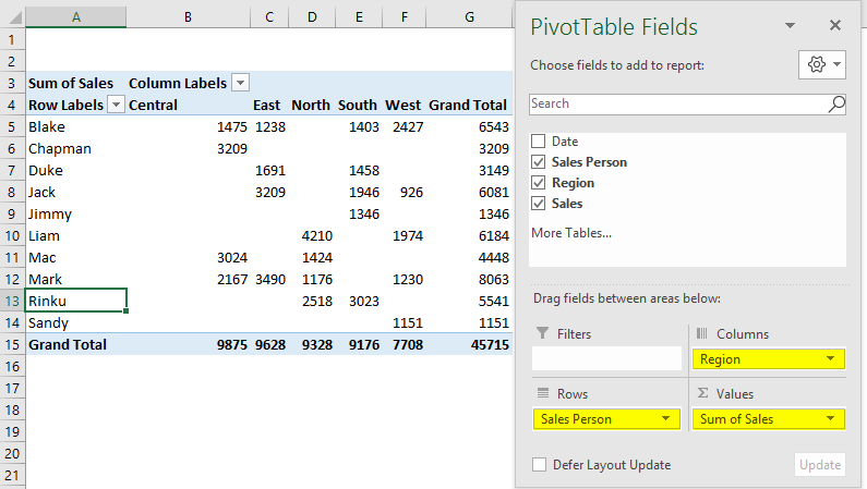
First, we will create a pivot table for the salesperson by region. In the Tables object, click inside the data set, click the INSERT tab, select the Pivot table, and click Ok; the Pivot Table Fields pane appears in another sheet. (You can name the sheet as “SALES_BY_REGION”)
In the PivotTable Fields pane, drag salesperson to the Rows section, Region to the Columns section, and sales to the Values section.
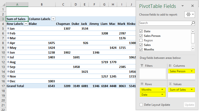
Similarly, create a second PivotTable in the same way, To create a pivot table for the salesperson by date wise or quarterly (SALES_BY_QUARTER).
Drag data to the Rows section, salesperson to the Columns section & sales to the Values section.
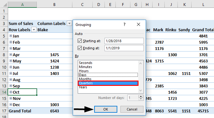
Here we want to summarize data every quarter; therefore, dates need to be grouped as “Quarter”. To do that, right-click on any cell in the Row Labels column and choose Group.
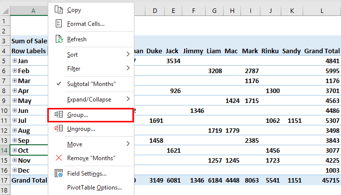
The grouping tab appears, with the start date & end date, in the BY list. It appears in blue after selection. Unselect Months (default value) and others; now select only Quarters. Then click OK.
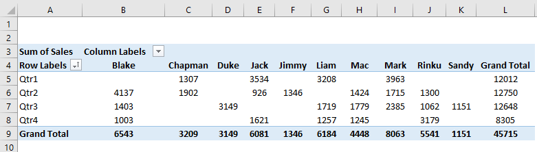
After grouping into quarters, data appears as shown below.
Here, we need to create a PivotChart on each of the created pivot tables in both sheets.
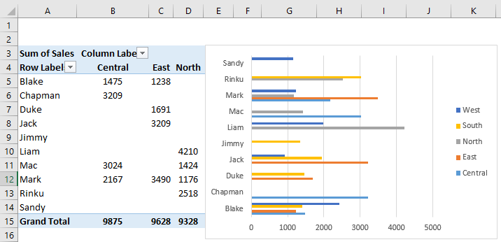
Go to the “SALES_BY_REGION” sheet, click inside the PivotTable, under the PivotTable Analyze tab, select PivotChart, insert chart popup window appears, in that Select Bar, under that select Clustered Bar chart.
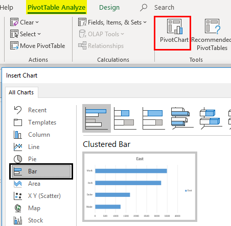
A pivot chart appears for “SALES_BY_REGION.”
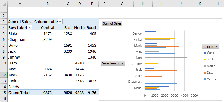
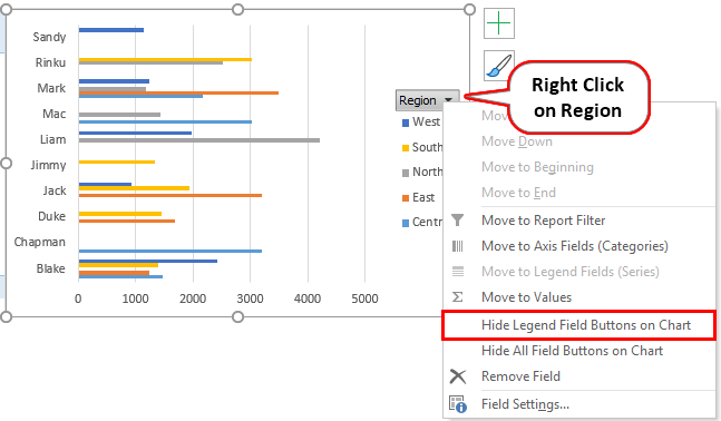
Here you can hide the region, salesperson & sum of sales in the pivot chart by right-clicking and selecting “Hide Legend Field Buttons on Chart” so those three fields will not appear on the chart.
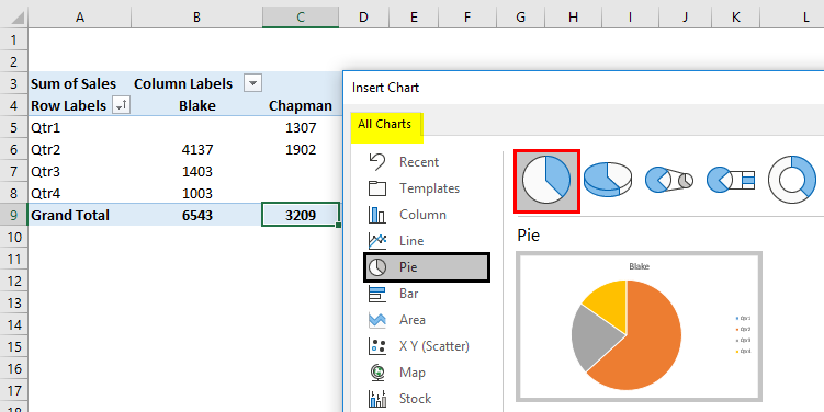
Similarly, users can apply a pivot chart in the “SALES_BY_QUARTER” sheet to choose a Pie chart for visualizing quarterly sales data. Here also, you can hide those 3 fields.
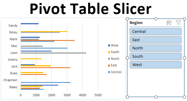
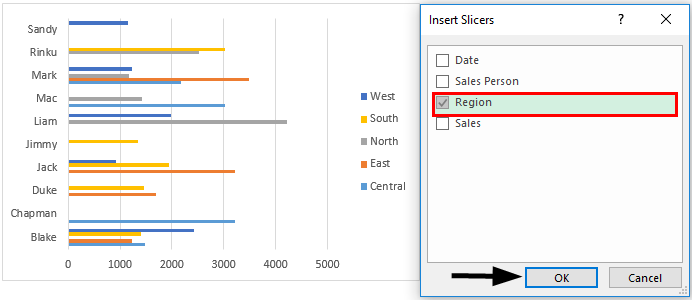
To check individual salesperson performance by region-wise & quarterly data, we need to add slicers to help you out, where you can filter out individual performance. Go to the “SALES_BY_REGION” sheet under analyze tab. Click Insert Slicer in the Filter group.
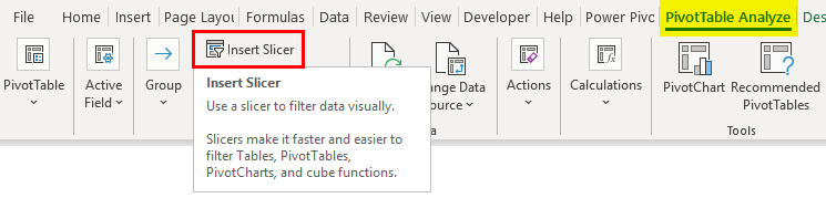
Insert slicers window appears, in that select Region field & click OK.
Region-wise, Slicer will appear.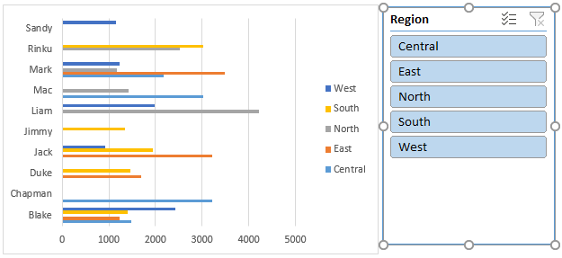
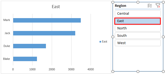
After inserting the region-wise slicer, users can filter the performance of individual salespersons based on their respective regions. In the below screenshot, I have selected the east region to see individual salesperson’s performance in that region appearing in the pivot chart & table.
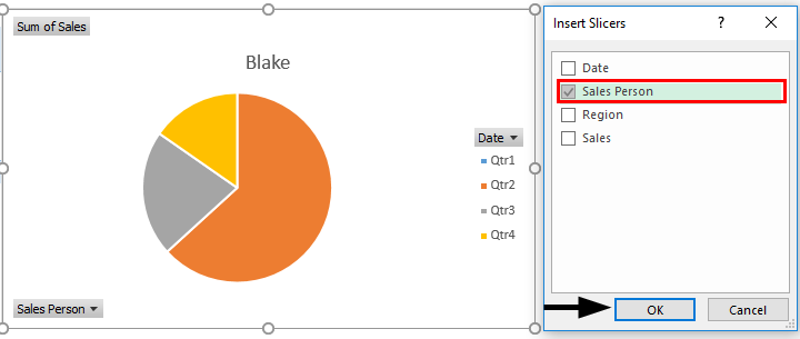
Similarly, under the PivotTable Analyze tab, you can add slicers in the “SALES_BY_QUARTER” sheet. Click on Insert Slicer in the Filter group. Insert Slicers window appears in that select salesperson. Click OK.
Sales Person Slicer will appear as shown below.
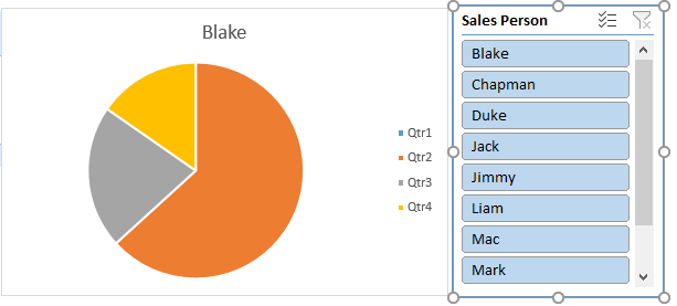
After inserting the salesperson-wise slicer, users can filter the quarterly performance of individual salespersons. In the below-shown screenshot, I have selected Chapman to check out his sales performance, where you can find changes in the pivot table & chart, showing his performance quarterly.
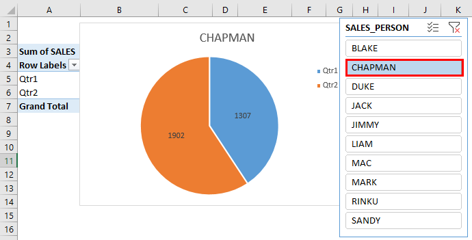
The slicer can control both the pivot table and the pivot chart. i.e., Both the pivot table & chart are updated once you change the salesperson. Users can select multiple items in a slicer by clicking the slicer buttons while simultaneously holding the Ctrl key, allowing them to choose multiple items.
Things to Remember
- In slicers, users can create multiple columns. One slicer can be linked to multiple pivot tables & charts.
- Compared to the report filter, Slicer has better advantages & options. One slicer can be Linked to multiple pivot tables & charts, which helps out to cross-filter & prepare an interactive report using Excel.
- Slicers can be fully customized, where you can change their look, settings & color with the help of slicer tool options.
- You can Resize a slicer with height & width options in the slicer tools options.
- There is an option to Lock the slicer position in a worksheet with the below-mentioned procedure.
Recommended Articles
This is a guide to Pivot Table Slicer. Here we discuss How to Add or Create Pivot Table Slicer in Excel, practical examples, and a downloadable Excel template. You can also go through our other suggested articles –
