Amazing MS PowerPoint Presentation
If you are the sort who needs to present often in front of a live audience, then you’re sure to have tapped into the pretty power of MS PowerPoint presentations. To an audience craving entertainment along with any learning engagement, an MS PowerPoint Presentation content may well be Queen! That said, as presentation expectations evolve and audiences demand richer storytelling, many presenters are also exploring Alternatives to powerpoint that offer more flexibility, interactivity, and visual impact.
In this post, we discuss 8 MS PowerPoint Presentation tips. To aid your PowerPoint presentation learning, we’ve divided this post into two parts; the first focuses on presentation hacks, and the second focuses on MS PowerPoint presentation Microsoft hacks. The intent is to encourage you to use this tool better collectively so you deliver and present with PowerPoint better.
MS PowerPoint Presentation Tips
PART 1 – Presentation Hacks
-
Keep it visually appealing
This is perhaps the essential tip for any effective presentation so that we will take some writing space for it. Our eyes are intentionally our most powerful sense organ. So if you intend to allure the audience with your PowerPoint presentation, you have to cater to them first with a visually appealing act. To save time on that, you can visualize your presentation using a chatgpt powerpoint plugin. With this plugin, you can add charts, infographics & on-demand images effortlessly making your presentation visually appealing act.
Some tried-and-tested rules for this are included below.
-
Don’t bite the bullet list!
PowerPoint tradition demands that you keep your slides extremely basic, as either a picture or a bulleted list. Well, we’ll happily tell you to break this tradition!
Bulleted lists are passed in today’s e-times. Sure, they have their uses to summarize important information quickly. But with reducing attention spans, we’ve found more effective ways to grab audience attention: vibrant graphics, customized clipart, charts and graphs, embedded videos, live-feed screenshots, etc. As the revised adage would probably say, a picture (or a media element) speaks more than 1000 bulleted lists!
-
Keep it spiffy!
Before you argue that “spiffy” is not an English word, let us reiterate the importance of holding the audience’s attention. And this cannot happen as one visual animation drags after another. (Another non-English word there!
Whatever visual factor you introduce, ensure that it inserts seamlessly into your MS PowerPoint presentation without drawing undue attention. (This means a firm NO to heavy animations after every slide.)
-
Please keep it simple!
Finally, don’t miss the Key principle, ever! Yes, we did use the words “visual” and “appealing” in the same sentence. But don’t treat this as an exercise to create a Disneyland of visual wonder even as you unleash a crazy riot of colors, graphics, designs, and animations on your unsuspecting audience. This can come across as “gimmicky” and take away from the authenticity of your presentation. You want your audience’s focus on your topic first, always. So retain visual balance.
-
Step up into the e-age by embedding e-media
That’s online multimedia elements for you.
In today’s e-age, we bet you rely heavily on the internet to prepare for your presentation. Whether it’s material content, social media, YouTube videos, blogs, live feeds, etc., the world wide web connects you to a whole host of extra information related to your topic.
Return the favor to your audience in a seamless manner.
So, for instance, if you have a video from a particular site that you want to showcase in your PowerPoint presentation, you’d probably include a link on your slide and then open it up in a separate window. However, this can be distracting and takes the focus away from your presentation.
With integration tools like LiveWeb, you can seamlessly include external video in your presentation. Hence, it opens up in the same window (much like an embedded video) with live feeds and other online media elements. This small tip can take the overall effect of your presentation to another level, much like an integrated webinar or a live demo. Nice!
And that’s it; that’s the end of Part 1. These two simple yet potent suggestions are all you must follow before you get your hands dirty with the actual PowerPoint Presentation. And you can do this easily with the PowerPoint hacks below.
PART 2 – Office Powerpoint Hacks
-
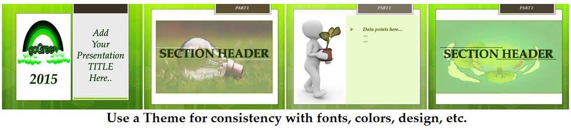
Keep it consistent with the suitable MS PowerPoint Theme
Have you been privy to an MS PowerPoint presentation that showcases a blue theme? No, wait, it’s yellow. Err, blue again, and…. pink… purple… white? Drat, there’s no theme. By the seventh slide, you’ve got eye burn!
There is a definite limit to how much visual variation we can comfortably digest. So keep your presentation visually consistent by endorsing a common theme. Please do this before designing your slides so you don’t have to correct them individually later. You can use an AI PowerPoint generator to create and edit your slides as you like.
The good news is that PowerPoint comes loaded with many default MS PowerPoint presentation themes that you can use with a single mouse click (all available through the Design Tab). Each theme has its own set of backgrounds (including page color, watermarks, shapes, images, and graphics), special effects, fonts, and color palettes. It’s an effortless way to maintain consistency across your MS PowerPoint Presentation.
For instance, here’s an example of how you can use the built-in Austin theme to back a topic’s “Go-Green” flavor, even as you keep it consistent yet interesting.
While you cannot wholly modify a default theme, you can manually edit certain facets like colors, effects, etc. Read on to learn more about this.
-
Make friends with the Design Tab.
The Design Tab is critical to making your MS PowerPoint presentation “visually appealing.” In addition to popular PowerPoint presentation themes, it also has a host of features (like fonts, colors, etc., all explained below) to enhance the look and feel of your presentation.
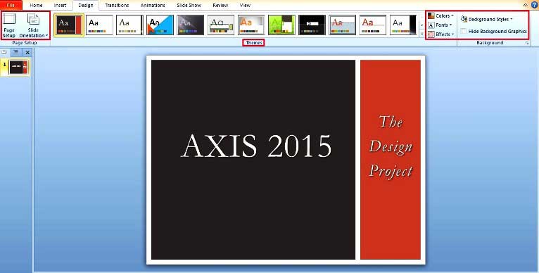
Here, spend a few minutes to figure out the following:
-
Page Setup:
This determines the size and orientation of your slide. In rare cases, you may want to revise the default settings to fit special sizing needs for your visual projector.
-
Fonts:
A theme consistently uses Serif or Sans Serif fonts so your typeface remains clean and legible. The default fonts (of Calibri, Cambria) are chosen for their universal appeal. However, your theme may have a different need, so don’t hesitate to explore different fonts. Also, spend a few minutes exploring the character spacing in your font. Depending on your font type (too long or too short), you can choose to modify the default sizing and spacing of individual characters.
-
Effects:
Effects determine the influence of your theme on all media elements used in your presentation (like shapes, lines, fonts, color changes, images, etc.). PowerPoint provides three flavors of effects: subtle, moderate, or intense (names are self-explanatory). But it is the combination that offers exciting effects on your presentation. Your chosen theme automatically sets these. But should you need to customize them for your presentation, you can use the drop-down tab in the Design View. Highlight the text, shape, picture, or other media elements you want to customize, and click on the related drop-down box to change default settings. (Changes will run across the entire presentation.)
-
Background styles:
Use this drop-down tab to change your background page’s color, shape, graphics, style, and texture. If you want to hide the MS PowerPoint presentation graphics while keeping the top layer shapes, check the “Hide Background Graphics” box below this tab to customize the slide.
We also encourage you to proactively explore the Format menu (for any media elements like text, shapes, graphics, pictures, charts, sound/video objects, etc.) and uncover the hidden gems that MS PowerPoint provides. You can do this by right-clicking on your chosen element and then clicking on the “Format…” option in the drop-box to enter a new world of customized settings. You can use this to add shadows to your text, make it pop with a background glow, change the texture of your background page, change the spacing between text objects, give it a 3D look, and much more.
-
Be unafraid to experiment with Colors:
Every theme’s color palette contributes to the background image, shape, font, etc. While you cannot modify a theme in totality, you can still cleverly change the palette to get contrasting styles with the same theme.
For instance, the above picture showed a title slide created with the “Grid” theme (one of PowerPoint’s built-in themes). Here’s a preview of what happens when experimenting with different color palettes on the same piece.
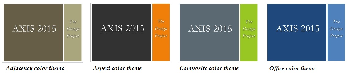
As you can see, this is mighty effective in providing varied styles with just a few mouse clicks. However, note that whatever color palette you choose will run through all your MS PowerPoint Presentation slides.
Another trick you can use is manually editing the color palette and applying high-contrast colors for a defining slide. Here’s an example.
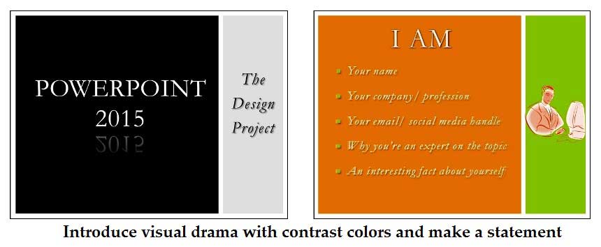
As you can see, it’s another effortless way to add instant visual drama to your slide and heighten its impact!
-
Create your brand template.
The best PowerPoint presentations aren’t just visually appealing; there are well laid out with content. Design your personal brand MS PowerPoint presentation template that’s user-friendly and easy for your audience to digest. We’ve seen some enthusiastic designers overload their fancy MS PowerPoint presentations with a hefty dose of audio/visual elements. Unfortunately, they are laid out such that it takes away from the main topic.
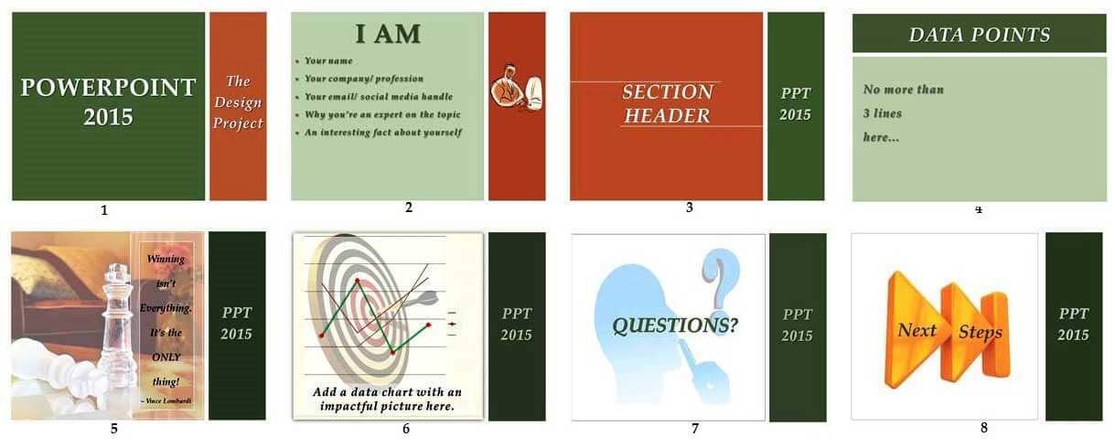
Here are pre-defined MS PowerPoint presentation templates that are our suggestions for you. But of course, you must customize this to capture your personal PowerPoint presentation brand template!
- Opening slide – This should be a high-impact Title slide with minimal distractions.
- Intro – Use this to introduce yourself to the audience as you share why you are the expert, some fun stats, and your contact details.
- Section headers – Introduce them so the audience gets a breather between sub-topics. These are also suitable placeholders for jokes, audio/video clips, gimmicky animations, and the lot, so insert them after such planning.
- Data points – Powerpoint slides with actual content. These should be easy to read and digest, with no more than 2-3 lines per slide. Avoid bullet lists where possible, as it’s the easiest way to put your audience to sleep!
- Graphics – Introduce a slide or two between data points that contain PowerPoint presentation pictures, charts, tables, video clips, etc., to break the monotony. These work best with one high-impact statement.
- Questions – Most presentations encourage this. Set a slide (and time) to address audience questions depending on your situation. This also improves audience participation.
- Next steps – Always leave the audience with something more: perhaps suggestions for further reading, a URL that gives additional information, the download link for the PowerPoint presentation file, etc.
-
Use the Presenter’s View to manage your notes.
Have you noticed how your notes often become redundant during the live show? Considering they don’t show up on the actual slides, they’re not much help during your live PowerPoint Presentation.
With Microsoft PowerPoint 2010 (and above), that has changed.
Version 2010 (and above) provides you with a “Presenter View,” accessible through the “Slide Show” tab, and allows you to pan two views.
- One for you, the presenter. This includes the slide sorter list, the actual slide, and your PowerPoint presentation notes (so you can refer to these talking points during the live session).
- Two, for the audience. This contains the slide (only).
But of course, this MS PowerPoint presentation view works only when you have two displays, ideally your laptop/ desktop (for your opinion) and another display projector to capture the audience’s perspective.
This MS PowerPoint presentation view gives you much more control as you get a peek into upcoming slides and can accordingly schedule a break, introduce the next topic, and overall pace yourself better.
-
Play with PowerPoint’s excellent features!
We know; this sounds like too generic a tip. But really, we’re reserving this space for some last-minute shout-outs on better PowerPoint Presentation design.
- Keep your slide layout “clean.” This means you align objects and media elements and keep them visually consistent.
- Use high-quality images always.
- Don’t forget to customize your text/ graphics/ media element using the Format. You can add a reflection, change shadow settings, edit the shape, remove the background part of a picture, and plenty more. It’s well worth your time!
- Play with PowerPoint’s Shapes and SmartArt (available in PowerPoint 2010 and above). These are accessible through the Insert tab and empower you to create plenty of ready-to-use templates like org charts, flow charts, message bubbles, etc. With the Smart-Shapes picture tab, you can effortlessly showcase a collage of photos. Nice!
- If you switch between PC/Mac systems for your final act, save your MS PowerPoint presentation as a series of images (available through the Save As option), and import them into the last system to maintain consistency and compatibility.
The final piece…
Solid design, a clean process delivery, and a lively disposition back a good MS PowerPoint presentation. We believe we’ve armored you with the first two here. Don’t forget to wear your best-friendly face to land the final piece!
Recommended Articles
This has been a guide to how to create a fantastic MS PowerPoint presentation. Here we also discuss the 8 MS PowerPoint Presentation tips. You may also have a look at the following articles to learn more –
