Updated March 16, 2023

Introduction to Minitab Pareto Chart
The following article provides an outline for Minitab Pareto Chart. A Pareto Graphic is a discrete data quality chart that aids in identifying the most common forms of fault occurrences. Minitab is a scientific software tool that calculates Pareto charts automatically. Add the fault categories in the form of a column in Minitab. A form of bar chart in which the data depicted are ordered from largest to smallest. On the X-Axis, the types of events are ordered from minimum to maximum frequency. The left Y-Axis represents the likelihood of occurrence, while the right Y-Axis represents the total percentage.
What is Minitab Pareto Chart?
Pareto charts categorize data by the frequency with which it occurs. A bar chart is used to depict data frequencies; however, a Pareto can alternatively use a line chart to show the relative frequency of occurring instances. The Pareto analysis aims to get the most value out of quality improvement, but that doesn’t mean that tiny, easily handled issues should be overlooked until the most significant problems have been resolved. The 80:20 rule is another name for the Pareto principle. As the “concept” says, 80 percent of a process’s flaws are caused by 20% of the factors, and 80 percent of revenue is generated by 20% of the customers.
For example, an e-commerce company could wish to learn from customer reviews what types of complaints they have and which ones they need to address first. As a result, it will help prioritize the criteria in this scenario. For example, signal strength, hardware issues, connection failure, billing issues, and incorrect account information are all examples of complaints.
How to Create Minitab Pareto Chart?
The Pareto Chart is one of the most important charts for visually representing areas of focus in a firm maybe.
Here are some handy bits of information about the Pareto chart:
1. The decreasing bars on these charts will be either put on a level that indicates the sum of all bars (Minitab) or placed on a level proportional to the giant bucket (Count).
2. % of the total: Pareto’s should also reflect the proportion of the entire Cumulative Percentage which each particular bar represents. The cumulative proportion of each additional bar is often shown in one of two ways in Pareto charts.
According to the idea, most consequences are caused by a limited number of factors. Problem areas can be easily identified using the Pareto chart.
Creating a Pareto chart is very simple. Initially, use the data in a sheet showing the defects count. In our case, we have five different product types for online shopping; we need to identify the defects to enhance the product quality.
Let’s see how to create in Minitab.
The data set used here is:
|
Count |
Producttype |
| 4 | Salwar |
| 15 | beverages |
| 6 | jeans |
| 26 | T-shirt |
| 3 | footwear |
| 8 | accessories |
To go to the Pareto chart, Select stat from the menu, then direct to the sub-menu -> Quality Tools. Meanwhile, a window pops out with the title named “Pareto chart.”
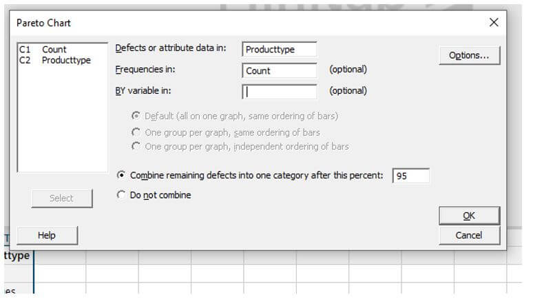
Select the Attribute box and fill in the box along with the frequencies, and select the percentage as ’95’. Finally, click “ok.”
It opens a window like this:
How to Run Minitab Pareto Chart?
The goal of performing a Pareto analysis here on the data set was to determine how many defective goods each category produced. In this case, the faults are the results, while the manufacturing sector is the cause. A graph-like structure appears when we click a Pareto graphic. Each bar usually signifies a different type of flaw or issue. The bar’s elevation indicates any significant unit of measurement, such as frequency of occurrence or cost. The line represents the percentage of flaws.
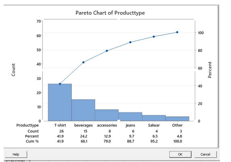
In the above example, products were sorted in descending order by the number of defects created in the Minitab chart. For example, on the left, a product T-shirt with 26 of the 70 total flaws was placed. The percentage under the defect count indicates how much of the overall defects that product was responsible for. The connecting data points above the bars show how much each product contributes to the total number of defects in terms of a percentage. The graph demonstrates that only around 80% of the influence is caused by 20% of the real causes.
Advantages of Minitab Pareto Chart
Given below are the advantages mentioned:
- The diagrammatic representation is straightforward to comprehend.
- Many situations, such as quality assurance and stock control, have applications.
- It emphasizes the critical aspects in any scenario that significantly impact the process.
Example of Minitab Pareto Chart
Let us see the making of the Pareto chart in a Minitab.
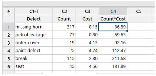
A car manufacturer’s inspector studies the sources of material part problems to prioritize improvement projects. The inspector keeps track of the number and types of problems throughout the procedure. To prioritize the flaws discovered by the inspector, a developer develops a Pareto chart.
Step 1:
Open a Minitab and enter sample data under c1, c2 and C3.
Step 2:
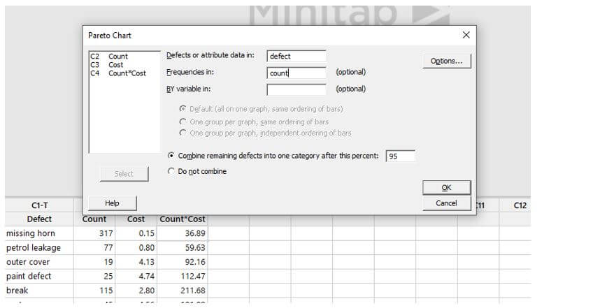
Select Stat > Quality Tools > Pareto Chart from the drop-down menu.
Enter Defect in the Defects or attribute data field.
Next, enter the count in the Frequencies in box.
After this percent, select Combine remaining problems into one category and enter 95.
Step 3:
The chart is shown like this:
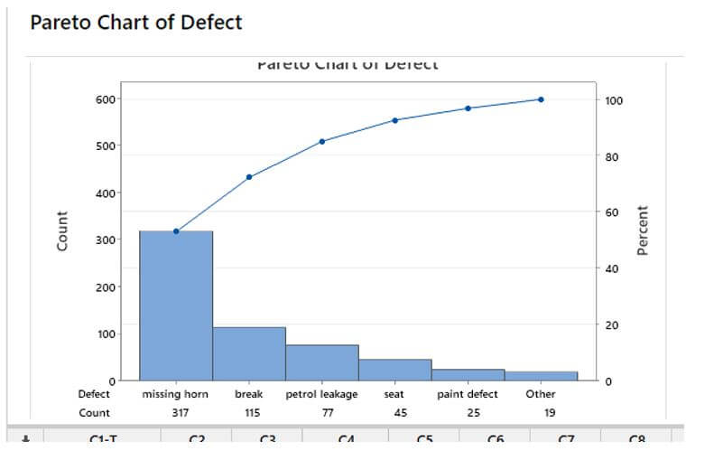
The Pareto Chart on the left depicts the car team’s estimated quantity of defective goods. The blue bars are decreasing and are on a scale that peaks at 300, which is the total number of problems for all car parts. Take note of the table at the bottom of the visual as well. The three rows show essential data in each of the “bars” they’re in. The information comes in the form of a count, a percent of the whole, and a percentage distribution. The cumulative percentage is the information that powers the red line that spans the image and is centered on the right axis labeled percent.
Conclusion
The Pareto chart shows the most prevalent flaws and the most frequent reason for defects and customer complaints. It can assist in continuous improvement in areas wherein significant quality improvements can be accomplished.
Recommended Articles
This is a guide to Minitab Pareto Chart. Here we discuss the introduction and how to create a Minitab Pareto chart, along with Advantages and examples. You may also have a look at the following articles to learn more –
