Updated May 22, 2023
.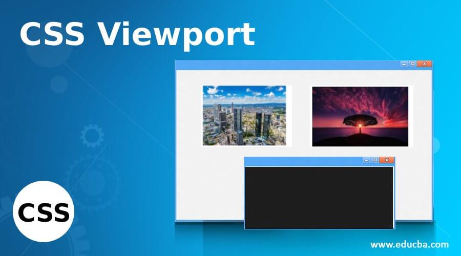
Definition of CSS Viewport
CSS Viewport is defined as the visible area on a window screen that refers to the displays of mobile devices. Adding a CSS <meta> tag with a viewport efficiently improves the web pages’ look on smaller screens. The ViewPort is not the same size as the original Webpage. It is not standard but is still tagged as a critical approach for Responsive Web Design. In simple terms, viewport helps web browsers to break pages and add them on a small screen in a readable format (prevents side scroll). Here Let’s learn the Viewport meta tag in our CSS.
Syntax and Parameters
We can integrate this CSS viewport in two ways. One by CSS and the other by HTML document. The general syntax looks like the following:
Using CSS @viewport rule
@viewport {
width: device-width;
zoom: 1.1;
min-zoom: 0.4;
max-zoom: 2;
user-zoom: fixed;
}
This rule has the following parameters
- Width: It adjusts to the device in a normal or landscape view. It takes values like auto, device width, height, length, and percentage. And width sets shorthand properties, namely max and min-width.
- Zoom: It sets for zooming by giving an initial scale in the meta tag. Even this controls the min and max zoom factor. A zoom factor of 1.0 or 100% implies no zooming. Here the larger values make zoom in, and smaller ones zoom out.
- Orientation Descriptor: It helps display the document view in portrait or landscape.
In HTML document
<meta name="viewport" content="width=device-width, initial-scale=1">The general format of the viewport tag used in mobile-optimized websites. Well, Here, the meta viewport tag has to do some settings for changing the scale point of the viewport. The parameter content=” width=device-width sets the width of the page to respond to the width of the screen. The second parameter initial-scale=1 helps in setting the initial zoom point of the page. We can make use of the height value to determine the height of the screen.
How to Use Viewport in CSS?
In this article, we will give you how to use a viewport to enlarge the screen size in browsers. To get started, the viewport can be included in HTML in two ways. Firstly, it can be directly used in the document by adding a meta tag within the head section. Alternatively, it can be referenced from an external CSS file. When using the CSS file approach, it is recommended to place the viewport declaration at the beginning of the file to ensure proper display. For creating a responsive web page, it is advisable to apply CSS styles targeting different devices and screen sizes.. One of the primary roles in any responsive design is a viewport Size.
For example
@viewport {
width: 640px;
}
Here we had set the width to a number value 640px. Also, we can add auto-it. Next, to optimize the layout, I combine the viewport with media rules, where the viewport rule is nested inside.
article, main {width :100%;}
@media screen and (min-width: 40px) {
article {float:right; width:70%;}
Main {float:right;width: 77%;}
}
@media screen and (min-width: 400px)
{article {padding: 30px;
}
}
When coming to browser Support, this @viewport in CSS supports only Internet Explorer and Opera. We have seen a few steps of using Viewport, with which you will get to know the usage of them in daily web design development. And also falls under the new CSS feature to optimize the websites for different devices.
Examples of CSS Viewport
Here Let’s see some examples with the viewport in action.
Example #1 – Simple Example with meta tag
<!DOCTYPE html>
<html>
<head>
<title>EDUCBA- Education Management</title>
<meta charset="utf-8" name="viewport"
content= "width=device-width, initial-scale=1.0">
<style>
.edu {
font-size:30px;
font-weight:bold;
color:red;
text-align:center;
}
.edum {
font-size:19px;
text-align:center;
}
p {
color :aqua;
text-align:justify;
}
</style>
</head>
<body>
<div class = "edu">EDUCBA- Education Management</div>
<div class = "edum"> Trending New Courses - EDUCBA</div>
<p>EDUCBA is a high-level trusted Asia's Largest Open Online learning with over 4500+ courses which covers domains like finance, business, data analytics.With Professionals froexperts industriescovering new courses daily. The company size has 51- 200 employees ana the specialists in E-Learning, Research and consulting. </p>
<p> Data Science Course taught by experts in Data Science which covers data Science Certification along with this training. Mastering new skills with real-time easy projects and could get personalized course recommendations </p>
</body>
</html>
As we can see in the above code that the content is displayed in a landscape orientation defined by device width.
Output:

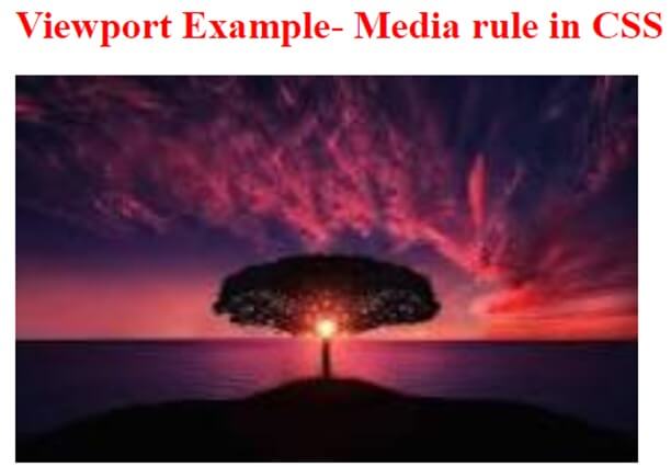
Example #2 – With CSS @viewport.
<!doctype html>
<html>
<head>
<style>
@viewport { width: auto; }
@media (max-width: 600px) {
@viewport { width: 620px; }
}
body {
margin: 1;
}
img {
min-width: 505px;
}
h1
{ color: red;
}
</style>
<title>Viewport Example with Media rule</title>
</head>
<body>
<h1> Viewport Example- Media rule in CSS </h1>
<imgsrc="lights.jpg">
</body>
</html>
The above code makes the image to fit with the width size of the viewport.
Output:
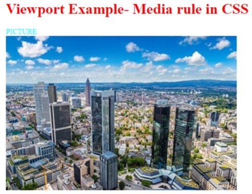
Example #3 – Combining media + viewport
<!doctype html>
<html>
<head>
<style>
@viewport {
width: 320;
}
@media screen and (min-width: 420px) {
div { color: aqua; }
}
@media screen and (max-width: 420px) {
div { color: green; }
}
body {
margin: 1;
}
img {
min-width: 500px;
}
h1
{ color: red;
}
</style>
<title>Viewport Example 2 with Media rule</title>
</head>
<body>
<h1> Viewport Example- Media rule in CSS </h1>
<div> PICTURE </div>
<imgsrc="frankfurt.jpg">
</body>
</html>
Here I have used a combination with a query called media and rendered the viewport width to 420px. The user selects this size and scales the layout to fit the respective space in the display.
Output:
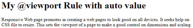
Example #4
<!doctype html>
<html>
<head>
<title>My @viewport Rule with auto value</title>
<style>
@viewport {width: auto;}
</style>
</head>
<body>
<h1>My @viewport Rule with auto value </h1>
Responsive Web page promotes in creating a web pages to look good on all devices.
It seeks help on CSS file to resize. This sets the viewport of a page to make a good control on dimensions and scaling.
</body>
</html>
The above code is very simple to demonstrate the document with any size viewport using auto. The output looks like this.
Output:
Conclusion
To summarize the Viewports in CSS – We have discussed the ways of implementing Viewport in CSS with a demonstration. By including the viewport tag in CSS, it signifies the intention to create a flexible layout that is suitable for website development and adapts well to various mobile devices.
Recommended Articles
We hope that this EDUCBA information on “CSS Viewport” was beneficial to you. You can view EDUCBA’s recommended articles for more information.

