Updated June 9, 2023
Introduction to CSS Units
CSS Units are defined as the different ways where the length is expressed. This Unit specifies how the web design interacts with various devices, also considered a base measurement unit. The Units in CSS help the CSS properties like margin, width, and font size to express their length in units without whitespace, and it accepts negative values. For a value’ 0,’ the units can be neglected.
List of CSS units (Explain each with an example)
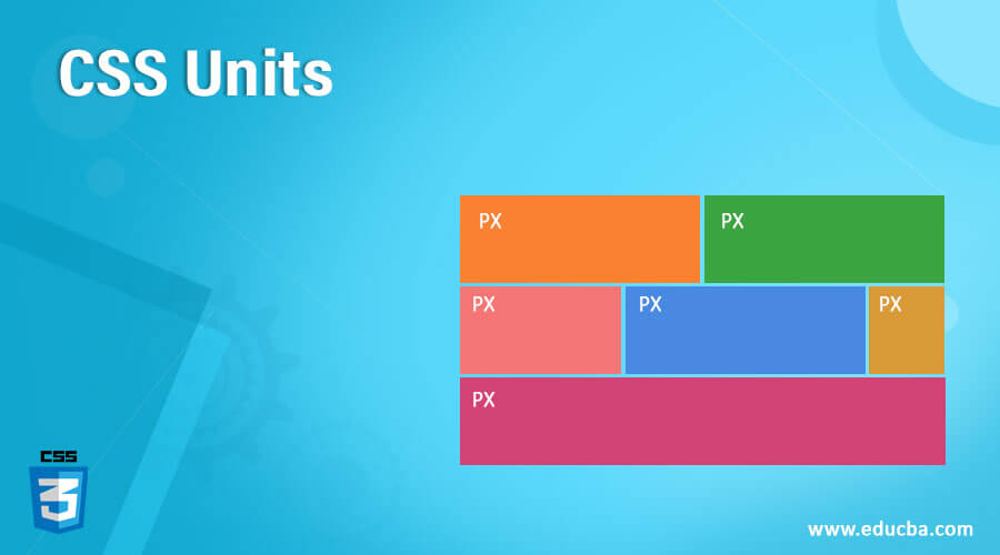
This section will highlight a few popular CSS Units types to set the properties. Two types of CSS Units are classified as absolute and Relative Units.
1. Absolute Units
The Absolute unit sets the size and is not applicable for screen size since the size varies for the screen image. The size remains the same on the phone or on a large window screen for any property set to absolute value. For example, when you already know the output size, such as a page layout, you consider it an absolute unit. This unit is suitable when you do not expect responsiveness from the site and is also useful for defining max and min-width when the areas become excessively wide.
The list of Physical Absolute units are:
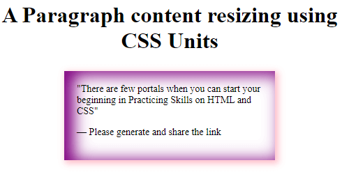
- px: These pixels are the most popular unit for screen size. This is the most common unit in CSS, which fixes the element’s width in the code. Also used in Spacing and position properties. So pixel is a visual angle of a device and fixes the size of an element on a screen.
Example:
<!DOCTYPE html>
<html>
<head>
<style>
blockquote {
width: 50%;
margin: 25px auto;
padding: 18px;
font-size: 14px;
box-shadow: inset 11px 3px 22px 3px purple, 3px 3px 9px 2px pink;
}
</style>
</head>
<body>
<h1><center> A Paragraph content resizing using CSS Units</h1>
<blockquote>
<q>There are few portals when you can start your beginning in Practicing Skills on HTML and CSS</q>
<p>— Please generate and share the link</p>
</blockquote>
</body>
</html>Output:
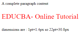
- pt: It defines the units as points. In CSS, we assign one point as 1/72 inch. This unit is highly recommended for devices such as printers.
Syntax:
property : vpt;Where ‘v’ is the numeric value. Ex: height : 10pt;
Example of the unit in points
<!DOCTYPE html>
<html>
<head>
<style>
.pointvalue {
font-size: 22pt;
color:red;
}
</style>
</head>
<body>
<p>A complete paragraph content</p>
<p class="pointvalue">EDUCBA- Online Tutorial</p>
<p> dimensions are : 1pt=1.4px so 22pt=30.8px</p>
</body>
</html>
Output:
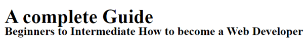
- pc: This unit represents the length in picas and is not highly recommended by W3C.
Syntax:
property: a pt;Where ‘a’ is any numeric value.
- in: This inch is specifically used when you create a printed book page.
Example:
Implementing ‘pc’ and ‘in’ units together
<html>
<head>
<title>Absolute unit- Inches</title>
<style>
.examp {
font-size: .7pc;
font-weight:bold;
}
.skill {
font-size: .3in;
line-height: .2in;
}
</style>
</head>
<body>
<div class = "examp"> A complete Guide</gfg>
<div class = "skill"> Beginners to Intermediate How to become a Web Developer   </body>
</html>
Output:
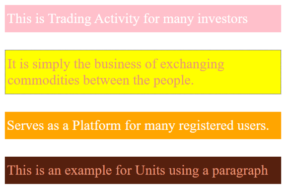
- cm: The most commonly used for daily purposes is centimeters, which is used less in web development cases.
Example:
<!DOCTYPE html>
<html>
<head>
<title> CSS Relative units- Example </title>
<style>
body {
margin: 1cm;
padding: 0.5cm;
font-family: 'Times Roman';
font-size: 0.8cm;
}
p {
padding: 12px 4px;
margin: 1cm;
color: darksalmon;
}
p:nth-of-type(1) {
background: pink;
color: white;
}
p:nth-of-type(2) {
background: yellow;
border: 1px dotted blue;
font-family: 'Dosis';
}
p:nth-of-type(3) {
background: orange;
color: white;
}
p:nth-of-type(4) {
background: #56200e;
}
</style>
</head>
<body>
<p>This is Trading Activity for many investors</p>
<p> It is simply the business of exchanging commodities between the people.</p>
<p>Serves as a Platform for many registered users.</p>
<p>This is an example for Units using a paragraph</p>
</body>
</html>
Output:
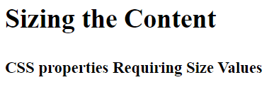
- mm: The length is specified as a millimeter.
Example:
<html>
<head>
<title>Absolute unit- MM</title>
<style>
.abc {
font-size: 10mm;
font-weight:bold;
}
.demo {
font-size: 6mm;
line-height: 2mm;
}
</style>
</head>
<body>
<div class = "abc"> Sizing the Content</abc> <br> </br>
<div class = "demo"> CSS properties Requiring Size Values</div>
</body>
</html>
Output:
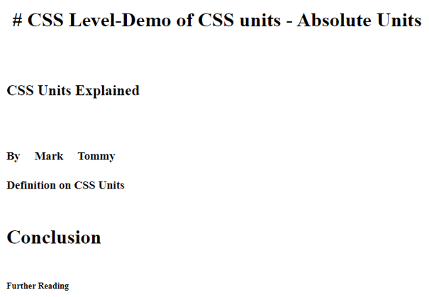
Example:
<!DOCTYPE html>
<html lang="en">
<head>
<meta charset="utf-8">
<title>Demo of CSS units - Absolute Units</title>
<style>
h1 { margin: 0.1in; }       /* inches */
h2 { line-height: 4cm; }     /* centimeters */
h3 { word-spacing: 5mm; }    /* millimeters */
h4 { font-size: 14pt; }      /* points */
h5 { font-size: 2pc; }      /* picas */
h6 { font-size: 14px; }     /* picas */
</style>
</head>
<body>
<h1># CSS Level-Demo of CSS units - Absolute Units</h1>
<h2>CSS Units Explained</h2>
<h3>By Mark Tommy</h3>
<h4>Definition on CSS Units</h4>
<h5>Conclusion</h5>
<h6>Further Reading</h6>
</body>
</html>
Output:
2. Relative Units
These units are not fixed across devices and are widely used for low-resolution screen sizes, making them suitable for responsive website design. They specify the relative units which are completely dependent on other length properties. This preference is especially prominent for digital media screens. A few of the Relative units are:
- Percentage: This helps enclose parent elements in percentage.
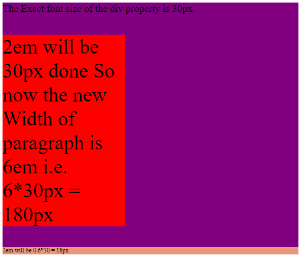
- em: This relative unit falls on the element font size. When we define the font size for the HTML element, their values are relative to one other. For example, if the font size of the parent is 10px and the child is 0.2 em, then the rendered size is 2px. Thus, the font size of the child element could be increased or decreased.
Example: In the following example, we calculate the em value in pixels.
<!DOCTYPE html>
<html>
<head>
<style>
div {
font-size: 20px;
background: purple;
}
.base {
font-size: 2em;
width: 6em;
background: red;
}
.derived {
font-size: 0.6em;
background: darksalmon;
}
</style>
</head>
<body>
<div>
The Exact font size of the div property is 30px.
<p class="base">2em will be 30px done So now the new Width of paragraph is 6em i.e. 6*30px = 180px <p>
<p class="derived">2em will be 0.6*30 = 18px</p>
</div>
</body>
</html>
Output:
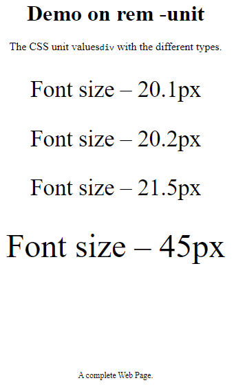
- rem: The value of this element is always equal to the ‘s font-sizeroot element’s font-size. Here is the demo.
Example:
<html>
<head>
<style>
body {
text-align: center;
}
div {
font-size: 2.1rem;
}
span {
font-size: 3rem;
}
.hex {
font-size: 12px;
padding-top: 120px;
}
</style>
</head>
<h1>Demo on rem -unit</h1>
<p>The CSS unit values<code>div</code> with the different types.
</p>
<div>
<p>Font size – 20.1px</p>
<div>
<p>Font size – 20.2px</p>
<div>
<p>Font size – 21.5px
<br><br><span> Font size – 45px</span></p>
</div>
</div>
</div>
<p class="hex">A complete Web Page.</p>
</html>Output:
- ch: It equals the width of an element ‘0’. It means all the characters are of the same width.
Example:
width: 20ch;- vh: Relative to the height of the viewport.
Example:
font-size: 12vh;- vw: Relative to the width of the viewport.
Example:
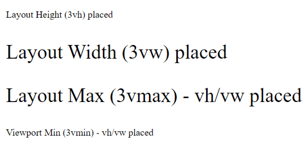
font-size :8vw;- vmin, vmax: We use this when we require an image to adjust its size to fit smaller or larger viewport dimensions.
- ex: This unit is a completely lower value assignment of the font size.
Example: Relative Units example.
<!DOCTYPE html>
<html>
<head>
<title> CSS Relative units- Example </title>
<style>
.v1 {
font-size:3vh;
}
.v2 {
font-size:3vw;
}
.v3 {
font-size:3vmax;
}
.v4 {
font-size:3vmin;
}
</style>
</head>
<body>
<p class="v1">Layout Height (3vh) placed</p>
<p class="v2">Layout Width (3vw) placed</p>
<p class="v3"> Layout Max (3vmax) - vh/vw placed </p>
<p class="v4"> Viewport Min (3vmin) - vh/vw placed </p>
</body>
</html>
Output:
Conclusion
We end here with a brief note on CSS Units, which is the most fundamental aspect while creating a page layout design. Therefore, in this article, we have seen different CSS units and how it works,, which is very helpful to create a better layout design.
Recommended Articles
We hope that this EDUCBA information on “CSS Units” was beneficial to you. You can view EDUCBA’s recommended articles for more information.

