Updated June 23, 2023

Introduction to CSS transform
The transform property in CSS allows for scaling, translating, skewing, or rotating any HTML element. This transforms property changes the coordinate space of the visual formatting model in CSS. This transform property is also applied to any 3D or 2D HTML transformation to the element.
How Does Transform Done in CSS?
This transforms property in CSS can be done with multiple functions. Based on this function, arguments transform the operation performed.
1. none: It is the default value of the transform property; it means no transformation.
2D matrix:
2. matrix(v1,v2,v3,v4,v5,v6): It defines 2D transformation with 6 values.
Syntax:
element
{
transform: matrix(v1,v2,v3,v4,v5,v6);
}
3D matrix:
3. matrix3d(v1,v2,v3,v4,v5,v6,….,v16): It defines 3D transformation with 16 values.
Syntax:
element
{
transform: matrix(v1,v2,v3,v4,v5,v6,.....,v16);
}
translate(): This is used to translate the element.
4. translateX(x-coordinate): Defines the translation for only the x-axis.
Syntax:
element
{
transform: translateX(value);
}
5. translateY(y-coordinate): Defines the translation for only the y-axis.
Syntax:
element
{
transform: translateY(value);
}
6. translateZ(z-coordinate): Defines the translation for only the z-axis.
Syntax:
element
{
transform: translateZ(value);
}
7. translate(x-coordinate, y-coordinate): It defines the 2D translation.
Syntax:
element
{
transform: translate(value1,value2);
}
8. translate3d(x-coordinate, y-coordinate, z-coordinate): It defines the 3D translation.
Syntax:
element
{
transform: translate3d(value1,value2,value3);
}
scale(): This is used for scale transformation.
9. scaleX(x-coordinate): Defines the scale transformation for only the x-axis.
Syntax:
element
{
transform: scaleX(value);
}
10. scaleY(y): Defines the scale transformation for the only y-axis.
Syntax:
element
{
transform: scaleY(value);
}
11. scaleZ(z): Defines the scale transformation for only the z-axis.
Syntax:
element
{
transform: scaleZ(value);
}
12. scale(x-coordinate, y-coordinate): It defines the 2D scale transformation.
Syntax:
element
{
transform: scale(value1,value2);
}
13. scale3d(x-coordinate, y-coordinate, z-coordinate): It defines the 3D scale transformation.
Syntax:
element
{
transform: scale3d(value1, value2, value3);
}
rotate(): This is used to rotate the element.
14. rotate(angleValue): Defines the 2D rotation with some angle.
Syntax:
element
{
transform:  rotate(value);
}
15. rotateX(x-coordinate): It rotates the element only with respect to the x-axis.
Syntax:
element
{
transform:  rotateX(value);
}
16. rotateY(y-coordinate): It rotates the element only with respect to the y-axis.
Syntax:
element
{
transform:  rotateY(value);
}
17. rotateZ(z-coordinate): It rotates the element only with respect to the z-axis.
Syntax:
element
{
transform:  rotateZ(value);
}
18. rotate3d(x-coordinate, y-coordinate, z-coordinate, angleValue): It rotates the element in x, y and z-axis with specified angle.
Syntax:
element
{
transform:  rotate3d(value1, value2, value3);
}
skew(): This is used for skew transformation.
19. skewX(angleXValue): It defines the 2D skew transformation only with respect to the x-axis.
Syntax:
element
{
transform:  skewX(value);
}
20. skewY(angleYValue): It defines the 2D skew transformation only with respect to the y-axis.
Syntax:
element
{
transform:  skewY(value);
}
21. skew(xAngle,yAngle): It defines the 2D skew transformation with respect to the x-axis and y-axis.
Syntax:
element
{
transform:  skew(value1, value2);
}
perspective(): This is used to view the transformation.
22. perspective(value): It defines the view of transformed 3D elements.
Syntax:
element
{
transform:  perspective(value);
}
Examples to Implement of CSS transform
Below are examples of CSS transform:
Example #1 – Translate Function
Code:
<!DOCTYPE html>
<html>
<head>
<style>
div {
background-color: lightgray;
width: 400px;
height: 200px;
color: maroon;
font-size: 22px;
border: 1px solid green;
transform: translate(250px,80px);
}
h1
{
color:navy;
text-align: center;
}
</style>
</head>
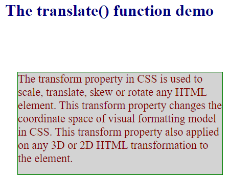
<body>
<h1>The translate() function demo</h1>
<div>
The transform property in CSS is used to scale, translate, skew or rotate any HTML element. This transform property changes the coordinate space of visual formatting model in CSS.
This transform property also applied on any 3D or 2D HTML transformation to the element.
</div>
</body>
</html>Output:
Example #2 – Rotate Function
Code:
<!DOCTYPE html>
<html>
<head>
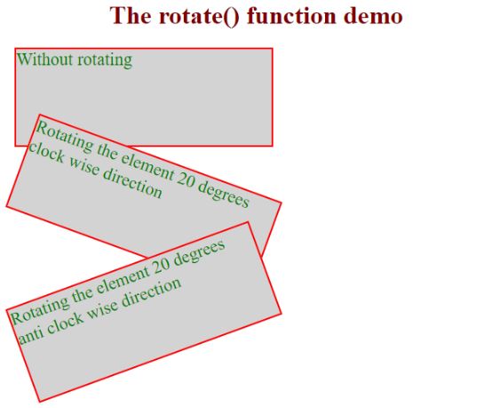
<style>
div {
margin: 10px;
width: 320px;
height: 120px;
background-color: lightgray;
color: green;
font-size: 22px;
border: 2px solid red;
}
#div1 {
transform: rotate(20deg); /*rotate the element clock wise direction*/
}
#div2 {
transform: rotate(-20deg); /*rotate the element anti clock wise direction*/
}
h1
{
color: maroon;
text-align: center;
}
</style>
</head>
<body>
<h1>The rotate() function demo</h1>
<div>
Without rotating
</div>
<div id="div1">
Rotating the element 20 degrees clock wise direction
</div>
<div id="div2">
Rotating the element 20 degrees anti clock wise direction
</div>
</body>
</html>Output:
Example #3 – Scale Function
Code:
<!DOCTYPE html>
<html>
<head>
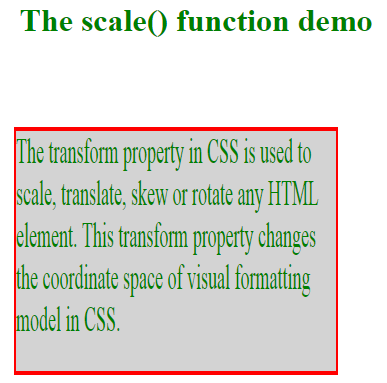
<style>
div {
margin: 150px;
width: 320px;
height: 120px;
background-color: lightgray;
color: green;
font-size: 18px;
border: 2px solid red;
transform: scale(1,2);/*scale in x and y direction*/
}
h1
{
color: green;
text-align: center;
}
</style>
</head>
<body>
<h1>The scale() function demo</h1>
<div>
The transform property in CSS is used to scale, translate, skew or rotate any HTML element. This transform property changes the coordinate space of visual formatting model in CSS.
</div>
</body>
</html>Output:
Example #4 – Skew Function
Code:
<!DOCTYPE html>
<html>
<head>
<style>
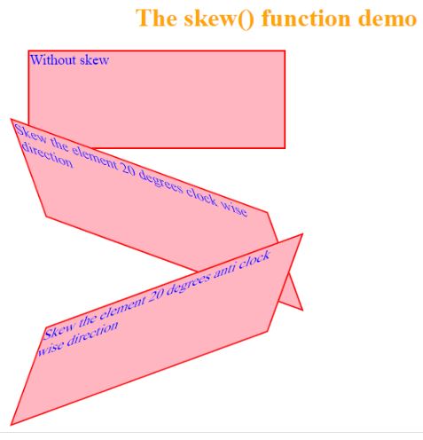
div {
margin:20px;
width: 320px;
height: 120px;
background-color: lightpink;
color: blue;
font-size: 18px;
border: 2px solid red;
}
#div1 {
transform: skew(20deg, 20deg);
}
#div2 {
transform: skew(-20deg, -20deg);
}
h1
{
color: orange;
text-align: center;
}
</style>
</head>
<body>
<h1>The skew() function demo</h1>
<div>
Without skew
</div>
<div id="div1">
Skew the element 20 degrees clock wise direction
</div>
<div id="div2">
Skew the element 20 degrees anti clock wise direction
</div>
</body>
</html>Output:
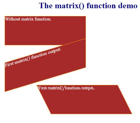
Example #5 – Matrix Function
Code:
<!DOCTYPE html>
<html>
<head>
<style>
div {
width: 310px;
margin: 20px;
height: 110px;
background-color: brown;
border: 1px solid orange;
color: white;
font-size: 18px;
}
.div1 {
transform: matrix(1, -0.3, 0, 1, 0, 0);
}
.div2 {
transform: matrix(1, 0, 0.5, 1, 150, 0);
}
h1
{
color: navy;
text-align: center;
}
</style>
</head>
<body>
<h1>The matrix() function demo</h1>
<div>
Without matrix function.
</div>
<div class="div1">
First matrix() function output.
</div>
<div class="div2">
First matrix() function output.
</div>
</body>
</html>
Output:
Conclusion
The CSS transform property applies rotation, skewing, scaling, translating, and matrix transformations to HTML elements. Each functionality we have different functions like rotate(), skew(), scale() and matrix(), etc.
Recommended Articles
We hope that this EDUCBA information on “CSS transform” was beneficial to you. You can view EDUCBA’s recommended articles for more information.

