Introduction to CSS offset
CSS offset property also termed as motion is defined as to dictate the content position part and allows an element to define in a path. And it supports four common values the top, left, bottom, and right. It defines a movement path for an element in the HTML during an animation move. We use Keyframes move for animating and set the neglected values to their initial value. This helps us specify the offset of the element from the given position, such as the edges of the containing box.
Syntax
The general syntax for CSS Offset is as follows.
Offset: path | rotate | distance | position | anchor;How to offset property work in CSS?
Let us start with the offset property values, which make the offset do actions on the move. They specify the initial position of the path.
- Offset rotate: We use this property to implement the box angle in conjunction with the offset-path direction. And the orientation of this also depends on the offset path and direction. And the offset rotation takes values like auto, reverse, and <angle>. Auto helps the element to face in a particular direction. We use this property to control the behavior of the defined path when the element rotates.
- Offset path: This is the most working value in offset and is considered the primary motion path module; meanwhile, this has some values like URL, path(), and none. This takes a path() function, and it is positioned like this:
offset-path: path('M 0 200 L 250 200 L 400 200');We use keyframes for the animation to move the element on a path.
- offset distance: Offset distance is specified along the path provided it should specify with a fixed length. It ranges from 0% to 100 %. The middle value is 50 %, and the default value is 0%. All these values specify the total length of the path, and you can provide their values in length and percentage.
Let’s take a sample code here.
M300,0 A300,300 0 1,1 200,400 A200,200 0 1,1 200,0Here, we construct a path first, where the starting point represents the topmost position of the circle. The first letter ‘M’ says it’s a Starting point to Move to (300, 0). In the next part, make an arc with 300, 300 as a radius.
There are a few commands in the path. They are
- M: To move a position
- L: to draw a line.
- A: To make an arc
- Z: The path is closed and returns to the starting point.
So, in all the below examples, a motion is achieved in the elements. Every element is moved in the path by animating the offset-distance property, which is done by CSS transition.
- offset-anchor: This makes a spot on a specified element with that the position of the path is determined. In simple terms, it makes a point within the box and moves along with the offset path. It takes the value of auto and position.
Examples of implementing CSS offset
Here are the examples as follows:
Example #1 – With Path property
Code:
<!DOCTYPE html>
<html>
<head>
<title>Hello World</title>
<style>
@keyframes smove {
from {
offset-distance: 2%;
}
to {
offset-distance: 150%;
}
}
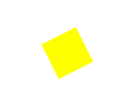
dzv {
width: 50px;
height: 50px;
background-color: yellow;
offset: path("M 150 150 L 210 120 L 230 300 z") auto;
animation: smove 5s linear infinite;
}
</style>
</head>
<body>
<h2> Demo on Offset property</h2>
<div></div>
</body>
</html>Output:
Example #2 – Using distance and stroke
Code:
<!DOCTYPE html>
<html>
<head>
<title>Hello World</title>
<style>
body {
background: brown;
padding: 21px;
display: flex;
justify-content: center;
}
.run {
stroke: blue;
}
.demo {
motion-path: path('M 5 5 m -3, 0 a 3,5 0 1,0 8,0 a 4,4 0 1,0 -8,0');
offset-path: path('M 5 5 m -4, 0 a 4,4 0 1,0 8,0 a 4,4 0 1,0 -8,0');
animation: move 4s linear infinite;
}
@keyframes move {
100% {
motion-offset: 110%;
offset-distance: 110%;
}
}
</style>
</head>
<body>
<svg viewbox="0,0 20,20" width="150px" height="150px">
<path
class="run"
fill="none"
stroke-width="0.20"
d="M 5 5 m -4, 0 a 4,4 0 1,0 8,0 a 4,4 0 1,0 -8,0"
/>
<circle class="demo" r="2" fill="yellow"></circle>
</svg>
</body>
</html>
In this example, we animate the circle using the path value of the offset property.
Output:

Example #3
Code:
<!DOCTYPE html>
<html>
<head>
<title>Hello World</title>
<style>
svg {
width: 200px;
display: block;
position: relative;
}
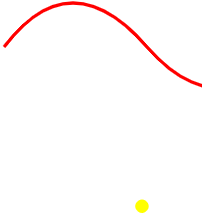
.memo {
width: 12px;
height: 12px;
background-color: yellow;
border-radius: 60%;
offset-path: path('M20 90 Q 80.5 10, 150 90 T 300 80');
offset-distance: 0%;
animation: memoball 5s linear alternate infinite;
}
@keyframes memoball {
from {
offset-distance: 0%;
}
to {
offset-distance: 50%;
}
}
</style>
</head>
<body>
<svg width="200px" height="150px" version="1.1">
<path fill="transparent" stroke="red" stroke-width="3" d="M20 90 Q 80.5 10, 150 90 T 300 80" class="path"></path>
</svg><div class="memo"></div>
</body>
</html>Output:
Example #4 – Rotate
Code – rotate.html
<!DOCTYPE html>
<html>
<head>
<title> Offset-Rotate Property</title>
<style>
body {
background-color: #3cb371;
}
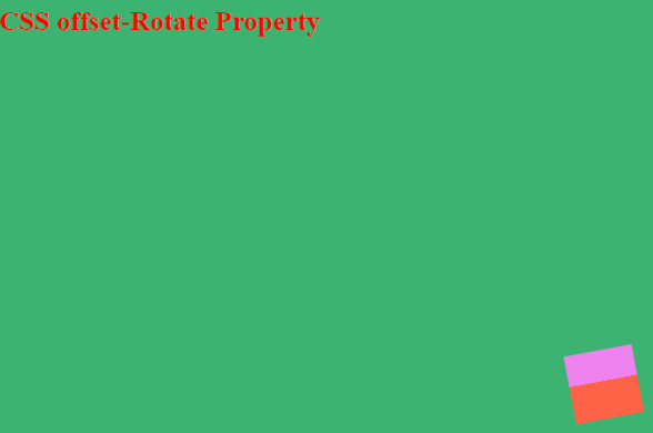
.rotater {
width: 60px;
height: 60px;
background: linear-gradient(#ff6347 55%, #ee82ee 55%);
position: relative;
left: 60%;
top: 200px;
offset-path: path("M19.50,52.42s50.77-75.05,105.20-.65,105.70-7.20,105.75-7.20S250.36,6.50,150.33,8.08s-15,71.57-94.51,74.56S18.45,58.46,19.50,60.42Z");
offset-rotate: reverse;
animation: move 5s linear infinite;
}
@keyframes move {
100% {
offset-distance: 100%;
}
}
h2{
color : red;
}
</style>
<body>
<h2>CSS offset-Rotate Property</h2>
<div class="rotater"></div>
</body>
</html>Here, we define a path using an offset and rotate the element using the reverse value.
Output:
Example #5 – Using anchor property
Code:
<!DOCTYPE html>
<html>
<head>
<title> Offset-Rotate Property</title>
<style>
body {
background-color: pink;
padding: 0 5em;
width: 100%;
}
svg, .bbb {
position: absolute;
}
.bbb {
height: 60px;
width: 60px;
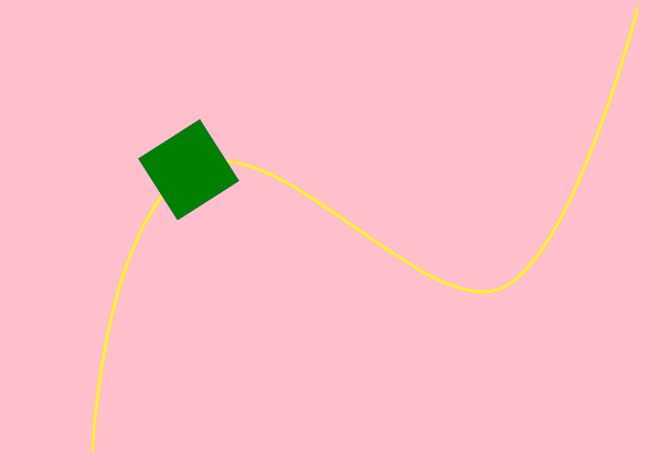
offset-path: path("M0,381 C8.21283455,261.121686 34.1400486,180.27218 75.575265,145.646712 C141.863248,92.2187469 265.92384,261.819412 334.586493,241.743905 C397.463236,219.698512 452.033427,1.38464317 452.012437,1.28454317");
offset-rotate: 0;
animation: move 5s 0ms infinite alternate ease-in-out;
}
.aa {
background-color: blue;
offset-anchor: center center;
}
.bb {
background-color: green;
offset-anchor: left top;
}
.cc {
background-color: rose;
offset-anchor: right bottom;
}
@keyframes move {
100% {
offset-distance: 100%;
}
}
</style>
<body>
<svg class="track" viewBox="0 0 450 376" width="450px" height="376px">
<path fill="none" stroke="yellow" stroke-width="2" d="M0,381 C8.21283455,261.121686 34.1400486,180.27218 75.575265,145.646712 C141.863248,92.2187469 265.92384,261.819412 334.586493,241.743905 C397.463236,219.698512 452.033427,1.38464317 452.012437,1.28454317"></path>
</svg>
<div class="bbb aa"></div>
<div class="bbb bb"></div>
<div class="bb cc"></div>
</body>
</html>Output:
Conclusion
Therefore, in this article, we have seen the property using their work in animation frames, going through several properties values, and implementing them in SVG elements using HTML and CSS. Since this is animation usage, it is mandatory to check the browser compatibility too.
Recommended Articles
We hope that this EDUCBA information on “CSS Offset” benefited you. You can view EDUCBA’s recommended articles for more information.

