Updated June 15, 2023
Introduction to CSS Multiple Borders
Multiple borders in CSS can be done by box-shadow property. Generally, we can get a single border with border property. Box-shadow property is not for various borders; we are still creating multiple borders with box-shadow property. We use the box-shadow property for different borders because we don’t have any predefined property for various borders. Box-shadow property has 5 values first 3 values are not required because as we are not interested in box-shadow, but the 4th and 5th values are considered. 4th value is for border size, and the 5th value is for border color.
Syntax of CSS Multiple Borders
As we discussed above, multiple borders can be achieved by box-shadow property. Observe below syntax and examples for a clear understanding:
Syntax 1:
div
{
box-shadow: value1 value2 value3 value4 value5;
}
Value1: h-offset, gives horizontal shadow. We are not interested of this so make it 0.
Value2: v-offset, gives vertical shadow. We are not interested of this so make it 0.
Value3: blur, gives blur shadow. We are not interested of this so make it 0.
Value4: Gives shadow. This shadow we will use it as border in our requirement.
Value5: Gives color to border.
Syntax 2:
div
{
box-shadow: value1 value2 value3 value4 value5,//first border
value1 value2 value3 value4 value5, //second border
value1 value2 value3 value4 value5//3rd border
.//4th border
.
.
.//Nth border
;
}
Examples of CSS Multiple Borders
Given below are the examples of CSS Multiple Borders:
Example #1 – Box-shadow with 2 borders around the paragraph
Code:
<!DOCTYPE html>
<html>
<head>
<title> Multiple Borders </title>
</head>
<style>
.borders {
height: 400px;
width: 400px;
margin: 10px auto;
text-align:justify;
background: aqua;
padding: 10px;
color: black;
box-shadow: 0 0 0 8px brown,
0 0 0 12px blue;
}
</style>
<body>
<font color="brown" style="text-align: center"><h2>Borders</h2></font>
<div class="borders">
<h5>User can import a task with any document, it stores in oracle
database, create a task by specific data with comments for task
description. Assign same task to other users to perform actions on it
and also multiple users can at a time assign a task.</5>
</div>
</body>
</html>
Output:
Explanation:
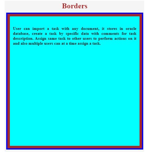
As we can see in the above output, we applied 2 borders with box-shadow property. The brown color is the first border, and the blue is the second.
Example #2 – Box-shadow with 3 borders around the paragraph
Code:
<!DOCTYPE html>
<html>
<head>
<title> Multiple Borders </title>
</head>
<style>
.borders {
height: 400px;
width: 400px;
margin: 10px auto;
text-align:justify;
background: purple;
padding: 10px;
color: black;
box-shadow: 0 0 0 8px brown,
0 0 0 12px blue,
0 0 0 20px yellow;
}
</style>
<body>
<font color="brown" style="text-align: center"><h2>Borders</h2></font>
<div class="borders">
<h5>User can import a task with any document, it stores in oracle
database, create a task by specific data with comments for task
description. Assign same task to other users to perform actions on it
and also multiple users can at a time assign a task.</5>
</div>
</body>
</html>
Output:
Explanation:
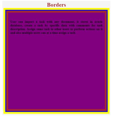
As we can see in the above output, we applied 3 borders with box-shadow property. The brown color is the first border, the blue color is the second, and the yellow color is the third.
Example #3 – Box-shadow with 4 borders around the paragraph
Code:
<!DOCTYPE html>
<html>
<head>
<title> Multiple Borders </title>
</head>
<style>
.borders {
height: 400px;
width: 400px;
margin: 10px auto;
text-align:justify;
background: orange;
padding: 10px;
color: black;
box-shadow: 0 0 0 8px brown,
0 0 0 12px blue,
0 0 0 20px yellow,
0 0 0 25px green;
}
</style>
<body>
<font color="brown" style="text-align: center"><h2>Borders</h2></font>
<div class="borders">
<h5>User can import a task with any document, it stores in oracle
database, create a task by specific data with comments for task
description. Assign same task to other users to perform actions on it
and also multiple users can at a time assign a task.</5>
</div>
</body>
</html>
Output:
Explanation:
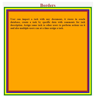
As we can see in the above output, we applied 4 borders with box-shadow property. The brown color is the first border, the blue color is the second border, the yellow color is the third, and the green border is the fourth color.
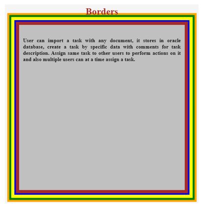
Example #4 – Box-shadow with 5 borders around the paragraph
Code:
<!DOCTYPE html>
<html>
<head>
<title>Multiple Borders</title>
</head>
<style>
.borders {
height: 400px;
width: 400px;
margin: 10px auto;
text-align:justify;
background: silver;
padding: 10px;
color: black;
box-shadow: 0 0 0 8px brown,
0 0 0 12px blue,
0 0 0 20px yellow,
0 0 0 25px green,
0 0 0 30px orange;
}
</style>
<body>
<font color="brown" style="text-align: center"><h2>Borders</h2></font>
<div class="borders">
<h5>User can import a task with any document, it stores in oracle
database, create a task by specific data with comments for task
description. Assign same task to other users to perform actions on it
and also multiple users can at a time assign a task.</5>
</div>
</body>
</html>
Output:
Explanation:
As we can see in the above output, we applied 5 borders with box-shadow property. The brown color is the first border, the blue color is the second border, the yellow color is the third border, the fourth color is a green border, and the fifth color is the orange border.
Example #5 – Image with 6 borders
Code:
<!DOCTYPE html>
<html>
<head>
<title>Multiple Borders</title>
</head>
<style>
.image {
height: 400px;
width: 400px;
margin: 20px 0px 0px 100px;
box-shadow: 0 0 0 8px brown,
0 0 0 12px blue,
0 0 0 20px yellow,
0 0 0 25px green,
0 0 0 30px orange,
0 0 0 40px red;
}
</style>
<body>
<font color="brown" style="text-align: left"><h2>Borders with Image</h2></font>
<img class="image" src="m1.jpg">
</body>
</html>
Output:

Explanation:
As we can see in the above output, we applied 6 borders with box-shadow property. The brown color is the first border; the blue color is the second border; the yellow color is the third border; the fourth color is the green border; the fifth color is an orange border; and red is the 6th border color around the image.
Recommended Articles
We hope that this EDUCBA information on “CSS Multiple Borders” was beneficial to you. You can view EDUCBA’s recommended articles for more information.

