Updated June 12, 2023
Introduction to CSS Curved Text
The following article provides an outline for CSS Curved Text. Organized representation is the root of styling. The idea of CSS is to have the page/website look exactly like it’s required to. There are direct methods to achieve some of the customizations. And then, there are some indirect methods to achieve a particular output. Curved text happens to fall in the latter category. By curved text, we refer to text along a path, which is not straight. It can be zigzag or circular, or any preferred shape. This makes the heading of the page stand out. It can also serve various other purposes.
Methodology and Examples
As mentioned earlier, CSS does not provide a direct property to achieve curved text. However, we can use the transform property to create curved text. This will include placing the text at different angles and coordinating with each other so the text falls on a defined trajectory. We will define a number of classes and call them on the HTML page accordingly, such that each letter is placed at a certain angle and the text appears curved.
Example #1 – Using External CSS
a. Since we use External CSS in this example, we will start by creating the CSS page first.
b. As seen in the methodology, we will create several classes for this example. The concept is to arrange the alphabet of a word at different angles. To achieve this, we will create separate classes with varying degrees of transformation for each alphabet.
c. Let us take the term HELLO WORLD and break it. It breaks into 10 letters. Hence, if we follow our methodology, there will be 10 classes defined in this example, each for a letter, respectively.
d. Now, we can code the classes for each letter as follows.
.c1 {
transform: rotate(6deg);
color: violet;
}
.c2 {
transform: rotate(12deg);
color: indigo;
}
.c3 {
transform: rotate(18deg);
color: blue;
}
.c4 {
transform: rotate(24deg);
color: green;
}
.c5 {
transform: rotate(30deg);
color: yellow;
}
.c6 {
transform: rotate(36deg);
color: orange;
}
.c7 {
transform: rotate(43deg);
color: red;
}
.c8 {
transform: rotate(48deg);
color: purple;
}
.c9 {
transform: rotate(54deg);
color: goldenrod;
}
.c10 {
transform: rotate(60deg);
color: teal;
}
e. In addition to these classes, let us style the heading element <h1> in the following manner.
h1 span {
font-size: 26px ;
transform-origin: bottom;
font-family: 'Franklin Gothic Medium', 'Arial Narrow', Arial, sans-serif;
height: 300px;
width: 50px;
left: 50;
top: 50;
position: absolute;
}
f. The final CSS code should, hence, look like this.
h1 span {
font-size: 26px ;
transform-origin: bottom;
font-family: 'Franklin Gothic Medium', 'Arial Narrow', Arial, sans-serif;
height: 300px;
width: 50px;
left: 50;
top: 50;
position: absolute;
}
.c1 {
transform: rotate(6deg);
color: violet;
}
.c2 {
transform: rotate(12deg);
color: indigo;
}
.c3 {
transform: rotate(18deg);
color: blue;
}
.c4 {
transform: rotate(24deg);
color: green;
}
.c5 {
transform: rotate(30deg);
color: yellow;
}
.c6 {
transform: rotate(36deg);
color: orange;
}
.c7 {
transform: rotate(43deg);
color: red;
}
.c8 {
transform: rotate(48deg);
color: purple;
}
.c9 {
transform: rotate(54deg);
color: goldenrod;
}
.c10 {
transform: rotate(60deg);
color: teal;
}
g. Now that the CSS code is done, we will move to the HTML part of the example.
h. Following the methodology, each letter will be written in a different <span>, where a different class will be called. This ensures that each letter is positioned at a distinct angle compared to the others.
i. We will first off call the external CSS file in the header section.
<head>
<title>Hi There</title>
<link rel = "stylesheet" href = "curvedText.css">
</head>
j. Moving on to the body section, we will call a total of ten spans within the Header <h1> tag, each presenting a different letter of the term HELLO WORLD.
<h1>
<span class="c1">H</span>
<span class="c2">E</span>
<span class="c3">L</span>
<span class="c4">L</span>
<span class="c5">0</span>
<span class="c6">W</span>
<span class="c7">0</span>
<span class="c8">R</span>
<span class="c9">L</span>
<span class="c10">D</span>
</h1>
k. Combining the body and header section, the final HTML page should look like this.
<html>
<head>
<title> Demo of Curved text using CSS and HTML </title>
<link rel = "stylesheet" href = "curvedText.css">
</head>
<body>
<h2>Demo of Curved text using CSS and HTML</h2>
<h1>
<span class="c1">H</span>
<span class="c2">E</span>
<span class="c3">L</span>
<span class="c4">L</span>
<span class="c5">0</span>
<span class="c6">W</span>
<span class="c7">0</span>
<span class="c8">R</span>
<span class="c9">L</span>
<span class="c10">D</span>
</h1>
</body>
</html>
l. We will save this html page and open it through a browser.
The final outcome will look like this:
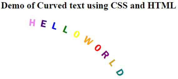
m. As we can see in the screenshot, since each letter is placed at equal angles, it forms a circular path. The angles can be experimented with to achieve any path required.
Example #2 – Using Internal CSS
a. For this example, we will take the same logic, but instead of using an external CSS file, we will declare the styling in the head section of the HTML page within the style tag <style />.
b. The body section will remain the same as the previous example, where each span will call a different class such that each alphabet of the phrase is placed at equal angles from each other.
c. The final HTML code should look like this.
<html>
<head>
<title>Demo Of curved text using CSS and HTML</title>
<style>
h1 span {
font-size: 26px ;
transform-origin: bottom;
font-family: 'Franklin Gothic Medium', 'Arial Narrow', Arial, sans-serif;
height: 300px;
width: 50px;
left: 50;
top: 50;
position: absolute;
}
.c1 {
transform: rotate(6deg);
color: violet;
}
.c2 {
transform: rotate(12deg);
color: indigo;
}
.c3 {
transform: rotate(18deg);
color: blue;
}
.c4 {
transform: rotate(24deg);
color: green;
}
.c5 {
transform: rotate(30deg);
color: yellow;
}
.c6 {
transform: rotate(36deg);
color: orange;
}
.c7 {
transform: rotate(43deg);
color: red;
}
.c8 {
transform: rotate(48deg);
color: purple;
}
.c9 {
transform: rotate(54deg);
color: goldenrod;
}
.c10 {
transform: rotate(60deg);
color: teal;
}
</style>
</head>
<body>
<h2>Demo of Curved text using CSS and HTML</h2>
<h1>
<span class="c1">H</span>
<span class="c2">E</span>
<span class="c3">L</span>
<span class="c4">L</span>
<span class="c5">0</span>
<span class="c6">W</span>
<span class="c7">0</span>
<span class="c8">R</span>
<span class="c9">L</span>
<span class="c10">D</span>
</h1>
</body>
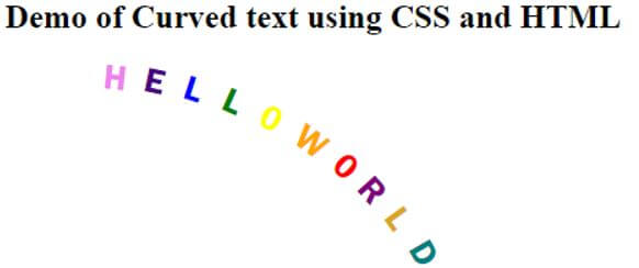
</html>d. The output will look like this:
We followed one methodology to obtain a curved text in the above two examples. Please note that there are many other methods to do this. Some may involve JavaScript and other components too.
Recommended Articles
We hope that this EDUCBA information on “CSS Curved Text” was beneficial to you. You can view EDUCBA’s recommended articles for more information.

