Updated June 13, 2023
Introduction to CSS box-shadow
CSS box-shadow defines as a property that attaches shadows to a specified element. This adds deep designs in the website creation without in need of images and other container elements. This property brings a box away from the background by just drawing borders. These powerful properties in CSS can create eight paper life shadow effects. The box-shadow property provides 2-D effects on a web page.
Syntax and Parameters:
box-shadow: none|h-offset v-offset | blur | spread |color |inset|initial|inherit;Here the two values are commonly followed by the remaining values.
Example:
Here we have three parameters; the first two sets are the location of the shadows in both axes.
#demo1
{
Box-shadow: 5px ,10px, red; // This says offset-x, y, color value.
}
How does the box-shadow Property work in CSS?
The CSS box shadow has six different values on this property.
1. inset
This value creates a shadow inside the box using the shadow property, as it could not create a shadow outside. This is declared either at the beginning or end of the property. In some situations, this may be omitted.
Example:
box-shadow: inset 1px 1px 2px 2px green; //[inset][horizontal offset][vertical offset][blur radius][spread distance][color]
2. color
This sets the color of the shadow box.
3. horizontal offset
It provides a length of the shadow effect. Positive values are assigned to render the shadow to the right. Negative values shift the shadows to the left.
Example:
box-shadow : 30px 20px;
Here the horizontal offset is set to 30px, which is higher than the v-axis, and the vertical offset is 20px.
4. vertical offset
It renders the box’s shadow position on Y-axis. Here the positive value scales down, and negative values will move up.
Example with negative values:
Box-shadow: 20 px -10 px; the negative value moves the shadow towards the top.
5. blur
The sharpness of the shadow is visible clearly. And in some cases, it is optional as the default value is zero, which specifies a color as solid and a shadow as sharper.
Example:
Box-shadow: 4px 4px 10px;
6. spread distance
It allows the shadow size to shrink or grow in the box. Here the fourth value is for the spread radius. This spreads the shadow, which extends in all directions. The positive value makes the shadow expand in all sizes. Negative value contract on all sides.
Example:
Box-shadow: 0 20px 20px -4px;
Among these six values, importance is given to horizontal and vertical OFFSET. Except for color and inset values, the CSS length is px, em, and percentage, and the color value uses hexadecimal values.
Examples of CSS box-shadow
Given below are the examples:
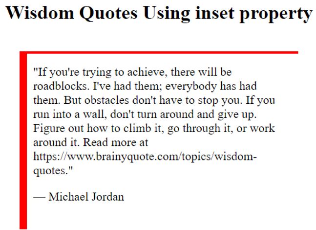
Example #1
Using inset Property value.
Here a border shadow is reflected inside with the color red.
Code:
<!DOCTYPE html>
<html>
<head>
<style>
blockquote {
width: 60%;
margin: 45px auto;
padding: 22px;
font-size: 20px;
box-shadow: inset 12px 4px red;
}
</style>
</head>
<body>
<h1><center> Wisdom Quotes Using inset property</h1>
<blockquote>
<q>If you're trying to achieve, there will be roadblocks. I've had them; everybody has had them. But obstacles don't have to stop you. If you run into a wall, don't turn around and give up. Figure out how to climb it, go through it, or work around it.
Read more at https://www.brainyquote.com/topics/wisdom-quotes.</q>
<p>— Michael Jordan</p>
</blockquote>
</body>
</html>Output:
Example #2
Using color value.
Code:
<!DOCTYPE html>
<html>
<head>
<title> Box-Shadow using Offset</title>
<style>
.adc1 {
border: 1.5px solid;
padding: 10px;
box-shadow: 6px 9px 9px 9px orange;
}
.adc2 {
border: 1.5px solid;
padding: 10px;
box-shadow: 6px 9px 9px 20px yellow;
}
</style>
</head>
<body>
<div class = "adc1">
<h1>Welcome to Hot CSS Picks</h1>
</div><br><br>
<div class = "adc2">
An Online class Tutorial
</div>
</body>
</html>
Output:
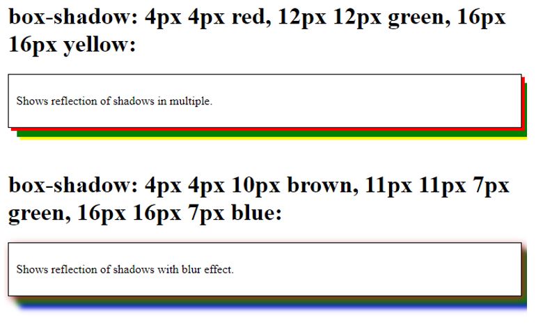
Example #3
Using Multiple Shadows on the box.
We can add multiple shadows on an element using the single box-shadow property. So, any number of shades with different colors could be specified but should be separated by commas. In the below code, box-shadow specifies three different colors. box-shadow:4px 4px red, 12px 12px green, 16px 16px yellow.
Code:
<!DOCTYPE html>
<html>
<head>
<style>
#multiple1 {
border: 1px solid;
padding: 10px;
box-shadow:4px 4px red, 12px 12px green, 16px 16px yellow;
}
#multiple2 {
border: 1px solid;
padding: 10px;
box-shadow:4px 4px 10px brown, 11px 11px 7px green, 16px 16px 7px blue;
}
</style>
</head>
<body>
<h1>box-shadow: 4px 4px red, 12px 12px green, 16px 16px yellow:</h1>
<div id="multiple1">
<p>Shows reflection of shadows in multiple.</p>
</div>
<br>
</br>
<h1>box-shadow: 4px 4px 10px brown, 11px 11px 7px green, 16px 16px 7px blue:</h1>
<div id="multiple2">
<p>Shows reflection of shadows with blur effect.</p>
</div>
</body>
</html>
Output:
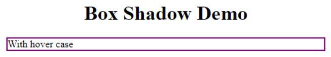
Example #4
Code:
<!DOCTYPE html>
<html>
<head>
<title> Box-Shadow Demo</title>
<style>
.shadbox {
box-shadow: 0 0 0 2px purple;
&:hover {
box-shadow: 0 0 0 4px purple;
}
}
</style>
</head>
<body>
<h1><center> Box Shadow Demo </center> </h1>
<div class="shadbox"> With hover case</div>
</body>
</html>
Output:
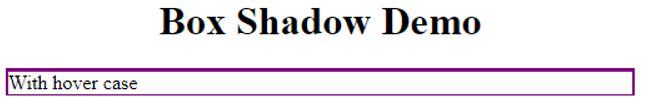
When changing the y-offset to negative, like.
Code:
<style>
.shadbox {
box-shadow: 0 -1px 0 2px purple;
&:hover {
box-shadow: 0 -1px 0 4px purple;
}
}
</style>
So here we could see the Border top is shaded due to negative value.
Output;
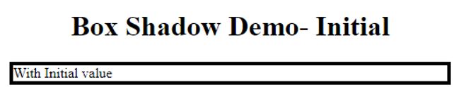
Example #5
Using initial value – default.
Code:
<!DOCTYPE html>
<html>
<head>
<title> Box-Shadow Demo</title>
<style>
.shadbox {
box-shadow: initial;
border : 4px solid;
&:hover {
box-shadow: initial;
border : 4px solid;
}
}
</style>
</head>
<body>
<h1><center> Box Shadow Demo- Initial</center> </h1>
<div class="shadbox"> With Initial value</div>
</body>
</html>
Output:
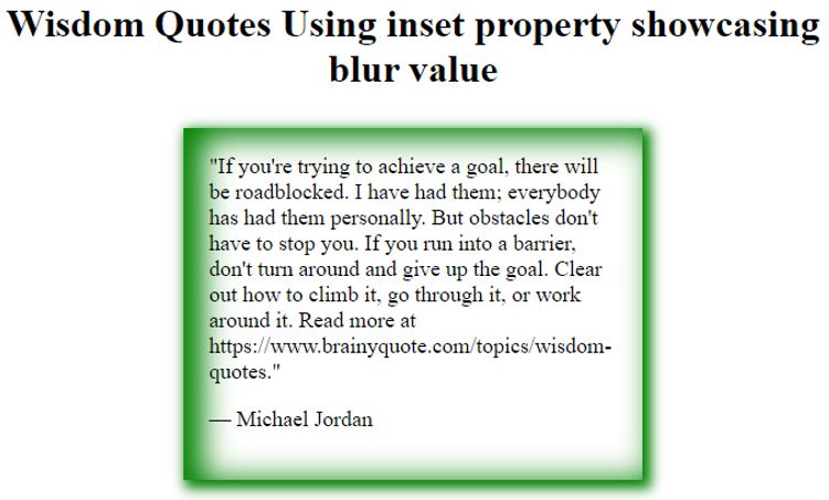
Example #6
Displaying Blur Shadow.
Code:
<!DOCTYPE html>
<html>
<head>
<style>
blockquote {
width: 50%;
margin: 30px auto;
padding: 21px;
font-size: 18px;
box-shadow: inset 12px 4px 24px 4px green, 4px 4px 10px 3px green;
}
</style>
</head>
<body>
<h1><center> Wisdom Quotes Using inset property showcasing blur value</h1>
<blockquote>
<q>If you're trying to achieve a goal, there will be roadblocked. I have had them; everybody has had them personally. But obstacles don't have to stop you. If you run into a barrier, don't turn around and give up the goal. Clear out how to climb it, go through it, or work around it.
Read more at https://www.brainyquote.com/topics/wisdom-quotes.</q>
<p>— Michael Jordan</p>
</blockquote>
</body>
</html>Output:
Conclusion
Therefore, the Shadow-box property web page can utilize those elements used in design software to create 3D effects. Thus, we have gone through their property values with a detailed demo in this article. Ultimately this shadow has some fantastic effects.
Recommended Articles
We hope this EDUCBA information on “CSS box-sh”dow” was benef”cial to you. You can view EDUCBA’s reEDUCBA’sd articles for more information.

