Updated June 16, 2023
Introduction to CSS background-clip
The following article provides an outline for the CSS background clip. While styling and coding pages in HTML, you might want to modify the area of the background of all or some of the components of the page. CSS Background Clip is the measure of the extent to which it is applied in the background clip component of the CSS code by tweaking different values of the parameters to achieve a better look of your HTML UI design which is as per your design requirement in your project, eventually increasing more user engagement of your webpage. In this article, we will see the process that we can follow to change the area of background elements of an HTML page by utilizing CSS background-clip properties with many examples.
Syntax and Parameters of CSS background-clip
Given below is the syntax of the CSS background-clip:
background-clip: border-box|padding-box|content-box|initial|inherit;Now the query is how many different values are for the parameters? Those are various types of properties that signify the extent of the background for an element.
Given below is the table with details where various values of parameters are mentioned:
| Value | Description |
| border-box | This is the default value of the background clip. In this case, the extension of the background is behind the area of the border. |
| padding-box | In this case, the extension of the background is inside the area of the border. |
| content-box | In this case, the extension of background is till the content area. |
| initial | In this case, the background extension is over the entire area. |
| inherit | In this case, child element inherits this property from its parent element. |
How background-clip Property works in CSS?
- You must mention desired values of the parameters of background-clip following the basic syntax of CSS in HTML code so that you can get that extended background in output.
- You can see the examples with HTML code to know how you will be able to extend the area of the background of elements by the use of different values of background-clip properties in CSS.
Examples of CSS background-clip
Given below are the examples mentioned:
Example #1
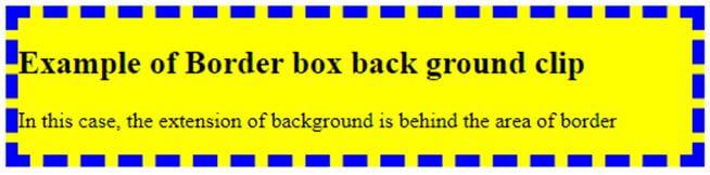
In the first example, we will see an illustration of the default background-clip property, which is border-box. In this case, the area of background is behind the area of the border of the element. In this example, we have kept the border in different colors (border is blue, and the area is yellow) so that you can see the extension of the area of the background with respect to the border.
Code:
<!DOCTYPE html>
<html>
<head>
<title>Example of Border Box</title>
<style>
.scrpt {
background-color: yellow;
background-clip:border-box; // defines parameter value
text-align:center;
border:9px dashed blue; //defines border color
}
</style>
</head>
<body>
<div class = "scrpt">
<h2>
Example of Border box back ground clip
</h2>
<p>
In this case, the extension of background is behind the area of border
</p>
</div>
</body>
</html>
Output:
As you can see below, the border is in blue color, and the area is in yellow color. Blue border is inside the yellow background.
Example #2
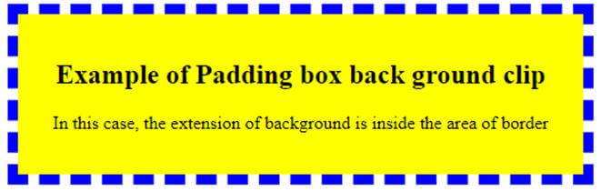
In the second example, we will see an illustration of another background-clip property which is a padding box. In this case, the area of the element’s background is lying inside the area of the border. In this example, we have kept the border in a different color from the color of the background so that you can differentiate them to see the extension of the area of the background with respect to the border.
Code:
<!DOCTYPE html>
<html>
<head>
<title>Example of padding box </title>
<style>
.scrpt {
background-color: yellow;
background-clip:padding-box;
padding: 20px;
border: 9px dashed blue; }
</style>
</head>
<body style = "text-align:center">
<div class = "scrpt">
<h2>
Example of Padding box back ground clip
</h2>
<p>
In this case, the extension of background is inside the area of border
</p>
</div>
</body>
</html>
Output:
Here also, you can see below the border is in blue color and the area is in yellow color. Blue border is outside the yellow background.
Example #3
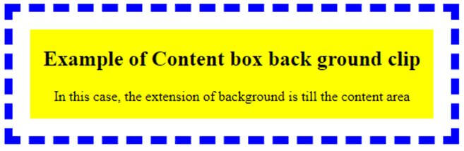
In this example, we will see another illustration of background-clip property: a content box. In this case, as the name suggests, the area of background is the area of the border of the element. In this example, we have kept the border in different colors so that you can see the extension of the area of the background with respect to the border.
Code:
<!DOCTYPE html>
<html>
<head>
<title>Example of content box </title>
<style>
.scrpt {
background-color: yellow;
background-clip:content-box;
padding: 20px;
border: 9px dashed blue;
}
</style>
</head>
<body style = "text-align:center">
<div class = "scrpt">
<h2>
Example of Content box back ground clip
</h2>
<p>
In this case, the extension of background is till the content area
</p>
</div>
</body>
</html>
Output:
Here, the blue border is well far from the yellow background. The background extends only to the area of the content, not beyond that.
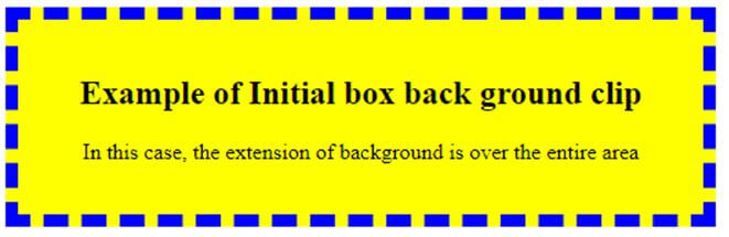
Example #4
In the fourth example, we will see an illustration of another background-clip property which is an initial box. In this case, the area of background is over the entire area of the border of the element. In this example, we have kept the border in a different color from the color of the background so that you can see the span of the area of the background with reference to the border.
Code:
<!DOCTYPE html>
<html>
<head>
<title>Example of intial box </title>
<style>
.scrpt {
background-color: yellow;
background-clip:initial;
padding: 20px;
border: 9px dashed blue;
}
</style>
</head>
<body style = "text-align:center">
<div class = "scrpt">
<h2>
Example of Initial box back ground clip
</h2>
<p>
In this case, the extension of background is over the entire area
</p>
</div>
</body>
</html>
Output:
Blue border is expanding over the whole area of the yellow background.
Conclusion
In this article, we have shown you various examples of how we used different values of background-clip parameters of the HTML page with the help of CSS. This article will be extremely beneficial for those who are engaged with front-end designing through HTML and CSS.
Recommended Articles
This is a guide to CSS background clips. Here we discuss the introduction to CSS background-clip and how the background-clip property works with respective examples. You may also have a look at the following articles to learn more –

