Updated July 1, 2023
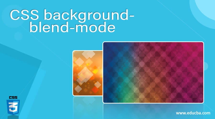
Introduction to CSS background-blend-mode
In Cascading Style Sheet(CSS), two or more images are joined together with a single image, also known as a blended image. It can also need for the background presentation, like colors, animations, etc these are some modern features that have to be enabled with their view so that two or more images are blended with some background features. These types of requirements will need for the user with more needs and facilities in the application because background-blend mode has its own property it can be enabled and defined with a blending mode of each background layer. In this article, we will discuss CSS background-blend mode.
Syntax and Parameters:
We know that CSS codes are combined and written with the HTML page, or we must save it as a separate file with .css extension. If we use CSS codes in the web page, HTML has a separate tag called <style> tag for writing the CSS codes in the HTML web page.
<html>
<head>
<style>
.pencil-effect{
background:
url(filename.jpg);
url(file.jpg);
background-blend-mode:difference;
---some css scripts based on the user requirements—
}
</style>
</head>
<body>
</body>
</html>
The above codes are the basic syntax of the background-blend-mode property in CSS. We used one of the effects called the pencil effect. We may also use some different sets of effects based on the customer’s requirements. hence the background-blend mode has the property before the image is passed in the URL code; likewise, we will use different kinds of properties that are enabled and pass the parameters according to the sections.
How background-blend-mode property works in CSS?
In the Presentation layer, CSS is one of the most important in web applications. If one picture says about lakhs of words in the image, then the blending of images is also worth the many more times of that scenario. That’s wise. We use design possibilities of the presentation layer of the web pages. The CSS blend mode has one of the modes or ways through the present application with more user-friendly web pages. So it can include other properties similar to mix-blend-mode and isolation property enabling the images the user can catch view with the help of eye-catching protection and photo effects of the web application are doing only some animation software like Adobe Photoshop.
We can use more than one property in the background images in the CSS sheet. Likewise, more than one gradient is rendered on top of each other, with the functions used separately with the help of commas. The images are in different formats like jpg, png, etc, and also with bytes, kilobytes, megabytes, gigabytes, etc. We have seen a different set of animation modes with the background-blend-mode property. Spectrum Background is one of the modes it shows the full colors of the spectrum with background images. The Plaid background is another animation script with plaid patterns using gradients to enable the background-blend-mode property.
The circle’s background is one of the animation effects of using radial gradients. We used a comma operator to separate the two image background positions, each corresponding to a single copy of the background image. The first image will point only on the x-axis from the center positions to the left side by the pixel formats, and from the y-axis, the center positions will be upwards by the pixel notation. In the second type, the background copied image will do the opposite position from moving down to the right position. For the specifically related images, we will boost the image brightness and also the secondary effect for increasing the contrasting lines of the image. The same scenario as other effects, namely the Chalkboard effect and Night vision effect, will blend the images with some animation effects based on the customer’s requirements.
Examples of CSS background-blend-mode
Lets us discuss examples of CSS background-blend mode.
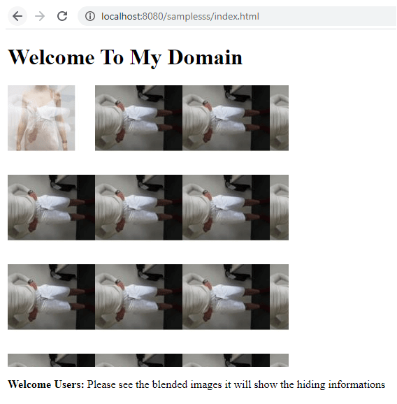
Example #1
Code:
<!DOCTYPE html>
<html>
<head>
<style>
#sma {
width: 402px;
height: 403px;
background-repeat: no-repeat, repeat;
background-image: url("second.jpg"),url("first.jpg");
background-blend-mode: screen, difference, lighten;
}
</style>
</head>
<body>
<h1>Welcome To My Domain</h1>
<div id="sma"></div>
<p><b>Welcome Users:</b> Please see the blended images it will show the hiding information’s</p>
</body>
</html>
Output:
Example #2
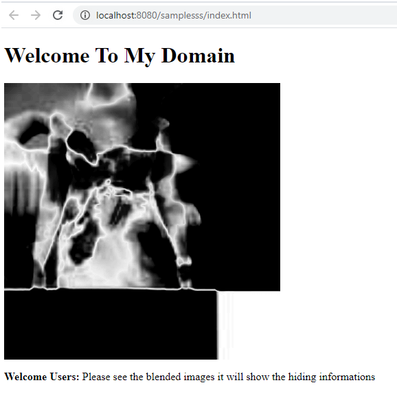
Code:
<!DOCTYPE html>
<html>
<head>
<style>
#smb {
width: 402px;
height: 403px;
background:
url("first.jpg"),
url("second.jpg");
background-size: cover;
background-blend-mode: difference;
background-position:
calc(52% — 2px) calc(54% — 2px),
calc(53% + 2px) calc(56% + 2px);
filter: brightness(4) invert(2) grayscale(3);
}
</style>
</head>
<body>
<h1>Welcome To My Domain</h1>
<div id="smb"></div>
<p><b>Welcome Users:</b> Please see the blended images it will show the hiding informations</p>
</body>
</html>
Output:
Example #3
Code:
<!DOCTYPE html>
<html>
<head>
<style>
#smb{
width: 402px;
height: 403px;
background:
url("first.jpg"),
radial-gradient(
rgba(2,256,1,.7),
black
),
repeating-linear-gradient(
transparent 5,
rgba(1,5,2,.3) 7px,
transparent 8px
);
}
#ght {
width: 402px;
height: 403px;
background:
url("first.jpg"),
radial-gradient(
rgba(0,255,0,.4),
black
),
repeating-linear-gradient(
transparent 0,
rgba(0,0,0,.5) 6px,
transparent 7px
);
background-blend-mode: overlay;
background-size: cover;
}
</style>
</head>
<body>
<h1>Welcome To My Domain</h1>
<div id="smb"></div>
<div id="ght"></div>
<p><b>Welcome Users:</b> Please see the blended images it will show the hiding informations</p>
</body>
</html>
Output:
The above three examples will explain the different scenarios of the background-blend property enabled in the CSS web pages. We used the animation effects in the web page background for image purposes. It added in the gradient and the background-blend mode. We can use any number of image formats in the styles even though it will accept the animation image format like .gif; the PDS Photoshop software files also accept the style sheet.
Conclusion
Web applications will use some presentation concepts it’s affecting user attraction in the business. So web applications must support the users from the business perspective and their growth. The CSS concepts and properties are the best in the industry for user attraction and business growth.
Recommended Articles
This is a guide to CSS background-blend mode. Here we discuss the introduction to CSS background-blend mode and How the background-blend-mode property works in CSS? respectively. You may also have a look at the following articles to learn more –

