Updated August 24, 2023
Combo Chart in Excel (Table of Contents)
Excel Combination Chart
You might have visualized your data with some of the graphical techniques most of the time in your reports, as it is a nice way to do so and gives a quick analytical overview of the data. However, have you faced any such scenarios where you have to use a combination of two charts (for example, bar chart and line chart) in a single graph to give a more crisp idea about the data? I bet you must have come with such scenario’s. Combining two or more charts in a graph is not an easy task, but we will make it so throughout this article and assure you that you will be able to do it on your own with ease once you go through this article.
Definition of Combo Chart in Excel
As the word suggests, the combo chart combines two graphs on the same chart to make it more understandable and visually appealing. It allows you to represent two different datasets (related to each other) on the same chart. In the usual chart, we have two axis, X-axis, and Y-axis, where on Y-axis, you have series data, and on X-axis, you have categories. However, when you use a combination chart, you’ll have two series or, in other words, two Y-axis for the same X-axis or categories.
Example to Create Combo Chart in Excel
In the below example, we will explore how to create a combination of a Bar graph and a Line graph on the same chart.
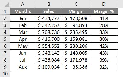
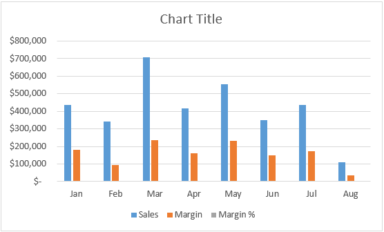
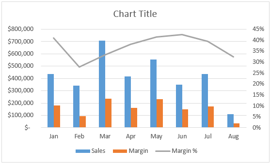
Suppose we are running a manufacturing company and selling our products globally. The Sales, Margin, and Margin% values from January to August (the Year 2019) for all the products we sold. See the image below.
We wanted to plot a graph of the same in Excel, so our management can better understand how we are moving in the business around the globe in the past 8 months. A bar chart seems to be the nicest way to make comparisons.
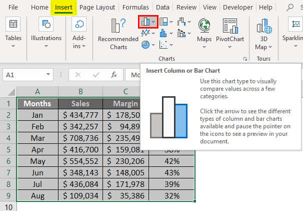
Step 1 – Select all the data spread across columns A to D (Along with headers). Navigate to the “Insert” Tab, and under the Charts section, click on the “Column or Bar Chart” icon.
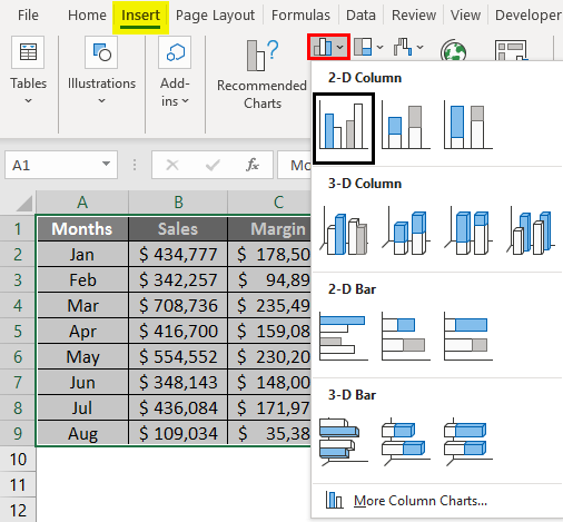
Step 2 – Once you click on the Insert Column or Bar Chart icon, you can see multiple graph options for representing your data. Select the Clustered Column Chart option from the list.
Step 3 – Once you click the Clustered Column Chart option, you’ll see a chart like this in your Excel sheet.
You can directly insert a combination chart and recommend the Charts option present under the Chart section. However, we wanted this to be for all the users (Some Excel users using the older version might not have the recommended charts option); we are showing it step by step.
In the graph above, you can see that the margin percentage is not visible because they have very small values compared to that of sales and Margin. However, we wanted to make the Margin% visible to management as well. So that they will have a better understanding of movements happening, for this, we can add a Line Chart under this one and mention Margin% on the line chart. Follow the steps below to create a combination of two charts:
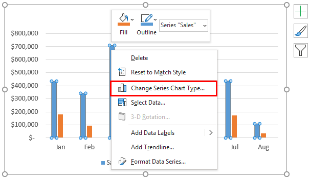
Step 4 – Select series bars and right-click on any one of those. You’ll see a series of options. Out of those, select the Change Series Chart Type… option.
Step 5 – As soon as you click on the Change Series Chart Type… option, a Change Chart Type window will pop up, as shown in the below screenshot.
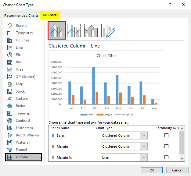
Step 6 – In the Change Chart Type window, select Combo as a category (we want to combine two charts). It will most often be selected by default for you by the system, using its own intelligence.
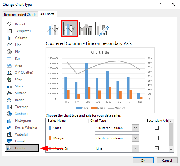
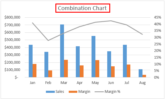
Step 7 – Inside Combo, you’ll see different combination options (ideally four). Select the second option, Clustered Column – Line, on the Secondary Axis chart. This chart option enables the secondary axis to be visible on the right-hand side of the graph. See the screenshot below.

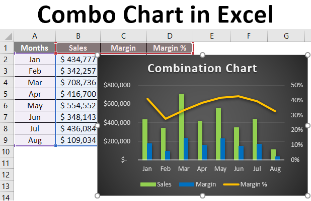
Step 8 – Click the “OK” button, and you’ll be able to see the updated combined graph below.
Now, the Margin% looks like having more relevance in that graph. Because it is now added as separate series values (remember the secondary Y-axis on the right-hand side of the graph). As the series values have been plotted on a separate axis, they are now irrelevant to the primary series values (Y-axis) values. Therefore, they can now be seen more precisely, visually, and technically more relevant.
Step 9 – Add the Chart Title as “Combination Chart” under the Chart Title section under the combo graph.
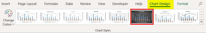
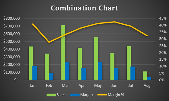
You can use more customizations like changing the design of the graph, adding axis labels or changing series bars and series line colors, changing widths, etc., to make your graph visually more pleasant. All these options are present under the Design tab.
This is how we can create Combo Chart under Excel with different data for the same categories.
This is from this article. Let’s wrap things up with some points to be remembered.
Things to Remember
- It is a hybrid of two or more charts, so it saves time and space to create two separate graphs. However, simultaneously, it might confuse the user due to the complexity that gets added due to the combination.
- The combination chart allows one to plot two different series values across the same categories, which is more decent because one can compare two different values for the same categories in a single graph.
- Though it seems easier to generate in Excel, it needs to be precise and non-confusing to the user so that they can better visualize two different values for the same categories.
- You can use different combinations of charts besides Bar and Line charts to make a better combination. Ex. Gantt & Bar chart.
Recommended Articles
This is a guide to Combo Chart in Excel. Here we discuss How to create Combo Chart in Excel, practical examples, and a downloadable Excel template. You can also go through our other suggested articles –
