EDUCBA

EDUCBA

MENUMENU
  • Free Tutorials
  • Free Courses
  • Certification Courses
  • 360+ Courses All in One Bundle
  • Login

Bubble Chart in Tableau

By Priya PedamkarPriya Pedamkar

Home » Data Science » Data Science Tutorials » Tableau Tutorial » Bubble Chart in Tableau

Bubble Chart in Tableau

Introduction to Bubble Chart in Tableau

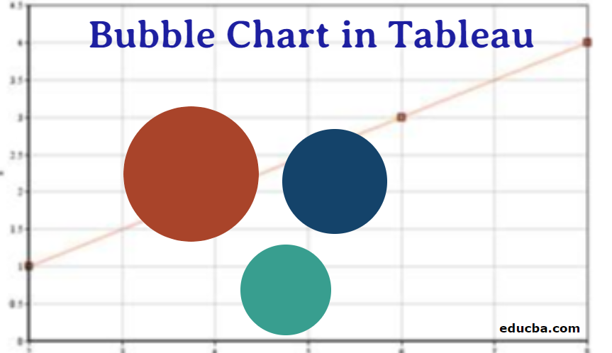
In advance to learn about the details of how the bubble chart is plotted in tableau, lets first learn what is bubble chart and when it is the most appropriate time to choose a bubble chart. The name bubble chart itself conveys that when plotted it looks like an assembly of bubbles. A bubble chart can display three or four dimensions of data. Each bubble in the plot represents any member in the dimension field and the size of the bubble represents the value of the measure. We can also add that a Bubble chart is an enhanced version of a scatter plot present in Microsoft Office.

Scatter plot is a type of plot where typically two variables can be visualized and the plot will look like a collection of points, you can use a bubble chart instead of scattering plot if your dataset has three data variables that need to be visualized and the size of bubble in the plot will be determined by the values of the third variable. Let’s see an example to understand the things better, suppose there are around 20 universities in a state and we have the data of the number of people applied to these universities and the number of people who got accepted into these universities for the past 5 years.

Start Your Free Data Science Course

Hadoop, Data Science, Statistics & others

With this information, we can calculate the acceptance rate and plot a bubble chart by taking

  • the acceptance rate to determine the size of the bubble,
  • university name on one axis,
  • year on the other one.

As we are done with the introduction of the bubble chart, let’s have a brief discussion about Tableau. Tableau is a data visualization tool that can help produce interactive dashboards that help in a better understanding of the data by using graphs, charts and is primarily focused on helping everyone to make data-driven decisions. The interesting part about tableau is it allows real-time data analytics.

Creating a Bubble Chart in Tableau

So far, we have learned what is bubble chart and what is tableau, now let’s go step by step how to create a bubble chart in Tableau.

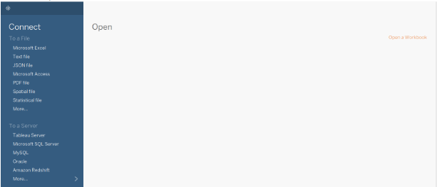
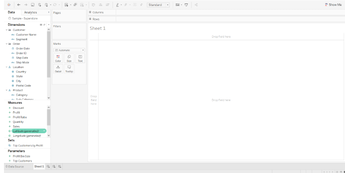
1. Open Tableau and you will be able to see the below screen. Connect to a file or server (based on where you input data is present) using the connect option present on the left side of the Tableau landing page

Bubble chart in Tableau - Step 1

2. Here, in this case, I am using sample data source “Sample – Superstore” present in the tableau and this is how the sample data looks in our case.

Sample SuperStore

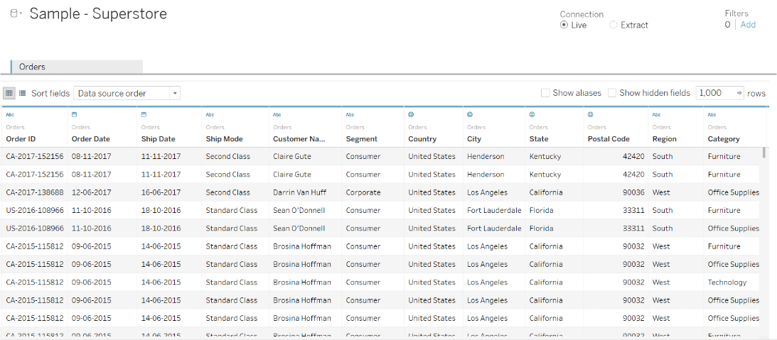
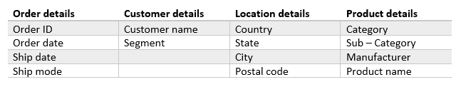
If you see all the columns there are five attributes in the measures division (Discount, Quantity, Profit, Profit ratio, Sales) and there are few attributes in the dimension’s divisions like Product, Location, Order, Customer and these are divided again into the smaller division which provides us with more details.

Customer Details

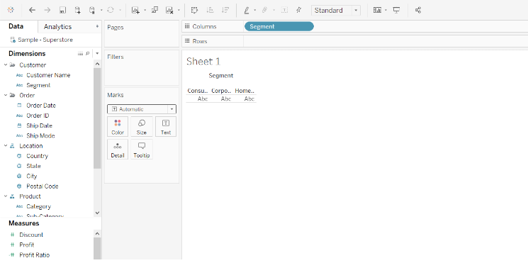
3. Click on the option “Sheet 1” present on the bottom left corner and you will be able to see like the image shown below and this is where you prepare dashboards

Bubble chart

4. Drag the segment into columns, as there are only three types of values in this column in the data source (Consumer, Corporate, Home Office) it will look like the screenshot below this step is done

Bubble chart

5. Drag the sales measure into rows, and once it is dragged tableau will automatically sum them categorically and it will look like this once this step is done.

Bubble Chart in Tableau

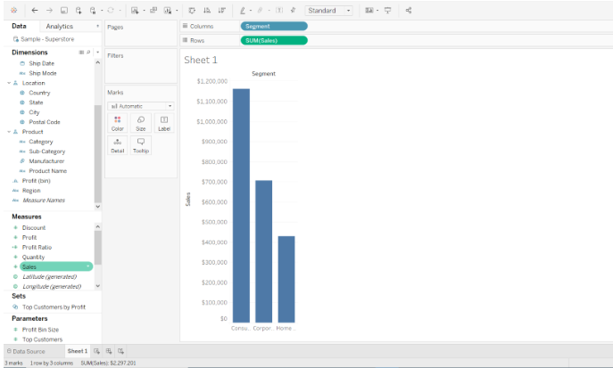
6. The default chart type in Tableau is bar chart when there is a measure on the Rows shelf and dimension on the columns shelf. This is the reason why we are able to see a bar chart here. As we need a bubble chart click on the option “Show me” present on the right top corner and select the bubble chart option in the last.

Bubble Chart in Tableau

7. And also to create a bubble chart we need at least 1 or more dimensions and 1 or 2 measures. Here, in this case, we have one dimension (Segment) and one measure (Sales). It will look similar to this when we click on the bubble chart option.

Popular Course in this category
Tableau Training (4 Courses, 6+ Projects)4 Online Courses | 6 Hands-on Projects | 39+ Hours | Verifiable Certificate of Completion | Lifetime Access
4.5 (6,121 ratings)
Course Price

View Course

Related Courses
Business Intelligence Training (12 Courses, 6+ Projects)Data Visualization Training (15 Courses, 5+ Projects)

bubble chart option

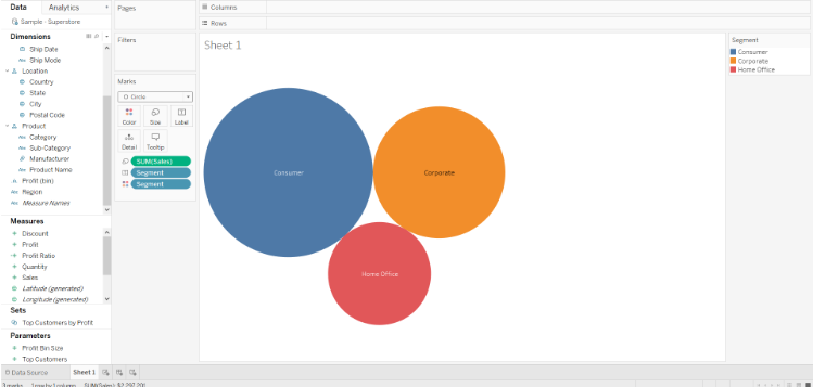
8. To make it more packed and detailed we can drag other dimensions or measures into the features present in marks cards.

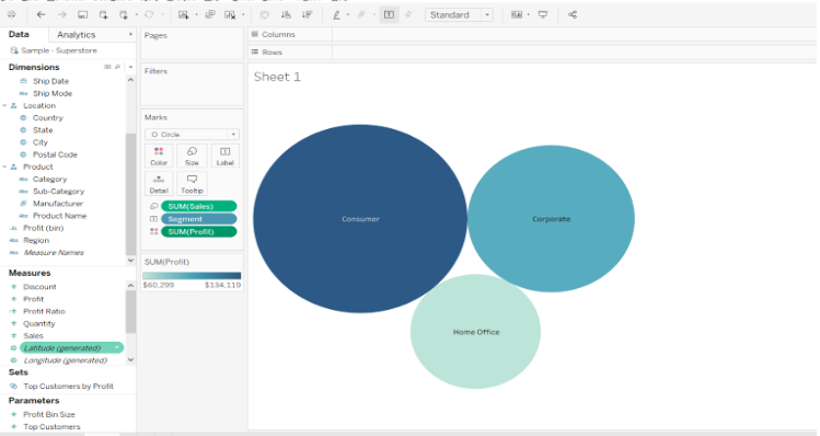
9. Here the size of the bubble shows the aggregate of sales for different segments. Drag profit onto the color feature present in measures card and the color of the bubble will represent the aggregate of profit in that specific segment. The same is shown in the below screenshot.

aggregate of sales

Conclusion

In this way, we can create bubble charts and also play a major role while understanding the social, economic, medical, and other scientific relationships between countries. However, there are a few setbacks that are important to be considered while doing a bubble chart they are

  1. Bubble charts can become a spot of difficulty to interpret when the magnitude differences in the bubble data elements are large.
  2. Bubble charts with a large number of triplet data points will tend to have bubbles that overlap and obscure other bubbles, thus restricting the elegance, usefulness, completeness, and accuracy of interpretation of the bubble chart.

Recommended Articles

This has been a guide to Bubble Chart in Tableau. Here we discuss what is a bubble chart and stepwise creation of bubble chart in tableau in simple and easy way. You may also look at the following articles to learn more –

  1. Tableau Architecture
  2. Tableau Alternatives
  3. Tableau Commands
  4. Line Chart in Tableau

Tableau Training (4 Courses, 6+ Projects)

4 Online Courses

6 Hands-on Projects

39+ Hours

Verifiable Certificate of Completion

Lifetime Access

Learn More

2 Shares
Share
Tweet
Share
Primary Sidebar
Tableau Tutorial
  • Charts
    • Tableau Charts
    • Tableau Chart Types
    • Donut Chart in Tableau
    • Funnel Chart in Tableau
    • Gantt Chart in Tableau
    • Bubble Chart in Tableau
    • Pareto Chart in Tableau
    • Sankey Chart In Tableau
    • Stacked Bar Chart in Tableau
    • Tableau Bullet Chart
    • Waterfall Chart in Tableau
    • Line Chart in Tableau
    • Heat Map in Tableau
    • Histogram in Tableau
    • CrossTab in Tableau
    • Treemap in Tableau
    • Trend Lines in Tableau
    • Tableau Reference Lines
    • Tableau Dual Axis
    • Legend in Tableau
    • Pie Chart in Tableau
    • Tableau Storyline
  • Basic
    • What is Tableau
    • What is Tableau Dashboard
    • What is Tableau Server
    • Uses of Tableau
    • Tableau Versions
    • Tableau Architecture
    • Is Tableau Free
    • Tableau New Features
    • How To Install Tableau
    • How to Use Tableau?
    • Install Tableau Server
    • Tableau Commands
  • Statement
    • Tableau IF Statement
    • Case Statement in Tableau
  • Functions
    • Tableau Functions
    • Tableau String Functions
    • Concatenate in Tableau
    • Rank Function in Tableau
    • Tableau Aggregate Functions
    • Tableau Date Functions
    • Window Sum Tableau
    • LOD Expressions in Tableau
    • LOOKUP Function in Tableau
    • Tableau Fixed Function
    • Tableau Count Distinct
    • Tableau Window Functions
  • Sort/Filters
    • Sorting in Tableau
    • Filters in Tableau
    • Types of Filters in Tableau
    • Tableau Action Filter
    • Context Filter in Tableau
    • Tableau Parameter Filter
    • Adding Filters in Tableau Dashboard
    • Tableau Context Filter
  • Tableau Dashboard
    • Dashboard in Tableau
    • Tableau Dashboard Creation
    • Tableau Dashboard Design
    • Tableau Workbook
  • Advanced
    • Tableau Reporting
    • Tableau Reporting Tool
    • Conditional Formatting in Tableau
    • Data Blending in Tableau
    • Parameters in Tableau
    • Tableau Data Sets
    • Tableau Drill Down
    • Tableau Dynamic Parameters
    • Tableau Table Calculation
    • Tableau Visualization
    • Tableau Joins
    • Pivot in Tableau
    • Data Visualization With Tableau
    • Forecast in Tableau
    • Map Layers in Tableau
    • Group in Tableau
    • Tableau Group by
    • Hierarchy in Tableau
    • Sets in Tableau
    • How to create a Set in Tableau
    • Tableau Order of Operations
    • Tableau User Group
    • Tableau Calculated Field
    • Custom SQL in Tableau
  • Interview Questions
    • Tableau Interview Questions

Related Courses

Tableau Certification Course

Business Intelligence Courses

Data Visualization Courses

Footer
About Us
  • Blog
  • Who is EDUCBA?
  • Sign Up
  • Corporate Training
  • Certificate from Top Institutions
  • Contact Us
  • Verifiable Certificate
  • Reviews
  • Terms and Conditions
  • Privacy Policy
  •  
Apps
  • iPhone & iPad
  • Android
Resources
  • Free Courses
  • Database Management
  • Machine Learning
  • All Tutorials
Certification Courses
  • All Courses
  • Data Science Course - All in One Bundle
  • Machine Learning Course
  • Hadoop Certification Training
  • Cloud Computing Training Course
  • R Programming Course
  • AWS Training Course
  • SAS Training Course

© 2020 - EDUCBA. ALL RIGHTS RESERVED. THE CERTIFICATION NAMES ARE THE TRADEMARKS OF THEIR RESPECTIVE OWNERS.

EDUCBA Login

Forgot Password?

EDUCBA
Free Data Science Course

Hadoop, Data Science, Statistics & others

*Please provide your correct email id. Login details for this Free course will be emailed to you
Book Your One Instructor : One Learner Free Class

Let’s Get Started

This website or its third-party tools use cookies, which are necessary to its functioning and required to achieve the purposes illustrated in the cookie policy. By closing this banner, scrolling this page, clicking a link or continuing to browse otherwise, you agree to our Privacy Policy

EDUCBA

*Please provide your correct email id. Login details for this Free course will be emailed to you
EDUCBA
Free Data Science Course

Hadoop, Data Science, Statistics & others

*Please provide your correct email id. Login details for this Free course will be emailed to you

Special Offer - Tableau Training (4 Courses, 6+ Projects) Learn More