Updated February 27, 2023

Introduction to Bar Plot Matlab
MATLAB provides us with plenty of functionalities, useful in various computational problems. Apart from its computational capabilities, MATLAB is also a great tool for visualization. It provides us with the ability to plot a wide variety of charts. In this article, we will focus on one of the most basic charts that are used for visualization, i.e BAR plots.
Let us first understand Bar plot in their simplest form:
- Bar plot is a simple visual representation of data in the form of multiple bars
- Higher the value, higher is the length of the bar. These bars can take both positive and negative values as per our data.
Syntax
Below is the syntax for creating Bar plots in MATLAB
- This function will plot a bar for each element contained in the input array ‘A’
- This function can also create ‘X’ groups containing ‘Y’ bars, incase ‘A’ is ‘X x Y’ matrix.
TABLE for color codes
| Color | Code |
| Red | R |
| Blue | B |
| Cyan | C |
| Black | K |
| Green | G |
| White | W |
| Magenta | M |
| Yellow | Y |
Examples to Implement Bar Plot Matlab
Let us understand the function bar (A) with an example:
Example #1
First, we will define ‘A’ as an array containing random values.
A = [ 91 75 60 80 100 112 45 74 84 60 ]
Our input array A is then passed as an argument to the function bar (A). This is how our input and output will look like in MATLAB console:
Code:
A = [ 91 75 60 80 100 112 45 74 84 60 ]
bar(A)
Output:
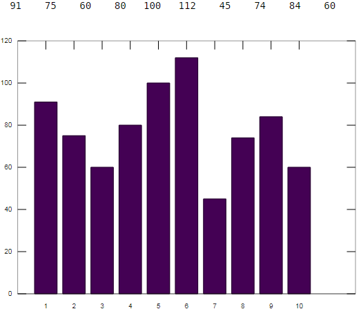
Explanation: As we can observe in the output obtained, our plot contains 10 bars corresponding to 10 array elements. In the above plot, we do not have any category for our array elements. Now, what if we need specify some category for our array elements.
Example #2
To indicate categories, we will create an array of categories and will pass this to our bar function. But here, we need to keep one thing in mind, the bar function by default takes a list of categories which is sorted, resulting in changing the order that we are expecting. Now to preserve our order, we will call ‘reordercats’ function.
Let understand this with an example:
1. Let A be an array of salaries of 5 employees Sam, Tom, Ria, Nick, Vicky; in the same order.
- A = [ 10000, 15000, 30000, 40000, 50000 ]
2. Now we want to plot a bar graph for the data above. We will pass our names as categorical array:
- B = categorical ({‘Sam’, ‘Tom’, ‘Ria’, ‘Nick’, ‘Vicky});
3. Now to preserve our order, we will have to call ‘reordercats’.
- B = reordercats(B, {‘Sam’, ‘Tom’, ‘Ria’, ‘Nick’, ‘Vicky})
4. And finally:
- bar (A, B)
This is how our input and output will look like in MATLAB console:
Code:
A = [ 10000, 15000, 30000, 40000, 50000 ]
B = categorical ({'Sam', 'Tom', 'Ria', 'Nick', 'Vicky'});

B = reordercats(A, {'Sam', 'Tom', 'Ria', 'Nick', 'Vicky'});

bar (A, B)
Output:
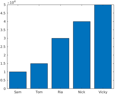
Explanation: As we can observe in our output, our plot contains the salaries of employees with employee names as categories.
Example #3
Next we will learn how to create a stacked bar plot. A stacked bar contains multiple values in the same bar. To create a stacked bar, we pass a matrix as an argument. ‘bar’ function creates stacked bar for each row in the input matrix.
Let us understand this with an example.
First, we will create an input matrix. For this example, we will create 4 x 3 matrix.
- A = [5 2 6; 3 5 1; 4 4 9; 2 7 4];
Since this is a 4 x 3 matrix, the bar function will create 4 bars, with each bar containing 3 stacks. Our input matrix A is then passed to our bar function with a keyword “stacked”. The keyword “stacked” is used in MATLAB to create a stacked bar plot. bar(A,’ stacked’)
This is how our input and output will look like in MATLAB console:
Code:
A = [5 2 6; 3 5 1; 4 4 9; 2 7 4];

bar(A,'stacked')
Output:
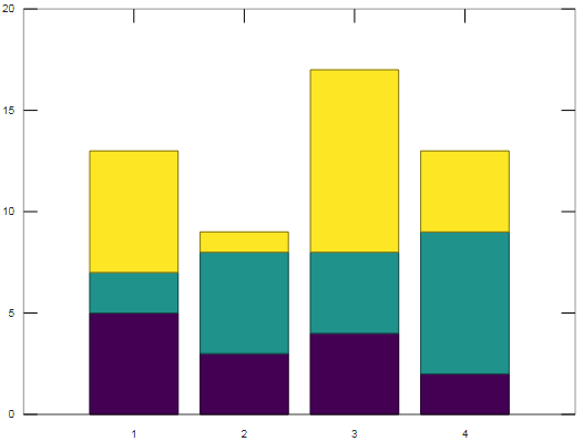
Explanation: As we can clearly see in our output, our function has created 4 bars of 3 stacks each.
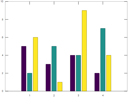
In another type of visualization, instead of stacks, we can get 4 sets of 3 bars. For this, we simply drop the keyword “stacked” from the above code. This is how our input and output will look like in MATLAB console:
Code:
A = [5 2 6; 3 5 1; 4 4 9; 2 7 4];

bar(A)
Output:
Example #4
Next we will learn how to create bars with colors of our choice. For this, we will use predefined color codes (Please refer table at the end of the article for pre-defined color codes). The color code is passed as an argument to our function ‘bar’. For our understanding, let us create bars of red color. Here, the syntax is similar to that of simple bars, with the only difference that the pre-defined code for red color is passed as an argument.
Let us take same array as we used in our first example:
- A = [ 91 75 60 80 100 112 45 74 84 60 ]
Syntax
plot(A, ‘r’)
Code:
A = [ 91 75 60 80 100 112 45 74 ]
bar(A, 'r')
Output:
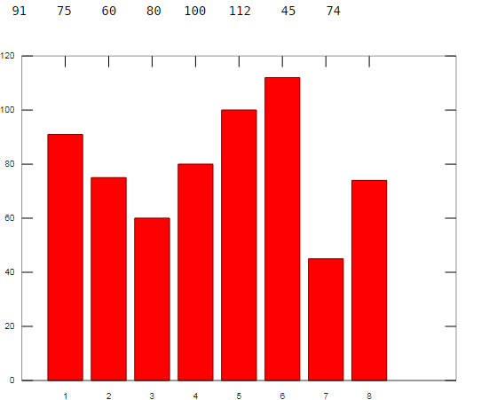
As we can see, our bars are now of red color.
Conclusion
We learned how to create bar plots in MATLAB and how to define categories for bars. We can also create bars of the desired color. Another great way of using a bar plot is to create stacked bars which can be created by passing a matrix as an argument.
Recommended Articles
This is a guide to Bar Plot Matlab. Here we discuss an introduction to Bar Plot Matlab, appropriate syntax, and examples to implement with respective graph. You can also go through our other related articles to learn more –
