Updated May 9, 2023

Introduction to ASP.NET Checkbox
Checkbox control is inherited from the web controls class, which is used when there is a need to get multiple inputs from the user. Its checkbox of control takes inputs in the form of ‘True’ or ‘False,’ which can be converted into different reasons.
Syntax:
<asp:CheckBox AccessKey="string" AutoPostBack="True|False" BackColor="color name|#dddddd" BorderColor="color name|#dddddd" BorderStyle="NotSet|None|Dotted|Dashed|Solid|Double|Groove|Ridge| Inset|Outset" BorderWidth="size" CausesValidation="True|False" Checked="True|False" CssClass="string" Enabled="True|False" EnableTheming="True|False" EnableViewState="True|False" Font-Bold="True|False" Font-Italic="True|False" Font-Names="string" Font-Overline="True|False" Font-Size="string|Smaller|Larger|XX-Small|X-Small|Small|Medium| Large|X-Large|XX-Large" Font-Strikeout="True|False" Font-Underline="True|False" ForeColor="color name|#dddddd" Height="size" ID="string" nCheckedChanged="CheckedChanged event handler" OnDataBinding="DataBinding event handler" OnDisposed="Disposed event handler" OnInit="Init event handler" OnLoad="Load event handler" OnPreRender="PreRender event handler" OnUnload="Unload event handler" runat="server" SkinID="string" Style="string" TabIndex="integer" Text="string" TextAlign="Left|Right" ToolTip="string" ValidationGroup="string" Visible="True|False" Width="size"/>Explain:
<asp:CheckBox AccessKey="test" AutoPostBack="true" BackColor="Yellow" BorderColor="#ff0000" BorderStyle="Double" BorderWidth="3" CausesValidation="true" Checked="false" ClientIDMode="AutoID" CssClass="Test" Enabled="true" EnableTheming="true" EnableViewState="true" Font-Bold="true" Font-Italic="false" Font-Names="ABC" Font-Overline="false" Font-Size="Large" Font-Strikeout="false" Font-Underline="true" ForeColor="Violet" Height="10" ID="chkbx_TestBox" OnCheckedChanged="chkbx_TestBox_CheckedChanged"OnDataBinding="chkbx_TestBox_CheckedChanged" OnDisposed="chkbx_TestBox_CheckedChanged" OnInit="chkbx_TestBox_Init" OnLoad="chkbx_TestBox_Init" OnPreRender="chkbx_TestBox_Init" OnUnload="chkbx_TestBox_Unload" runat="server" SkinID="Test" TabIndex="3" Text="CheckifTrue" TextAlign ="Right" ToolTip="Check" ValidateRequestMode="Enabled" ViewStateMode="Enabled" ValidationGroup="TestGroup" Visible="true" Width="10" />The above code creates a checkbox button with ID as ‘chkbx_TestBox,’ which has yellow as the back color. The checkbox button also has the facility to bind to the database field, which will convert the value to checked and unchecked. The OnDataBinding event attaches the database field to the check box button. The button can also render as checked by default and visible or non-visible using the ‘Checked’ and ‘visible’ properties.
Properties of ASP.NET CheckBox
Below are the properties of the Class:
- AccessKey: The value set at the access key helps to navigate to the other web server control.
- Attributes: The properties used to render the checkbox button control on the web page.
- AutoPostBack: The property sets whether the checkbox automatically posts back to the web server.
- BackColor: This property sets the back color of the control.
- BorderColor: The border of the checkbox control can be given a different color than the back color.
- Checked: The value sets or gets whether the checkbox will be rendered as checked by default
- Context: This property gets the HttpContext object for the current web request.
- Enabled: This property can set the value or return the value already set, which tells if the checkbox is enabled by default.
- Forecolor: The property sets the font color of the text of the checkbox button.
- Height: The height property sets the size of the control.
- ID: With the help of the value set in the ID property, it can be used to access the control anywhere on the web page.
- Text: The Text property sets the text displayed with the checkbox button control.
- Visible: The property decides whether the web page will render the control.
- Width: The property sets the width f the control.
Examples
Below are the examples of ASP.NET CheckBox.
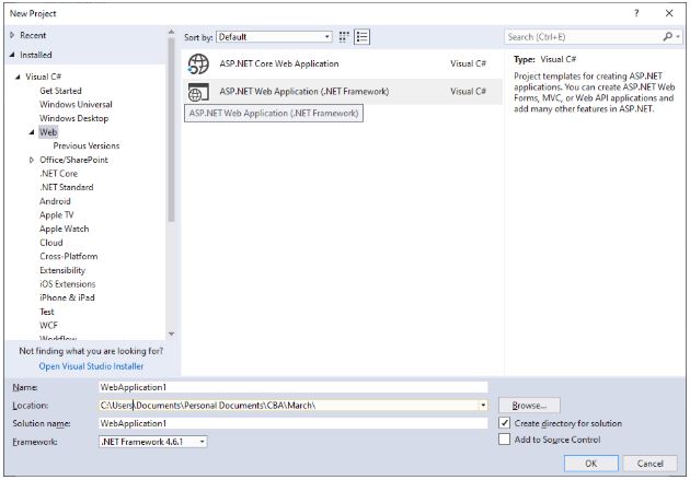
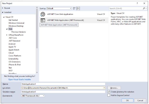
1. Open Visual Studio 2017 -> File -> New -> Project -> Select ASP.NET Web Application
2. Select Web Forms as we are demonstrating a simple Checkbox button.
3. The checkbox button can be added in the .aspx part of the web page using the following:
Code:
<%@ Page Language="C#" AutoEventWireup="true" CodeBehind="Default.aspx.cs" Inherits="WebApplication2.Default" %>
<!DOCTYPE html>
<html xmlns="http://www.w3.org/1999/xhtml">
<head runat="server">
<title></title>
</head>
<body>
<form id="form1" runat="server">
<div>
<asp:CheckBox ID="chkbx_ExampleBox" Text ="Check to say Yes" Checked ="false" BackColor="#33ccff" Font-Bold="true" runat="server" OnCheckedChanged="chkbx_ExampleBox_CheckedChanged" AutoPostBack="true"/>
<asp:Label ID="Label1" runat="server"></asp:Label>
</div>
</form>
</body>
</html>
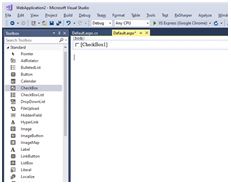
4. The checkbox control can also be added from the designer section of the .aspx page by dragging and dropping the CheckBox button option from the Toolbox
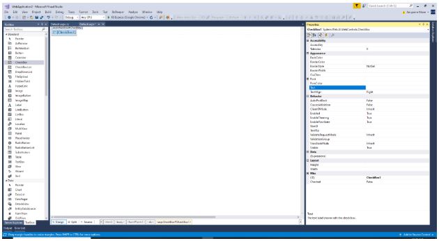
5. To access the properties window of the checkbox control, you need to click on the window located on the right side of the IDE.
6. The code to display text on the check of the checkbox button can be written as:
Code:
using System;
using System.Collections.Generic;
using System.Linq;
using System.Web;
using System.Web.UI;
using System.Web.UI.WebControls;
namespace WebApplication2
{
public partial class Default : System.Web.UI.Page
{
protected void Page_Load(object sender, EventArgs e)
{
}
protected void chkbx_ExampleBox_CheckedChanged(object sender, EventArgs e)
{
if(chkbx_ExampleBox.Checked)
{
Label1.Text = "You have checked the checkbox";
}
else
{
Label1.Text = string.Empty;
}
}
}
}
If you check the checkbox button, the Label control will display the text shown in the above code. The web page automatically refreshes when the OnCheckChanged event occurs and then checks the ‘if’ condition to determine if the checkbox has been selected or not. If the user checks the checkbox, the program will enter the if loop, and the webpage will display the message “You have checked the checkbox” using the ‘Text’ property of the web control. If the user unchecks the checkbox, the postback happens again. The ‘if’ loop executes the ‘else’ section, which sets the ‘Text’ property of the ‘label’ control to empty.
7. The final output will look like this.
Conclusion
The AutoPostBack property of the checkbox button is standard as other controls. When a user selects a checkbox, it immediately triggers a postback due to the SelectedIndexChanged property. Apart from the binding properties of the checkbox button, it also supports themes and skins. The checkbox button can also have CSS styling for which it has a CssClass property defined, which can be mentioned while creating Checkbox Button. The value can point to any external CSS file from which the styling needs to be done. The checkbox button comes with the facility to select multiple options for the user.
Recommended Article
We hope that this EDUCBA information on “ASP.NET CheckBox” benefited you. You can view EDUCBA’s recommended articles for more information.
