Updated April 21, 2023
Introduction to Angular Material Dialog
Angular Material provides a versatile dialog component that can be used to display pop-ups to the user, prompting them for an action or input. Although commonly used for confirmation dialogs, the dialog component can be utilized for a variety of other purposes. This includes displaying small pieces of functionality or registration forms, among other things. The Angular Material library includes an inbuilt module for creating these dialogs quickly and easily, complete with default styling and animations. To use the dialog component in our application, we need to import the required packages and use a specific tag in the template to create and display the dialog. In the next section of this tutorial, we will explore the implementation of this component in greater detail, providing a step-by-step guide to using it effectively in our projects.
Syntax:
In this section, we will see the syntax to use dialog inside our application. The proper configuration will see in the coming section of the tutorial. Let’s take a closer look at the syntax for a better understanding see below;
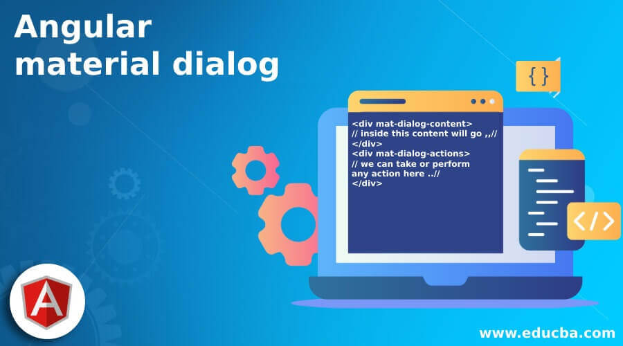
<div mat-dialog-content>
// inside this content will go ,,//
</div>
<div mat-dialog-actions>
// we can take or perform any action here ..//
</div>
As you can see in the above syntax, we are trying to use ‘mat-dialog-content’ to create our dialog in angular using the material library. Full practice examples will see in the coming section of the tutorial for a better understanding of the implementation.
How does Dialog work in Angular Material?
As of now, we already know that dialog is pretty much direct to create inside our application. In this section, we will have a closer look at the full steps and configuration needed for the dialog created using the material library, for which we will use the in-build module and directive provided by the material framework. Let’s get started to see below;
1) MatDialogModule: This is a module provided by the material library which can be used to create the dialog in the application; Angular Material must be present in either the root module or any of the child modules in order to use it. If it is not, an error may occur, and the dialog may not be visible. For reference, follow the below code and place it inside the root module see below;
e.g. :
import {MatDialogModule} from '@angular/material/dialog';2) mat-dialog-close: This will help to close the current dialog. Below see the syntax to use ;
e.g. :
<mat-dialog-close></mat-dialog-close>3) mat-dialog-title: This is used to show the title of the dialog. below see the reference code:
e.g. :
<mat-dialog-title></mat-dialog-title>4) mat-dialog-content: This contains the content for the dialog box; below, see the syntax to use this in code:
e.g. :
<mat-dialog-content></mat-dialog-content>Below are the necessary steps to step angular and material project, follow to get started;
- Angular CLI is important to be in place; it makes us enable to create our angular project with ease and very quickly. We can type in the below line of command on the command prompt it will install CLI for us as global;
e.g. :
npm install -g @angular/cli)3) In the third step, we can now create the angular project just by typing in the below command. We should name our angular project as we want. The command will start from ‘ng new’ after this, we can give our own project name. Below is the reference command;
syntax :
ng new your project namee.g. :
ng new my-first-projectwe can create this project inside any directory. After the successful completion of the command, you will see a folder created on the mentioned path.
4) To install all the necessary dependencies for an Angular project, we can run the command below. The installation will ensure that all necessary packages and dependencies are available for use in creating components within the project.
e.g. :
npm install5) Now we are all set to start our angular application, can we see the default implementation by running it locally with the default port of 4200? run the below command on the command prompt to see changes;
e.g. :
ng serve6) We can now access our angular application by the below URL :
e.g. :
http://localhps:42007) Currently, Angular Material has not been integrated into the Angular project. For that, we need to install and execute one more command, which will turn install all the material packages and modules inside our application
e.g. :
ng add @angular/materialThat’s it we are ready to go with the application using the material library.
Example
1) index.html code:
<!DOCTYPE html>
<html lang="en">
<head>
<meta charset="utf-8">
<meta name="viewport" content="width=device-width, initial-scale=1.0">
<link href="https://fonts.googleapis.com/icon?family=Material+Icons&display=block" rel="stylesheet">
<title>Dialog demo material</title>
</head>
<body class="mat-app-background">
<dialog-demo>Loading ..</dialog-demo>
<span class="version-info">Current build: 12.1.1</span>
</body>
</html>
2) module.ts code:
import {NgModule} from '@angular/core';
import {MatDialogModule} from '@angular/material/dialog';
@NgModule({
exports: [
MatDialogModule,
]
})
export class DialogMaterialDemo {}
3) demo.dialog.component.ts code :
import {Component} from '@angular/core';
import {MatDialog} from '@angular/material/dialog';
/**
* @title Demo Dialog
*/
@Component({
selector: 'dialog-demo',
templateUrl: 'demo.dialog.component.html',
})
export class DemoDialogComponen {
constructor(public dialog: MatDialog) {}
openDialog() {
const dialogRef = this.dialog.open(DialogContent);
dialogRef.afterClosed().subscribe(result => {
console.log(`Dialog result: ${result}`);
});
}
}
@Component({
selector: 'dialog-content-demo',
templateUrl: 'demo.dialog.component.dialog-content.html',
})
export class DialogContent {}
4) demo.dialog.component.html code :
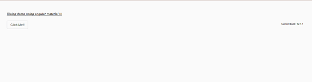
<h5><u><i>Dialog demo using angular material !!!</i></u></h5>
<button mat-stroked-button (click)="openDialog()">Click Me!!</button>
5) demo.dialog.component.dialog-content.html code :
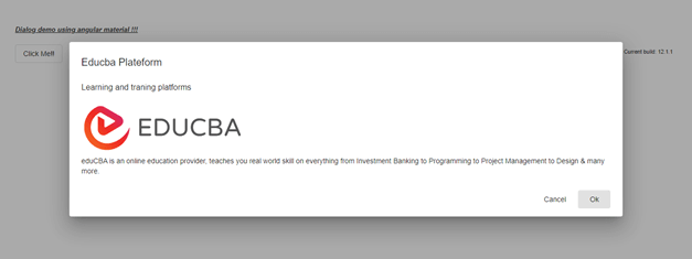
<h2 mat-dialog-title>Educba Plateform</h2>
<mat-dialog-content class="mat-typography">
<h3>Learning and traning platforms</h3>
<img src="https://lh5.googleusercontent.com/p/AF1QipN_aupGaqTiv5_xbfKTl2qZz0XAJlGMt0WucgkU=w319-h100-k-no" alt="Photos of educba">
<p>
eduCBA is an online education provider, teaches you real-world skills in everything from Investment Banking to Programming to Project Management to Design & many more.
</p>
</mat-dialog-content>
<mat-dialog-actions align="end">
<button mat-button mat-dialog-close>Cancel</button>
<button mat-button [mat-dialog-close]="true" cdkFocusInitial>Ok</button>
</mat-dialog-actions>
Output :
Before click :
After click :
Conclusion
By the use of it, we can easily create the dialog and perform the action of it, for which it provides s ‘mat-dialog-actions’. This material dialog comes up with default styling and animations, which look more attractive and user-friendly as well. It is easy to maintain, understand, and handle developers.
Recommended Articles
This is a guide to Angular Material Dialog. Here we discuss How dialog works in Angular material along with the examples and outputs. You may also have a look at the following articles to learn more –

