Updated November 18, 2023
Introduction to Figma grid
In this article, we are going to learn about the grid in Figma. Using the grid improves the structure and readability. It also removes the guesswork and provides a structure to the layout. Since the content is created for one screen, it is viewed on many different screens with different size and resolution to make sure the design is responsive and adapt to the display size is crucial. To accomplish this goal, we use the grid in Figma in conjunction with constraints to achieve the desired effect. So, we will apply the grid to one or more frames in our design.
Steps of Figma grid
Here are the following steps mention below
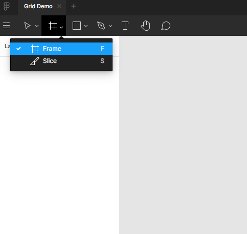
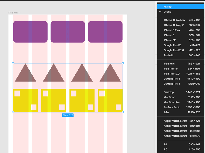
Step 1: We can either use Figma on the web, or you can download the application. In this article, we are doing an application. First, we will start with creating a Frame or press F and then select the iPad mini layout from the design tab.
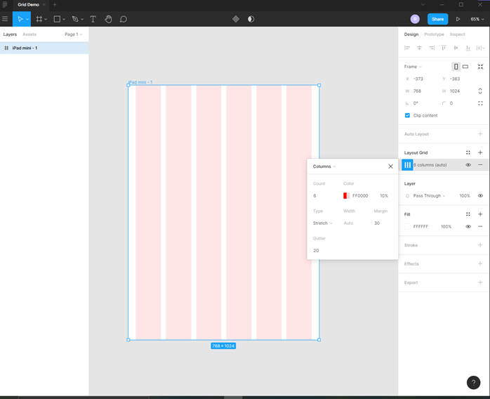
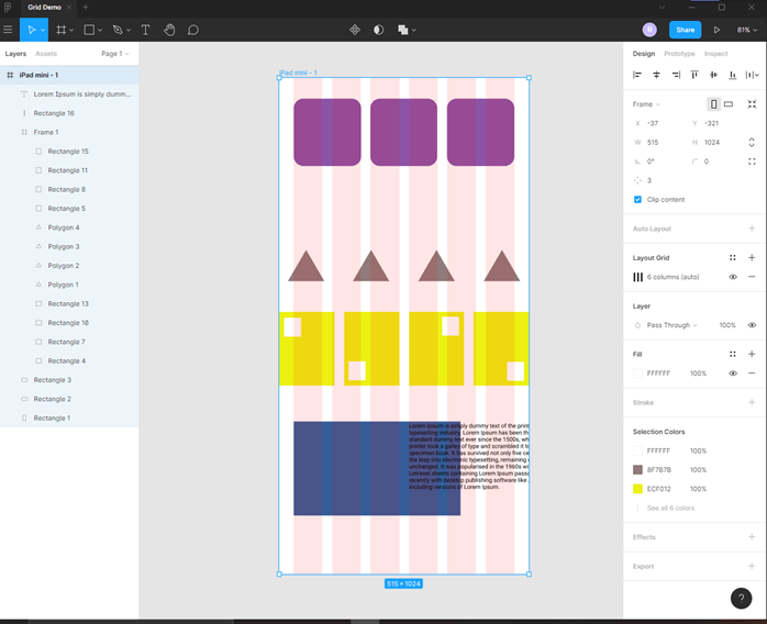
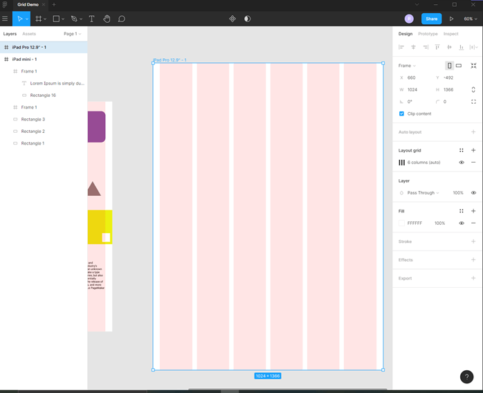
Step 2: A new frame will be added, and its dimensions are 768 x 1024

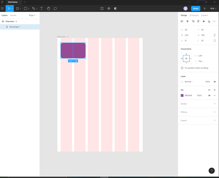
Step 3: Now add a layout grid; by default, it is a Grid layout, so change it to columns layout. Set the count to 6 and margin to 30, which spaces the content from the sides and gutter to 20, which spaces the content between columns.
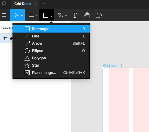
Step 4: Now select the rectangle from the tools panel or press R
Step 5: Then drag the rectangle which spans the first two columns, change the fill color and give it some corner radius like 20
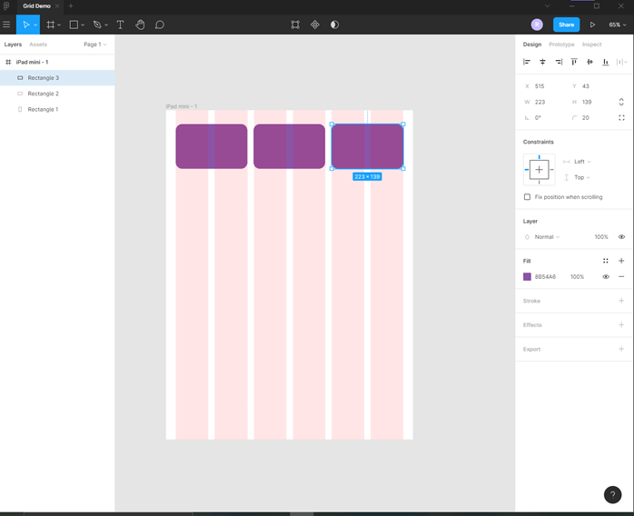
Step 6: Hold the Alt key and drag the rectangle two more times to fix the grid as shown.
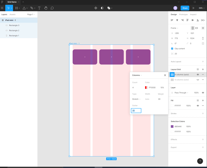
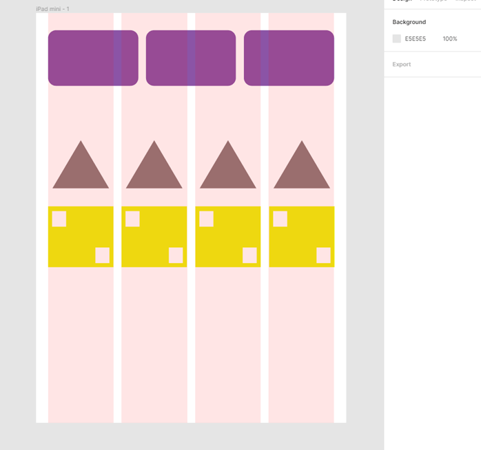
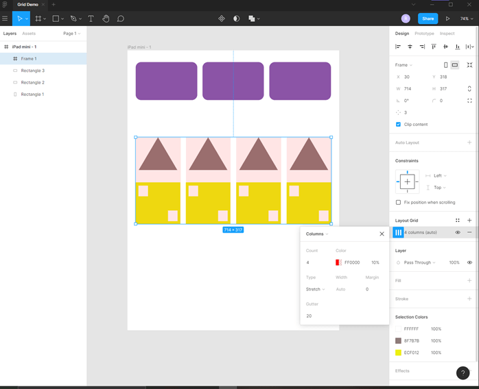
Step 7: Now, we will create a different layout in the middle of our frame; for that, we need to change the layout grid so that it hides the current grid and from the layout grid in the design panel. Then add a 4-column layout with a margin of 30 and a gutter of 20
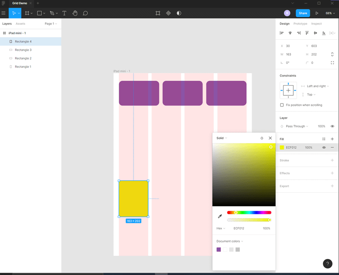
Step 8: Then add a rectangle and change the fill to some yellowish color
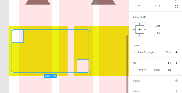
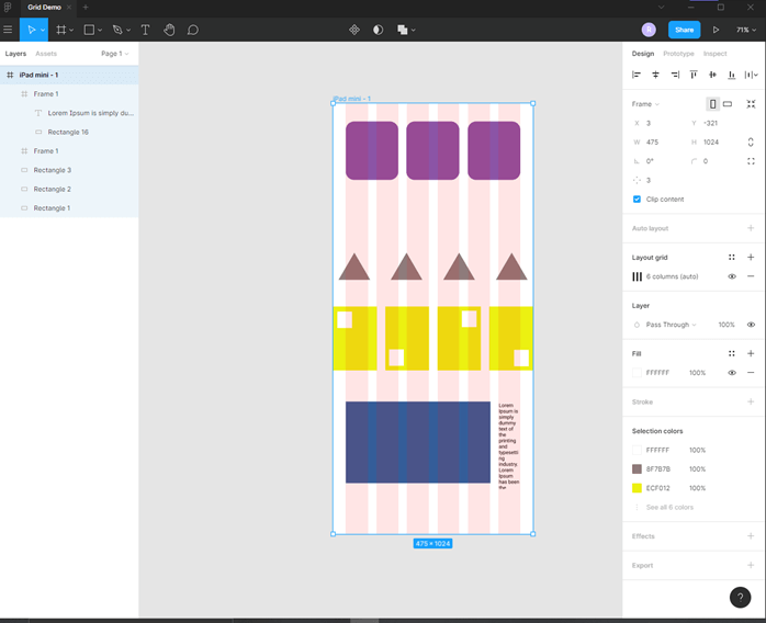
Step 9: Now add another two rectangles as shown and a triangle by using a polygon tool. Make sure that the small square is 10 px inside from top, bottom, or left, right. One trick is to use align left or align right using design panel, which will put them in the corner, then press shift and arrow keys to move as shown.
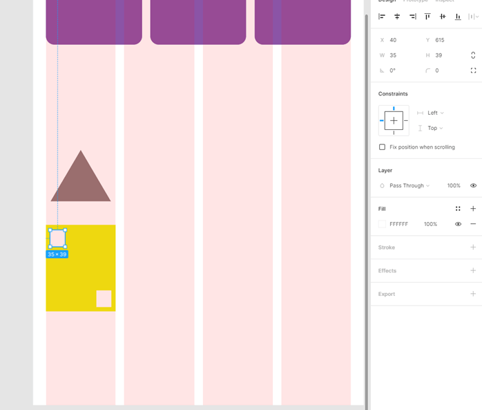
Step 10: Then, we have duplicated the rectangles and triangle on all 4 grids using the alt key and drag.
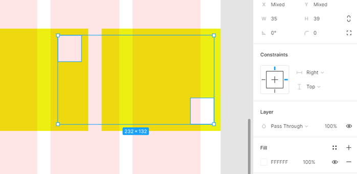
Step 11: Now resizing the mainframe, we see that the rectangles on top follow the grid positions and shrink uniformly, but the section in the middle does not because though we have specified 4 columns, but still the 6 column grid is applied
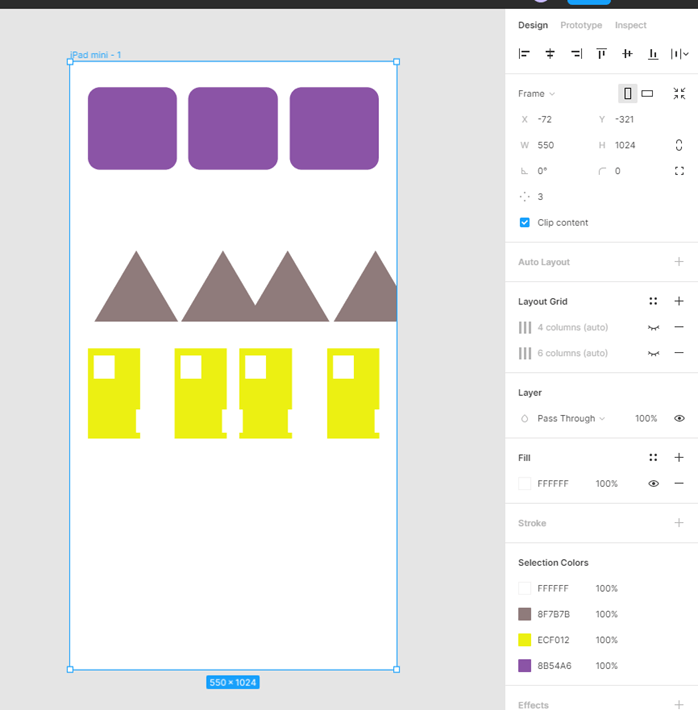
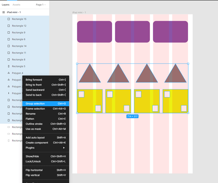
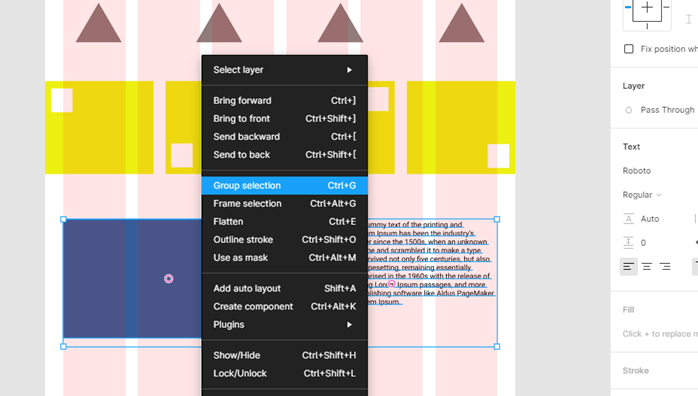
Step 12: To solve this, we will first select all the rectangles and triangles in the middle section. You can click and drag over the area to select all and then group the selection by right-clicking in the layers panel and Group selection or pressing Ctrl + G.
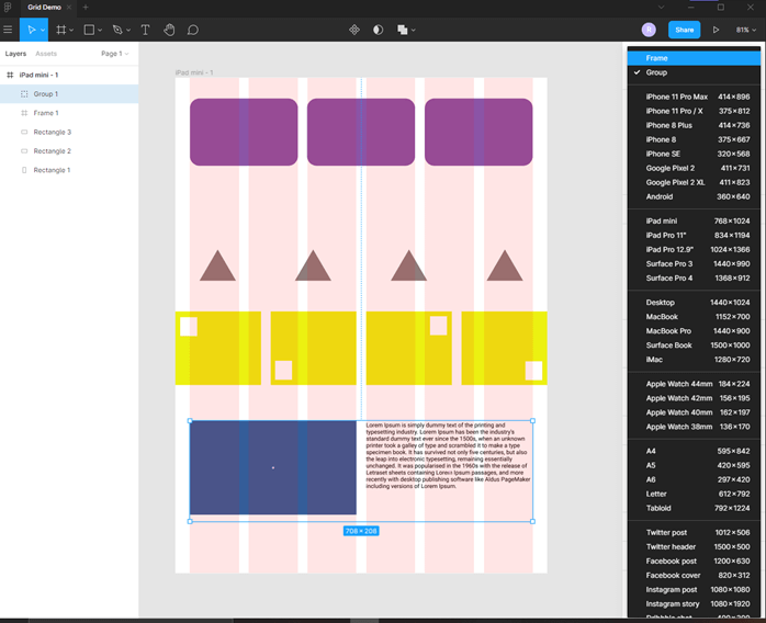
Step 13: Then, in the design panel, instead of Group, select a frame from the dropdown, which is just a custom frame with dimensions of the group.
Step 14: So now what we do is that we remove the 4 column layout grid from the mainframe using the design panel and click – on the layout grid section, which should keep you with only 6 column layout. Then add a layout grid of 4 columns to the frame, which we have just created with the margin of 0 px and the gutter of 20 px.
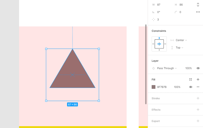
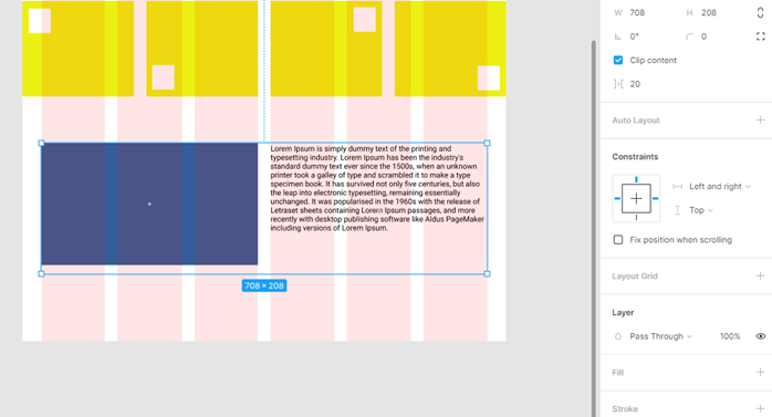
Step 15: Now, we can adjust this frame independent of the mainframe and drag it to span across the entire mainframe with no margin from the sides. Then resize the triangles by clicking alt and dragging the sides to scale from the center and also holding shift to ensure that the aspect ratio is not changed or distorted. Also, remove those extra small rectangles and arrange them as shown.
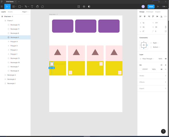
Step 16: The constraints for Triangle are Center, Top
Step 17: The constraints for the first two small rectangles are left, top as no matter what is the layout, we want them to stay left.
Step 18: The constraints for the last two small rectangles are right, top as no matter what is the layout, we want them to stay right.
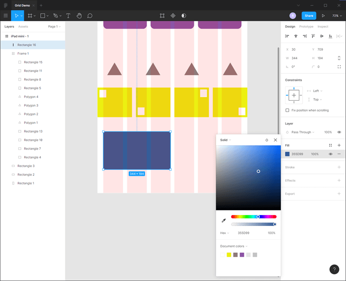
Step 19: Next, we create another rectangle spanning 3 grid as shown with left, top constraint.
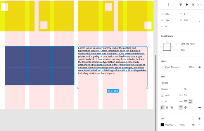
Step 20: Then select text tool or press T to create a textbox spanning 3 columns with left and right, top constraint, and paste some dummy lorem ipsum text inside it.
Step 21: Now, when we change the layout, the text is messed up with the rectangle as they are still trying to follow the 6 layout grid structure
Step 22: So press Ctrl + Z to change to the default dimension of the mainframe, then select both rectangle and text, then right-click to Group selection or press Ctrl + G
Step 23: Now again, change the group to frame
Step 24: Now, in this frame, we do not want any layout grid but what we want is to set the constraint of the frame to left and right, top.
Step 25: Now, if we resize the mainframe, then the rectangle is in the proper place, and the text reflows as it should.
Step 26: Now, to quickly test our prototype on multiple devices, we just add create a new frame and set the layout grid the same as the first one.
Step 27: Then paste the first frame on the second and then drag to fit this layout. I might need to adjust some shapes to fit the grid.
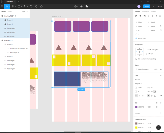
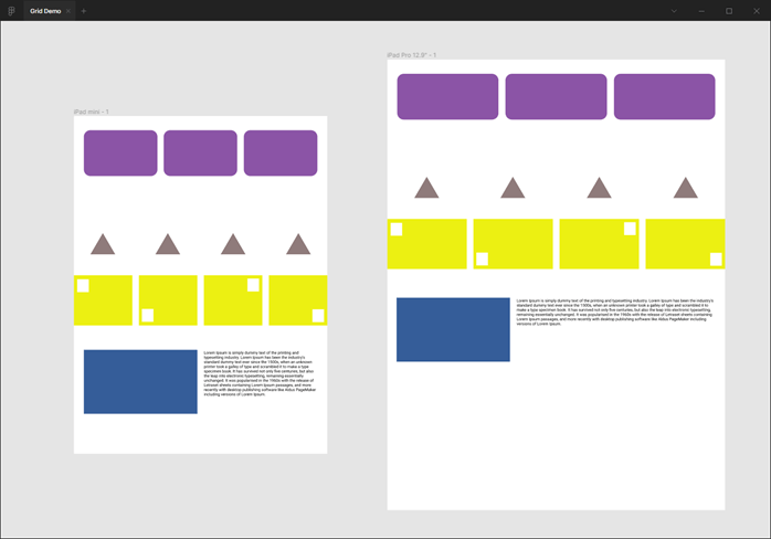
Step 28: We can see that our design is fully responsive and have adapted this new form factor.
Conclusion
In this article, we have learned how we use the grid in Figma. First, we have started with a simple frame, and then we created a grid and added all the objects and shapes using multiple grid layout and frames to create a cohesive design which respects the different aspect size and aspect ratio of the screen.
Recommended Articles
This is a guide to the Figma grid. Here we discuss how we use the grid in Figma, and then we created a grid and added all the objects and shapes. You may also have a look at the following articles to learn more –
