Updated August 24, 2023

What is a 3D Scatter Plot in Excel?
In this article, we will learn about 3D Scatter Plot in Excel. A scatter plot is a graph or chart used for data visualization and interpretation using dots to represent the values for two variables- one plotted along the x-axis (horizontal axis) and the other plotted along the y-axis (vertical axis). Scatter plots are generally used to show a graphical relationship between two variables.
Scatter plots are interpreted as follows:
- The scatter chart’s points appear randomly scattered on the coordinate plane if the two variables are not correlated.
- If the dots or points on the scatter chart are widely spread, then the relationship or correlation between the variables is said to be weak.
- If the dots or points on the scatter chart are concentrated around a line, then the relationship or correlation between the variables is strong.
- If the pattern of dots or data points slopes from lower left to upper right, the correlation between the two datasets is positive.
- If the pattern of dots or data points slopes from the upper left to the lower right, the correlation between the two datasets is negative.
In Excel, a scatter plot is also called the XY chart, as it uses the Cartesian axes or coordinates to display values for two data sets. These two data sets are shown graphically in Excel with the help of a “Scatter Plot Chart”. This article will show how to create a “3D Scatter Plot” in Excel.
How to Create a 3D Scatter Plot in Excel?
Let’s understand how to create the 3D Scatter Plot in Excel with some examples.
Example #1
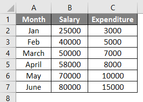
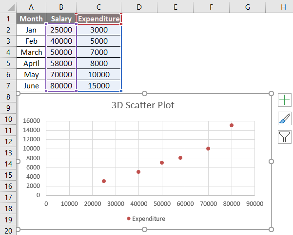
Let us say we have an interrelated dataset of different monthly salaries and monthly expenditures in those particular months. We can plot the relationship between these two datasets via a Scattered Plot Chart.
We have the following monthly salaries and expenditures in an Excel sheet:
The following steps can be used to create a scattered plot chart for the above data in Excel.
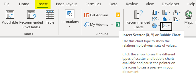
- Select the dataset -> Click on the ‘Insert’ tab -> Choose ‘Scattered Chart’.
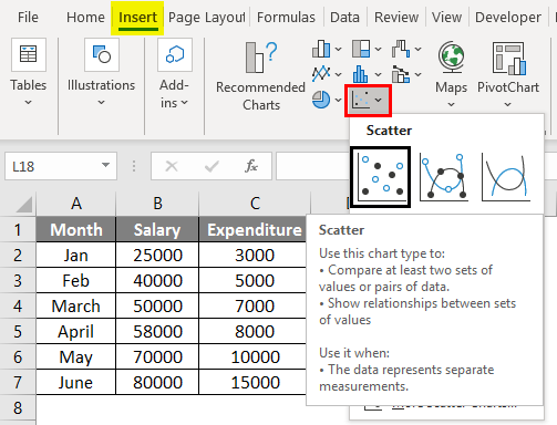
- Then click the Scatter chart icon, and select the desired template.
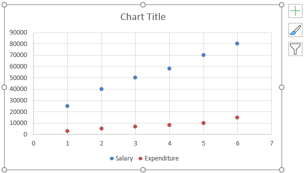
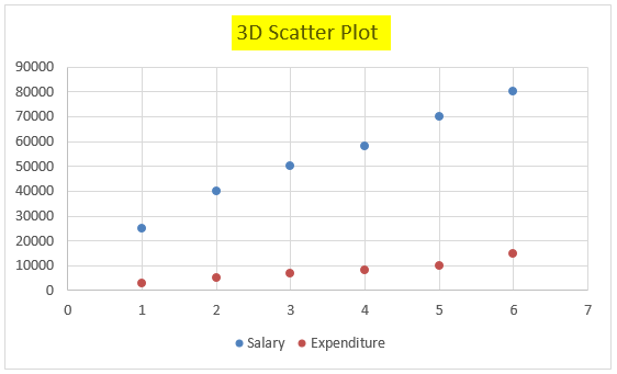
- This will plot the chart as follows:
- Change the chart title by double-clicking on it and renaming it:
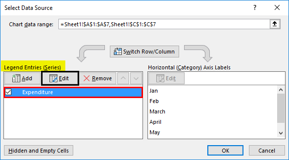
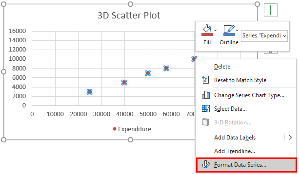
- Now right-click on this scatter chart and click on ‘Select Data’ as below:
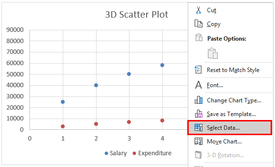
- On doing this, a popup window will appear as follows:
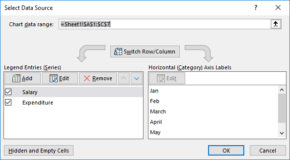
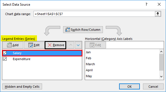
- Select ‘Salary’ in the ‘Legend Entries (Series)’ section in this window, and then click on ‘Remove’:
- Now select ‘Expenditure’ in the ‘Legend Entries (Series)’ section in this window, and then click on ‘Edit
- A popup window for Edit Series appears as follows:
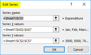
- Now select the ‘Salary’ range for ‘Series X values’ and click on OK as shown in this window:
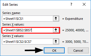
- This will generate a Scatter plot as below:
- Now right-click on any of the dots represented as data points and select ‘Format Data Series.
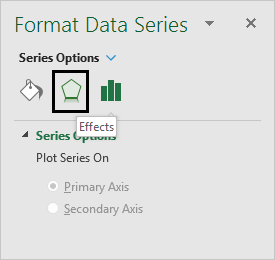
- This will open the ‘Format Data Series dialog box. Now click on ‘Effects’ and then select ‘3-D Format.’
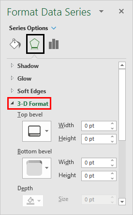
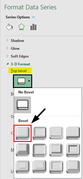
- Now select ‘circle’ type top bevel in the expansion of ‘3-D Format.’
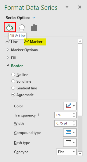
- Now select ‘Fill & Line’ in the ‘Format Data Series’ and click ‘Marker.’
- Under the ‘Marker’ section, expand the ‘Fill’ option and then select ‘Vary colors by point’ as below:
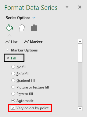
Choosing this option will give different colors to each data point or dot.
- Now under the ‘Marker’ section, expand ‘Marker Options’ and then select ‘Built-in’ and increase the size as below:
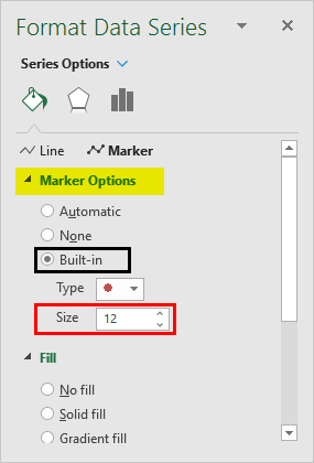
This will increase the size of the dots or data points.
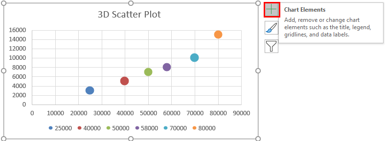
- Now click on the ‘Plus’ icon on the right of the chart to open the ‘Chart Elements’ dialog box:
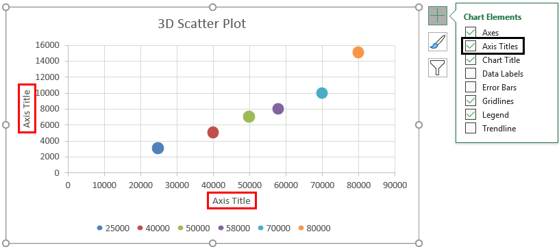
- Now select ‘Axis Titles’. This would create an ‘Axis Title’ textbox on a horizontal and vertical axis (x and y-axis).
- Now we rename the horizontal and vertical axes (x and y-axis) ‘Salary’ and ‘Expenditure’, respectively.
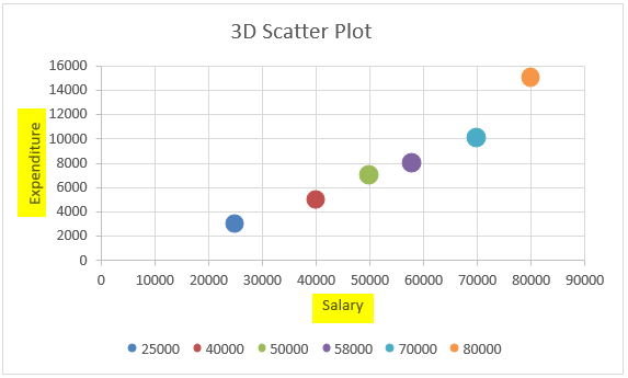
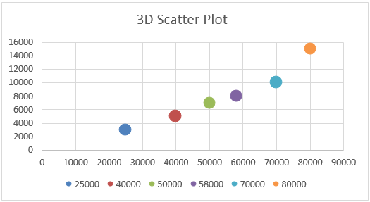
So this is the 3-D scattered plot chart for ‘Salary versus Expenditure’. Now let us see how we can interpret this for the two given datasets:
We can see from the chart that when the salary is 25,000 for the month of ‘January’, expenditure is 3,000. Similarly, when the salary is 30,000 for the month of ‘February, expenditure is 5,000. So when the two datasets are seen in this manner, we find that the two datasets are related to each other, as when salary increases, expenditure also increases. Also, since the data points or dots are concentrated around a line (linear), we can say that the relationship between these two datasets appears to be strong.
Things to Remember About 3D Scatter Plots in Excel
- Scatter plots show the extent of correlation between two variables, i.e., how one variable is affected by the other.
- Scatter plots may even include a trendline and equation over the points to help make the variables’ relationship more clear.
- An outlier on a Scatter plot indicates that the outlier or that data point is from some other data set. Scatter Plot is a built-in chart in Excel.
- A Scatter plot matrix shows all pairwise scatter plots of the two variables on a single view with multiple scatterplots in a matrix format.
Recommended Articles
This is a guide to 3D Scatter Plot in Excel. Here we have also discussed how to create a 3D Scatter Plot in Excel, practical examples, and a downloadable Excel template. You can also go through our other suggested articles –
