Updated June 22, 2023
Introduction to Sticky Sidebar CSS
A sticky Sidebar in CSS is used when the sidebar wants to fix at a specific position, even if the page scrolls down to the bottom or up to the top. It means the sidebar is always fixed on any side. Now a day’s sticky sidebar feature has almost all the websites because it is very difficult to select the different options from the sidebar when we scroll down the entire page. To access sidebar elements, we must go to the top again and select the option. It will kill user time. Therefore, developers come up with a sticky sidebar.
Advantage:
- Easily access sidebar elements.
Why CSS over HTML?
- Suppose we have 1000 pages with the same styles as all the 1000-page elements. Writing the same logic 1000 times in programming languages is not recommended because it significantly impacts processing time and efficiency.
- Instead of writing common logic 1000 times, we can use Cascading Style Sheets(CSS) to write common logic in a single place and invoke a CSS file in an HTML file.
Invoking CSS file in HTML:
- <link rel= “stylesheet” href=” Styles.css”> By using this link, we can invoke all CSS styles to the HTML page.
How to Create a Sticky Sidebar in CSS?
In CSS Sidebar can be sticky by using a position attribute with fixed. Please refer below Syntax for a better understanding.
Syntax:
HTML Page Code
<!-- Side Bar elements -->
<div class="sideBar">
<a href="#">Name1</a>
<a href="#">Name2</a>
<a href="#">Name3</a>
<a href="#">Name4</a>
<a href="#">Name5</a>
<a href="#">Name6</a>
.
.
.
.
</div>
<!-- Main content of the page-->
<div class="main">
//some code
</div>
CSS Code
.sidBar {
position: fixed; /* Make the sidebar immovable*/
z-index: 1; /* Side bar stays at the top */
top: 0;
left: 0;
overflow-x: hidden; /* restricting horizontal scroll */
}
Examples of Sticky Sidebars in CSS
Here are examples of a sticky sidebar in CSS:
Example #1 – Sticky Sidebar
Code:
<!DOCTYPE html>
<html>
<head>
<meta charset="ISO-8859-1">
<title>Sticky SideBar</title>
<style>
h2 {
color: brown;
}
.sideBar {
height: 100%;
width: 150px;
overflow-x: hidden;
padding-top: 22px;
position: fixed;
z-index: 1;
top: 0;
left: 0;
background-color: green;
padding-top: 22px;
}
body {
font-family: fantasy;
}
.content {
margin-left: 160px; /* Same as the width of the side bar */
font-size: 20px;
padding: 0px 8px;
border: 1px;
border-color: blue;
border-style: solid;
}
.sideBar a {
padding: 5px 7px 5px 15px;
color: blue;
text-decoration: none;
font-size: 24px;
display: block; /* is not allowing to have other block of elements inside the element */
}
.sideBar a:hover {
color: brown;
}
@media screen and (max-height: 500px) {
.sideBar {
padding-top: 14px;
}
.sideBar a {
font-size: 17px;
}
}
</style>
</head>
<body>
<div class="sideBar">
<a href="#">Login</a>
<a href="#">Register</a>
<a href="#">Purchase</a>
<a href="#">Order</a>
</div>
<div class="content">
<h2>Side Bar Demo</h2>
<p>Sticky Sidebar in CSS used when sidebar wants to fix at the
specific position even page scroll down to the bottom or scroll up to
the top. It means sidebar always fixed at any side.
<p>Now a days sticky sidebar feature has almost all the websites
because it is very difficult to select the different options from
sidebar when we scroll down to the entire the page.</p>
<p>If we want to access sidebar elements, then we must go to top
again and select the option. It will kill user time therefore
developers come up with sticky sidebar concept in CSS.</p>
</div>
</body>
</html>
Output:


Code Explanation: As you can see in the above example, the sidebar remains fixed before and after scrolling, indicating that we have successfully achieved our requirement.
Example #2 – With Buttons
Code:
<!DOCTYPE html>
<html>
<head>
<title>Sticky SideBar</title>
<style>
h2 {
color: brown;
}
.sideBar {
height: 100%;
width: 150px;
overflow-x: hidden;
padding-top: 22px;
position: fixed;
z-index: 1;
top: 0;
left: 0;
background-color: green;
padding-top: 22px;
}
body {
font-family: fantasy;
}
.content {
margin-left: 160px; /* Same as the width of the side bar */
font-size: 20px;
padding: 0px 8px;
border: 1px;
border-color: blue;
border-style: solid;
}
.sideBar button {
padding: 5px 7px 5px 15px;
color: blue;
text-decoration: none;
font-size: 24px;
display: block; /* is not allowing to have other block of elements inside the element */
}
.sideBar button:hover {
color: brown;
}
@media screen and (max-height: 500px) {
.sideBar {
padding-top: 14px;
}
.sideBar button {
font-size: 17px;
}
}
</style>
</head>
<body>
<div class="sideBar">
<button>EDUCBA</button>
<button>Courses</button>
<button>Hot Courses</button>
<button>Login</button>
<button>Register</button>
<button>Course Fee</button>
<button>Contact</button>
</div>
<div class="content">
<h2>Side Bar with Buttons</h2>
<p>Sticky Sidebar in CSS used when sidebar wants to fix at the
specific position even page scroll down to the bottom or scroll up to
the top. It means sidebar always fixed at any side.
<p>Now a days sticky sidebar feature has almost all the websites
because it is very difficult to select the different options from
sidebar when we scroll down to the entire the page.</p>
<p>If we want to access sidebar elements, then we must go to top
again and select the option. It will kill user time therefore
developers come up with sticky sidebar concept in CSS.</p>
</div>
</body>
</html>
Output:


Code Explanation: As you can see in the above example, the sidebar remains fixed before and after scrolling, indicating that we have successfully achieved our requirement.
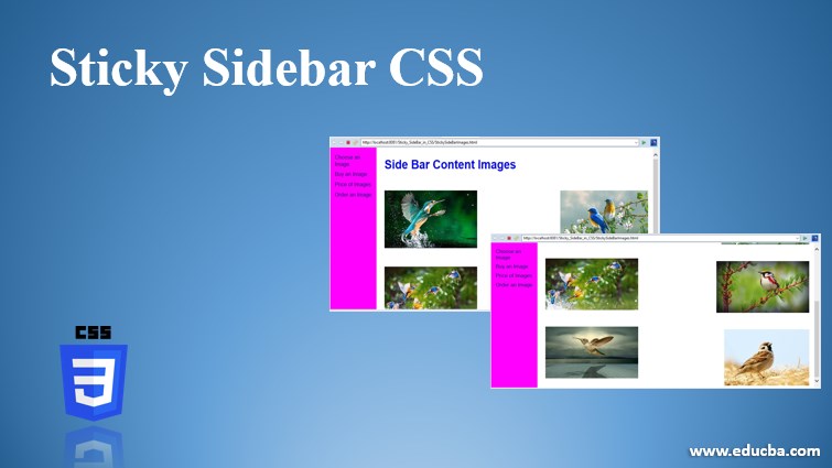
Example #3 – Sticky Sidebar and Images
Code:
<!DOCTYPE html>
<html>
<head>
<meta charset="ISO-8859-1">
<title>Sticky SideBar</title>
<link rel="stylesheet" href="StickySideBarImages.css">
</head>
<body>
<div class="sideBar">
<a href="#">Choose an Image</a>
<a href="#">Buy an Image</a>
<a href="#">Price of Images</a>
<a href="#">Order an Image</a>
</div>
<div class="content">
<h2>Side Bar Content Images</h2>
<p class="a"><img src="1.jpg"></p>
<p class="b"><img src="2.jpg"></p>
<p class="c"><img src="3.jpg"></p>
<p class="d"><img src="4.jpg"></p>
<p class="e"><img src="5.jpg"></p>
<p class="f"><img src="6.jpg"></p>
</div>
</body>
</html>
CSS Code: StickySideBarImages.css
h2 {
color: blue;
}
.sideBar {
height: 100%;
width: 150px;
overflow-x: hidden;
padding-top: 22px;
position: fixed;
z-index: 1;
top: 0;
left: 0;
background-color: fuchsia;
padding-top: 22px;
}
body {
font-family: sans-serif;
}
.a
{
float: left;
}
.b
{
float: right;
}
.c
{
float: left;
}
.d
{
float: right;
}
.e
{
float: left;
}
.f
{
float: right;
}
.content {
margin-left: 160px; /* Same as the width of the side bar */
font-size: 24px;
padding: 0px 8px;
}
.sideBar a {
padding: 5px 7px 5px 15px;
color: navy;
text-decoration: none;
font-size: 24px;
display: block; /* is not allowing to have other block of elements inside the element */
}
.sideBar a:hover {
color: lime;
}
@media screen and (max-height: 500px) {
.sideBar {
padding-top: 14px;
}
.sideBar a {
font-size: 17px;
}
}
Output:


Code Explanation: As seen in the above example, the sidebar remains fixed before and after, fulfilling our requirements.
Recommended Articles
We hope that this EDUCBA information on “Sticky Sidebar CSS” was beneficial to you. You can view EDUCBA’s recommended articles for more information.

