Updated March 6, 2023
Introduction to Seaborn Scatter Plot
The following article provides an outline for Seaborn Scatter Plot. A scatter plot is a simple way of displaying the number of clusters in the graph. A scatter plot indicates the relationship between number of clusters that are closer together than the other clusters. Scatter plot is a data visualization technique that is used to display the relationships between attributes.
Creating Seaborn Scatter Plot
A scatter plot is a visualization method used for to compare the values of the two variables with respect to some criterion. The scatter plot includes several different values. Each dot in the scatter plot represents one occurrence (or measurement) of a data item in the data set in which the data is being analyzed. This is because a scatter plot represents the total number of occurrences (or measurements) divided by the total number of attributes (or measurements).
Seaborn is built on top of Python’s core visualization library Matplotlib. It allows developers to plot a graphical visualization using Python’s plotting language, and the code includes a tool to load it into R or Matplotlib. You can also use the data to understand how data is used, to understand your analytics project’s business or to gain a deep understanding of the different ways customers generate data. You can start by exploring the data using Pandas.
We have created multiple scatter plots using the seaborn library with different data sets.
Example #1
Syntax:
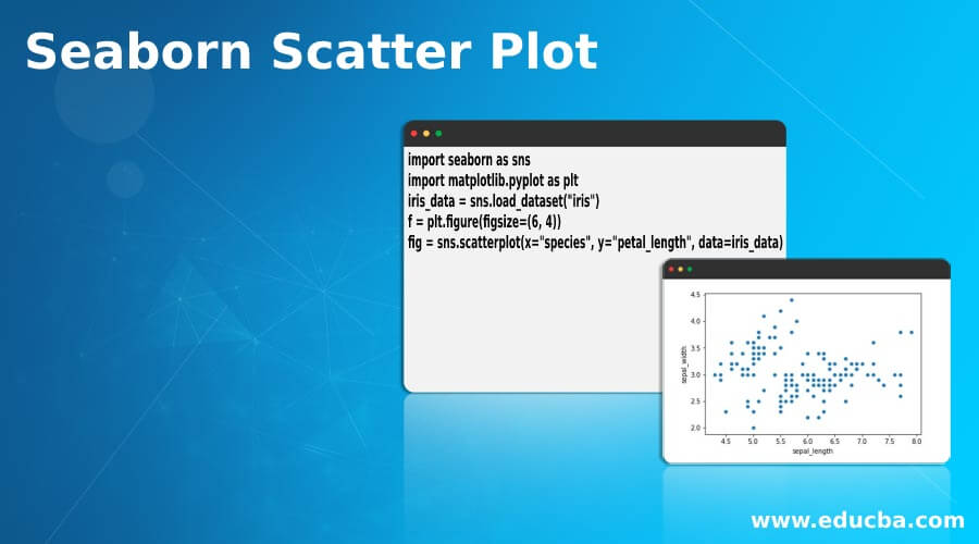
import seaborn as sns
import matplotlib.pyplot as plt
iris_data = sns.load_dataset("iris")
f = plt.figure(figsize=(6, 4))
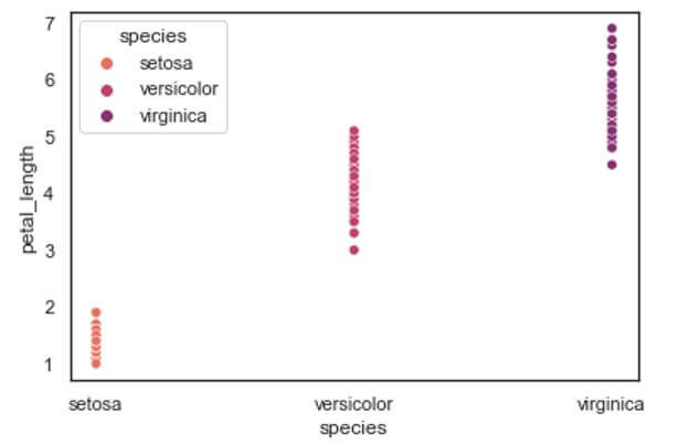
fig = sns.scatterplot(x="species", y="petal_length", data=iris_data)Output:
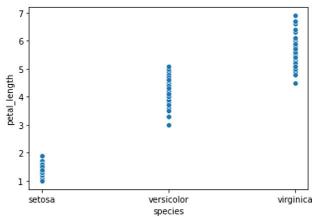
In the above example we have loaded the iris data set which represents the iris flower’s physical characteristics such as its sepal length, sepal width, petal length and petal width for three different species of the iris flower. We have created a scatter plot using seaborn sns.scatterplot with plotting the petal length of the given three species of the iris flower from the data set. We can see the significant difference between the petal length of the three species of the flowers where the petal length of setosa species is considerably smaller than the petal length of the other two species.
Example #2
Syntax:
import seaborn as sns
import matplotlib.pyplot as plt
iris_data = sns.load_dataset("iris")
f = plt.figure(figsize=(6, 4))
fig = sns.scatterplot(x="sepal_length", y="sepal_width", data=iris_data)
Output:
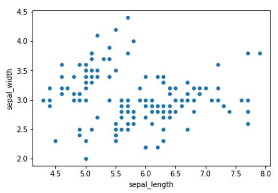
In this example we have plotted the scatter plot of two features of the iris flower namely sepal width and sepal length. Here we can see there is a wide range of points distributed along the x and y axis. For identifying individual data points of three different species we can use an attribute ‘hue’ from the seaborn library where it differentiate the categorical variable by applying different colors to them for identifying the characteristics of individual variable.
Example #3
Code:
import seaborn as sns
import matplotlib.pyplot as plt
iris_data = sns.load_dataset("iris")
f = plt.figure(figsize=(6,4))
fig = sns.scatterplot(x="sepal_length", y="sepal_width", hue = 'species', data=iris_data)
Output:
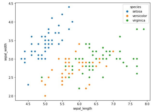
In the above example we have used a feature in seaborn scatterplot known as ‘hue’ which allows us to plot categories from a variable of the bar plot. We can use this feature to plot the categories inside the categorical variable. We have plotted the relationship between the sepal length and sepal width of different species of the flowers. Hue parameter allows us to individually plot the categorical values in separate colors.
Example #4
Syntax:
import seaborn as sns
import matplotlib.pyplot as plt
iris_data = sns.load_dataset("iris")
f = plt.figure(figsize=(6, 4))
fig = sns.scatterplot(x="species", y="petal_length", hue='species', palette="flare", data=iris_data)
Output:
In the above example we have plotted the scatterplot with unique color palette using the palette parameter. This parameter allows us to plot the categorical variable in an increasing color tone where the categories are represented form lighter to a darker tone in ascending order of the numerically greater aggregate variable. Here virginica species has greater petal length compared to the rest of the species so it is represented in the darkest tone while days that received correspondingly lesser petal length species are represented in consequent lighter tones.
Example #5
Syntax:
import seaborn as sns
import matplotlib.pyplot as plt
iris_data = sns.load_dataset("iris")
f = plt.figure(figsize=(8, 6))
fig = sns.scatterplot(x="sepal_width", y="petal_length", size="sepal_length", hue ='species', palette="muted", sizes=(40, 200) , data=iris_data)
Output:
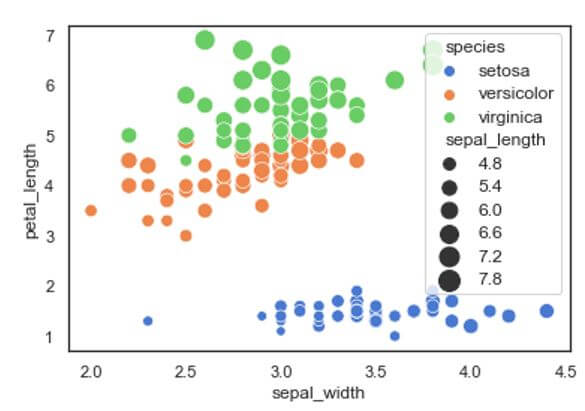
In this example we have plotted the sepal width in x-axis and petal length in y-axis for the three different species of the iris flowers. We have used a special attribute known as “sizes” to differentiate the scatter points or bubbles according to the sepal length of different species. Here we can see that the scatter points or the bubbles plotted would vary from larger to smaller in size according to the sepal length of the species. By giving the sizes attribute we can able to clearly identify the differentiation between the variables using a single feature or characteristic. The corresponding sizes of the sepal length is also shown in the legend section of the scatter plot.
Example #6
Syntax:
import seaborn as sns
import matplotlib.pyplot as plt
iris_data = sns.load_dataset("iris")
f = plt.figure(figsize=(8, 6))
fig = sns.scatterplot(x="sepal_width", y="petal_length", size="sepal_length", hue ='species', palette="muted", sizes=(40, 200) , marker="x", alpha=.6, data=iris_data)
Output:
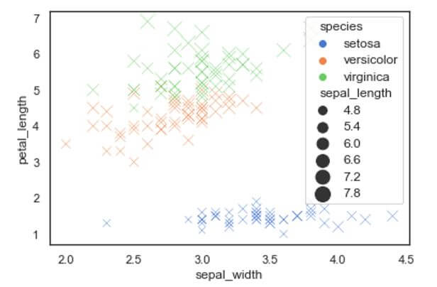
We can also change the scatter point design to our desired shapes by using the attribute “marker”. In the market attribute we can give the shape of the scatter points we wanted in the example we have used “x” mark to mark the points. Also another attribute known as “alpha” is used to show the Proportional opacity of the different points.
Seaborn comes with some very important features. First, the framework offers a very lightweight framework for building and developing distributed applications and infrastructure. Its power comes from the large number of modules, which are easy to maintain and use. Second, the package is very large, mainly based on python modules which are very widely used and widely tested. Finally, the package also supports writing the code in different programming languages (such as C, C#, Java, Python, PHP, and R).
Conclusion
In this article we saw about the seaborn bar plot with various examples. We have plotted various bar plots using seaborn library and numpy library and demonstrated different attributes and parameters to the barplot function. Seaborn is an open source library used in python programming language. It provides high quality API for data visualization. It consists of modules representing data streams, operations and data manipulation. Seaborn library along with Matplotlib is widely used around the data science community.
Recommended Articles
This is a guide to Seaborn Scatter Plot. Here we discuss the introduction and creating seaborn scatter plot respectively. You may also have a look at the following articles to learn more –
