Updated August 24, 2023
Scatter Chart in Excel
A scatter chart in Excel is normally called an X and Y graph, also called a scatter diagram, with a two-dimensional chart showing the relationship between two variables. The scatter chart shows that both horizontal and vertical axes indicated numeric values that plot numeric data in Excel.
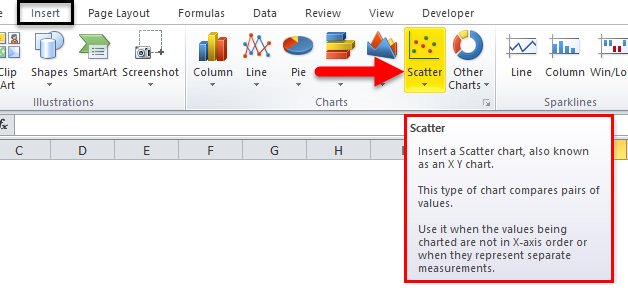
The scatter charts in Excel under the INSERT menu CHART group are shown in the screenshot below.
In Excel, we have a list of scatter charts listed below.
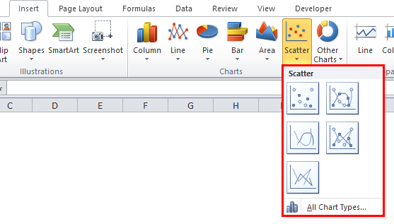
- Scatter with only Markers.
- Scatter with Smooth Lines and Markers.
- Scatter with Smooth Lines.
- Scatter with Straight Lines and Markers.
- Scatter with Straight Lines.
We will see the above mentioned scatter chart with a clear example where all the above graphs need X and Y values to display it.
How to Create a Scatter Chart in Excel?
Scatter Chart in Excel is very simple and easy to create. Let us now see how to create Scatter Chart in Excel with the help of some examples.
Example #1 – Using Scatter Chart with only Markers
In this example, we will see how to apply to an Excel scatter chart with only Markers using the example below.
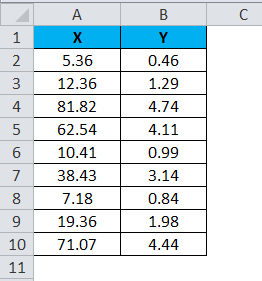
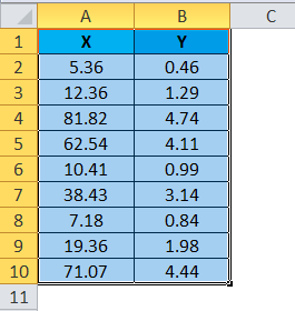
Consider the table below, which has random X and Y values.
To apply the scatter chart using the above figure, follow the steps below.
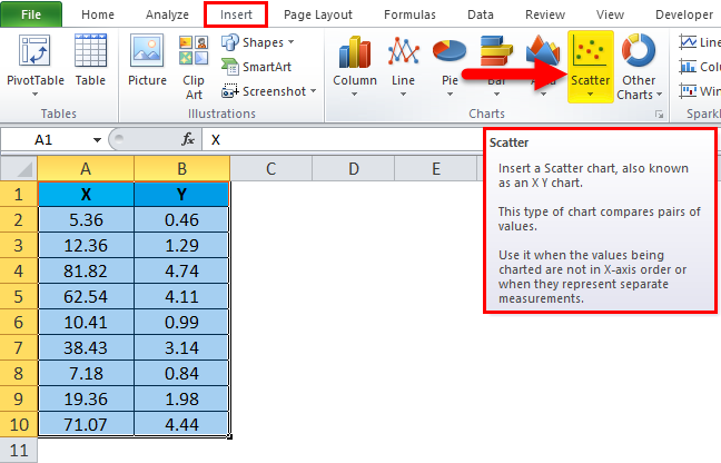
Step 1 – First, select the X and Y columns as shown below.
Step 2 – Go to the Insert menu and select the Scatter Chart.
Step 3 – Click on the down arrow so that we will get the scatter chart list shown below.
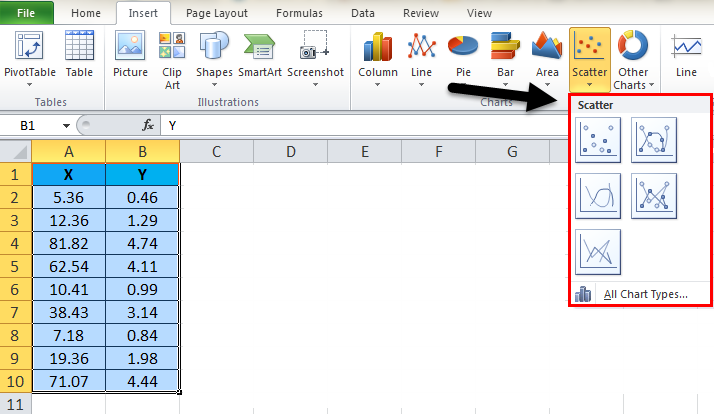
Step 4 – Select the first option, which shows Scatter with only Markers.
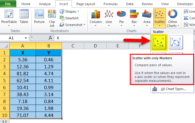
So that the selected numeric values will be displayed in markers, as shown in the result below.
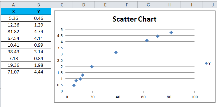
We can see that X and Y values lie between the exact figure with dots in the above result. For example, the X value of 38.43 exactly lies with the Y value of 3.14.
Example #2 – Using Scatter Chart with Smooth Lines and Markers
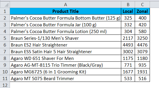
This example shows how to apply the scatter chart with a smooth line and markers. Consider the below example, which shows sales value with local and zonal.
Assume that we need to compare the sales of local and zonal locations. In such a case, we can use Excel scatter chat to give us the exact result to compare it, and we can apply the Scatter Chart with Smooth Lines and Markers by following the steps below.
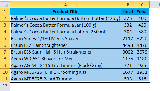
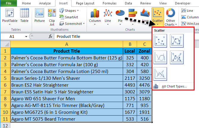
Step 1 – First, select the entire column cell A, B, and Product Title, Local and Zonal, as shown below.
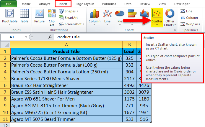
Step 2 – Now go to the Insert menu and select the Scatter chart as shown below.
Step 3 – Click the down arrow to get a list of scatter charts, as shown below.
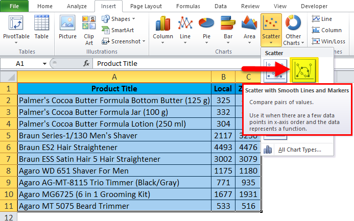
Step 4 – Click on the second scatter chart called Scatter with smooth lines and markers.
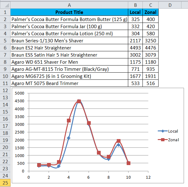
Once we select the specific chart, we will get the output result below.
In the below scatter chart, we can easily compare the sales figure, which shows up’s and downs depending on the sales value.
Also, we can check the scatter chart by placing the cursor on the dots so that Excel will display the X and Y values, as shown below.
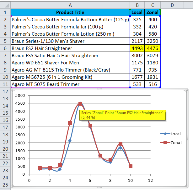
As we can see in the above screenshot, the local and zonal sales values are almost close to the product name “Braun ES2 Hair Straightener”, which shows the dotted line with the same merge as shown above.
Example #3 – Using Scatter Chart with smooth Lines
In this example, we will see how to apply the Excel scatter chart with lines using the below example.
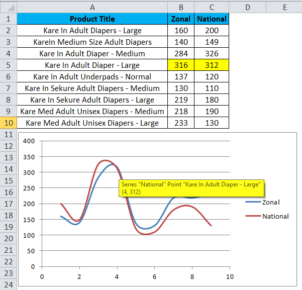
Consider the below sales dump data showing Zonal and National wise sales values.
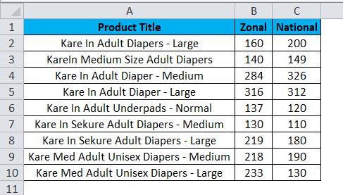
Using the above figure, we can compare the sales for Zonal and National using the scatter chart with smooth lines by following the steps below.
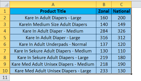
Step 1 – First, select the entire column cell A, B, and C named Product Title, Zonal, and National, as shown below.
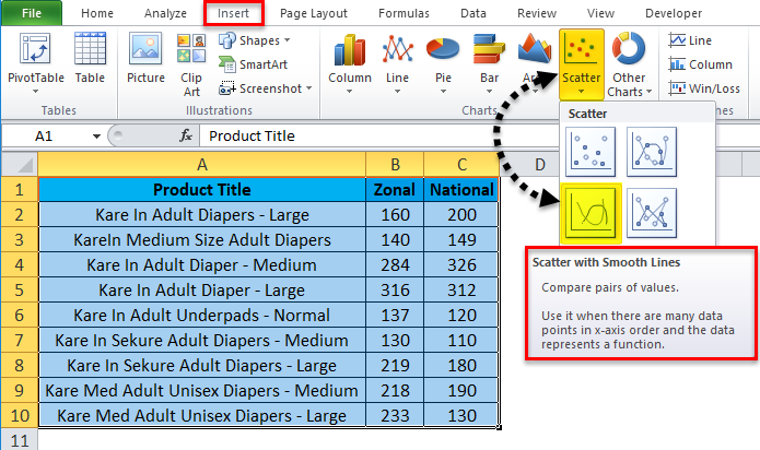
Step 2 – Go to the Insert menu and select Scatter chart with smooth lines, as shown below.
Once we click on the scatter chart with smooth lines, we will get the output chart below. The result below shows a scatter chart with smooth lines, which shows the comparison result for the zonal and national wise sales.
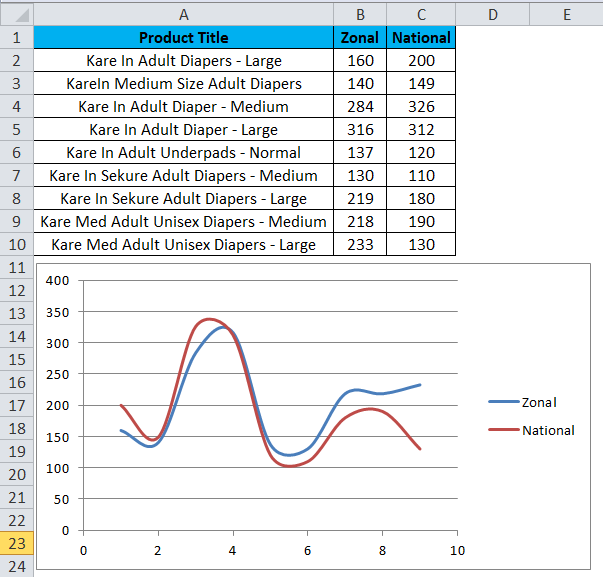
As we can check from the above screenshot, the Zonal, and National Sales lines merges exactly with the Zonal sales values as 316 and National as 312, shown below.
Example #4 – Using Scatter Chart with Straight Lines and Markers
This example shows how to apply an excel Scatter chart with a straight line and markers with the below example.
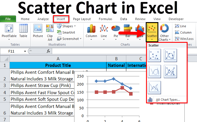
Consider the below figure, which shows sales data nationally and internationally wise. Here we can compare the sales using the scatter chart with straight lines and markers by following the steps below.
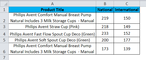
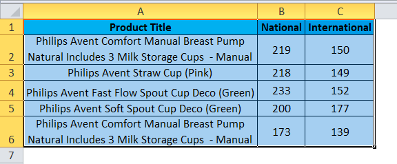
Step 1 – First, select the entire column cell A, B, and C named Product Title, National, and International.
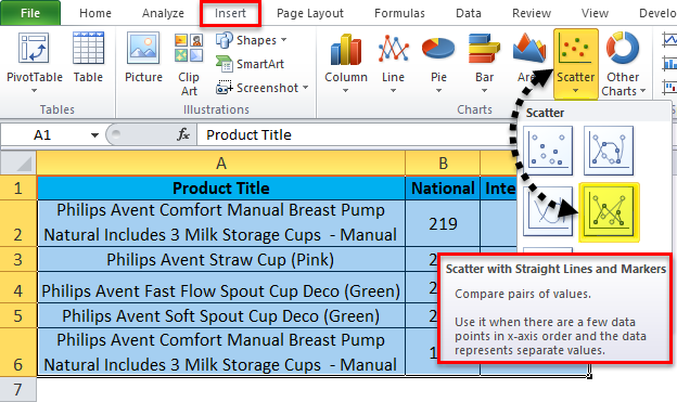
Step 2 – Go to the Insert menu and select the Scatter with straight lines and markers, as shown below.
We will get the result below once we click on the scatter chart with straight lines and markers.
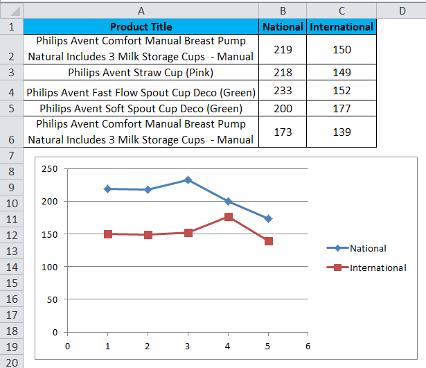
In the above screenshot, we can see the scatter chart with a straight line and markers which shows ups and down where international sales are high at 177 for the product “Philips Avent Soft Spout Cup Deco (Green)” and National sales is high at 233 for the product “Philips Avent Fast Flow Spout Cup Deco (Green).”
Things to Remember
- While using a scatter chart, always use X and Y values correctly, or else we will not get the exact chart.
- We cannot apply the scatter chart with only one value; it needs both X and Y values to display in Excel.
Recommended Articles
This has been a guide to Scatter Charts in Excel. Here we discuss how to create a Scatter Chart in Excel, along with Excel examples and a downloadable Excel template. You may also look at these suggested articles –
