Updated May 19, 2023

Introduction of React Native Linear Gradient
Linear Gradient is a way of creating an image that transitions between different colors. Linear Gradients can fill lines, rectangles, texts, circles, images, etc. Although React Native does not directly support linear gradients, we can still use a library called react native linear gradient to add linear gradients to our projects. React Native has different components and ways to implement a linear gradient. A linear gradient is easy to make in react native without needing extra dependencies.
Syntax
Below are the syntax mentioned:
1. Basic Linear Gradient
<LinearGradient
colors={[' #ed83f2', ' #dafc74', ' #ed4a7b']}
style={styles.linearGradient}>
<Text style={styles.buttonText}>
Basic Linear Gradient Syntax
</Text>
</LinearGradient>
2. Horizontal Linear Gradient
<LinearGradient
start={{x: 1, y: 0}}
end={{x: 0, y: 0}}
colors={['#ed83f2', '#dafc74', '#ed4a7b'']}
style={styles.linearGradient}>
<Text style={styles.buttonText}>
Horizontal Linear Gradient Syntax
</Text>
</LinearGradient>
3. Location Linear Gradient
<LinearGradient
start={{x: 0.0, y: 0.35}}
end={{x: 0.6, y: 2.0}}
locations={[0,0.5,0.6]}
colors={['#ed83f2', '#dafc74', '#ed4a7b'']}
style={styles.linearGradient}>
<Text style={styles.buttonText}>
Location Linear Gradient Syntax
</Text>
</LinearGradient>
Working of React Native Linear Gradient
Linear Gradient can be created using the props described below:
- Colors: This defines an array of multiple colors which displays the gradient. Example: [‘Yellow,’ ‘cyan’] shows the gradient from yellow to cyan.
- start: This object defines the starting coordinates of the gradient in the following way: {x:number,y:number}. The coordinates set the position where the gradient will start. It is written as a fraction of the complete gradient’s size and starts from the top left corner. Example:{x:0.2,y:0.2} defines the gradient to start at 20% from the top and 20% from the left corner.
- end: It works just like the start; the only difference is that it defines the gradient’s end.
- locations: This defines where each gradient color will change or stop. It maps to the colors synced with the colors prop. Example: [0.2,0.5,1] illustrates the first color to start from 0% to 20%, then the second color begins from 20% and ends at 50%, and now the last color will take the rest of the gradient left. These props will be enough to start with Linear Gradient.
Examples
Following are the examples given below:
Example #1
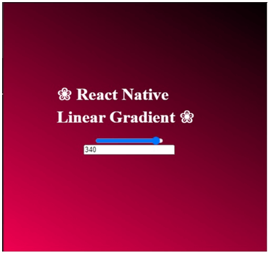
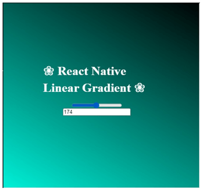
Example with Range Slider & Percentage window:
In the example below, one changes the color using the range slider, which moves from 0 to 360, or editing the range in the percentage box below the range slider. The linear horizontal gradients are already been set up within the code. One changes the gradients by editing the below code according to one’s needs.
The files used to implement the code below are:
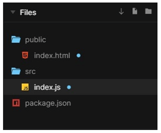
1. index.html
<!DOCTYPE html>
<html lang="en">
<head>
<meta charset="utf-8">
<meta name="viewport" content="width=device-width, initial-scale=1, shrink-to-fit=no">
<meta name="theme-color" content="#050505">
<link rel="manifest" href="%PUBLIC_URL%/manifest.json">
<link rel="shortcut icon" href="%PUBLIC_URL%/favicon.ico">
<title>React Native Linear Gradient App</title>
</head>
<body>
<noscript>
To run application, enable JavaScript.
</noscript>
<div id="root"></div>
</body>
</html>
2. index.js
import React from "react";
import ReactDOM from "react-dom";
import styled
, { createGlobalStyle } from "styled-components";
const Reset = createGlobalStyle`
* {
margin: 0;
padding: 0;
}
`;
constFullScreen = styled.div`
height: 101vh;
width: 101vw;
`;
const Gradient = styled.div`
background: linear-gradient(
30deg,
hsl(${props =>props.hue}, 120%, 50%),
hsl(${props =>props.hue - 305}, 120%, 0%)
);
height: 105%;
width: 99%;
`;
constCentered = styled.div`
position: absolute;
top: 45%;
left: 45%;
transform: translateX(-45%) translateY(-45%);
display: flex;
align-items: center;
justify-content: center;
flex-direction: column;
`;
constRangeInput = styled.input.attrs({
type: "range"
})``;
const RangeInput1 = styled.input.attrs({
type: "percentage"
})``;
const Text = styled.h1`
color: #fcfcfc;
font-family: times;
margin-bottom: 18px;
`;
function App() {
const [hue, setHue] = React.useState(340);
return (
<>
<Reset />
<FullScreen>
<Centered>
<Text>{'\u2740'} React Native Linear Gradient {'\u2740'}</Text>
<RangeInput
value={hue}
onChange={evt =>setHue(evt.target.value)}
min="0"
max="360"
/>
<RangeInput1
value={hue}
onChange={evt =>setHue(evt.target.value)}
min="0"
max="360"
/>
</Centered>
<Gradient hue={hue} />
</FullScreen>
</>
);
}
constrootElement = document.getElementById("root");
ReactDOM.render(<App />, rootElement);
Output:
Example #2
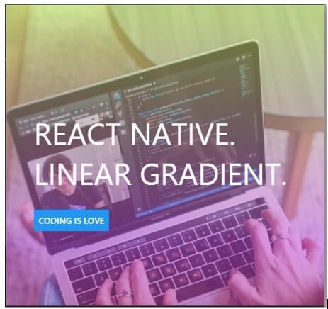
Example with an Image
In the example below, we have used an image and a dummy button. The linear gradients along the x-axis (i.e. horizontally) are set up using 3 different colors. One changes the gradients by editing the below code according to one’s needs.
The files used to implement the code below are:
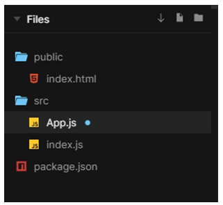
1. index.html
<!DOCTYPE html>
<html lang="en">
<head>
<meta charset="utf-8">
<meta name="viewport" content="width=device-width, initial-scale=1, shrink-to-fit=no">
<meta name="theme-color" content="#050505">
<link rel="manifest" href="%PUBLIC_URL%/manifest.json">
<link rel="shortcut icon" href="%PUBLIC_URL%/favicon.ico">
<title>React Native Application</title>
<style>
html,
body {
height: 100%;
}
body {
overflow: hidden;
}
#root {
display: flex;
height: 100%;
}
</style>
</head>
<body>
<noscript>
To run this application, enable JavaScript.
</noscript>
<div id="root"></div>
</body>
</html>
2. App.js
import React
, { Component } from "react";
import { Button
, StyleSheet
, View
, Text } from "react-native";
import FullWidthImage from "react-native-fullwidth-image";
import LinearGradient from "react-native-web-linear-gradient";
import "typeface-roboto";
constlogoUri =
"https://images.pexels.com/photos/3861964/pexels-photo-3861964.jpeg?auto=compress&cs=tinysrgb&dpr=1&w=500";
class App extends Component {
render() {
return (
<View style={styles.heroContainer}>
<LinearGradient
colors={["#c4ed5c", "#bb4fdb", "#80161e"]}
style={styles.linearGradient}
/>
<FullWidthImage
accessibilityLabel="Rahul Dubey"
source={{ uri: logoUri }}
/>
<View style={styles.heroHeaderContainer}>
<View style={styles.heroHeaderTextContainer}>
<Text style={styles.heroHeaderText}>React Native.</Text>
<Text style={styles.heroHeaderText}>Linear Gradient.</Text>
</View>
<Button title="Coding is Love" />
</View>
</View>
);
}
}
const styles = StyleSheet.create({
heroContainer: {
position: "relative"
},
linearGradient: {
position: "absolute",
zIndex: 10,
left: 0,
top: 0,
right: 0,
bottom: 0,
opacity: 0.55
},
heroHeaderContainer: {
left: 0,
top: 0,
right: 0,
bottom: "30%",
position: "absolute",
alignItems: "start",
justifyContent: "center",
zIndex: 11,
marginLeft: 45
},
heroHeaderText: {
fontSize: 49,
color: "#fcfcfc",
textTransform: "uppercase"
},
heroHeaderTextContainer: {
marginBottom: 28
}
});
export default App;
3. index.js
import { AppRegistry } from "react-native";
import App from "./App";
AppRegistry.registerComponent("App", () => App);
AppRegistry.runApplication("App", {
rootTag: document.getElementById("root")
});
Output:
Conclusion
We were able to comprehend the idea of a linear gradient and its application on the basis of the article mentioned above. To comprehend its use and how it may be employed in accordance with our needs, we went through various cases. We hope this article has made the concept of Linear Gradient easy to understand.
Recommended Articles
We hope that this EDUCBA information on “React Native Linear Gradient” was beneficial to you. You can view EDUCBA’s recommended articles for more information.

