Updated September 16, 2023
Introduction to React Components Libraries
The following article provides an outline for React Components Libraries. React component libraries can be either used by NPM or by using CDN. Every reacts component library developed by the community or by us is for some specific purpose; some libraries are made to handle a huge amount of data from the server for representing data to end users in tabular format, and some libraries are made to give us beautiful icons, some libraries give us Microsoft office like views. All these libraries are made so that we need to write minimum code for HTML; we only need to pass a parameter to design what we want.

Table of Content
Explanation of React Components Libraries
As we see in the introduction, the react component library is a library that can be used in any project. So, for example, suppose we have 3 separate projects, and we want to keep a few things like button, header, and footer to look the same in all 3 projects; then, in that case, we will create a react component library and publish it to NPM(node package manager). Whenever any project needs to show a button, footer, or header, we use these packages library in all these projects.
We can use many available react libraries in our project; this library was developed by others and published as open source.
Top 10 List React Component Libraries
Given below are the List of the Best React Component Libraries
1. Rebass
Rebass has many components that we can use for designing and developing any components. Any library component looks similar to any general component; the only difference is that they are imported from the library instead of from the existing folder. Rebass has many library components; let us discuss one of them.
We will use a ” Flex ” component to design a container containing all required parameters. Flex container takes various attributes as input and produces HTML design accordingly. All these attributes will go to another parent container written inside the library. Let us take the example below; we are passing align-items, px, py, bg, and button, heading. The actual HTML design for these attributes is written inside the library component, which will return a valid html design. Rebass gives many more components we need to learn our requirement, and accordingly, we need to pass attributes to it. It will provide us with html design. The main advantage here is we do not have to write HTML repeatedly; also, one exact design for all the projects will be defined in the library.
Follow the example below, along with html output for the code:
It has some commonly used components:
a. Flex
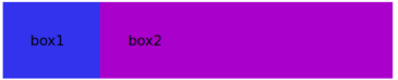
It will create responsive and flexible layout components; for example, if you want to show two boxes parally with different 2:6 ratios, see the example below.
Code:
<Flex>
<Box
p={4}
width={1/6}
color='black'
bg='primary'>
box1
</Box>
<Box
p={4}
width={1/2}
color='black'
bg='secondary'>
box2
</Box>
</Flex>
Output:
We have many more components like Flex, for example, Box, Slider, radio, and various input boxes.
2. Ant-Design
In the above, we learn a fundamental design for the Rebass component library; here, Ant-design gives us a complete and flexible design. Ant-design has 50 component library. With the help of Ant-Design, one can design and develop a full-fledged application. We can discuss some of the important and mainly used components of Ant-Design.
a. DatePicker
Date picker provides a wonderful way to display date format; it allows us to show date and year with many more customization features. A simple format is below; you can pass various parameters to this attribute.
Code:
<DatePicker />b. icon
You have seen various icons like an icon for download, the icon for upload, an icon for next or previous, etc. Ant-Design gives us multiple icons. If we go to write HTML for these icons, it will take time, and even that may not be that precise. In the below code, we only defined the icon type, and we will get a respective icon. For example, if we want to create a Twitter icon, we have to define type=” twitter”; similarly, if we have a Windows icon, we must pass type=” windows.”
Code:
<Icon type="step-backward" />c. Drop-down
You have seen in HTML select and options to create a drop-down, but these drop-downs created with the HTML were not that much of interactive, or to make them interactive, we need to write a lot of css and design. With the help of Ant-Design, we can use the component called < Drop-down> and was parameters about how the drop-down will open and how it will look like and specify any text name for each drop-down as an options object.
Code:
<Dropdown overlay={menu} placement="position where dropdown will open like right left and center etc">
<Button>button</Button>
</Dropdown>
d. button
You must have heard about buttons in HTML, but have you ever created any buttons for searching, deleting, uploading, or downloading? To make these buttons using any plain HTML, we need a lot of HTML coding, but with the help of the Ant-Design components library, we have to define the name of the icon=” button type what we want.” For example, if we create an upload button, we can pass the icon=” upload.” See the below example. Remember, any button performs business logic on clicking on it. So end-users should understand the purpose of buttons with button looks.
Code:
<Button type="primary" shape="circle" icon="download" size={size} />There are many more components in the Ant-Design components library; it is around 50 we can go through all and their implementations.
3. React-Bootstrap
React-bootstrap provides various components to design buttons, drop-downs, or any HTML-based UI components. It is very much similar to any other component. We can use these components in two different ways, either with the help of the NPM package or the library’s help. Below are ways to include them in any project for implementation. React-bootstrap comes with CSS style and html mixed all together. Because of their beautiful style, we can use them for pre-style and pre-compiled UI.
npm install react-bootstrap bootstrapCode:
<script src="https://unpkg.com/react-bootstrap@next/dist/react-bootstrap.min.js" crossorigin/>(CDN)4. Material-UI
Material UI is one of the most popular components libraries for react js. It has a lot of components to design and develop our website with the least amount of HTML code. Google created material UI based on the card and grid-based layouts. It has beautiful responsive animations. If you want beautiful and interactive UI components for your website, go with this library.
This package is available in the NPM library; we can get it there or use the CDN library URL.
npm install @material-ui/core.Include the script and CSS paths in the script and link sections.
Code:
<link rel="stylesheet" href="path" />5. Fabric React
Microsoft developed it. So you can understand the importance of it. They made it so that UI will look similar to any Microsoft Office. So anyone wanting to look and feel Microsoft-like UI should go with this library. If you are developing something with many logical manipulations and there will be office-like work and attributes, then we should consider this.
6. React Virtualized
This reacts component library is available to react to NPM. It was developed basically for tabular and listing rendering. We may think that rendering a table or list is not a big deal, but it is a big deal. Suppose your UI will render thousands of elements simultaneously; in this case, the performance will be a measure issue. React Virtualized has done great work in resolving the performance issue of large data representations.
7. Gestalt
To deal with the problem of miscommunication between developers and designers, they developed Gestalt react component library. This library gives us many pre-compiled libraries that can solve many of the prototyping of components, can be designed quickly, and can be analyzed.
8. React spinner
If you have heard about spinner, this component library is only about spinner. This component library does not cover everything, given its focus mainly on the spinner. So we can use this library whenever you need something spinner like the icon.
9. Grommet
We should use this component library if your design contains more sketching and screen reader functionality. So the main idea behind this component is accessibility. It is also good for theming and responsiveness.
10. Custom Components Library
We can also design and develop and publish our components library on NPM. You can log in through the login credentials of NPM on your console command and publish your developed library. Remember, we can not publish a duplicate NPM component library. For example, if we try to develop and publish any component with the name React-bootstrap, it will not allow it as it has already been published by someone else.
11. Blueprint (UI)
Blueprint is a minimalistic and elegant UI component library for React. It offers a comprehensive set of reusable components designed for building data-driven web applications. Blueprint focuses on simplicity, modularity, and a clean design, making it a popular choice for developers seeking an efficient and visually appealing way to create user interfaces in React.
12. Semantic UI React
Semantic UI React is a library of React components that follows the principles of the Semantic UI framework. It provides a range of pre-designed, customizable components for building web interfaces with a consistent and intuitive design language. Developers can leverage Semantic UI React to create modern and visually appealing user interfaces in their React applications.
13. Elemental UI
Elemental UI is a minimalist set of UI components for React, focusing on simplicity and performance. It offers basic building blocks for web interfaces, such as buttons, forms, and grids, with an emphasis on easy customization. Elemental UI is suitable for developers who prefer lightweight and flexible component libraries for their React projects.
14. Fluent UI
Fluent UI, formerly known as Office UI Fabric, is a design framework and set of React components developed by Microsoft. It provides a consistent and customizable user interface for building web and mobile applications, aligning with Microsoft’s Fluent Design System principles. It simplifies the creation of visually appealing, responsive, and accessible user interfaces.
15. Chakra UI
Chakra UI is a modular and accessible component library for React applications. It offers a set of customizable and composable UI components, making it easy to create modern and responsive user interfaces. Chakra UI is known for its developer-friendly approach and support for dark mode, making it a popular choice for building stylish and accessible React applications.
Frequently Asked Questions (FAQs)
Q1. Why should I use a React component library?
Answer: Using a React component library can help you save development time, maintain a consistent design across your application, and benefit from well-tested components. It also promotes code reusability and can improve collaboration within development teams.
Q2. What are some popular React component libraries?
Answer: Some popular React component libraries include Material-UI, Ant Design, Bootstrap, Semantic UI React, and Chakra UI. The choice of library depends on your project’s specific requirements and design preferences.
Q3. Can I customize the appearance of components from a React component library?
Answer: Most React component libraries allow you to customize the appearance of their components to some extent. You can often override styles, pass in custom props, or even create your own themes to match your project’s design requirements.
Q4. What is the difference between a UI framework and a React component library?
Answer: A UI framework, like Bootstrap or Foundation, typically provides a complete set of design and layout components along with CSS styling. In contrast, a React component library focuses specifically on providing reusable React components, often leaving the styling to be more flexible and customizable by developers.
Recommended Articles
This is a guide to React Components Libraries. Here we discuss the introduction and top 10 react components libraries, respectively. You may also look at the following articles to learn more –

