Updated March 21, 2023
Introduction to Qlikview Dashboard
Before we understand about Qlikview dashboard, let us try to comprehend what is a dashboard and what is the need of it. As we deal with different kinds of data on a routine basis, we need to extract the right information from the data and dashboards help us in doing this complex task. It gives us an overview of the data and tells the story from the data. Hence it is very important to choose the right Intelligence tool to present the relevant information.
Qlikview is one such BI tool which helps us in tackling the business challenges through the visualization. It consists of different sheets having data loaded into the memory. It can connect to any relational databases or any fixed file format data like CSV/excel etc. and loads data in memory to perform the processing. It can simultaneously integrate with various sources. With the amazing architecture of data association in memory, we can display dynamic values in all the visualization. We can perform aggregations over data and can create reports based on the aggregated data on the fly.
Input Data
Qlikview can read data from multiple sources at once like RDMS databases, excel files, delimited files, web-based files, XML files and even through Inline sources.
You can just drag and drop your excel file into the Qlikview interface and here you go! You have got all your excel data in the Qlikview sheet. You can play with the configuration on the interface as per your requirement.
Delimited files can be loaded into Qlikview Dashboard by selecting the menu option available in the editor. You need to open the script editor window of the application then click on the ‘Insert’ menu, choose ‘Load Statement’ and click on ‘Load from File’. It will enable you to load your CSV files or any other fixed format data files to load into the application so that you can perform an analysis of the data.
Qlikview can also read data from the web i.e. HTML format files. It can read tables from web pages by taking URL as an input object. To extract data from the web you need to open Script Editor then choose ‘Data from Files’ tab and then choose ‘Web Files’. You will get a prompt to enter your input object where you can provide your URL.
Qlikview can connect to various databases like SQL Server, MySQL, PostgreSQL Server, etc. It can extract data from tables along with the table structure in its environment to perform associations and analysis.
Inline data can also be inserted in Qlikview by either typing or pasting data from the clipboard. For this, you need to choose the ‘Insert’ tab then ‘Load Statement’ and then choose ‘Load Inline’ and perform the operation.
Dashboard Creation
Dashboard creation is an art! You can draw many useful insights out of your data through dashboards. You just need to know the right information that you want to display on the dashboard and the associations between the data that you want to understand. You can start by creating sheet objects in the Qlikview dashboard to load the data and apply metrics on data values. And here you go! You are ready with one good dashboard!!
Qlikview dashboard has Four components which we can use to design our dashboard has follows:
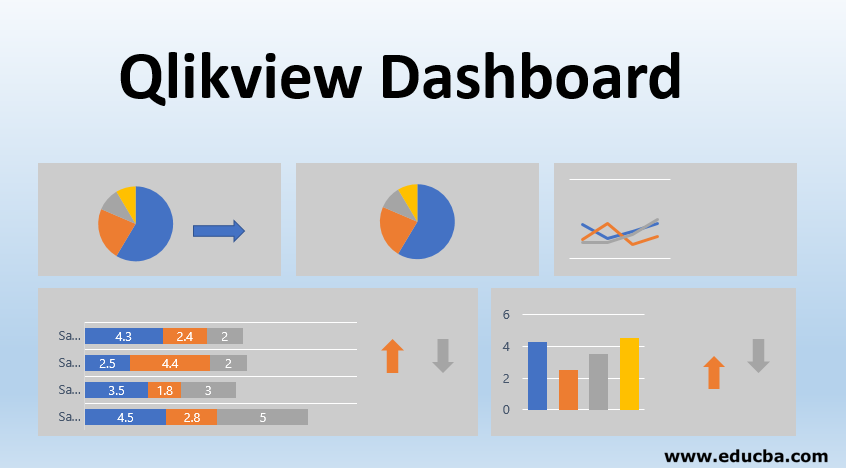
1. Charts: Multiple charts are available like a bar chart, pie charts, line charts, etc.
2. Selections: This will select only chosen values and fields associated with it and deactivate rest all.
3. Buttons: These will be there for forwarding or backward movement between sheets. This feature will come under the advance part.
4. Metrics: Sum or average or anything that you want to compute can be declared and used in the Qlikview sheet.
Example
For the Qlikview dashboard, you need to do the following steps:
1. Load Data
To create a dashboard in Qlikview, you need to first load data into your Qlikview sheet. You can browse your data from Script editor in the File menu. From script editor choose ‘Data from Files’ and then choose ‘Table Files’. It will prompt you to choose your desired file. Select your file and click ‘Ok’. This will load your data file in the QlikView sheet.
2. Select Relevant Fields
We can select only those fields which we want to use to create a story from the data. For this, we need to click on ‘Layout’ in the editor and then click on ‘Select Fields’. Once you will click on this you will get a window open showing all the available fields. Choose the field you want to use and then click ‘Ok’. You can perform this to select multiple fields as well.
3. Chart Selection
Once you are done with the data selection you can choose your own chart type to do the visualization. For adding a chart, do Right-click anywhere on the sheet and select ‘New Sheet Object’ and then ‘Chart’. This will open a window for you to select your chart type. You can choose the bar chart or pie chart or any other if you want from the available options.
4. Dimension Selection
You can choose your dimensions on which you want to see your fact values under the ‘Dimensions’ tab. Select your field and click on ‘Finish’.
5. Metric Definition
You can define your own expression that you wanted to see as a part of a dashboard. For e.g. sum(sales), avg(sales) over months.
6. Dashboard Presentation
Hooray!! After completing all the steps above, you will get your dashboard ready to showcase. You can filter your dashboard on different dimension values and visualization will change accordingly.
Conclusion
We have seen here the usefulness of the Qlikview dashboard and its attractive features. Qlikview can also handle data from various sources and it provides the associations involved in the data. But we need to understand the important thing at the end of the day is that we need to design a dashboard as per business requirement’s which is what Qlikview is best at. Some of the strengths of Qlikview, it helps in creating dynamic reports and users can do a live search regarding data and reports. The drawback here is that as Qlikview works in GB scale loading and reloading of data consumes a lot of time.
Recommended Articles
This is a guide to the Qlikview Dashboard. Here we discuss the introduction, Input Data, Dashboard Creation and Example. You can also go through our other suggested articles to learn more–
