Updated March 27, 2023
Power BI Charts
Power BI tools are known for their visualization charts. Microsoft Power BI has good visualization charts which play a key role in representing the data in the dashboards. If the data is represented clear then the finding of the insights is very easy.
Top 10 Types of Charts in Power BI
The Power Bi generally has 30 different types of charts. But the top 10 charts are:
- Clustered Bar chart
- Clustered column chart
- Waterfall chart
- Pie chart
- Donut chart
- Line chart
- Funnel chart
- Area chart
- Guage chart
- Stacked chart
How to Create Charts in Power BI?
Visualizations are used to effectively present your data. There are different ways to create a visualization, to load the dataset into Power BI.
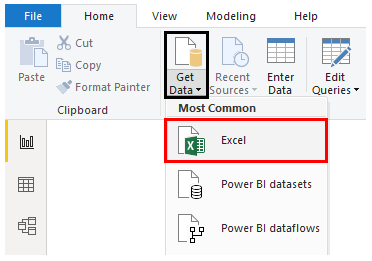
- Click on Get Data Menu under Home Tab.
- From the drop-down menu of Get Data, select the appropriate data source type.
- In this case, it is Excel, so clicked on Excel as shown by the below screenshot.
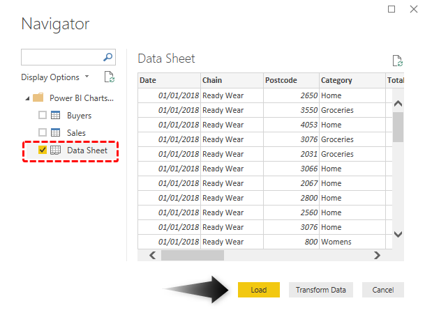
Select the files from the location it is stored. Once the requisite dataset is selected, in the Navigator window, select the appropriate sheet from the Excel workbook, and then click on Load.
#1. Clustered Bar Chart
The first visualization we will see is the Clustered Bar chart. This chart is also called as the Horizontal Bar chart. This chart is generally used to see the number of units sold. The chart contains Bars which easily represent how much sale is done. These bar charts are horizontal bar charts that are used to represent the data.
- Select the Bar chart from the visualization chart.
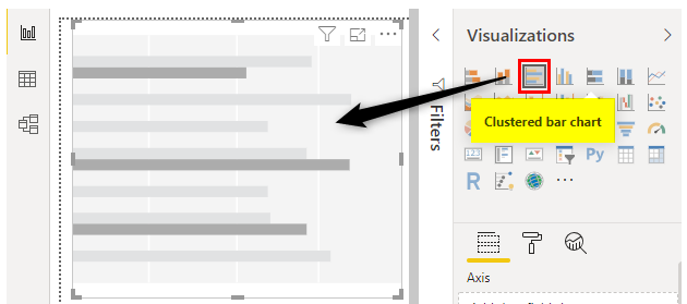
- Select the Buyers from the Buyers table and total units from the Sales table.
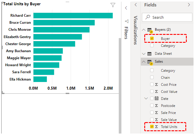
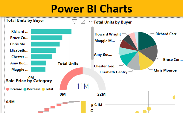
Here from the above, we observe the bar chart showing which buyer made the highest purchase.
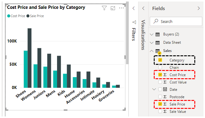
#2. Clustered Column Chart
This chart is quite opposite of the Clustered bar chart. The Clustered column chart is also known as the vertical bar chart. This chart is generally used to check per quarter in the entire units how many units are sold and how many are unsold. Like this, we get for the entire quarters in a particular year. From this, we come to the conclusion that at which quarter the units are sold more.
- Select the Clustered column chart from the visualization chart.
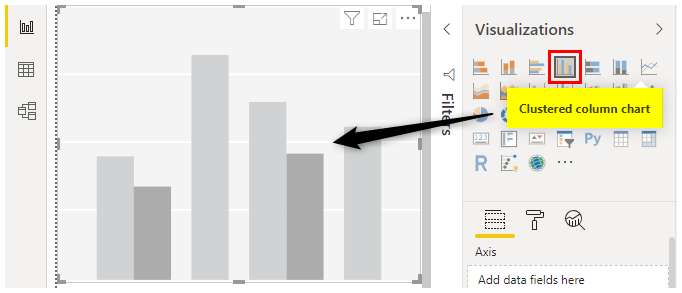
- Select the categories in the Sales table and the cost price and the sale price from the Sales table.
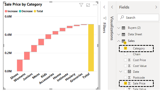
#3. Waterfall Chart
The Waterfall chart is used to see how the sale prices of the categories present in the market. The chart is in the form of waterfall.
- Select the Waterfall chart from the Visualization chart.
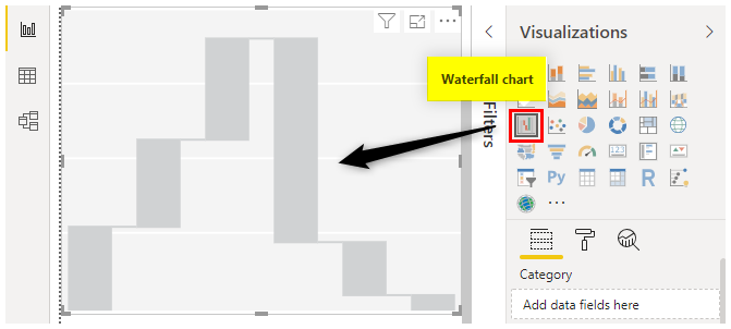
- Select the Category option and the Sale Price from the Sales table.
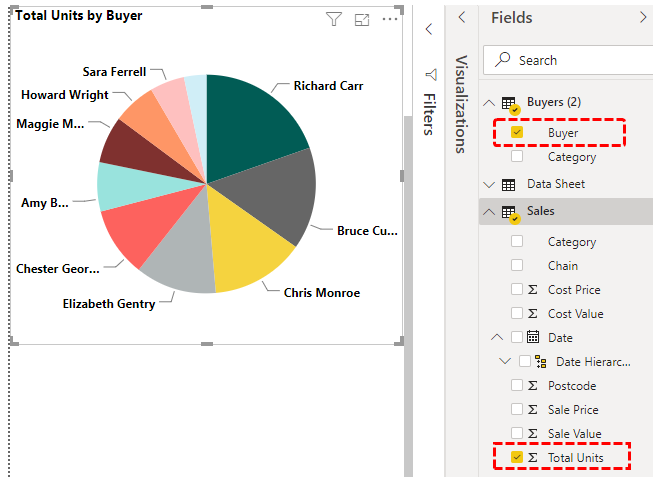
#4. Pie Chart
The Pie chart is generally used to Buyer wise total units sold. The Pie chart is generally in the form of the circle. With the colors filled inside. From the below Figure we can conclude that Richard Carr is making the Highest sales.
- Select the Pie chart from the Visualization table.
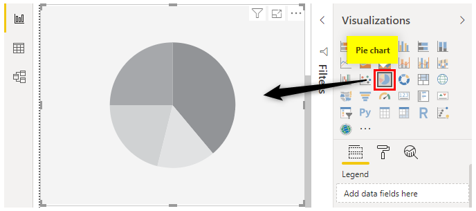
- Select the Buyer from the Buyers table and the total units from the Sales table.
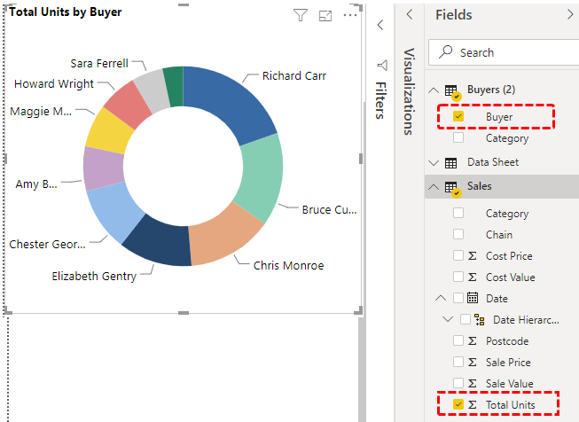
#5. Donut Chart
Donut chart is the chart that is in the form of the Donut. This Donut chart is generally used to show how much sale made by each Buyer.
- Select the Donut chart from the Visualization table.
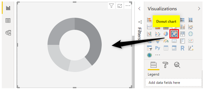
- Select the Buyers option from the Buyers table and the total units from the Sales table.
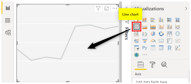
#6. Line chart
Line chart is generally made between two categories. The chart contains Lines. The Line chart is generally used to see whether the total products are sold or not. It also states whether we have reached the target value or not. Here no color is filled between the two data points.
- Select the Line chart from the Visualization chart.
- Select the Category option. Click the cost value and the sale value.
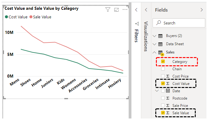
- This shows the actual differences between the cost value and the sale value.
#7. Funnel Chart
A funnel chart is generally used to see the individual sales made by the Buyer. This chart is in the Funnel shape so the chart is given as Funnel.
- Select the Funnel chart option in the visualization chart.
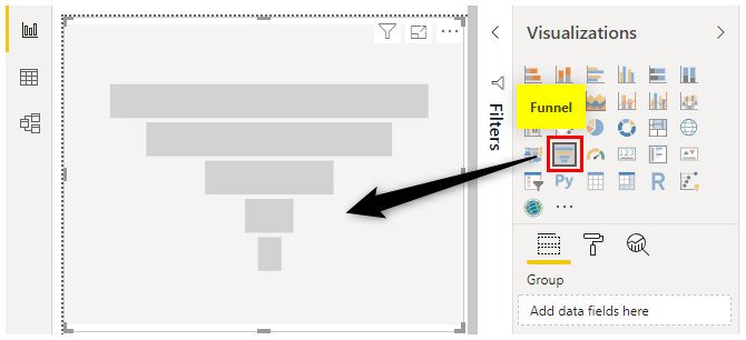
- Select the Buyers option in the Buyers Table and Total units in the Sales Table.
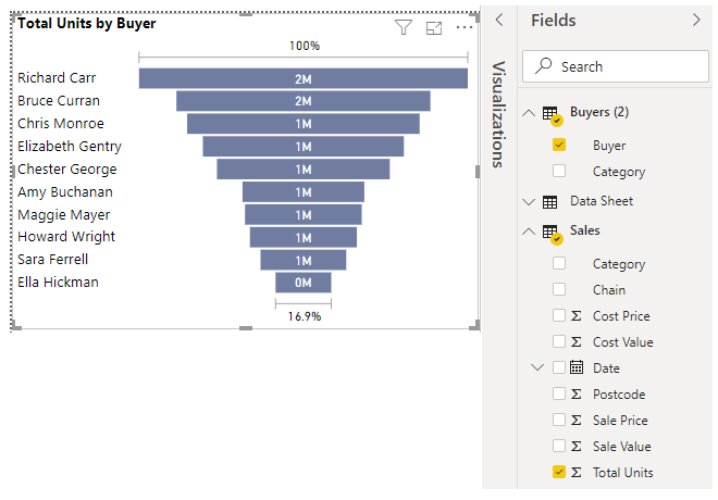
- From the above chart, we can conclude that Richard Carr is making more sales.
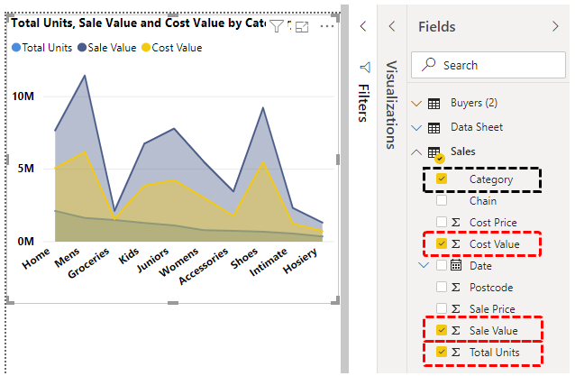
#8. Area Chart
The Area chart is the advanced version of the line chart. Here the area is filled with the colors between the two data points. Here we have selected the Total units, Sales value, and the cost value. Due to this chart, the decision is taken very quickly.
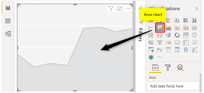
- Select the Area chart from the visualization table.
- Select the category from the Sales table and the total units, Sale value and Cost value.
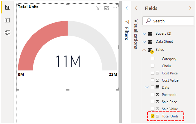
#9. Gauge Chart
The Guage chart is generally used to set the value as target and check hoe much value we finally reached. Here the target value is 100 and we have reached to 85. It means the sales have been reached to 85 per cent.
- Select the Gauge chart from the visualization table.
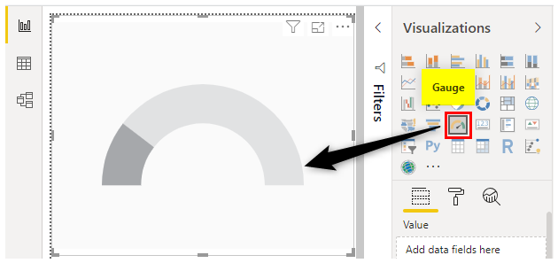
- Select the Total units sold from the Sales table.
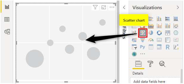
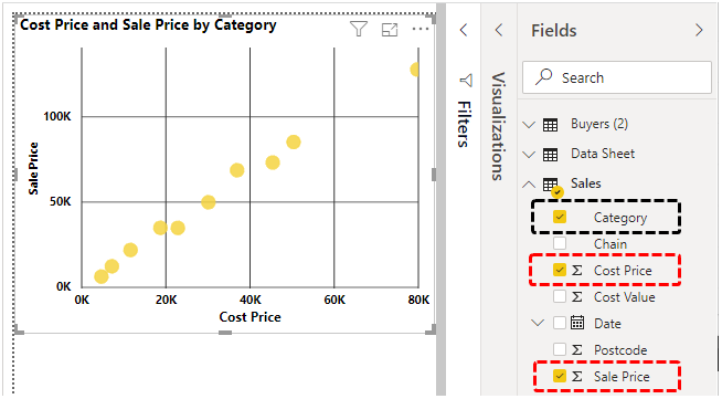
#10. Scatter Chart
Scatter chart is the chart that is drawn between the two data points.
Steps:
- Select the Scatter chart from the Visualization chart.
- Select the category from the Sales table and the Cost price and Sale price from the Sale table.
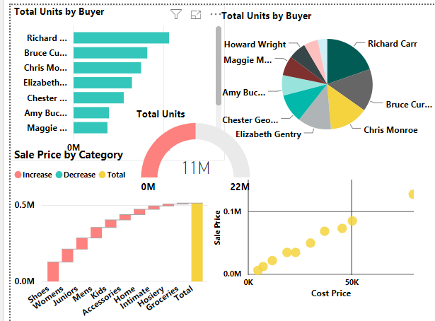
#11. Dashboard
The dashboard is the place where we display all the charts in a single place. Here we can easily identify the insights and explain it to our client. Due to this, the other person pays attention to listen to our insights due to the rich visualization. Below is the Dashboard for our Sales and Buyers data set.
Things to Remember
- The Line chart and the Area chart are not similar. The main difference is there a gap. In the area chart, the gap between two points is filled with the color whereas the line chart the gap between the two points is not filled.
- The Donut and the Pie chart are not similar. The main difference is the space in the middle of the circle. In the Donut chart, space is more. It can be reduced by reducing the size of the granularity. In the Pie chart, the gap is filled by the respective colors.
Recommended Articles
This is a guide to Power BI Charts. Here we discuss the top 10 types of Charts in Power BI along with the step-by-step examples and downloadable Power BI Chart Template. You may also look at the following articles to learn more –
