Updated June 12, 2023
Pie Chart in Excel
The Pie Chart in Excel shows the completion or main contribution of different segments out of 100%. Each value represents the portion of the Slice from the total complete Pie. For Example, we have 4 values A, B, C, and D. A total of them is considered 100 either in percentage or in number; any value A would have its contribution towards the completion of Pie formation, which is shown as Pie Chart.
How to Make Pie Charts in Excel?
The Pie Chart is very simple to use. Let us now see how to make Pie charts in Excel with the help of some examples.
Example #1 – 2D Pie Chart in Excel
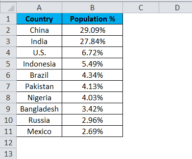
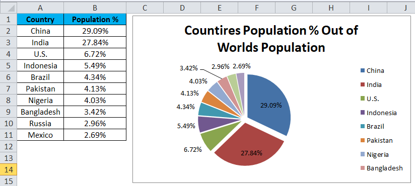
Look into the first example here. I have a top ten country population percentage over the world population. The first column contains a country name, and the second contains the population percentage.
We need to show this in a graphical way. I have chosen a PIE CHART to represent slices of PIE.
Follow the below steps to create your first PIE CHART in Excel.
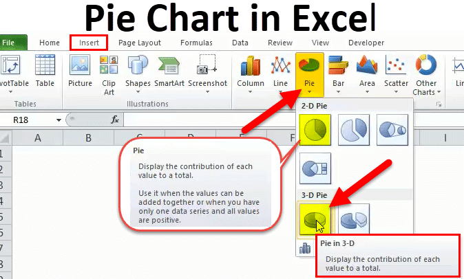
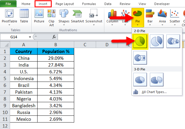
Step 1: Do not select the data; rather, place a cursor outside the data and insert one PIE CHART. Go to the Insert tab and click on a PIE.
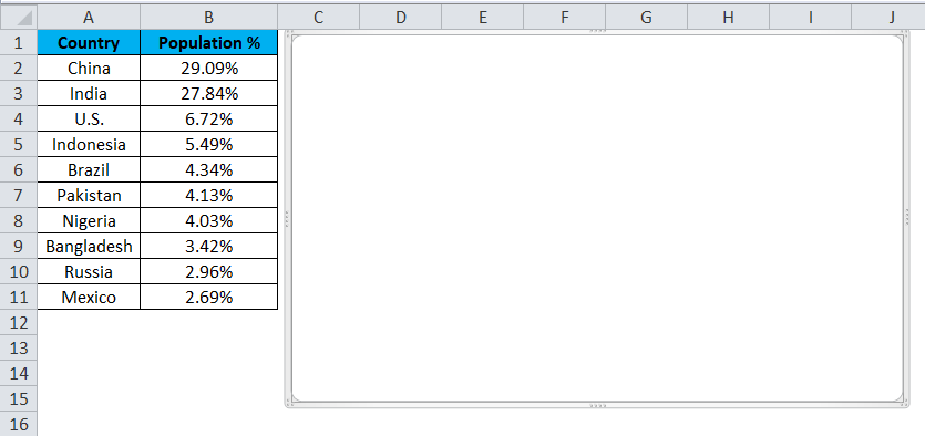
Step 2: Once you click on a 2-D Pie chart, it will insert the blank chart as shown in the below image.
Step 3: Right-click on the chart and choose Select Data.
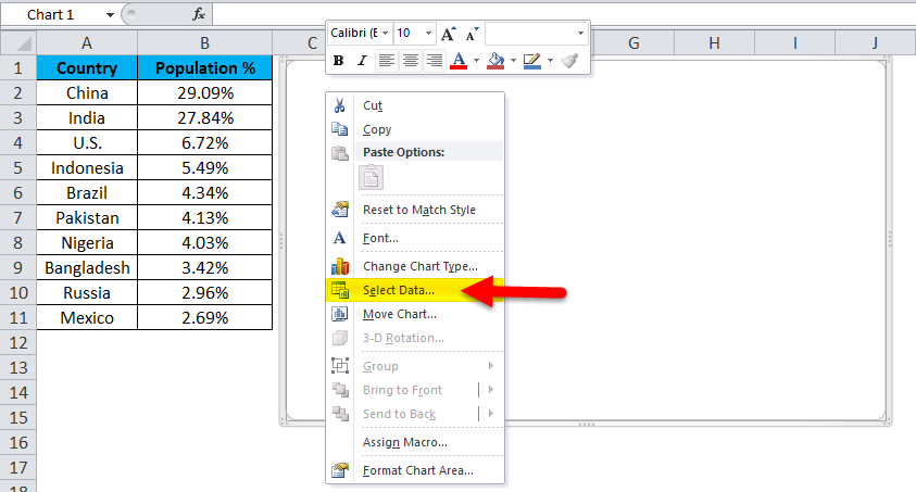
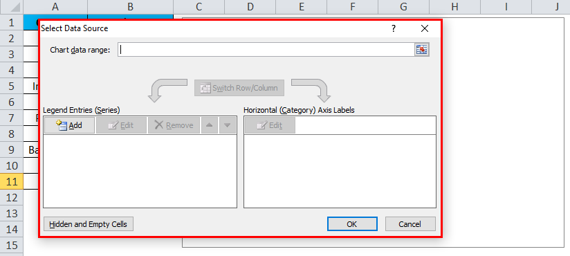
Step 4: Once you click Select Data, it will open the box below.
Step 5: Now click on the Add button.
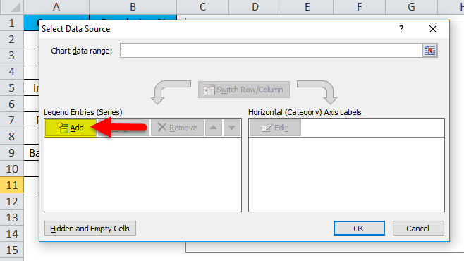
It will open the below box.
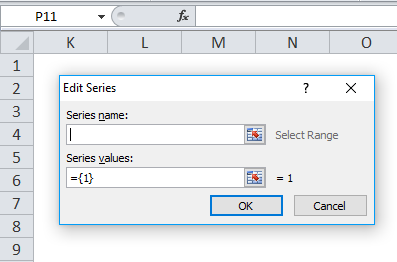
In the Series Name, I have selected the heading as a percentage.
In the Series Values, I have selected all the country’s percentage values ranging from B2 to B11.
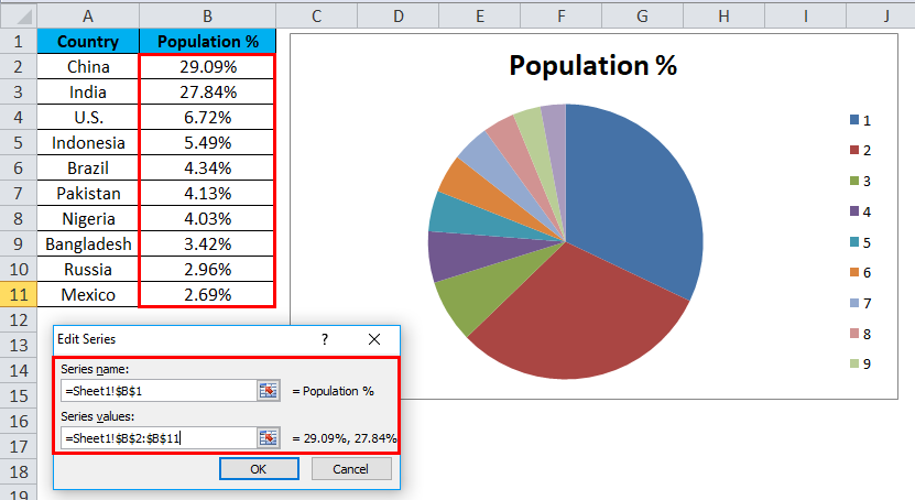
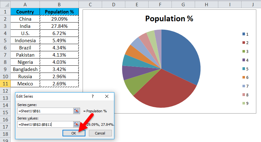
Step 6: Click on OK.
Step 7: Now click on the Edit option.
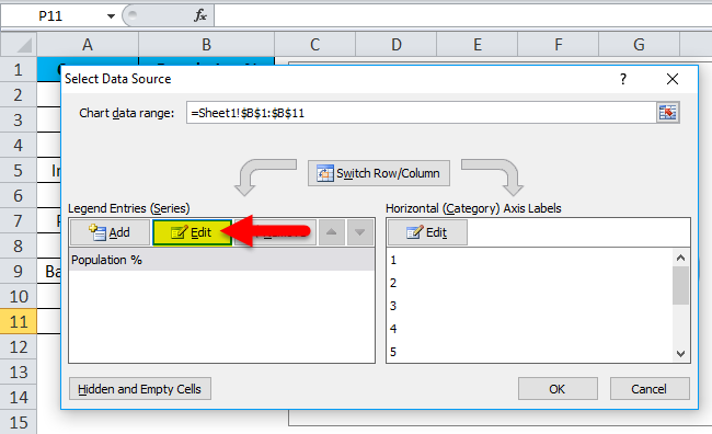
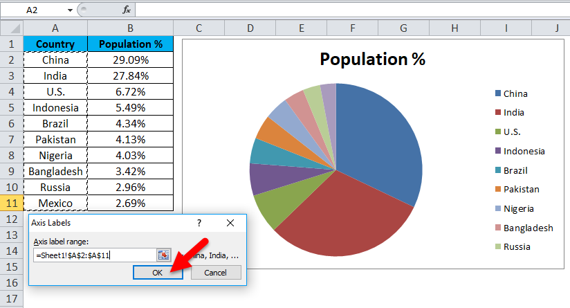
Step 7: Here, we must select the values to show horizontally. Horizontally we need to show all the country’s names. Countries’ names range from A2 to A11.
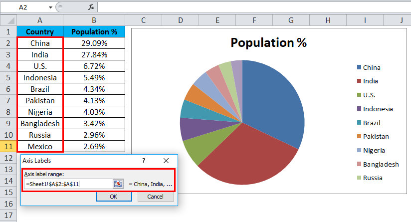
Step 8: Now, finally, click on OK.
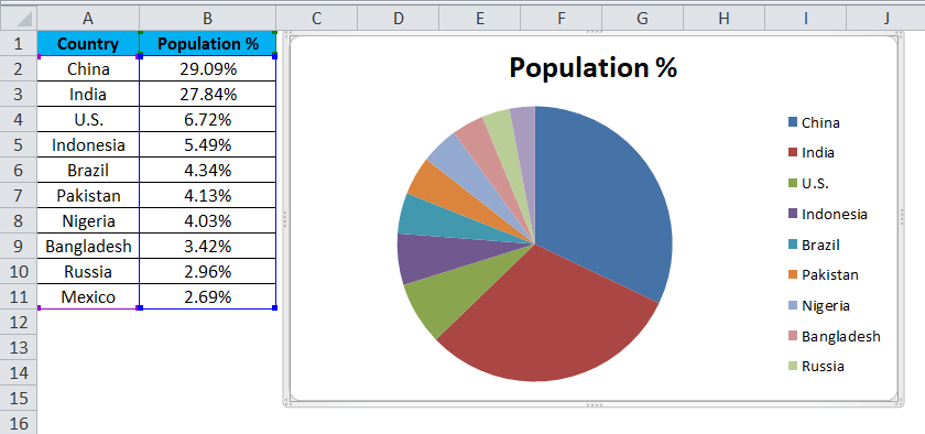
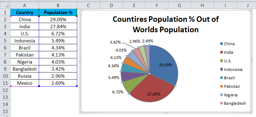
Your PIE CHART is ready.
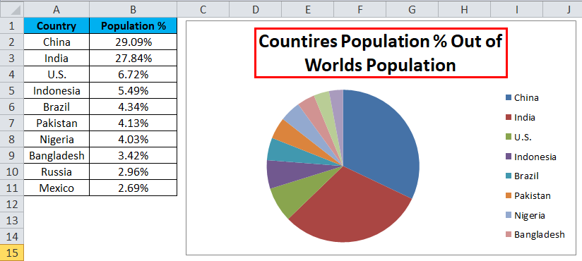
Step 9: This is not yet the fully finished chart. We need to do some formatting to it. First, change the heading of the chart.
Click on the heading
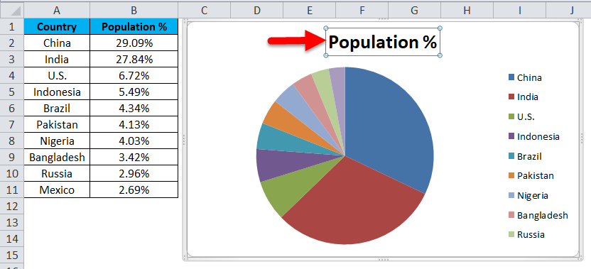
and type your heading.
Step 10: Right-click on one of the pie slices and select Add data labels.
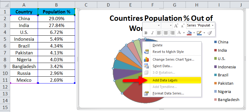
This will add all the values we are showing on the pie slices.
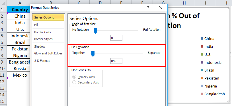
Step 11: You can expand each pie differently. Right-click on the pie and select Format Data Series.
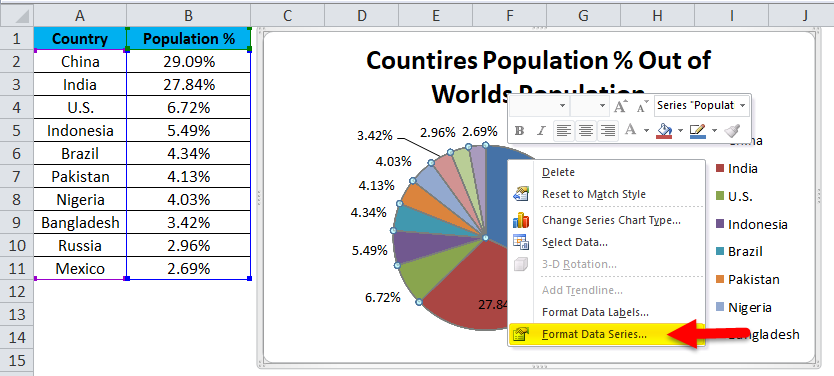
Step 12: Now, you can expand the Pie Explosion according to your wish.
Step 13: Now, your chart is ready to rock.
This way, we can present our data in a PIE CHART, making the chart readable.
Example #2 – 3D Pie Chart in Excel
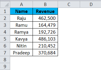
Now we have seen how to create a 2-D Pie chart. We can create a 3-D version of it as well. For this example, I have taken sales data as an example. I have a salesperson’s name and their respective revenue data.
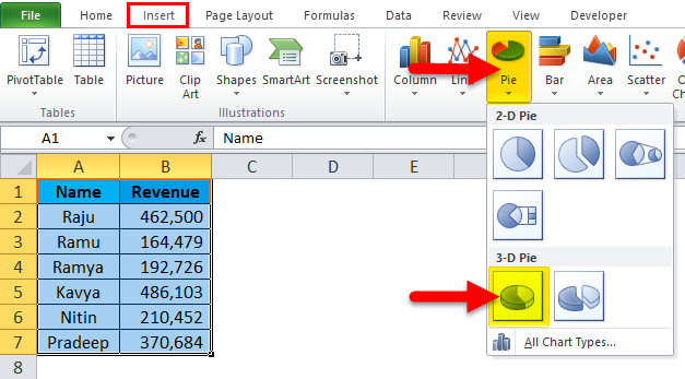
Step 1: Select the data to Insert, click on PIE, and select 3-D pie chart.
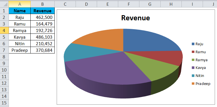
Step 2: It instantly creates a 3-D pie chart for you.
Step 3: Right-click on the pie and select Add Data Labels.
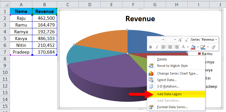
This will add all the values we are showing on the pie slices.

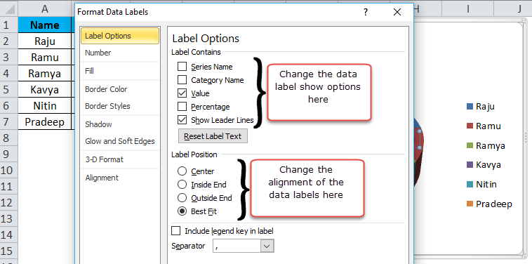
Step 4: Select the data labels we have added, right-click, and select Format Data Labels.

Step 5: Here, we can do so much formatting. We can show the series’ name along with their values and percentages. We can change these data labels’ alignment to center, inside end, outside end, and Best fit.
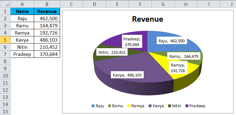
Step 6: Similarly, we can change the color of each bar, change the legends space, adjust the data label show, etc…..… Finally, your chart looks presentable to the reader or the user.
Advantages:
- Large data can be presented by using the Pie Chart in Excel.
- With the help of each slice bar, we can easily compare one with another.
- It is easy and does not need to be explained to the end user. It is understandable by any means.
Disadvantages:
- Fitting data labels in the case of smaller values is very difficult. It will overlap with other data labels.
- If there are too many things to show, it will make the chart look ugly.
Things to Remember
- Do not use 3D charts quite often. 3D chart significantly distorts the message.
- Instead of using legends, try to show them along with the data labels. This will be very much understandable to the users.
- Use a different color for each slice and make the chart look beautiful.
- Try to explore each slice by a maximum of 8%. Do not go beyond that threshold limit.
- If the labels are fewer, we can compare easily with the other slices. If there are too many values, try using a column chart instead.
Recommended Articles
This has been a guide to Pie Chart in Excel. We discuss creating Pie Chart in Excel, practical examples, and a downloadable Excel template here. You can also go through our other suggested articles –
