Updated April 5, 2023
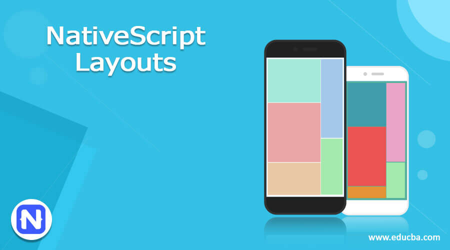
Introduction to NativeScript Layouts
NativeScript Layout is a layout system that provides sizes and positions of views on screen. It measures and positions the layout containers and their child view on a webpage. NativeScript Layout container is HTML tag <div> sort of, but more than that. Layouts define the way native UI elements are presented on screen. Generally, HTML<div> get sluggish in spite of the high efficiency of mobiles, and weak devices may face problems with the complicated structure of nested <div> which make up the mobile application. In NativeScript Layout, we have some predefined layouts which user can choose from, will get into it on further going through this topic. Here, we shall see How NativeScript Layouts are used for a good UI and what are its layout containers.
These layout containers act as parent components and can have one or more child components. Child components can be arranged based on the techniques provided by the parent container.
Top 6 NativeScript Layouts with Examples
Below are the 6 NativeScript Layout containers,
- Absolute Layout,
- Dock Layout,
- Grid Layout,
- Stack Layout,
- Wrap Layout,
- FlexBox Layout
We shall see each of the layout containers, syntax of each, and how it works.
1. Absolute Layout Container
It is one of the simplest layout containers in NativeScript. It allows users to set views by its coordinates, and the Absolute layout does not enforce any constraint on the children and place their children inside a 2-dimensional coordinate system having the top left corner as the origin. Responsiveness of the layout can be troublesome based on different screen sizes.
It uses 4 properties of children for positioning,
- left: It is the placement of children from origin moving sidewards in the x-direction.
- top: It is the placement of children from origin moving downwards in the y-direction.
- width and height: It is the width and height of children.
Syntax(Absolute Layout):
<AbsoluteLayout>

……..

</AbsoluteLayout>
Example #1: Absolute Layout Container Example
<Page loaded="pageLoaded" xmlns="http://www.nativescript.org/tns.xsd">

<ActionBar>

<Label text="Absolute Layout Container"></Label>

</ActionBar>

<AbsoluteLayout width="250" height="250">

<Label left="0" top="100" width="150" height="150" text="Top Left" backgroundColor="yellow"></Label>

<Label left="120" top="0" width="100" height="150" text="Top Right" backgroundColor="gray"></Label>

<Label left="0" top="150" width="150" height="150" text="Bottom Left" backgroundColor="green"></Label>

<Label left="140" top="150" width="150" height="150" text="Bottom Right" backgroundColor="red"></Label>

</AbsoluteLayout>

</Page>
Output:
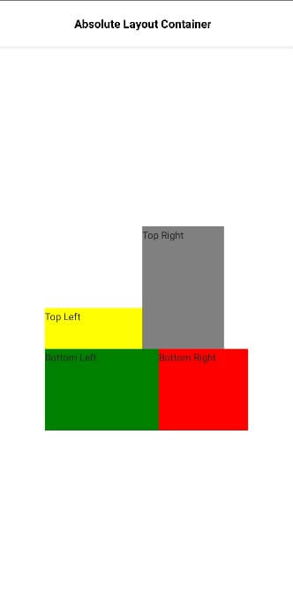
Here, we are displaying an Absolute Layout container of NativeScript. Width and height are defined to be 250. The top refers to the placement in the y-direction whereas the left refers to the placement in the x-direction.
2. Dock Layout Container
It is one of the useful containers if the user wants to have the layout pinned to any part of the screen, i.e., enables the child container to dock inside the parent container. Each side of the container can be docked. It uses the dock properties of children for docking; bottom: It docks the child component at the bottom corner of the screen.
- top: It docks the child component at the top corner of the screen.
- left: It docks the child component at the left corner of the screen.
- right: It docks the child component at the right corner of the screen.
Syntax (Dock Layout):
<DockLayout>

……

</DockLayout>
Example 2: Dock Layout Container Example
<Page loaded="pageLoaded" xmlns="http://www.nativescript.org/tns.xsd">

<ActionBar>

<Label text="Dock Layout Container"></Label>

</ActionBar>

<DockLayout width="300" height="250" backgroundColor="yellow" stretchLastChild="false">

<Label text="Top dock" dock="top" height="50" backgroundColor="gray"></Label>

<Label text="Bottom dock" dock="bottom" height="50" backgroundColor="gray"></Label>

<Label text="Left dock" dock="left" width="90" backgroundColor="orange"></Label>

<Label text="Right dock" dock="right" width="90" backgroundColor="red">

</Label>

</DockLayout>

</Page>
Output:
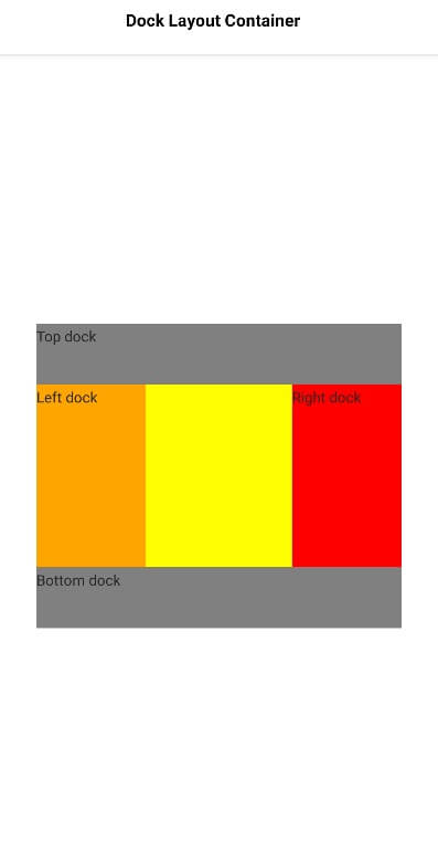
Based on the layout, we can easily say that this layout is docked at left, top, bottom, and right. Here yellow color is the background of the complete layout.
3. Grid Layout Container
It is one of the complex components and allows the arrangement of complicated views on top of each other, in a tabular format with rows and columns.
Properties to be noted here are,
- row and column: It is the row and column number
- rowSpan and colSpan: It is the total number of or rows or columns that the child component spans within the layout.
Syntax (Grid Layout):
<GridLayout>

……

</GridLayout>
Example 3: Grid Layout Container Example
<Page loaded="pageLoaded" xmlns="http://www.nativescript.org/tns.xsd">

<ActionBar>

<Label text="Grid Layout Container"></Label>

</ActionBar>

<GridLayout columns="70, auto, *" rows="70, auto, *" width="165" height="170" backgroundColor="gray">

<Label text="Grid 0,0" row="0" col="0" backgroundColor="yellow"></Label>

<Label text="Grid 0,1" row="0" col="1" colSpan="2" backgroundColor="orange"></Label>

<Label text="Grid 1,0" row="1" col="0" rowSpan="2" backgroundColor="red"></Label>

<Label text="Grid 1,1" row="1" col="1" backgroundColor="yellow"></Label>

</GridLayout>

</Page>
Output:
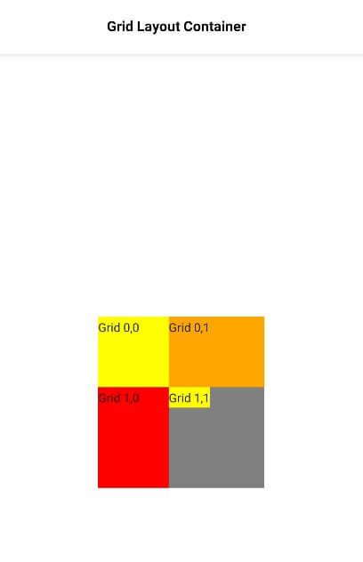
So here Grid layout has been showing, it is displayed in the form of rows and columns.
4. Stack Layout Container
It will organize its child elements in one-dimensional line, either in horizontal or vertical, depending upon the orientation set.
Syntax: (Stack Layout)
<StackLayout>

…..

</StackLayout>
Example 4: Stack Layout Container Example
<Page loaded="pageLoaded" xmlns="http://www.nativescript.org/tns.xsd">

<ActionBar>

<Label text="Stack Layout Container"></Label>

</ActionBar>

<StackLayout orientation="horizontal" width="300" height="100"

backgroundColor="gray">

<Label text="Grid 1" width="60" height="50" backgroundColor="yellow">

</Label>

<Label text="Grid 2" width="60" height="50" backgroundColor="red">

</Label>

<Label text="Grid 3" width="60" height="50" backgroundColor="yellow">

</Label>

<Label text="Grid 4" width="60" height="50" backgroundColor="red">

</Label>

<Label text="Grid 5" width="60" height="50" backgroundColor="yellow">

</Label>

</StackLayout>

</Page>
Output:
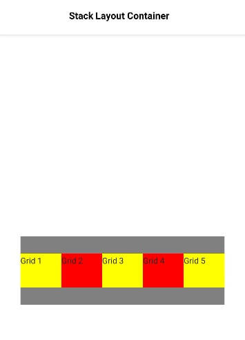
Here, we have shown the Stacked layout in a horizontal manner.
5. Wrap Layout Container
It is used to wrap the contents on new rows and columns depending upon the screen size.
Syntax: (Wrap Layout)
<WrapLayout>

…..

</WrapLayout>
Example 5: Wrap Layout Container Example
<Page loaded="pageLoaded" xmlns="http://www.nativescript.org/tns.xsd">

<ActionBar>

<Label text="Wrap Layout Container"></Label>

</ActionBar>

<WrapLayout orientation="vertical" width="150" height="200"

backgroundColor="gray">

<Label text="Grid 1" width="75" height="70" backgroundColor="yellow">

</Label>

<Label text="Grid 2" width="75" height="70" backgroundColor="orange">

</Label>

<Label text="Grid 3" width="75" height="70" backgroundColor="orange">

</Label>

<Label text="Grid 4" width="75" height="70" backgroundColor="yellow">

</Label>

</WrapLayout>

</Page>
Output:
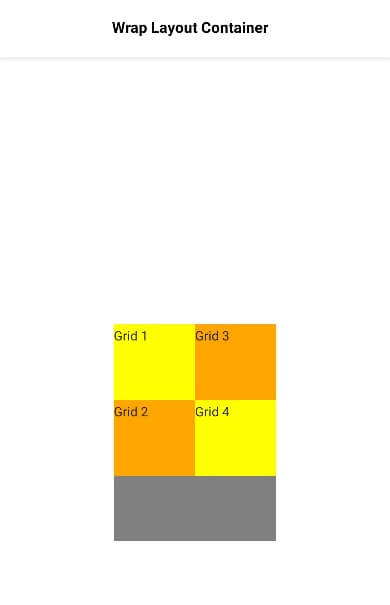
Here, we have shown a wrapped layout in a vertical manner.
6. FlexBox Layout Container
It is one of the advanced layout containers and provides an option to render simple to complex layouts to sophisticated layouts. It is based on CSS FlexBox.
It has a lot of properties,
- flexDirection: It is the direction in which child components are arranged. Possible values for flexDirection are
- row and column: Child elements arranged side by side in a row and one below another in the column.
- row-reverse and column-reverse: Child elements arranged side by side in a row and one below another in the column, in the reverse direction.
- flexWrap: It represents whether child elements will be rendered in a single row or column or flow to multiple rows with wrapping set by the flexDirection.
- wrap: It wraps the child elements if there is no space available in the flexDirection.
- wrap-reverse: Similar to wrap but in the reverse direction.
- justifyContent: It represents how the child elements are arranged based on each other and the overall structure.
- flex-end: Packs child element towards the end of the line.
- space-between: Packs child element by distributing evenly in line
- space-around: It is similar to space-between but packs child components evenly in line as well as around them.
Syntax:
<FlexboxLayout>

…..

</FlexboxLayout>
Example 6: Flex Box Layout Container example
<Page loaded="pageLoaded" xmlns="http://www.nativescript.org/tns.xsd">

<ActionBar>

<Label text="FlexBox Layout Container"></Label>

</ActionBar>

<FlexboxLayout flexDirection="row-reverse">

<Label text="1st Grid Item" backgroundColor="yellow"></Label>

<Label text="2nd Grid Item" backgroundColor="gray"></Label>

<Label text="3rd Grid Item" backgroundColor="orange"></Label>

<Label text="4th Grid Item" backgroundColor="gray"></Label>

<Label text="5th Grid Item" backgroundColor="pink"></Label>

<Label text="6th Grid Item" backgroundColor="gray"></Label>

<Label text="7th Grid Item" backgroundColor="red"></Label>

</FlexboxLayout>

</Page>
Output:
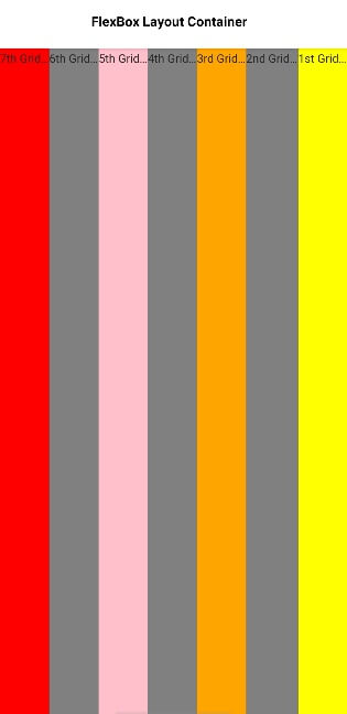
Here, we have implemented FlexBox Layout with flexDirection as the reverse. We also have flexWrap and also justifyContent.
Conclusion
With this, we shall conclude our topic ‘NativeScript Layouts’. We have seen what NativeScript Layout is and what are all the types included in these layouts. There are around 6 types of NativeScript Layouts which we have implemented, each with an example here to make you understand the concept in a better way.
Recommended Articles
This is a guide to NativeScript Layouts. Here we also discuss the definition and 6 NativeScript layouts along with different examples and their code implementation. You may also have a look at the following articles to learn more –
