
Introduction to Matplotlib Scatter
Matplotlib Scatter, in this we will learn one of the most important plots used in python for visualization, the scatter plot. We will be making use of the matplotlib library of Python for this purpose. Before we start creating scatter plots, let us first quickly understand what scatter plots are.
Scatter plots: Scatter plots are used in data visualization to get an intuitive understanding of our data. With scatter plots we can understand the relation between 2 variables. These plots are also very powerful in understanding the correlation between the variables, which can further be used in statistical techniques like linear regression, multiple regression, etc.
How to Create Scatter plots in python using Matplotlib?
We will start by importing the required libraries
import numpy as np[importing ‘numpy’]
import matplotlib.pyplot as plt[importing ‘matplotlib’]
Next, let us create our data for Scatter plot
A = 400
a = np.random.rand(A)[variable a with 400 random values]
b = np.random.rand(A)[variable b with 400 random values]
colors = (0,0,0)[this will set color of our plot]
Step #1: We are now ready to create our Scatter plot
plt.scatter(a, b, c = colors)[‘scatter’ is called using ‘plt’]
plt.title('Let us learn scatter plot)     [‘title’ is called to set title of our scatter plot]
plt.xlabel('x variable')[setting name of x-axis]
plt.ylabel('y variable')[setting name of y-axis]
plt.show()[displaying our scatter plot]
This is how our input and output will look like in python:
Code:
import numpy as np

import matplotlib.pyplot as plt

A = 400

a = np.random.rand(A)

b = np.random.rand(A)

colors = (0,0,0)

plt.scatter(a, b, c = colors)

plt.title('Let us learn scatter plot')

plt.xlabel('x variable')

plt.ylabel('y variable')

plt.show()
Output:
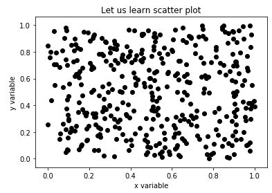
Explanation: For our plot, we have taken random values for variables, the same is justified in the output. As we mentioned in the introduction of scatter plots, they help us in understanding the correlation between the variables, and since our input values are random, we can clearly see there is no correlation.
Step #2: Next, let us take 2 different categories of data and visualize them using scatter plots.
import numpy as np[importing ‘numpy’]
import matplotlib.pyplot as plt[importing ‘matplotlib]
Next let us create our data for Scatter plot
A = 50
a1 = (1 + 0.6 * np.random.rand(A), np.random.rand(A))[variable a1with 50 random values]
a2 = (2+0.3 * np.random.rand(A), 0.5*np.random.rand(A))[variable a2with 50 random values]
data = (a1, a2)
colors = (“red”, “green”) [Defining variable ‘colors’, for setting color of the categories]
groups = (“Category 1”, “Category 2”) [Defining variable ‘groups’, for creating the label]
Let us now create our plot
fig = plt.figure()

Z = fig.add_subplot(1, 1, 1, facecolor='#E6E6E6') [Setting the color of the plot as grey]
for data, color, group in zip(data, colors, groups):[‘for loop’ to create the plot and set color, label]
x, y = data

Z.scatter(x, y, c=color, label=group)

plt.title(‘Learning scatter plot')[‘title’ is called to set title of our scatter plot]
plt.legend(loc=1)[‘loc’ is used to set the location of labels in the pot]
plt.show()[displaying our scatter plot]
This is how our input and output will look like in python:
Code:
import numpy as np

import matplotlib.pyplot as plt

A = 50

a1 = (1 + 0.6 * np.random.rand(A), np.random.rand(A))

a2 = (2+0.3 * np.random.rand(A), 0.5*np.random.rand(A))

data = (a1, a2)

colors = ("red", "green")

groups = ("Category 1", "Category 2")

fig = plt.figure()

Z = fig.add_subplot(1, 1, 1, facecolor='#E6E6E6')

for data, color, group in zip(data, colors, groups):

x, y = data

Z.scatter(x, y, c=color, label=group)

plt.title('Learning scatter plot')

plt.legend(loc=1)

plt.show()
Output:
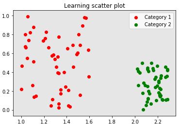
Explanation: So here we have created scatter plot for different categories and labeled them.
Example to Implement Matplotlib Scatter
Finally, let us take an example where we have a correlation between the variables:
Example #1
Here we will define 2 variables, such that we get some sort of linear relation between them
a = [8,10, 14, 12,20,25,30, 44, 48,52, 32, 30,44, 40, 55,50]
b = [70, 100, 136,120, 200, 210, 250, 300, 310, 411, 373, 427, 400, 420, 500, 510]
colors = (0,0,0)[this will set color of our plot]
Let us plot our data now
plt.scatter(a, b, c = colors)

plt.title('Scatter plot showing correlation')[‘title’ is called to set title of our scatter plot]
plt.xlabel('x variable')[setting name of x-axis]
plt.ylabel('y variable')[setting name of y-axis]
plt.show()[displaying our scatter plot]
This is how our input and output will look like in python:
Code:
import numpy as np

import matplotlib.pyplot as plt

a = [8,10, 14, 12,20,25,30, 44, 48,52, 32, 30,44, 40, 55,50]
b = [70, 100, 136,120, 200, 210, 250, 300, 310, 411, 373, 427, 400, 420, 500, 510]
colors = (0,0,0)

plt.scatter(a, b, c = colors)

plt.title('Scatter plot showing correlation')

plt.xlabel('x variable')

plt.ylabel('y variable')

plt.show()
Output:
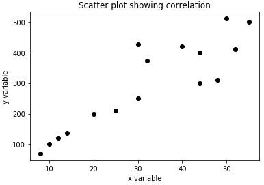
Explanation: We can clearly see in our output that there is some linear relationship between the 2 variables initially. While the linear relation continues for the larger values, there are also some scattered values or outliers.
Conclusion
Scatter plots become very handy when we are trying to understand the data intuitively. It helps us in understanding any relation between the variables and also in figuring out outliers if any.
Recommended Articles
This is a guide to Matplotlib Scatter. Here we discuss an introduction to Matplotlib Scatter, how to create plots with example for better understanding. You can also go through our other related articles to learn more –
