Updated June 17, 2023

Introduction to CSS Triangle Generator
Every triangle actively forms by joining 3 lines at its endpoints, creating a certain angle at each vertex. The sum of the three angles in a triangle actively equals 180 degrees. Usually, we have seen the equilateral and right-angle triangles; we will see how to create these 2 triangles in this tutorial. We can form 4 triangles from a single square or rectangle.
Creating four triangles in a square will be seen in the “How does triangle generator work in CSS” concept and examples that will clear your doubt.
Syntax of CSS Triangle Generator:
div{
width:0px;
height:0px;
border: 200px solid;
border-bottom-color: green;
border-top-color: transparent;
border-left-color: transparent;
border-right-color: transparent;
}
The above syntax will give you an equilateral triangle by setting the square’s top, left, and right corners to transparent, making the top, left, and right corners invisible. That complete fills our requirements.
How Does the Triangle Generator Work in CSS?
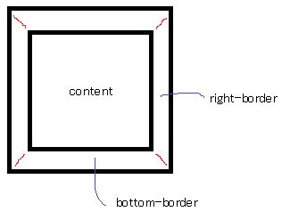
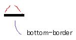
1. Any HTML page structure should have a top, right, bottom, and left border. The inner and outer borders have 45 degrees of deviation at highlighted red marks.
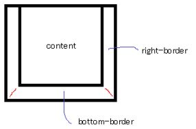
2. remove the top border than the above image becomes to look like the below image.
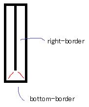
3. Remove the width of the above image. Then, it will become like the below image with a width of 0.
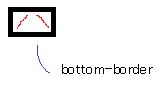
4. Remove the Height of the above image. Then, it will become a below image with height of 0.
5. Finally, remove the two-sided border of the above image. Then the resultant image should be like a triangle, as below.
From the above observation, we can technically set CSS values of border-bottom, border-left, border-right, and border-top to corresponding values to get a triangle.
Examples of CSS Triangle Generator
We can form 2 types of triangles in CSS using the examples below.
1. Equilateral Triangle
All the sides are equal in an equilateral triangle.
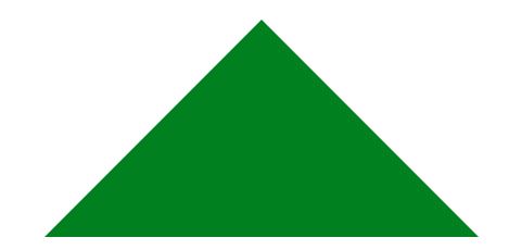
Example #1 – Top Equilateral Triangle (non-inverted)
It can be formed by setting the border’s top color to green and the rest of the borders transparent.
HTML Code: TopEquilateralTriangle.html
<!DOCTYPE html>
<html>
<head>
<meta charset="ISO-8859-1">
<link rel="stylesheet" href="TopEquilateralTriangle.css">
<title>TopEquilateralTriangle</title>
</head>
<body>
<div class="topEqui"></div>
</body>
</html>
CSS Code: TopEquilateralTriangle.css
.topEqui {
width: 0px;
height: 0px;
border: 200px solid;
border-bottom-color: transparent;
border-top-color: green;
border-left-color: transparent;
border-right-color: transparent;
}
Output:
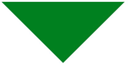
Example #2 – Bottom Equilateral Triangle (inverted)
It can be formed by setting border-bottom-color to green and the rest of the borders transparent. It is exactly an inverted image of the Top Equilateral Triangle.
HTML Code: BottomEquilateralTriangle.html
<!DOCTYPE html>
<html>
<head>
<meta charset="ISO-8859-1">
<link rel="stylesheet" href="BottomEquilateralTriangle.css">
<title>BottomEquilateralTriangle</title>
</head>
<body>
<div class="bottomEqui"></div>
</body>
</html>
CSS Code: BottomEquilateralTriangle.css
.bottomEqui {
width: 0px;
height: 0px;
border: 200px solid;
border-bottom-color: green;
border-top-color: transparent;
border-left-color: transparent;
border-right-color: transparent;
}
Output:
Example #3 – Left Equilateral Triangle (inverted)
It can be formed by setting the border-left color to green and the rest of the borders to transparent.
HTML Code: LeftEquilateralTriangle.html
<!DOCTYPE html>
<html>
<head>
<meta charset="ISO-8859-1">
<link rel="stylesheet" href="LeftEquilateralTriangle.css">
<title>LeftEquilateralTriangle</title>
</head>
<body>
<div class="leftEqui"></div>
</body>
</html>
CSS Code: LeftEquilateralTriangle.css
.leftEqui {
width: 0px;
height: 0px;
border: 200px solid;
border-bottom-color: transparent;
border-top-color: transparent;
border-left-color: green;
border-right-color: transparent;
}
Output:
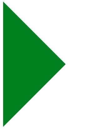
Example #4 – Right Equilateral Triangle (inverted)
It can be formed by setting the border-right-color to green and the rest of the borders to transparent. It is exactly an inverted image of the Left Equilateral Triangle.
HTML Code: RightEquilateralTriangle.html
<!DOCTYPE html>
<html>
<head>
<meta charset="ISO-8859-1">
<link rel="stylesheet" href="RightEquilateralTriangle.css">
<title>RightEquilateralTriangle</title>
</head>
<body>
<div class="rightEqui"></div>
</body>
</html>
CSS Code: RightEquilateralTriangle.css
.rightEqui {
width: 0px;
height: 0px;
border: 200px solid;
border-bottom-color: transparent;
border-top-color: transparent;
border-left-color: transparent;
border-right-color: green;
}
Output:

2. Right Angle Triangle
Base square and Height square sum are equal to hypothesis square, and one angle is 90 degrees is said to be Right angle triangle.
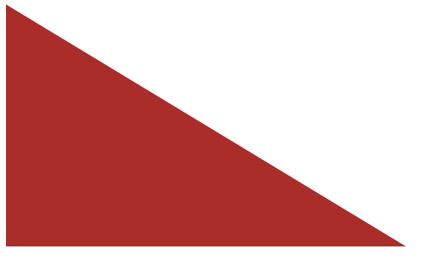
Example #5 – Left Right-angle Triangle
To form it, actively set the border-bottom-color and border-left color to brown while setting the rest of the borders to transparent.
HTML Code: LeftRightAngleTriangle.html
<!DOCTYPE html>
<html>
<head>
<meta charset="ISO-8859-1">
<link rel="stylesheet" href="LeftRightAngleTriangle.css">
<title>LeftRightAngleTriangle</title>
</head>
<body>
<div class="leftRightAngle"></div>
</body>
</html>
CSS Code: LeftRightAngleTriangle.css
.leftRightAngle {
width: 0px;
height: 0px;
border: 200px solid;
border-bottom-color: brown;
border-top-color: transparent;
border-left-color: brown;
border-right-color: transparent;
}
Output:
Example #5 – Right-Angle Triangle
You can form it by actively setting the border-top color and border-right-color to brown while setting the rest of the borders to transparent. Exactly inverted image of Left Right-angle Triangle.
HTML Code: RightRightAngleTriangle.html
<!DOCTYPE html>
<html>
<head>
<meta charset="ISO-8859-1">
<link rel="stylesheet" href="RightRightAngleTriangle.css">
<title>RightRightAngleTriangle</title>
</head>
<body>
<div class="rightRightAngle"></div>
</body>
</html>
CSS Code: RightRightAngleTriangle.css
.rightRightAngle {
width: 0px;
height: 0px;
border: 200px solid;
border-bottom-color: transparent;
border-top-color: brown;
border-left-color: transparent;
border-right-color: brown;
}
Output:

Conclusion
We can generate an equilateral and right-angle triangle with a square by setting the border color to specific color, and the rest are transparent, and width and height should be kept 0px.
Recommended Articles
We hope that this EDUCBA information on “CSS Triangle Generator” was beneficial to you. You can view EDUCBA’s recommended articles for more information.

