Updated June 27, 2023
Introduction to CSS Header Design
A website has a layout and is mainly divided into header, footer, menus, and content. In this, we will see the header section of the website layout. A header is located at the top of the website layout, containing a logo or website name and some brief information about the website content. The header section of the website is a very important part while designing the website, which is used to grab the customer’s attention and the customers establish connections with such websites very soon. Therefore header design of the website should be unique and appealing to the customers or users.
Functions of Header Designing in CSS
In this article, we will see how to design a website header. The header is usually laced at the top of the page, which is a crucial part of the website. Headers and footers represent essential elements of a website. Headers hold greater significance as visitors often interact with the header before exploring the website’s content and footer. The most recommended header size in website design is typically 1024px × 768px. Let us see a simple example of the header of the website.
Examples to Implement of CSS Header Design
Below are examples of CSS Header Design:
Example #1
Code:
<!DOCTYPE html>
<html>
<head>
<title>Educba Training </title>
<style>
body {
font-family: Times New Roman;
margin: 0;
}
.header {
padding: 10px;
text-align: center;
background: cyan;
color: black;
font-size: 20px;
}
.content {padding:20px;}
</style>
</head>
<body>
<div class="header">
<h1>CSS Header designing </h1>
<p>We can write here the header section </p>
</div>
<div class="content">
<h1> Website main content </h1>
<p>EDUCBA is an online training provider which offers you training programs or courses across any field which you wish to learn and excel on. </p>
</div>
</body>
</html>
Output:
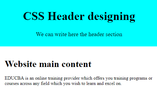
Explanation: In the above program, we can see we have designed the website’s header with different CSS styling properties. This is how the header section of the website. There is another property in CSS in which you can create a fixed or sticky header using CSS fixed positioning, such as CSS position property with the value fixed or sticky. Let us see an example below.
Example #2
Code:
<!DOCTYPE html>
<html>
<head>
<title>Educba Training </title>
<style>
body{
padding-top: 60px;
padding-bottom: 40px;
}
.fixed-header
{
width: 100%;
position: fixed;
background: #333;
padding: 10px 0;
color: #fff;
}
.fixed-header{
top: 0;
}
.container{
width: 80%;
margin: 0 auto;
}
nava{
color: #fff;
padding: 7px 25px;
display: inline-block;
}
</style>
</head>
<body>
<div class="fixed-header">
<div class="container">
<nav>
<a href="#"> Home </a>
<a href="#"> Articles </a>
<a href="#"> Directory </a>
<a href="#"> Events </a>
<a href="#"> About Us</a>
</nav>
</div>
</div>
<div class="container">
<p> EDUCBA is a leading global provider of skill based online education. It offers amazing 1700+ courses across 10+ verticals prepared by top notch professionals from the industry which are job oriented skill based programs demanded by the industry. Through its online feature you can learn at any time & anyplace so plan your study to suit your convenience & schedule. </p>
</div>
</body>
</html>
Output:
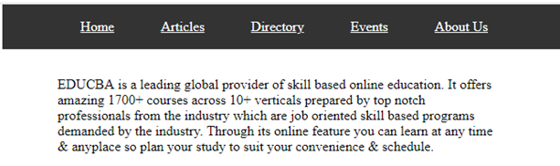
Explanation: In the above program, we have seen the CSS property position in the header section, in which we have declared the value as “fixed” as you can see in the above screenshot. As we know, there are many ways to create the header, which can be created as static or responsive. Responsive headers are defined as to which they can adjust to any screen sizes. There are options to create a responsive header, designed as shown in the example below.
Example #3
Code:
<!DOCTYPE html>
<html>
<head>
<style>
* {box-sizing: border-box;}
body {
margin: 0;
font-family: Arial;
}
.header {
overflow: hidden;
background-color: cyan;
padding: 20px 10px;
}
.header a {
float: left;
color: black;
text-align: center;
padding: 12px;
text-decoration: none;
font-size: 15px;
line-height: 25px;
border-radius: 5px;
}
.headera.logo {
font-size: 25px;
font-weight: bold;
}
.header a:hover {
background-color: grey;
color: black;
}
.headera.active {
background-color: green;
color: white;
}
.header-right {
float: right;
}
@media screen and (max-width: 500px) {
.header a {
float: none;
display: block;
text-align: left;
}
.header-right {
float: none;
}
}
</style>
</head>
<body>
<div class="header">
<a href="#default" class="logo">CompanyLogo</a>
<div class="header-right">
<a class="active" href="#home">Home</a>
<a href="#contact">Articles</a>
<a href="#about">About Us</a>
</div>
</div>
<div style="padding-left:20px">
<h1>CSS Responsive Header</h1>
<p>Resize the browser window to see the effect.</p>
<p> EDUCBA is a leading global provider of skill based online education. It offers amazing 1700+ courses across 10+ verticals prepared by top notch professionals from the industry which are job oriented skill based programs demanded by the industry. </p>
</div>
</body>
</html>
Output:

Explanation: In the above program, we have created a responsive header, which resizes itself accordingly as the size of the browser increases or decreases. Therefore, we refer to the header as a responsive header. We should note that if we specify the fixed width for the header, it won’t be responsive, so it is better to use center alignment. We can also see we have declared a media query in which we have to code for responsive header designing, and we have managed the max-width with “500px” and this we have done using two languages, HTML and CSS.
Conclusion
In this article, we have seen how to create a header in CSS. This article concludes that the header is a crucial and important section of any website layout. As we saw, the header is the main section that attracts customers, so designing an effective header is very important. We have also seen how to create a header using the position property of CSS, which provides values like sticky or fixed. In the end, we have discussed a responsive header for which we use a media query to create a responsive header for resizing the header to the browser size.
Recommended Articles
We hope that this EDUCBA information on “CSS Header Design” was beneficial to you. You can view EDUCBA’s recommended articles for more information.

