Updated October 6, 2023
Why do Investment Bankers and Equity Research Analysts prefer Band Charts?
Band Chart Sample Data
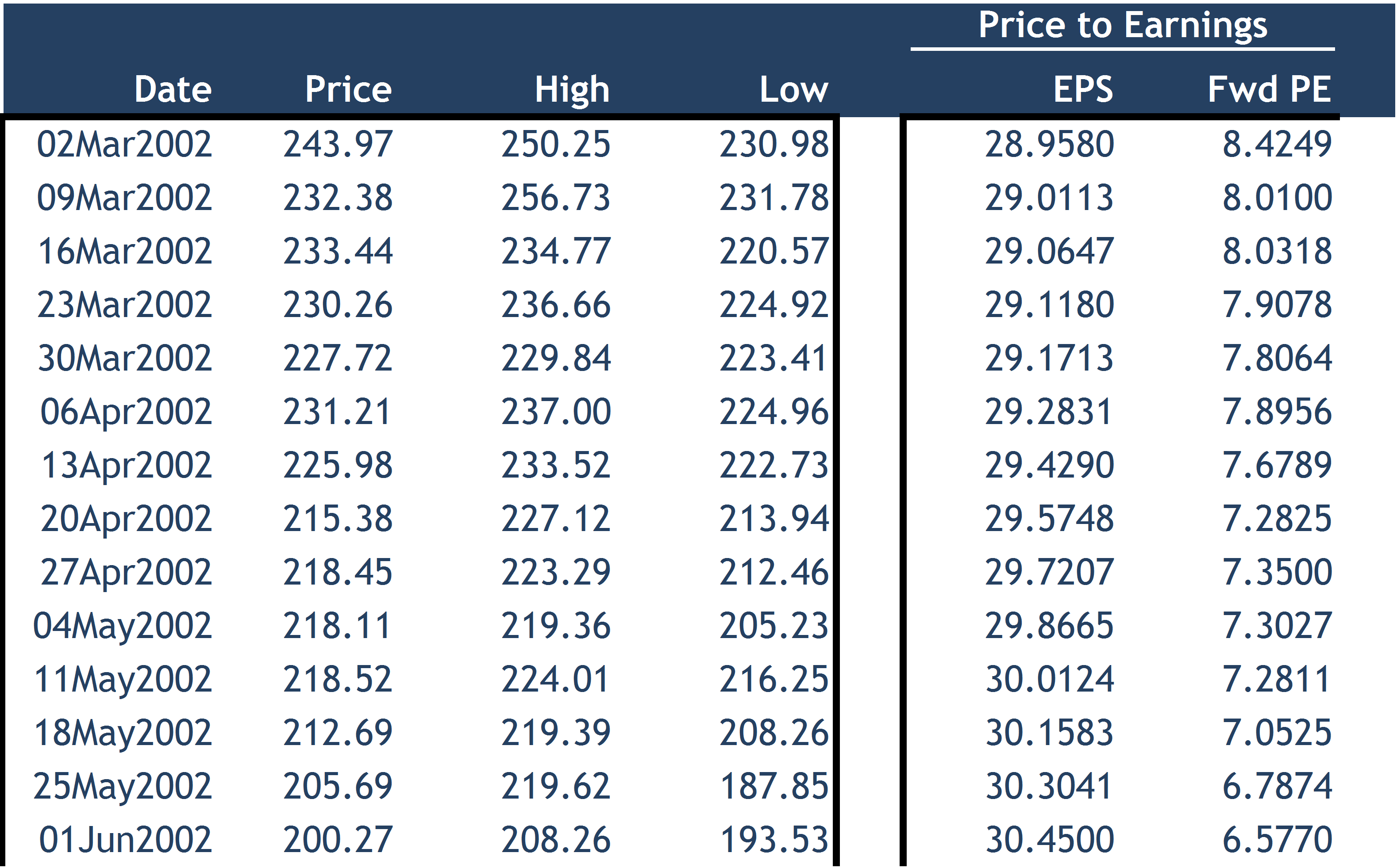
While working as equity research analysts, we make various valuation-related graphs. One can use the above data to make the Price-to-Earnings (PE) graph. We can plot the historical PE ratios. However, the PE ratio graph may not give us the required interpretation.
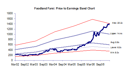
We could look at a better version of the PE ratio graph called Band Charts, made on the same data.
What are Band Charts?
Band Charts are also made on the same data as the Ratio Charts. However, the Y-axis of band charts provides the Price Per share as compared to the PE ratio, as given in the Ratio Graph. This kind of graph is one of the most important graphs used by Research Analysts for their reports. One draws the band between the maximum PE and the minimum PE for the stock.
The above Excel screenshot explains to you the investment banking basics of band chart. One can follow the below steps to make the band chart:
Step 1: Download the Price and the forward EPS for historical data from Bloomberg or other related databases.
Step 2: Calculate the PE ratio for the historical data.
Step 3: Calculate the average, maximum, and minimum of the PE ratios.
Step 4: Find the implied price at the average, maximum, and minimum PE ratio using the following formula:
- Price (corresponding to average) = Average PE x (Historical EPS)
- Price (corresponding to maximum) = Average PE x (Historical EPS)
- Price (corresponding to minimum) = Average PE x (Historical EPS)
- For better visual effects, you may like to add one PE line between maximum and average (called Upper) and likewise a line between minimum and average (called Lower)
Interpretation of Band Charts
Currently, the Price Line (colored in BLUE) is touching the Maximum PE Band Line of 20.2x. If we trace back the Maximum PE Band Line till March’02, we find the price range at which the stock would have traded. For example, as of March’02, the stock would have traded at Rs600/- if the PE of the stock then was 20.2x.
