Updated July 6, 2023

Introduction to React Native Modal
The React Native Modal is used to display some content above the enclosing view. It is a type of View Component. There are three different ways to display the modal in a React native app. The three different ways are:
- Slide
- Fade
- None
Every application needs to be more and more interactive to stand out in the market, and Modal is a way to make the application much more interactive, and it makes a view much more informative. In this article, we will go through a couple of examples and understand how we can work on Modal.
Working of React Native Modal with Examples
1. Basic Modal Example-
Components inside src folder:
- App.js
- Modal.js
- index.js
- styles.css
[i] App.js
import React from "react"; import Modal from "./Modal";
class App extends React.Component { constructor(props) {
super(props);
this.toggleModal = this.toggleModal.bind(this);
this.state = { isModalOpen: false
};
}
toggleModal() {
const { isModalOpen } = this.state; this.setState({ isModalOpen: !isModalOpen });
}
render() { return (
<div>
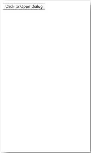
<button onClick={this.toggleModal}>Click to Open dialog</button>
<Modal isOpen={this.state.isModalOpen} onClose={this.toggleModal}>
<div>Hello CoderBug!</div>
<div>Feel free to add your Modal Content Here!</div>
</Modal>
</div>
);
}
}
export default App;[ii] Modal.js
import React from "react";
import PropTypes from "prop-types";
class Modal extends React.Component { render() {
if (!this.props.isOpen) { return null;
}
const BackgroundStyle = { backgroundColor: "#e9b8f5", position: "fixed",
top: 0,
right: 0,
bottom: 0,
left: 0
};
const ModalStyle = { maxWidth: 401,
minHeight: 201, backgroundColor: "#d8ff8f", margin: "auto",
padding: 6
};
const HeaderStyle = { height: 21,
width: "100%"
};
const CloseBtnStyle = { float: "right", cursor: "pointer", display: "block"
};
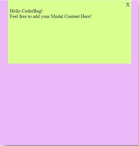
return (
<div style={BackgroundStyle}>
<div style={ModalStyle}>
<div style={HeaderStyle}>
<span style={CloseBtnStyle} onClick={this.props.onClose}> X
</span>
</div>
{this.props.children}
</div>
</div>
);
}
}
Modal.propTypes = {
onClose: PropTypes.function, isOpen: PropTypes.bool, children: PropTypes.node
};
export default Modal;[iii] index.js
import React from "react";
import ReactDOM from "react-dom";
import App from "./App";
const rootElement = document.getElementById("root");
ReactDOM.render(<App />, rootElement);
[iv] styles.css
.App {
font-family: sans-serif;
text-align: center;
}
Output:
2. Modal with Text and Image Modal Window-
Files include:
- SimpleModal folder
- SimpleModalLauncher folder
- IndexStyles.js
- index.html
- index.js
Components inside SimpleModal folder:
- SimpleModal.js
- SimpleModalStyles.js
Components inside SimpleModalLauncher folder:
- SimpleModalLauncher.js
- SimpleModalLauncherStyles.js
[i] SimpleModal.js
import React, { Component } from "react";
import PropTypes from "prop-types";
import injectSheet from "react-jss";
import isNil from "lodash/fp/isNil";
import styles from "./SimpleModalStyles";
class SimpleModal extends Component {
constructor(props) {
super(props);
this.handleKeyUp = this.handleKeyUp.bind(this);
this.handleOutsideClick = this.handleOutsideClick.bind(this);
}
componentDidMount() {
window.addEventListener("keyup", this.handleKeyUp, false);
document.addEventListener("click", this.handleOutsideClick, false);
}
componentWillUnmount() {
window.removeEventListener("keyup", this.handleKeyUp, false);
document.removeEventListener("click", this.handleOutsideClick, false);
}
handleKeyUp(e) {
const { onCloseRequest } = this.props;
const keys = {
27: () => {
e.preventDefault();
onCloseRequest();
window.removeEventListener("keyup", this.handleKeyUp, false);
}
};
if (keys[e.keyCode]) {
keys[e.keyCode]();
}
}
handleOutsideClick(e) {
const { onCloseRequest } = this.props;
if (!isNil(this.modal)) {
if (!this.modal.contains(e.target)) {
onCloseRequest();
document.removeEventListener("click", this.handleOutsideClick,
false);
}
}
}
render() {
const { onCloseRequest, children, classes } = this.props;
return (
<div className={classes.modalOverlay}>
<div className={classes.modal} ref={node => (this.modal = node)}>
<div className={classes.modalContent}>{children}</div>
</div>
<button type="button"
className={classes.closeButton}
onClick={onCloseRequest}
/>
</div>
);
}
}
SimpleModal.propTypes = { onCloseRequest: PropTypes.func,
children: PropTypes.oneOfType([
PropTypes.arrayOf(PropTypes.node),
PropTypes.node
]),
sheet: PropTypes.object,
classes: PropTypes.object
};
export default injectSheet(styles)(SimpleModal);
[ii] SimpleModalStyles.js
export default { '@global': {
'body': {
overflow: 'hidden',
},
},
modalOverlay: {
display: 'flex',
alignItems: 'center', justifyContent: 'center', position: 'fixed',
top: 0,
right: 0,
left: 0,
bottom: 0, padding: '1.1rem',
backgroundColor: '#0f0d0d', zIndex: '9999',
opacity: 1,
animation: 'show .05s ease', overflowX: 'hidden', overflowY: 'auto',
},
'@keyframes show': { '0%': {
display: 'none', opacity: 0,
}, '1%': {
display: 'flex', opacity: 0,
}, '100%': {
opacity: 1,
},
},
modal: {
width: '100%', backgroundColor: '#fcf0f0',
boxShadow: [0, 0, '0.626rem', '#171616'],
'@media (min-width: 575px)': { width: '33rem',
},
},
closeButton: { position: 'fixed', top: 0,
right: 0,
background: '#f5f0f0', width: '2.50rem', height: '2.50rem', padding: 0,
border: 0,
cursor: 'pointer', outline: 0,
boxShadow: [0, 0, '0.626rem', '#171616'],
'&:before, &:after': {
content: '""', position: 'absolute', top: '1.20rem',
left: '0.26rem',
width: '2.0rem',
height: '0.10rem', backgroundColor: '#6bb38f',
},
'&:before': {
transform: 'rotate(45deg)',
},
'&:after': {
transform: 'rotate(-45deg)',
},
'&:hover:before, &:hover:after': { backgroundColor: '#3b3434',
},
},
};
[iii] SimpleModalLauncher.js
import React, { Component } from "react";
import PropTypes from "prop-types";
import injectSheet from "react-jss";
import styles from "./SimpleModalLauncherStyles";
import SimpleModal from "../SimpleModal/SimpleModal";
class SimpleModalLauncher extends Component { constructor(props) {
super(props); this.state = {
showModal: false
};
}
handleToggleModal() {
this.setState({ showModal: !this.state.showModal });
}
render() {
const { buttonLabel, children, classes } = this.props; const { showModal } = this.state;
return (
<div>
<button type="button"
className={classes.modalButton} onClick={() => this.handleToggleModal()}
>
{buttonLabel}
</button>
{showModal && (
<SimpleModal onCloseRequest={() => this.handleToggleModal()}>
{children}
</SimpleModal>
)}
</div>
);
}
}
SimpleModalLauncher.propTypes = { buttonLabel: PropTypes.string.isRequired, children: PropTypes.oneOfType([
PropTypes.arrayOf(PropTypes.node), PropTypes.node
]),
sheet: PropTypes.object, classes: PropTypes.object
};
export default injectSheet(styles)(SimpleModalLauncher);
[iv] SimpleModalLauncherStyles.js
export default {
modalButton: {
padding: ['0.70rem', '1.80rem'],
backgroundColor: '#de71a2',
border: 0,
borderRadius: '0.30rem',
fontSize: '1.0rem',
color: '#fcf7fa',
cursor: 'pointer',
marginBottom: '0.80rem',
'&:hover': {
backgroundColor: '#71c99c',
},
},
};
[v] indexStyles.js
export default {
'@global': {
html: {
fontSize: '15px', boxSizing: 'border-box',
},
'*, *:before, *:after': { boxSizing: 'inherit',
},
body: {
backgroundColor: '#f4ffa3',
color: '#2e2b2b',
fontFamily: 'Sans-serif',
fontWeight: 'normal',
fontSize: '1.0rem',
lineHeight: '1.6',
},
h1: {
margin: ['2.0rem', 0, '1.0rem'],
},
header: {
marginBottom: '2.0rem',
},
a: {
color: '#55c2c9',
},
'a:hover': {
color: '#b479e0',
},
},
appWrapper: {
textAlign: 'center',
},
textModal: {
textAlign: 'left',
margin: '0.80rem',
padding: '0.80rem',
background: '#c1e4f5',
'& h2': {
marginTop: 0,
},
'& p': { marginBottom: 0,
},
},
imageModal: {
padding: '0.40rem',
'& img': {
display: 'block',
maxWidth: '100%', height: 'auto',
},
},
};
[vi] index.html
<div id="root"></div>[vii] index.js
import React from "react";
import { render } from "react-dom";
import PropTypes from "prop-types";
import injectSheet from "react-jss";
import styles from "./IndexStyles";
import SimpleModalLauncher from "./SimpleModalLauncher/SimpleModalLauncher";
const App = ({ classes }) => (
<div className={classes.appWrapper}>
<header>
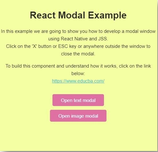
<h1>React Modal Example</h1>
<p>
In this example we are going to show you how to develop a modal window using React Native and JSS.
<br />
Click on the 'X' button or ESC key or anywhere outside the window to close the modal.
</p>
<p>
To build this component and understand how it works, click on the link below:
<br />
<a href="">https://www.educba.com/</a>
</p>
</header>
<SimpleModalLauncher buttonLabel="Open text modal">
<div className={classes.textModal}>
<h2>Welcome to Modal Window</h2>
<p>
THIS IS BASIC MODAL WINDOW. THIS WINDOW IS BUILT USING REACT
NATIVE.
</p>
</div>
</SimpleModalLauncher>
<SimpleModalLauncher buttonLabel="Open image modal">
<div className={classes.imageModal}>
<img
className={classes.imageInModal} src="https://placeimg.com/800/450/nature" alt="Nature"
/>
</div>
</SimpleModalLauncher>
</div>
);
App.propTypes = {
sheet: PropTypes.object, classes: PropTypes.object
};
const StyledApp = injectSheet(styles)(App);
render(<StyledApp />, document.getElementById("root"));Output:


Conclusion
On the basis of the above discussion, we got to know about what Modal is and how it can be used efficiently to build a good view. It is a great view component and adds a great feature to React Native-based applications, which makes the application more interactive and User Friendly. The above two examples show how it can be used to build both textual as well as image windows in React Native.
Recommended Articles
This is a guide to React Native Modal. Here we discuss the working of Modal with three different ways to display modal in an app and examples of how it can be used along with the outputs in detail. You may also look at the following articles to learn more –

