Updated April 20, 2023

Introduction to React Native Material
The following article provides an outline for React Native Material. Half a decade back, working on React Native was quite tedious. There was a lack of Libraries or User Interface toolkits to create native-like user interface elements, but the scenario is different now. Now, React Native is the latest trend among developers. There is one such Library which helps in creating some exciting UI elements which can act as an attraction point to the Application. Material User Interface Library helps us in creating awesome material bottom navigation and everything is in JavaScript. There are no native dependencies required for it, it’s very easy to use and the application looks stunning with this.
Using React Native Material with Examples
Given below are mentioned some of the examples:
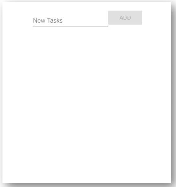
Example #1 – Based To-Do App
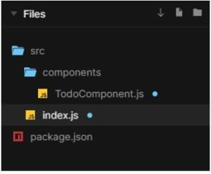
Components inside src folder:
- components folder
- index.js
Components inside components folder:
- TodoComponent.js
The files used to implement the example below are:
a. TodoComponent.js
import React from "react";
import TextField from "material-ui/TextField";
import Button from "material-ui/Button";
import IconButton from "material-ui/IconButton";
import Card from "material-ui/Card";
import Divider from "material-ui/Divider";
import Switch from "material-ui/Switch";
import DeleteIcon from "material-ui-icons/Delete";
import Tooltip from "material-ui/Tooltip";
import { FormGroup, FormControlLabel } from "material-ui/Form";
const styles = {
done: {
textDecoration: "line-through",
opacity: ".25",
display: "flex",
width: "99%"
},
header: {
justifyContent: "center",
display: "flex",
flexDirection: "row",
alignItems: "center"
},
main: {
width: "101%",
maxWidth: "401px",
margin: "21px auto"
},
card: {
padding: "21px",
margin: "21px 0"
},
todo: {
position: "relative",
display: "flex",
flexFow: "row",
alignContent: "space-between"
},
label: {
display: "flex",
width: "101%"
},
divider: {
position: "absolute",
width: "101%",
top: 0
}
};
class TodoComponent extends React.Component {
state = {
tasks: [],
newTask: ""
};
onTextUpdate = e => {
this.setState({ newTask: e.target.value });
};
addTask = () => {
let { tasks, newTask } = this.state;
tasks.push({ text: newTask, done: false });
this.setState({ tasks: tasks, newTask: "" });
};
deleteTask = task => {
let { tasks } = this.state;
tasks.splice(tasks.indexOf(task), 1);
this.setState({ tasks: tasks, newTask: "" });
};
toggle = task => {
let { tasks } = this.state;
tasks[tasks.indexOf(task)].done = !tasks[tasks.indexOf(task)].done;
this.setState({ tasks: tasks, newTask: "" });
};
render() {
const { tasks, newTask } = this.state;
return (
<div id="main" style={styles.main}>
<header style={styles.header}>
<TextField
label="New Tasks"
value={newTask}
onChange={this.onTextUpdate}
/>
<Button
variant="raised"
color="secondary"
disabled={!newTask}
onClick={this.addTask}
>
Add
</Button>
</header>
{tasks.length > 0 && (
<Card style={styles.card}>
<FormGroup>
{tasks.map((task, index) => (
<div key={index} style={styles.todo}>
{index > 0 ? <Divider style={styles.divider} /> : ""}
<FormControlLabel
control={
<Switch
color="secondary"
checked={!task.done}
onChange={() => this.toggle(task)}
/>
}
label={task.text}
style={task.done ? styles.done : styles.label}
/>
<Tooltip title="Click to Delete" placement="top">
<IconButton
aria-label="delete"
onClick={() => this.deleteTask(task)}
>
<DeleteIcon />
</IconButton>
</Tooltip>
</div>
))}
</FormGroup>
</Card>
)}
</div>
);
}
}
export default TodoComponent;
b. index.js
import React from "react";
import { render } from "react-dom";
import TodoComponent from "./components/TodoComponent";
import { MuiThemeProvider, createMuiTheme } from "material-ui/styles";
import blue from "material-ui/colors/pink";
const theme = createMuiTheme({
palette: {
primary: blue,
type: "light"
}
});
const App = () => (
<MuiThemeProvider theme={theme}>
<TodoComponent />
</MuiThemeProvider>
);
render(<App />, document.getElementById("root"));
Output:
Example #2 – Tour with a Dialog
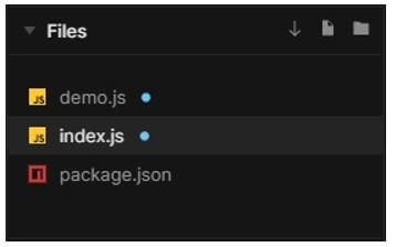
Components to build up:
- demo.js
- index.js
The files used to implement the example below are:
a. demo.js
import React from "react";
import { withStyles } from "@material-ui/core/styles";
import Button from "@material-ui/core/Button";
import Dialog from "@material-ui/core/Dialog";
import MuiDialogTitle from "@material-ui/core/DialogTitle";
import MuiDialogContent from "@material-ui/core/DialogContent";
import MuiDialogActions from "@material-ui/core/DialogActions";
import IconButton from "@material-ui/core/IconButton";
import CloseIcon from "@material-ui/icons/Close";
import Typography from "@material-ui/core/Typography";
import Slide from "@material-ui/core/Slide";
import Tour from "reactour";
const Transition = React.forwardRef(function Transition(props, ref) {
return <Slide direction="up" ref={ref} {...props} />;
});
const styles = theme => ({
root: {
margin: 0,
padding: theme.spacing(2.5)
},
closeButton: {
position: "absolute",
right: theme.spacing(1),
top: theme.spacing(1),
color: theme.palette.grey[501]
}
});
const DialogTitle = withStyles(styles)(props => {
const { children
, classes
, onClose
, ...other } = props;
return (
<MuiDialogTitle disableTypography className={classes.root} {...other}>
<Typography variant="h6">{children}</Typography>
{onClose ? (
<IconButton
aria-label="close"
className={classes.closeButton}
onClick={onClose}
>
<CloseIcon />
</IconButton>
) : null}
</MuiDialogTitle>
);
});
const DialogContent = withStyles(theme => ({
root: {
padding: theme.spacing(2.5)
}
}))(MuiDialogContent);
const DialogActions = withStyles(theme => ({
root: {
margin: 0.1,
padding: theme.spacing(1)
}
}))(MuiDialogActions);
const tourConfig = [
{
selector: '[data-tut="reactour__iso"]',
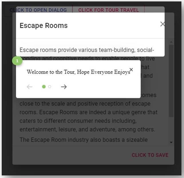
content: `Welcome to the Tour, Hope Everyone Enjoys`
},
{
selector: '[data-tut="reactour__logo"]',
content: `& this will be a exciting journey`
}
];
export default function CustomizedDialogs() {
const accentColor = "#8fc965";
const [open, setOpen] = React.useState(false);
const [isTourOpen, setTourOpen] = React.useState(false);
const handleClickOpen = () => {
setOpen(true);
};
const handleClose = () => {
setOpen(false);
};
const closeTour = () => {
setTourOpen(false);
};
const openTour = () => {
handleClickOpen(true);
setTourOpen(true);
};
return (
<div>
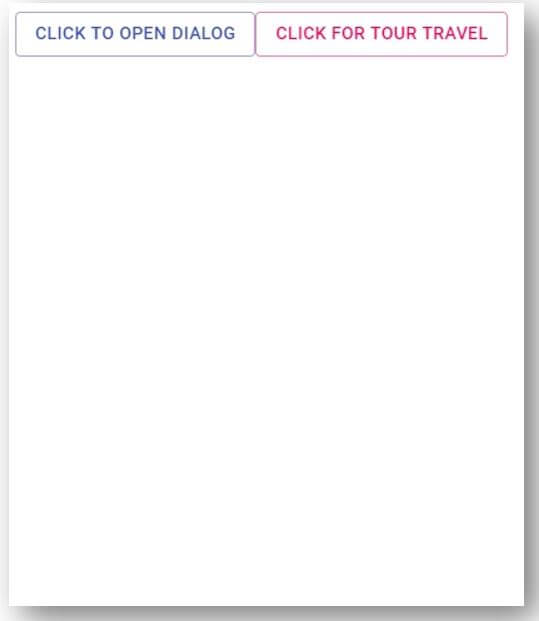
{ <Button variant="outlined" color="primary" onClick={handleClickOpen}>
Click to Open dialog
</Button> }
<Button variant="outlined" color="secondary" onClick={openTour}>
Click for Tour Travel
</Button>
<Tour
onRequestClose={closeTour}
disableInteraction={false}
steps={tourConfig}
isOpen={isTourOpen}
maskClassName="mask"
className="helper"
rounded={5}
accentColor={accentColor}
/>
<Dialog
TransitionComponent={Slide}
onClose={handleClose}
aria-labelledby="customized-dialog-title"
open={open}
>
<DialogTitle id="customized-dialog-title" onClose={handleClose}>
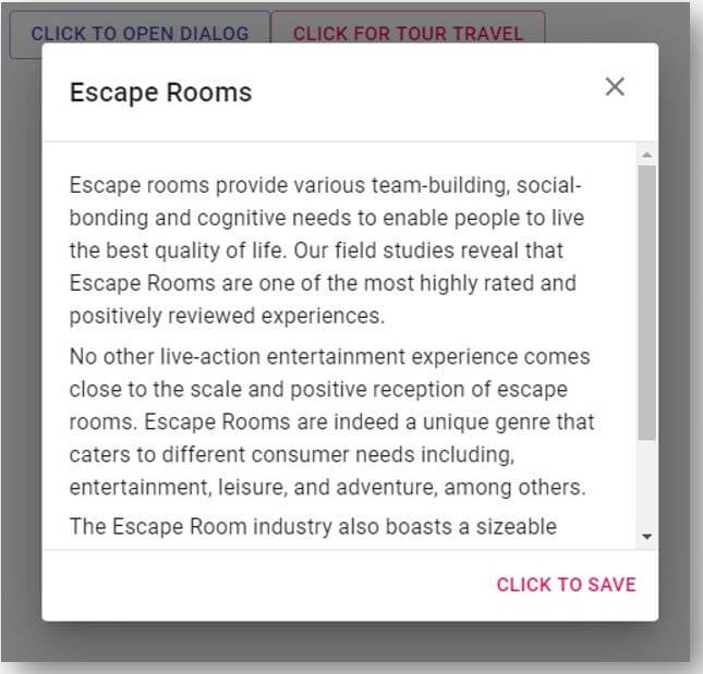
Escape Rooms
</DialogTitle>
<DialogContent dividers>
<Typography data-tut="reactour__iso" gutterBottom>
Escape rooms provide various team-building, social-bonding and cognitive needs to enable people to live the best quality of life. Our field studies reveal that Escape Rooms are one of the most highly rated and positively reviewed experiences.
</Typography>
<Typography gutterBottom>
No other live-action entertainment experience comes close to the scale and positive reception of escape rooms. Escape Rooms are indeed a unique genre that caters to different consumer needs including, entertainment, leisure, and adventure, among others.
</Typography>
<Typography gutterBottom>
The Escape Room industry also boasts a sizeable workforce comprising multidisciplinary roles including Game masters & Support Staff, Business Development Managers, Team Leads & Managers.
</Typography>
</DialogContent>
<DialogActions>
<Button
data-tut="reactour__logo"
autoFocus
onClick={handleClose}
color="secondary"
>
Click to Save
</Button>
</DialogActions>
</Dialog>
</div>
);
}b. index.js
import React from 'react';
import ReactDOM from 'react-dom';
import Demo from './demo';
ReactDOM.render(<Demo />, document.querySelector('#root'));
Output:
Conclusion
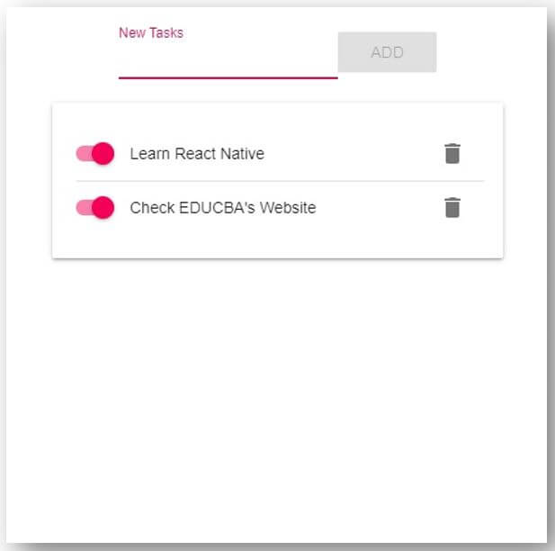
On the basis of the above two examples, we understood how to create some awesome UI elements using Material Library. In the first example, we have made a to do list app, which notes down the tasks and it has a switch that helps us understand if the task is done or yet to be done. In the second example, we have created a Tour of an app using Material Design, it has dialogs that pops up with our actions. The examples were informative and it must have given some ideas on using UI Library.
Recommended Articles
This is a guide to React Native Material. Here we discuss the introduction to React Native Material with uses and respective examples. You may also have a look at the following articles to learn more –

