Updated June 9, 2023
Introduction to Pure CSS Tooltip
It is an element to access any small information using the hover effect. It displays the messages after keeping the mouse in the required place. It is the pure class to show tiny messages of the item using CSS hover. It is the function to apply the CSS hover effect on images, items, or weblinks and disclose the related information. It is an animated function with the message box of the web application web elements or web links.
Syntax
The (HTML page) syntax is below.
<P class = "tooltip" > Pure CSS Tooltip
<span class = "tooltiptext" > Pure CSS tooltip is the most usable style sheet in the world wild. </span>
</P>
Description:
The class = “tooltip” is used to select the Item to create a hover effect.
The class = “tooltiptext” is used to create a message in the tooltip box.
The .top, .bottom, .left, and .right are using for select the tooltip box direction.
The (Style Page) syntax is below.
The tooltiptext becomes hidden before the hover effect applies in the tooltip class.
.tooltip .tooltiptext {
top: -10px;
left: 55px;
position: absolute;
visibility: hidden;
}
The tooltip text becomes visible after the hover effect applies in the tooltip class.
.tooltip:hover .tooltiptext {
visibility: visible;
}
The direction (HTML page) syntax is below.
- The top-side syntax is below.
<P class = "tooltip top" > Pure CSS Tooltip </P>- The bottom side syntax is below.
<P class = "tooltip bottom" > Pure CSS Tooltip </P>- The left-side syntax is below.
<P class = "tooltip left" > Pure CSS Tooltip </P>- The right-side syntax is below.
<P class = "tooltip right" > Pure CSS Tooltip </P>- The directions (Style Page) syntax is below.
- The right-side syntax is below.
.tooltip .tooltiptext {
bottom: 20px;
left: 50px;
}- The text in the top-side syntax is below.
.tooltip .tooltiptext {
width: 150px;
bottom: 20px;
left: 50px;
margin-left: -70px;
}
How does Pure CSS tooltip work?
There are two pure.css links in the framework. These responsive and non-responsive links are below.
The pure.css responsive framework link is added to the HTML files.
<link rel="stylesheet" href="https://unpkg.com/[email protected]/build/base-min.css">The pure.css non-responsive framework link is added to the HTML files.
<link rel="stylesheet" href="https://unpkg.com/[email protected]/build/pure-nr-min.css">The pure.css alternate CDNs file for the responsive framework is added to the HTML files.
<link rel="stylesheet" href="https://cdnjs.cloudflare.com/ajax/libs/pure/2.0.3/pure-min.css"/>Syntax adds to the web page.
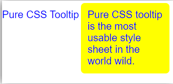
<P class = "tooltip" > Pure CSS Tooltip
<span class = "tooltiptext" > Pure CSS tooltip is the most usable style sheet in the world wild. </span>
</P>
The tooltiptext syntax adds in the html page..tooltip .tooltiptext {
top: -10px;
left: 55px;
position: absolute;
visibility: hidden;
}
.tooltip:hover .tooltiptext {
visibility: visible;
}- Combine the working procedure and make a demo of the tooltip.
<!DOCTYPE html>
<html>
<meta name = "viewport" content = "width = device-width, initial-scale = 1">
<link rel="stylesheet" href="https://unpkg.com/[email protected]/build/pure-min.css">
<style>
.tooltip {
color:blue;
position: relative;
display: inline-block;
}
.tooltip .tooltiptext {
top: -10px;
left: 55px;
position: absolute;
border-radius: 6px;
padding: 10px 10px;
visibility: hidden;
width: 120px;
background-color: yellow;
color:blue;
}
.tooltip:hover .tooltiptext {
visibility: visible;
}
</style>
<body>
<P class="tooltip"> Pure CSS Tooltip
<span class="tooltiptext"> Pure CSS tooltip is the most usable style sheet in the world wild. </span>
</P>
</body>
</html>
Examples
Let us discuss the examples.
Example #1
Code:
<html>
<meta name = "viewport" content = "width = device-width, initial-scale = 1">
<link rel="stylesheet" href="https://unpkg.com/[email protected]/build/pure-min.css">
<style>
.tooltip {
color:blue;
position: relative;
display: inline-block;
}
.tooltip .tooltiptext {
top: -10px;
left: 125px;
position: absolute;
border-radius: 6px;
padding: 10px 10px;
visibility: hidden;
width: 120px;
background-color: yellow;
color:blue;
}
.tooltip:hover .tooltiptext {
visibility: visible;
}
</style>
<body>
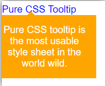
<P class="tooltip right"> Pure CSS Tooltip
<span class="tooltiptext"> Pure CSS tooltip is the most usable style sheet in the world wild. </span>
</P>Output:
Example #2: Arrow and bottom side message box
Code:
<!DOCTYPE html>
<html>
<meta name = "viewport" content = "width = device-width, initial-scale = 1">
<link rel="stylesheet" href="https://unpkg.com/[email protected]/build/pure-min.css">
<style>
.tooltip {
color:blue;
position: relative;
display: inline-block;
}
.tooltip .tooltiptext {
visibility: hidden;
width: 150px;
background-color: orange;
color: white;
text-align: center;
padding: 15px 10px;
position: absolute;
top: 100%;
left: 45%;
margin-left: -70px;
}
.tooltip .tooltiptext::after {
content: "";
position: absolute;
margin-left: -2px;
border-width: 10px;
bottom: 100px;
left: 55px;
border-style: solid;
border-color: transparent transparent orange transparent;
}
.tooltip:hover .tooltiptext {
visibility: visible;
}
</style>
<body>
<P class="tooltip"> Pure CSS Tooltip
<span class="tooltiptext"> Pure CSS tooltip is the most usable style sheet in the world wild. </span>
</P>
Output:
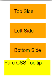
Example #3: Multiple message box
Code:
<!DOCTYPE html>
<html>
<head>
<meta name = "viewport" content = "width = device-width, initial-scale = 1">
<link rel="stylesheet" href="https://unpkg.com/[email protected]/build/pure-min.css">
<style>
body {
display: flex;
align-items: center;
flex-direction: column;
justify-content: center;
height: 500px;
}
.tooltip {
background-color: orange;
padding: 15px 15px;
position: relative;
margin: 15px;
}
.tooltip::after {
background-color: yellow;
color: black;
display: none;
position: absolute;
z-index: 999;
width: 150px;
height:50px;
}
.tooltip::before {
background-color: yellow;
content: ' ';
display: none;
position: absolute;
width: 15px;
height: 15px;
z-index: 999;
}
.tooltip:hover::after {
display: block;
}
.tooltip:hover::before {
display: block;
}
.tooltip.top::before {
top: 0;
left: 50px;
transform: translate(-55%, calc(-98% - 1px)) rotate(46deg);
}
.tooltip.top::after {
content: 'Pure CSS Tooltip';
top: 0;
left: 50px;
transform: translate(-55%, calc(-98% - 8px));
}
.tooltip.left::before {
top: 50%;
left: 0;
transform: translate(calc(-98% - 3px), -55%) rotate(46deg);
}
.tooltip.left::after {
content: 'Pure CSS Tooltip';
top: 0;
left: 0;
transform: translateX(calc(-98% - 8px));
}
.tooltip.bottom::before {
bottom: 0;
left: 52%;
transform: translate(-52%, calc(98% + 3px)) rotate(45deg);
}
.tooltip.bottom::after {
content: 'Pure CSS Tooltip';
bottom: 0;
left: 52%;
transform: translate(-52%, calc(98% + 8px));
}
</style>
</head>
<body>
<div >
<p class="tooltip top"> Top Side </p>
<p class="tooltip left"> Left Side </p>
<p class="tooltip bottom"> Bottom Side </p>
</div>
</body>
</html>
Output:
Conclusion
The Pure CSS tooltip is conveying small message help of one word, web link, and elements. It is a space-saving message box to display using the mouse pointer. It is user-friendly, easy to access information, and displays as per requirement.
Recommended Articles
We hope that this EDUCBA information on “Pure CSS Tooltip” was beneficial to you. You can view EDUCBA’s recommended articles for more information.

