Introduction to Creative PPT (PowerPoint Presentation)
Creating an engaging PowerPoint Presentation (PPT) can be pretty challenging. It is not just about sharing information but also presenting it in a way that captures the audience’s attention. Adding a creative touch to your PPT can make a significant difference, whether for a business meeting, classroom workshop, or conference presentation. A well-designed PPT can keep the audience focused and leave a lasting impression. This article will discuss practical tips to make your PPT creative and effective.
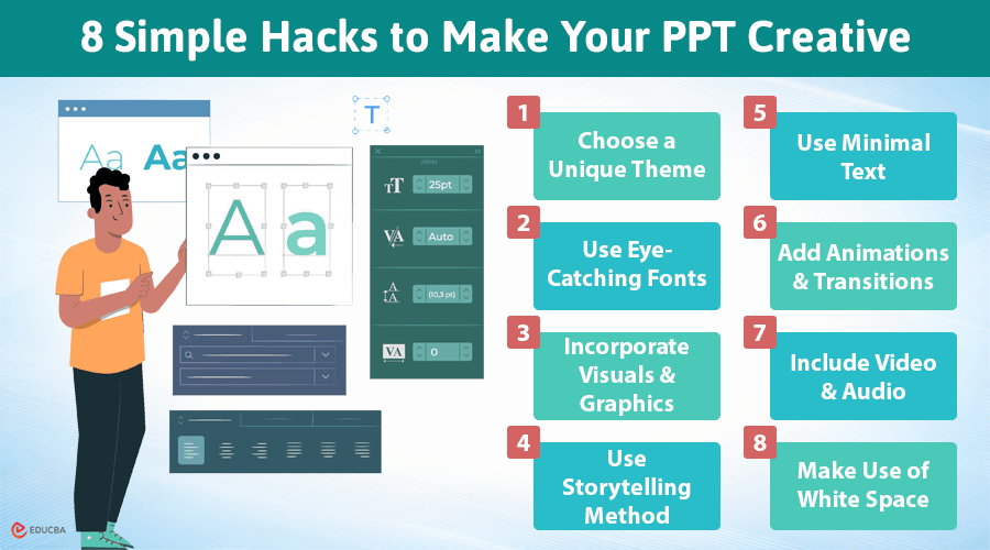
8 Simple Hacks to Make Your PPT Creative
Here are the best 8 practical ways to make your PPT creative and stand out among others:
#1. Choose a Unique Theme
One of the easiest ways to make your PPT creative is to select an uncommon theme. While PowerPoint offers plenty of templates, many are commonly used and may not stand out. If you seek help creating a unique presentation, you can buy presentation at CustomWritings. You should try finding custom designs or creating a theme that fits the topic or tone of your presentation
A unique theme needs to correspond with the general message of your presentation. For instance, if you are presenting a business plan, then select a professional and modern look. If it is an educational presentation, it would be more valid in fun and bright colors. Feel free to play with colors, but ensure they are balanced and do not distract your audience.
#2. Use Eye-Catching Fonts
Fonts are one of the most important factors when it comes to designing a PPT. Common fonts like Arial or Times New Roman are easy to read but lack originality. Try to apply more fun and creative fonts to the title and headings. Just be sure they remain clear and do not get too fancy. A good rule of thumb is to use bold, attractive font for headings and simpler font for body text.
For example:
- For Title/Heading, use Montserrat Bold for a clean and stylish look
- For the Body Text Font, go with Roboto Regular for simplicity and readability
Yet, do not overdo it on font variation. Stick to two or three fonts to maintain consistency. Too many fonts create the effect of disorganization in a presentation. And remember, font size is also essential. Make it large enough for others to easily see from the back of the room but not so large that it looks unprofessional.
#3. Incorporate Visuals and Graphics
The human mind is structured to process information from visuals much quicker than text. Adding images, charts, and graphs representing your data, concepts, or information will make your PPT creative and engage your audience’s minds, which will help you build more engagement. Visuals break up big blocks of text and illustrate key points.
Use high-resolution images relevant to your subject. If you present data, use graphics or charts to simplify it for your audience. Graphical elements, like icons, will add more dynamism and fun to your slide presentations.
#4. Use Storytelling Method
Presentations do not have to be a list of facts or some form of bullet point. Consider incorporating storytelling into your slide show. Stories are always more interesting to listen to and much easier to remember than mere information. When presenting data, do not just show numbers if you can tell what they mean through a story or case.
Consider your presentation like a story with a beginning, middle, and end.
For Example:
Beginning: “Have you ever wondered why 70% of startups fail within their first year? Let’s explore the common pitfalls they encounter.
Middle: “Company XYZ, which faced cash flow issues early on. By pivoting their business model and focusing on customer feedback, they managed to turn their fortunes around and thrive.”
End: “By focusing on customer insights and being adaptable, startups can greatly enhance their chances of success.”
Introduce a problem or question about your topic at the beginning, explain the solution or findings in the middle, and conclude with a resolution. Storytelling humanizes your presentation and helps your audience connect better to your message.
#5. Use Minimal Text
One of the biggest mistakes is overcrowding slides with too much text. If your audience sees large blocks of text, they will likely lose interest. Instead, aim to convey your message creatively using less text while focusing on key bullet points or very short sentences.
For Example:
Instead of saying, “Our company experienced a 20% increase in sales over the last quarter due to new marketing strategies,” you might use a slide that simply says:
- Sales Growth
- +20% Increase
- New Marketing Strategies
Slides should support your presentation, not replace your voice. If you have several points to cover, consider dividing them across multiple slides. Only use text when necessary, and keep it minimal. Instead, try incorporating visuals to convey your message. This approach cleans up the presentation, making it more engaging and easier to understand.
#6. Add Animations and Transitions
Although overdoing these things is not good, subtle animations and transitions add a touch of creativity to your content. Use them to highlight essential points effectively or smoothly transition from one slide to the next. You can animate text, images, and graphics in PowerPoint in many ways.
For Example:
When showing a graph:
- Use a fade-in animation for the graph itself.
- Apply a wipe effect for each data point so the audience sees the growth over time without being flooded by all the data at once.
However, do make sure it stays professional. Too much flash and glitter in animation can take more away from, rather than add to, a presentation. Stick with simple animations such as fades, wipes, or slides that will add interest without taking away from your message.
#7. Include Video and Audio
Incorporating multimedia elements like video clips or audio can make your presentation more engaging. A carefully selected video can break up your slideshow and create a change of pace. It is also an effective way to convey complex information or demonstrate concepts visually.
For example:
If you are showcasing a kitchen gadget, a quick 1-2 minute video demonstrating how to use it effectively can clarify its benefits and enhance audience understanding.
When adding videos, ensure they are relevant to your content and keep them brief—ideally under two minutes—to maintain your audience’s attention. You can use an AI slideshow maker to seamlessly integrate high-quality videos into your presentation, making the process quick and efficient. You can also include audio clips, but use them lightly. Music or sound effects can improve the atmosphere but should not dominate the presentation.
#8. Make Use of White Space
White space, also known as negative space, refers to the empty areas around words and images on a slide. This design element can improve readability and enhance the visual appeal of your presentation. It allows the content to breathe and prevents your slides from feeling overcrowded.
For Example:
Display a large number (e.g., “92%”) prominently in the center of the slide, surrounded by ample white space. Below it, include a concise phrase like “Customer Satisfaction Rate” in smaller font. This layout draws attention to the statistics while keeping the surrounding area clean.
A slide overloaded with text and crowded images can be difficult to follow and does not give the audience a place to rest their eyes. Using white space, you can highlight the most essential elements of your slides. This simple design technique gives your presentation a polished and professional look.
Final Thoughts
To make your PPT creative, focus on capturing your audience’s attention and making your message memorable. There are various ways to boost the creativity of your presentation, from selecting an outstanding theme and incorporating visuals and multimedia to telling engaging stories. Limit the amount of text and make your slideshow more interactive for the audience. Do not forget to practice and refine your delivery to ensure your speech leaves a lasting impact.
Recommended Articles
We hope this insightful guide on how to make your PPT creative inspires you to elevate your presentations. Check out these recommended articles for more tips and strategies to enhance your presentation skills.
