Updated May 30, 2023
Introduction to Google Data Studio
The following article provides an outline for How to use Google Data Studio? For beginners, this tool welcomes you to have a good understanding to build the Reports. Google’s Data Studio is for free; all it needs is logging in with Google’s credentials. Using GDS, one can perform many types of flexible Reports using charts and tables, i.e., Time series, Pie charts, Line, Area, Scatter charts. Especially if you are a Start-up or freelancer, this is the best pocket-friendly tool to pull out the Analytics in the best form and deliver the same to your end customer; this would allow you to save the project budget.
How to use Google Data Studio?
If you are wondering how to work on and use Google Data Studio, you are at the right place to go for a short trip of the step-by-step process where you will learn it easily and take back the practices to implement from your end. Usage of this tool is simple; like this, the tool is user-friendly and provides straight options to avoid confusion of switching between multiple options.
Below are the following steps:
Step 1: Ideation of Dashboard
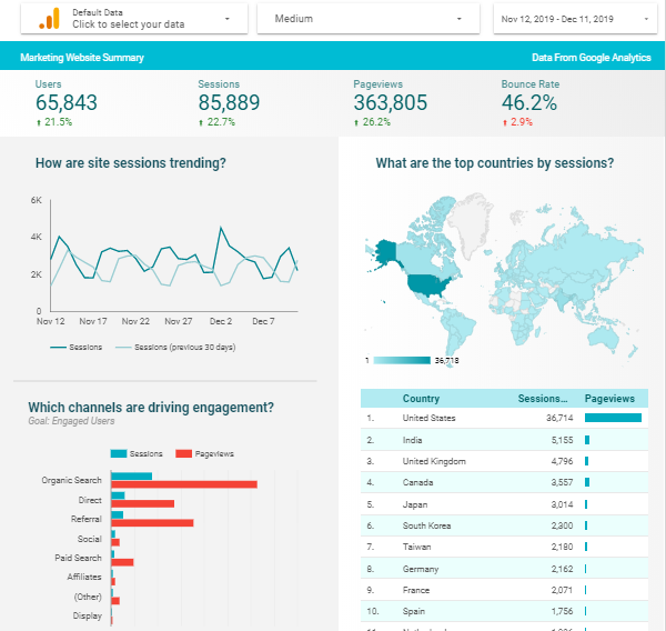
This process requires imagining the Dashboard’s output, like how it should appear and what are KPI needed? What are the important measures to consider? Which date range are we looking into? To have a better understanding, let’s see the below sample A dashboard of “Google AdWords”, where the performance of Campaigns & Ads is measured in terms of KPI’s like Click Through Rate (CTR), Conversion Rate (CR) & Cost per Click (CPC).
Step 2: Gathering All the Data
After understanding the requirements, gathering and transforming the data is the main challenge. Once the data types are defined and clear about the measures & dimensions to take, it is easy to go forward as it eliminates half the burden. However, after starting a dashboard, many get stuck in importing improper datasets and end up executing half information Charts, where it doesn’t help the end customer take any actionable insights.
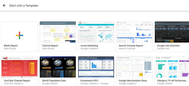
Step 3: Choosing/Create a Template
Google Data Studio provides some defaults, where Dashboards are created with the open-source. One can start with opting for any of either template and import the same for your own reference. Like in Step -1, I have shared the preview of “AdWords overview” with you the same way you can choose any of these to reduce your time and efforts as templatizing itself takes some serious time.
If you are a beginner, starting with a predefined template makes you understand how the Charts, KPI and Tables are created. Having this, you must know what properties are being used, how the blending operations are performed, and what measures are taken into filters that can be observed. All these can be done by reverse-engineering the proven dashboard by going back to each and every option & checking it.
Step 4: Connecting the Data Sources
Knowing what data source to connect is a basic sense; upon having that, knowing authentication logins in hands and data location eases this task, rather than connecting and searching for the data inside the searching server.
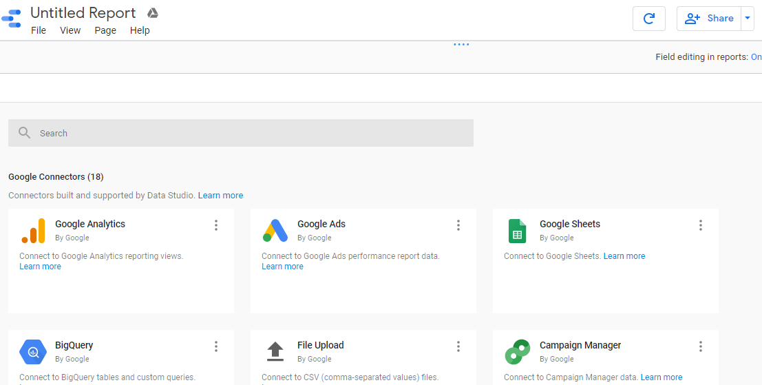
Usually, Google’s data studio allows you to connect with multiple data sources, i.e., 17, but these are limited to a few important sources like:
- File Upload from Computer
- Google Ads
- Attribution 360
- Big Query
- Cloud Spanner
- Cloud SQL
- Many more etc
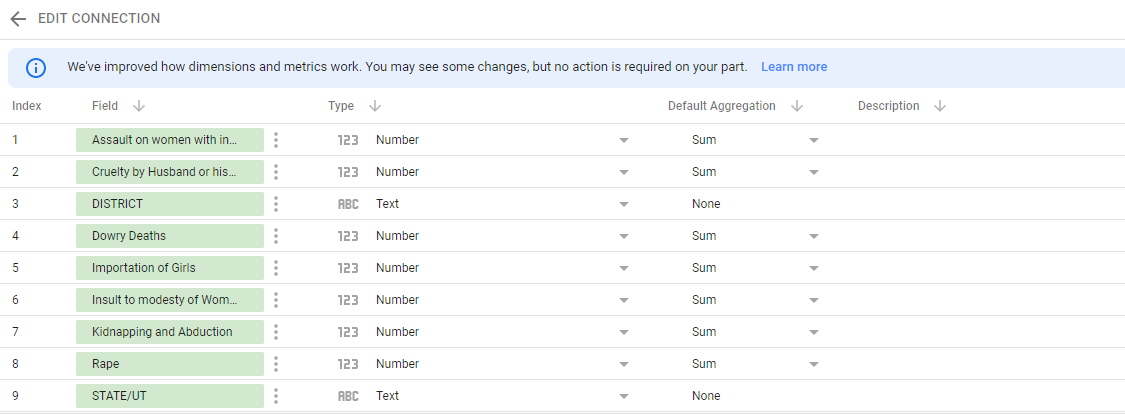
Step 5: Edit Fields/ Connection
Here, you can edit the fields by picking the required ones and can remove the unnecessary which comes by default through the connections. If at all you regret the connection, it can be edited by changing and updating to a newer one. Once you are sure everything is all set and good to go, click on Create Report.
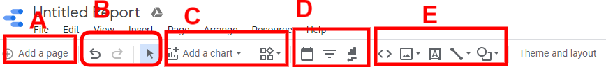
Step 6: Overview and Usage of Toolbar
Once you open a blank report, this is the screen you will see, like a whiteboard with the grid lines at a lighter tone in the background. First things first, before starting any operation, you should be aware of the Toolbar or the Menu options.
Error! Filename not specified.
- Section A: This section of the toolbar is to create a new page with the same Report. Pages can be switching from one to the other one.
- Section B: This section will pick the pointer and Undo/Redo options available to take back or go forward to the performed action. This will be done either by going for shortcut pressing CTRL+Z for Undo and CTRL+Y for Redo.
- Section C: This section is the most important one, where we can pick the type of chart/table/calendar/geographical and all. The chart selection can be changed at any point in time for the relevancy and convenience of the end-user. Knowing all the charts would help you to choose the most relevant one.
- Section D: This section inserts the text boxes and images from your local computer and applies the same on the dashboard.
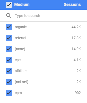
- Section E: This section helps you pick the date range and set up the Dashboard filters.
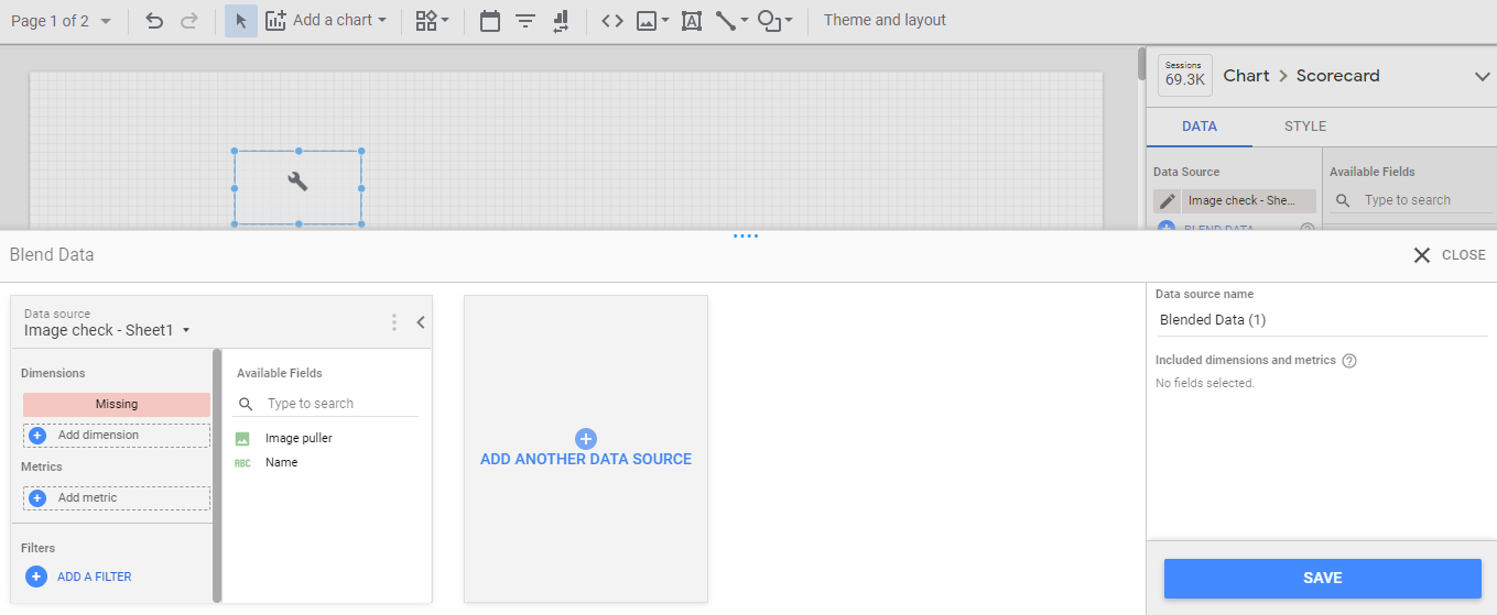
Step 7: Blending of the Data Sources
Blending is a concept of joining two different data sources making through a primary/foreign key. This is to provide a relation between the data sources, so those operations will be on the same page level. This technique is commonly used in Data Visualization tools like Tableau and Power BI etc.
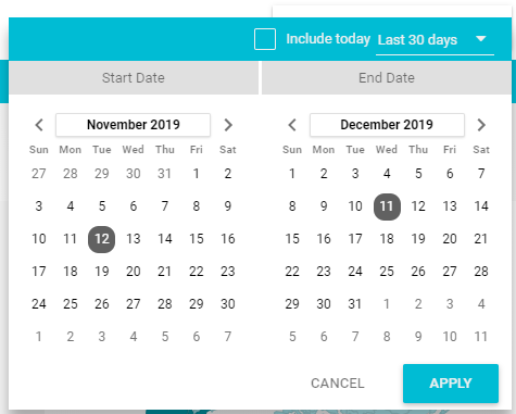
Step 8: Date Range & Filters
This Date range option is to set up the calendar option and see the number of the active dates of data that is connected. For example, we are seeing the data between 12th Nov’19 to 11th Dec’19; like the same, we can choose the specific period to see. Another option is Filter control, where we see the types of filters on the sheet or connection; by choosing the one among them, the data is segregated.
Step 9: Formatting & Contouring
Having proper formatting like the alignment of boxes one after the other and top to the bottom, where colour combinations are considered according to the project. For example, If a Customer prefers a Blue & Black combination, going with that is a safe option.
Conclusion – How to use Google Data Studio?
Using this tool has been conveyed theoretically and practically shown over snapshots. A suggestion is to have hands-on experience, start picking sample data available online and work on a Report to get confidence over this Google Data Studio.
Recommended Articles
This is a guide to How to use Google Data Studio? Here we discuss the introduction and how to use google data studio respectively. You can also go through our other related articles to learn more –
