Definition of Examples of Data Visualizations
Examples of data visualizations are used to get and display information in visual data like a map, chart, or graph. It makes it easy for humans to understand and get conclusions from the data. Examples of data visualization are finding patterns, trends, and outliers in huge data sets will be made simpler by the data visualization process. Information visualization, information, and statistical graphics for users are examples of data visualization.

Overview of Data Visualizations
Data visualization is one of the processes in the data science process, according to which data must be represented after it has been gathered, processed, and modeled in order to conclude. Data visualization falls under the larger subject of DPA (data presentation architecture), which tries to locate, search, format, manipulate, and convey data as effectively as feasible. Today, when we submit the necessary data as input, the business intelligence software and visualization tools automatically perform for us. Excel, Power Bi, and Tableau are all excellent options for visualization.
Different types of Maps, Different Charts, Time Series, Tables, Infographics, Graphs, Matrices, and Indicators are basic ways to display data visualization.
Key Takeaways
- Define the target audience and their particular needs.
- Establish a Specific Goal and shows information.
- Clean up your data.
- Use appropriate visuals of the information for users.
- Maintain data organization for the user.
- Use the appropriate color scheme.
- The data is displayed in user-interaction format.
Top 10 Data Visualizations Examples
Given below are the top 10 Data Visualizations Examples:
1. The Map of the Cholera
Jon Snow’s The Cholera Map is a well-known example of an early dot map representation. Bar graphs used in the graphic show how many people have died from cholera on particular city blocks. These bars’ lengths and concentrations illustrate the patterns and spread of the deaths brought about by this illness. A significant finding was made from this by looking at particular households and the fatalities associated with them. The homes with the most deaths were consuming the water in the same wells.
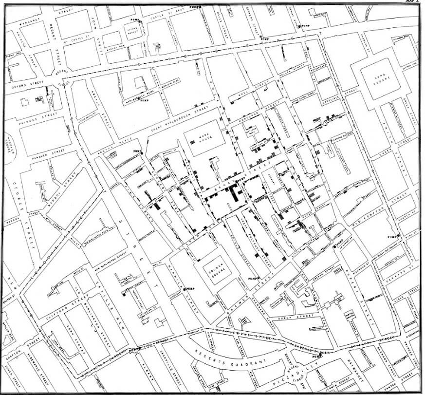
(Image source: wikipedia.org)
2. Visualization by the U.S. Office of Management and Budget
The US Office of Management created this interactive visualization. During Obama’s presidency, the White House created a treemap to represent the visualization. This is one of the best budget visualization examples that can be used to visually break down government programs and regions of interest.
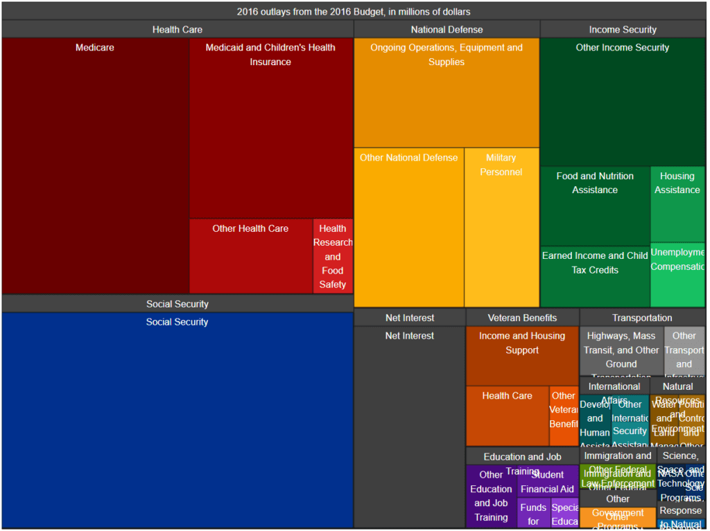
(Image source: obamawhitehouse.archives.gov)
3. Map of a Fly Brain
A data visualization showing the brain of a fruit fly. The high-resolution nervous system map shown in the aforementioned graphic is a portion of the fruit brain. A wiring diagram, or connectome, of connections in various areas of a fruit fly’s brain is made up of millions of connections between 25,000 neurons. The research has advanced thanks to Google’s computing capacity, and by 2022, researchers hope to have fully visualized the fruit fly brain.

(Image source: https: www.wired.com)
4. Work of Freight Rail
The sophisticated layers of technology that Freight Rail Works uses throughout its system are shown in this enlightening next graphic. Teams led by the creative Danil Krivoruchko and Aggressive/Loop created a dynamic and future animation of the data environment surrounding a moving train.
Magnificent waves of information illuminate the shapes of the objects as the train travels toward the smart metropolis, and then they fade away in waves. Zooming out on images of the massive city cluster reveals the paths across the continent and the elegance of a basic railway communications system.

(Image source: myshli.com)
5. Korean Clusters
An informational graphic is displaying Covid cases in Korea. In January 2020, there was a spike in Covid infections among visitors to Korean hospitals and churches. Scientists were able to locate the first case and create a tree of contacts amongst the afflicted individuals after connecting connections between the confirmed cases. The regions vise infected cases cluster in South Korea using data visualization.
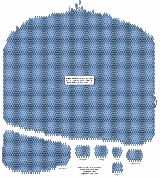
(Image source: www.reuters.com)
6. Largest Tech Mergers and Acquisitions in 2020
The major tech acquisitions of 2020 are displayed through data visualization. Despite the fact that 2020 was a disastrous year for most firms with negative results, this data visualization demonstrates that Big Tech saw a growth spurt. The chart displays the largest technology mergers and acquisitions that were completed in 2020, along with a brief summary of the acquired firm, the acquiring company, the transaction value, and the deal date. The chart is unique and visually appealing even though it is visually cluttered.
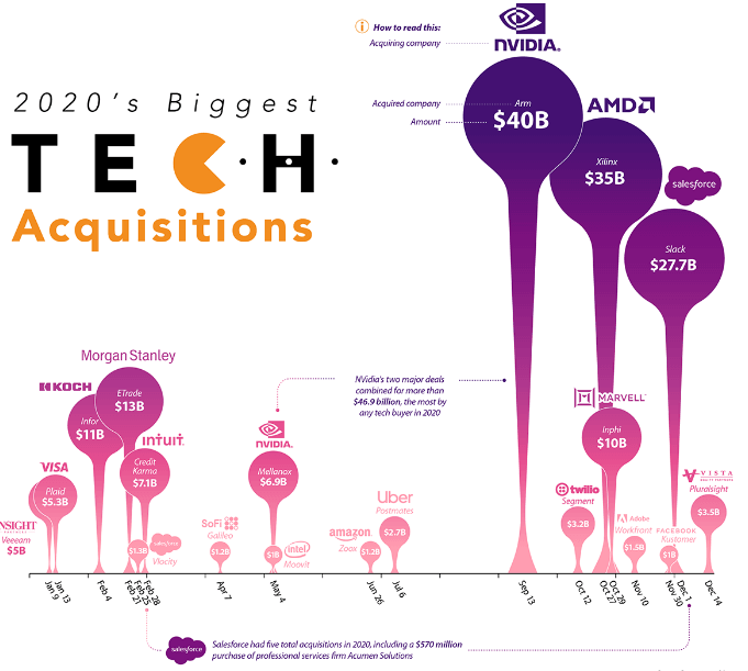
(Image source: visualcapitalist.com)
7. Stolen Painting
The Detail-oriented stolen paintings show using data visualization. This gorgeous graphic was made for Visual Data, a section on “La Lettura,” the Corriere Della Sera’s cultural supplement. The infographic lists the specifics of 40 paintings that have been stolen between 1900 and the present. It was startling to learn that the bulk of thefts occurred during the last 20 years and that the stolen works of art were never found.
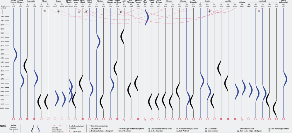
(Image source: www.behance.net)
8. Mars Mission 2024 Promo Reel
Data visualizations are used in this 3D image to convey the future vision. A striking red-gray color scheme is used to depict space missions and launching astronauts into space. Astonishing surface visuals and intricate landscape exploration motion. You briefly have the impression that you are a member of a Mars mission crew looking up at the stars.

(Image source: www.behance.net)
9. Changes in Climate and Icebergs
The ice mass is so huge that it cannot be depicted in a single shot, according to the graphic. It is related to the size of the iceberg to 66 different nations. Additionally, we may view excellent geodata about the dangerous South Georgia Island biodiversity from the “IUCN Red List of Threatened Species”.
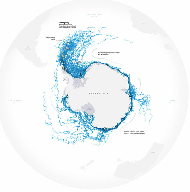
(Image source: reuters.com)
10. World Map of Cell Towers
This 40 million cell tower visualization is amazing, stylish, and imaginative. It is undoubtedly a memorable sight. We may observe how the mobile tower network illuminates major cities throughout the world, including Europe. The climate and population show in the form of cell towers in different regions.
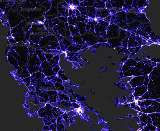
(Image source: alpercinar.com)
Conclusion
Data visualizations help make data understandable, simple, and clear. From enormous data sets, users may quickly extract key numbers, analyze them, and draw conclusions. Business users can utilize visualization to discover connections, trends, and patterns amongst data, giving it more significance.
Recommended Articles
This is a guide to Examples of Data Visualizations. Here we discuss the definition and top 10 data visualization examples. You can also look at the following articles to learn more –