Updated June 16, 2023
Introduction to CSS Scale()
A CSS scale() function is defined as a CSS Transformation property which allows resizing an element in the Two-dimensional Plane. It is used to increase or decrease the size of an element. When applying a scale transformation, it is necessary to provide instructions to the browser regarding the numbers that need resizing. Therefore, this scale() zooms in and out of the elements. A vector in a plane defines the scaling number. We can resize the dimensions at any different scale with the help of a CSS data type called transform-function.
Syntax
The Scaling() function applies scaling in all directions by utilizing two or one value that specifies the desired scaling to be applied. The general syntax for the Scaling() function is as follows:
scale( sx ) ; // with one argument on horizontal plane.The single parameter sets it for width or height. It means it assigns the value evenly to both X and Y axis. The values here are unitless and considered to be a multiplier concept.
The other syntax with two arguments is:
scale(sx,sy);Here
- sx – The element resizes horizontally.
- sy – The element resizes vertically.
Example:
This shrinks its size to half
.bb {
Transform:scale(0.6);
}
Next sample double the Y-Axis:
.bb {
So, the first thing we do is to create an HTML page for an element and to apply special effects using CSS3. Please ensure that when you apply scaling to an image, the original dimension of the image is greater than the size at which you perform the scaling. If you provide a value greater than one, the element will be scaled upwards in the specified direction, resulting in a larger appearance. If the specified number is one then it remains unchanged. And next, if you have a value within the zero range, you scale the element downwards. It is important to note that negative values are allowed here, but they do not perform any scaling. instead, they flip in any direction.
How Does the scale() Method Work in CSS?
Below are the scale() function and its description:
| scale() function | Description |
| Transform:scale(3);
Transform: scale(0.5); |
Here the value 3 would transform the size to 3 times its original image size.
And the value 0.5 transforms the size to half of its original image size. |
| Transform: scale(0); | Scaled out of the plane and not visible. |
| Transform: scale(3,1); | The horizontal size is scaled up by three, and the vertical is unchanged |
Examples to Implement scale() Function in CSS
The following section creates a Sample code that outlines the HTML page, and the CSS is embedded inside the head.
Example #1
Code:
<!DOCTYPE html>
<html lang="en">
<head>
<meta charset="utf-8">
<title>Example on CSS Scale() </title>
<style>
img {
-webkit-transform: scale (1.5);
-moz-transform: scale (1.5);
-ms-transform: scale (2);
transform: scale(1.5);
opacity: 0.7;
}
.new{
margin: 60px;
width:105px;
height:120px;
background: url("sas-img.png") no-repeat;
}
</style>
</head>
<body>
<h1> Example On CSS Scale() </h1>
<div class="new">
<imgsrc="sas-img.png" alt="Python">
</div>
</body>
</html>
Output:
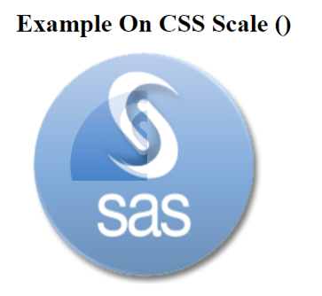
Explanation: We have created a Class ‘new’ and assigned CSS Properties to the image. So now we have applied scaling to the image, and the resulting output is presented below:
Example #2
Code:
<!DOCTYPE html>
<html>
<head>
<style type="text/css">
div.box {
width:150px;
height:90px;
background-color:#FFA07A;
margin-left:150px;
margin-top:150px;
position:relative;
}
div.boxenlarge {
transform: scale(1, 4);
-moz-transform: scale(1, 4);
-ms-transform: scale(1, 4);
-webkit-transform: scale(1, 4);
-o-transform: scale(1, 4);
}
</style>
</head>
<body>
<div class="box" onmouseover="this.className='box boxenlarge'" onmouseout="this.className='box'">
Scaling up top and bottom
</div>
</body>
</html>
Output:
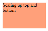
Explanation: In the above code, we apply scaling when a user presses the box over an element by rolling the mouse. So, as we move over the element, the additional class names mask the class names. We define the dimensions to achieve a desirable effect on the transforms through CSS. Moving on to the transformation part, we apply a Scale of 1 along the X-axis and 4 along the Y-axis. The element’s width grows by a factor of 1, and its weight increases by a factor of 4.
Example #3
Code:
<!DOCTYPE html>
<html>
<head>
<style type="text/css">
.scalehov {
width: 100px;
transition: all .4s ease-in-out;
}
.scalehov:hover {
transform: scale(1.5);
}
</style>
</head>
<body>
<img class="scalehov" src="rect.jpg" alt="">
</body>
</html>
Output:
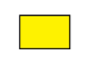
Example #4
The HTML document scales the <div> element and applies some transformations.
Code:
<!DOCTYPE html>
<html>
<head>
<meta charset="utf-8">
<title>scale() function Demo</title>
<style>
div {
display: inline-block;
overflow: hidden;
}
div img {
display: block;
transition: 2s;
}
div img:hover {
transform: scale(1.6);
}
</style>
</head>
<body>
<h1>Scale() function Demo </h1>
<div><imgsrc="scale_fish.png" alt=""></div>
<div><imgsrc="scale_fish1.png" alt=""></div>
<div><imgsrc="scale_fish2.png" alt=""></div>
</body>
</html>
Output:
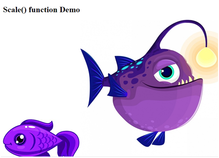
Explanation: Therefore, in the above code, I have created three image files; when we act by moving on the image, The picture gradually increases its size. Here we perform Scaling evenly in all dimensions as we specify a single value of ‘1.6’.
Example #5
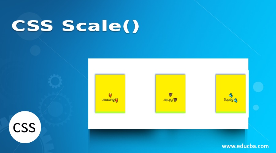
Choosing scaling value individually with both X-axis. Assigns a negative value here.
Code:
Scale_1.html
<html>
<div class="module">
<div class="object">🔥Summer🔥</div>
<div class="object">💩Winter💩</div>
<div class="object">💦Spring💦</div>
</div>
</html>
.css
.module{
font-family: Arial, Helvetica, sans-serif;
width: 90%;
height: 90%;
display: inline-flex;
justify-content: right;
align-items: center;
perspective: 30px;
}
.object {
width: 5em;
height: 5em;
padding: 2em;
margin: 1.5em;
text-align: center;
background-color: #FFF000;
border-top: 0.4em solid greenyellow;
box-shadow: 2px 2px 5px 0px royalblue;
}
.object {
transform: scale(-0.66, -0.6);
}
Output:
The result below shows the element upside down as the scaling value is negative.

Conclusion
Therefore, the examples provided here work well in all the browsers which are useful today by all web developers. The scaling () function with the help of CSS Transitions works well and effectively as this function allows to create of interactive pages. And finally, this CSS3 scale makes different spectacular effects in the HTML document by changing the properties of an image. Recent research has been done with the transition on animations where we can perform scale properties, but it is quite problematic when accessing the website.
Recommended Articles
We hope that this EDUCBA information on the “CSS Scale()” was beneficial to you. You can view EDUCBA’s recommended articles for more information.

