Updated June 30, 2023

Introduction to CSS Row
In CSS, the row property is known as the shorthand property. Web pages with specified grid rows use it to start from the beginning and end at a specific position to specify the size and location of the grid data items. You can declare it within the grid rows by contributing the lines in a table called grid row lines. It may coordinate with the html span classes even though it automatically supports the grid placements, hence specifying the inline lines at are start and end of the web pages.
Syntax & Parameters
We know that we combine and write CSS codes with the HTML page or save them as a separate file with a .css extension. If we use CSS codes in a web page, HTML has a different tag called <style> tag for writing the CSS codes in the HTML web page. You can declare the CSS Row property in CSS code using a different set of scenarios on web pages.
Syntax:
<html>
<head>
<style>
#grid{
display:grid;
grid-row:auto //we can declare any type of values in the grid-row property
---some css scripts based on the user requirements—
}
</style>
</head>
<body>
</body>
</html>
The above codes are one of the CSS templates using grid functionality for the row property. We can enable these properties in CSS to make the rows and columns in a grid layout. It is one of the CSS layouts that is more secure in the production environment.
How Does Row Work in CSS?
In CSS, we have used the row property enabled in the web page for creating the table rows with the help of row attributes. It specifies the height of the table cells that have the same width and assigns properties to them as well. Mostly we have used the grid layout for creating the tables on the web page for data security purposes. If the grid items are positioned using the specified rows, you can explicitly size them by utilizing these grid template rows and employing the implicit grid technique to create tracks to accommodate the content. This can occur either by explicitly positioning them within the rows or by using ranges so that data will be inserted inside the table cells using the auto-placement algorithms. Suppose the grid-auto-rows property is already enabled in the CSS file.
The CSS file contains many default properties that developers can utilize to customize web pages in the presentation layer position. Each CSS attribute has its syntax and properties for both the CSS page’s turn-on and off position. So we can set the property values like “auto, some number as values with some extension like pixels, etc.”. If the grid row is enabled in the CSS file, the property will track each table cell row and pattern of the tracks. The grid item is positioned into the rows that are not called or used explicitly in the table cells because it follows the auto-placement algorithm when the property grid-auto-rows: auto is enabled in the file. If we utilize other values such as length, percentage, flex, max-content, min-content, minimax(min, max), and auto, we apply these values to the grid-auto-rows property in different sequences. For each type of value, it has its properties. For example, we <length> value returns only the non-negative length values. Likewise, the percentage is a non-negative value but relates to the block sizes around the grid containers. If the table block sizes of the grid containers are indefinite, then the grid-auto-rows’ percentage value is auto. Each flex value of the grid-auto-rows property represents the flex-sized factor when the flex value is a non-negative dimension value with a unit that specifies the tracking flex factor values. Then we calculated the minimum and maximum values of the CSS properties.
Examples to Implement CSS Row
Below are the examples of CSS Row:
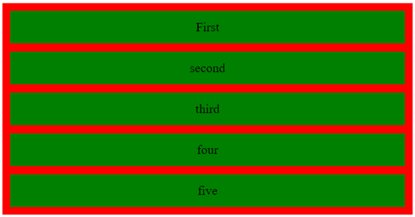
Example #1
Code:
<!DOCTYPE html>
<html>
<head>
<title>
Welcome To My Domain
</title>
<style>
.first {
display: grid;
grid-template-areas: "siva";
grid-gap: 13px;
padding: 12px;
background-color: red;
grid-auto-rows: auto;
}
.second {
text-align: center;
font-size: 20px;
background-color: green;
padding: 14px 0;
}
</style>
</head>
<body>
<div class = "first">
<div class = "second">First</div>
<div class = "second">second</div>
<div class = "second">third</div>
<div class = "second">four</div>
<div class = "second">five</div>
</div>
</body>
</html>
Output:
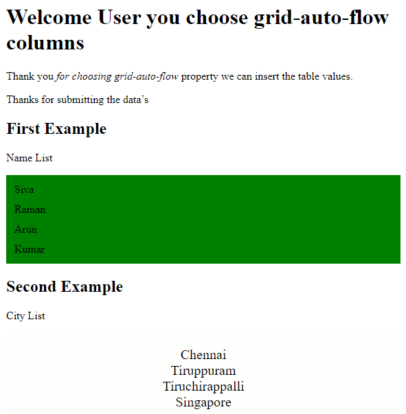
Example #2
Code:
<!DOCTYPE html>
<html>
<head>
<style>
.first {
display: grid;
grid-template-rows: auto auto;
grid-gap: 11px;
background-color: green;
padding: 12px;
}
.second {
background-color: rgba(254, 253, 252, 0.7);
text-align: center;
padding:20px 0;
font-size: 20px;
}
</style>
</head>
<body>
<h1>Welcome User you choose grid-auto-flow columns</h1>
<p>Thank you <em>for choosing grid-auto-flow</em> property we can insert the table values.</p>
<p>Thanks for submitting the data’s</p>
<h2>First Example</h2>
<p>Name List</p>
<div class="first" style="grid-auto-flow: row;">
<div class="siva">Siva</div>
<div class="raman">Raman</div>
<div class="arun">Arun</div>
<div class="kumar">Kumar</div>
</div>
<h2>Second Example</h2>
<p>City List</p>
<div class="second" style="grid-auto-flow: row;">
<div class="chennai">Chennai</div>
<div class=" tiruppuram ">Tiruppuram</div>
<div class=" tiruchirappalli "> Tiruchirappalli </div>
<div class="singapore">Singapore</div>
</div>
</body>
</html>
Output:
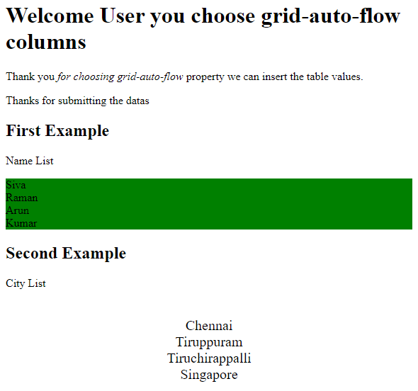
Example #3
Code:
<!DOCTYPE html>
<html>
<head>
<style>
.first {
display: grid;
grid-auto-rows: 10px;
grid-auto-rows: 2cm;
grid-auto-rows: 5vmax;
background-color: green;
grid-auto-rows: inherit;
grid-auto-rows: initial;
grid-auto-rows: unset;
}
.second {
grid-auto-rows: 10px;
grid-auto-rows: 2cm;
grid-auto-rows: 5vmax;
grid-auto-rows: min-content max-content auto;
grid-auto-rows: 10px 15px 39px;
grid-auto-rows: 11% 33.2%;
grid-auto-rows: 0.3fr 4fr 2fr;
grid-auto-rows: minmax(10px, auto) minmax(max-content, 3fr) minmax(23%, 8vmax);
grid-auto-rows: 10px minmax(10px, auto) 11% 0.3fr fit-content(40px);
text-align: center;
padding:23px 0;
font-size: 20px;
}
</style>
</head>
<body>
<h1>Welcome User you choose grid-auto-flow columns</h1>
<p>Thank you <em>for choosing grid-auto-flow</em> property we can insert the table values.</p>
<p>Thanks for submitting the datas</p>
<h2>First Example</h2>
<p>Name List</p>
<div class="first" style="grid-auto-flow: row;">
<div class="siva">Siva</div>
<div class="raman">Raman</div>
<div class="arun">Arun</div>
<div class="kumar">Kumar</div>
</div>
<h2>Second Example</h2>
<p>City List</p>
<div class="second" style="grid-auto-flow: row;">
<div class="chennai">Chennai</div>
<div class=" tiruppuram ">Tiruppuram</div>
<div class=" tiruchirappalli "> Tiruchirappalli </div>
<div class="singapore">Singapore</div>
</div>
</body>
</html>
Output:
Conclusion
We can enable and assign values for various purposes based on the user requirements by setting the values for properties in CSS, which has many default properties. In web applications, table cells have a set of rows and columns. Each one has some default values like auto use of other format values in CSS file.
Recommended Articles
We hope that this EDUCBA information on “CSS Row” benefited you. You can view EDUCBA’s recommended articles for more information.

