Updated June 13, 2023

Introduction to CSS Grid Layout
CSS Grid is a modern and powerful technique available in CSS that allows designing a web page using a grid-based layout system. CSS grid is a two-dimensional system compared to other design elements like flexbox. It helps web developers align web elements according to needs, and the elements can be divided into different regions with relationships such as size, layer, position, etc. Doing changes in the Grid layout system won’t affect the other elements. CSS grid layout system differs from the CSS frameworks available and allows web developers more freedom in terms of design.
Properties of CSS Grid Layout
Given below are the Layout Properties:
1. Grid Container: display property
For making the grid, we define a grid container as a parent, and all its elements are grid-child.
Code:
<!DOCTYPE html>
<html>
<head>
<title>
CSS Grid Layout
</title>
<style>
.all-display{
border : #81D4FA 2px solid;
background-color : #03a9f400;
text-align : left;
padding-left : 20px;
height :400px;
width : 95%;
}
.heading {
font-weight: bold;
font-size: 15px;
width: 95%;
}
.parent {
display: grid;
}
.child {
border: 1px solid #ccc;
margin-top: 4px;
width: 95%;
padding: 5px;
border-radius: 5px;
}
</style>
</head>
<body>
<div class = "all-display">
<div class = "heading">
<h2> CSS Grid Layout </h2>
</div>
<div class = "parent">
<div class = "child"> 1 </div>
<div class = "child"> 2 </div>
<div class = "child"> 3 </div>
<div class = "child"> 4 </div>
<div class = "child"> 5 </div>
<div class = "child"> 6 </div>
<div class = "child"> 7 </div>
<div class = "child"> 8 </div>
<div class = "child"> 9 </div>
</div>
</div>
</body>
</html>
Output:
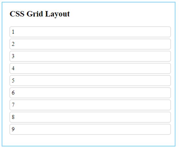
The parent element here is defined with display : grid property. This will set the grid to the block level. This property is a must while defining the grid layout. All the child elements in the grid container will automatically be treated as grid childs.
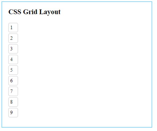
display : inline-grid
This property value will set the grid elements inline-level.
Output with inline-grid:
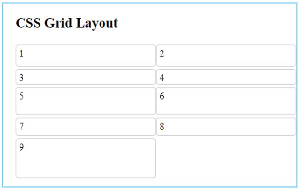
2. Grid Container: grid-template-columns
This property will divide the grid layout into based out of columns. The number of values supplied will decide the number of columns.
Code:
<!DOCTYPE html>
<html>
<head>
<title>
CSS Grid Layout
</title>
<style>
.all-display{
border : #81D4FA 2px solid;
background-color : #03a9f400;
text-align : left;
padding-left : 20px;
height : 260px;
width : 95%;
}
.heading {
font-weight: bold;
font-size: 15px;
width: 95%;
}
.parent {
display: grid;
grid-template-columns: auto auto;
}
.child {
border: 1px solid #ccc;
margin-top: 4px;
width: 95%;
padding: 5px;
border-radius: 5px;
}
</style>
</head>
<body>
<div class = "all-display">
<div class = "heading">
<h2> CSS Grid Layout </h2>
</div>
<div class = "parent">
<div class = "child"> 1 </div>
<div class = "child"> 2 </div>
<div class = "child"> 3 </div>
<div class = "child"> 4 </div>
<div class = "child"> 5 </div>
<div class = "child"> 6 </div>
<div class = "child"> 7 </div>
<div class = "child"> 8 </div>
<div class = "child"> 9 </div>
</div>
</div>
</body>
</html>
Output:

Here, we have divided the grid-child into two columns.
3. Grid Container: grid-template-rows
Similar to columns, this property will divide grid elements into rows. We can specify the size of each grid.
Code:
<!DOCTYPE html>
<html>
<head>
<title>
CSS Grid Layout
</title>
<style>
.all-display{
border : #81D4FA 2px solid;
background-color : #03a9f400;
text-align : left;
padding-left : 20px;
height : 300px;
width : 95%;
}
.heading {
font-weight: bold;
font-size: 15px;
width: 95%;
}
.parent {
display: grid;
grid-template-columns: auto auto;
grid-template-rows: 40px 30px 50px auto 70px;
}
.child {
border: 1px solid #ccc;
margin-top: 4px;
width: 95%;
padding: 5px;
border-radius: 5px;
}
</style>
</head>
<body>
<div class = "all-display">
<div class = "heading">
<h2> CSS Grid Layout </h2>
</div>
<div class = "parent">
<div class = "child"> 1 </div>
<div class = "child"> 2 </div>
<div class = "child"> 3 </div>
<div class = "child"> 4 </div>
<div class = "child"> 5 </div>
<div class = "child"> 6 </div>
<div class = "child"> 7 </div>
<div class = "child"> 8</div>
<div class = "child"> 9 </div>
</div>
</div>
</body>
</html>
Output:
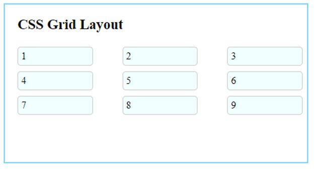
4. Grid Container: grid-gap
- grid-column-gap: sets the value of the gap between columns.
- grid-row-gap: sets the value of the gap between rows.
- grid-gap: sets the value of the gap between both rows and columns.
Code:
<!DOCTYPE html>
<html>
<head>
<title>
CSS Grid Layout
</title>
<style>
.all-display{
border : #81D4FA 2px solid;
background-color : #03a9f400;
text-align : left;
padding-left : 20px;
height : 250px;
width : 95%;
}
.heading {
font-weight: bold;
font-size: 15px;
width: 95%;
}
.parent {
display: grid;
grid-template-columns: auto autoauto;
grid-row-gap: 5px;
grid-column-gap: 40px;
/* grid-gap: 5px 40px;   //Same output*/
}
.child {
border: 1px solid #ccc;
margin-top: 4px;
width: 85%;
padding: 5px;
border-radius: 5px;
background-color: azure;
}
</style>
</head>
<body>
<div class = "all-display">
<div class = "heading">
<h2> CSS Grid Layout </h2>
</div>
<div class = "parent">
<div class = "child"> 1 </div>
<div class = "child"> 2 </div>
<div class = "child"> 3 </div>
<div class = "child"> 4 </div>
<div class = "child"> 5 </div>
<div class = "child"> 6 </div>
<div class = "child"> 7 </div>
<div class = "child"> 8 </div>
<div class = "child"> 9 </div>
</div>
</div>
</body>
</html>
Output:
5. Grid Child: grid-gap
- grid-column-start: specifies the start point for a column of the grid.
- grid-column-end: specifies endpoint for a column of the grid.
- grid-row-start: specifies the start point for a row of the grid.
- grid-row-end: specifies the endpoint for a row of the grid.
Code:
<!DOCTYPE html>
<html>
<head>
<title>
CSS Grid Layout
</title>
<style>
.all-display{
border : #81D4FA 2px solid;
background-color : #03a9f400;
text-align : left;
padding-left : 20px;
padding-right: 15px;
height : 250px;
width : 95%;
}
.heading {
font-weight: bold;
font-size: 15px;
width: 95%;
}
.parent {
display: grid;
grid-template-columns: auto autoauto;
grid-row-gap: 5px;
grid-column-gap: 40px;
}
.parent> div {
border: 1px solid #ccc;
margin-top: 4px;
padding: 5px;
border-radius: 5px;
background-color: azure;
}
.child-1 {
grid-column-start: 1;
grid-column-end: 3;
}
.child-6 {
grid-row-start: 3;
grid-row-end: 5;
}
</style>
</head>
<body>
<div class = "all-display">
<div class = "heading">
<h2> CSS Grid Layout </h2>
</div>
<div class = "parent">
<div class = "child-1"> 1 </div>
<div class = "child-2"> 2 </div>
<div class = "child-3"> 3 </div>
<div class = "child-4"> 4 </div>
<div class = "child-5"> 5 </div>
<div class = "child-6"> 6 </div>
<div class = "child-7"> 7 </div>
<div class = "child-8"> 8 </div>
<div class = "child-9"> 9 </div>
</div>
</div>
</body>
</html>
Output:
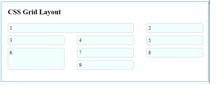
Here, child-1 starts at column 1 and ends at column 3, and child-6 starts at row 3 and ends at row 5.
Conclusion
It allows us to divide the web page into a grid-based system with two-dimensional changes. It is possible to design these grids in different ways using multiple properties, as we have seen.
Recommended Articles
We hope that this EDUCBA information on “CSS Grid Layout” was beneficial to you. You can view EDUCBA’s recommended articles for more information.

