Why Does Clothes Color Matching Matter?
Have you ever ordered a custom hoodie or t-shirt online, only to open the box and realize the shade does not match your expectations? It can be both frustrating and surprising, especially when the digital proof appears perfect on a laptop screen. This type of mismatch occurs more often than many anticipate and is largely the result of not fully understanding how different color systems work. Clothes color matching is not magic, yet it is also not as simple as pointing at a shade on a phone screen.
The truth is, colors look different depending on where they are displayed on a screen, on fabric, or on paper. A red on your phone may look slightly orange when printed. Without proper planning, the final product may not turn out as you imagined. Additionally, suppose you are adding accessories, such as custom labels or customized logo patches, to your clothing or pairing clothing with custom hats. In that case, it can be even more challenging to match the color perfectly. You need a color system that brings all these colors together.
Key Takeaways
- Clothes color matching is more complex than choosing a shade on-screen.
- RGB is for screens, CMYK is for print, and Pantone provides precise color consistency for physical products.
- Confirm which color system a manufacturer or printer uses before starting design work.
- Request proofs and fabric swatches to ensure critical color matches, preventing costly surprises.
Breaking Down the Big Three Systems
To better understand color matching in clothing, it is essential to examine the three primary color systems.
1. RGB (Red, Green, Blue): The Screen Favorite
RGB is the color model used by your computer, phone, or TV. It works by mixing light, which is why colors look so bright and vivid on a screen. It is perfect for digital design. But here is the catch clothes do not glow. Fabric absorbs and reflects light differently. So that electric neon you loved online may look a bit flat on a cotton hoodie.
2. CMYK: The Print Standard
CMYK refers to the color model using cyan, magenta, yellow, and black. Printers blend these inks to create colors on paper, packaging, or transfer sheets. When you design for print, CMYK is the safer choice but fabrics behave differently than paper. Sometimes ink sits differently on fabric threads, and what appears smooth in Photoshop appears slightly textured in real life.
3. Pantone: The Color Authority
Pantone Matching System (PMS) is like the strict teacher who does not let you fudge answers. It provides exact formulas for colors, which helps ensure that your navy blue looks the same whether it is on a polyester jacket, a cotton tee, or even a ceramic mug. Pantone is the gold standard for brand consistency. If you want clothes that color-match, look professional, and are predictable, Pantone is your best friend.
Real-Life Pitfalls in Clothes Color Matching
Even with the right color systems, mistakes can happen. The following points highlight common challenges that affect real-world scenarios.
1. The Online Surprise
Perhaps you have seen those memes where someone orders “burgundy” pants and receives what looks like a dull brown pair. That is not just bad luck it is usually because the RGB color on the website was not translated adequately to CMYK or Pantone for the actual product.
2. Fabric Makes a Difference
Even with perfect color codes, fabrics themselves can play tricks. A bright red on smooth polyester can look totally different on textured fleece. I once compared two t-shirts with the same Pantone red, and one looked richer just because of the weave. So, even with all this science, color-matching clothes still requires expectation management.
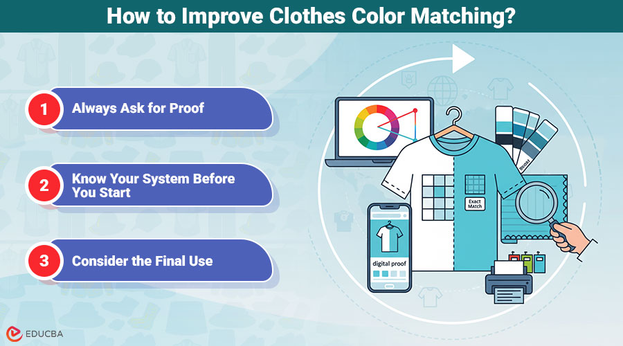
How to Improve Clothes Color Matching?
The following points outline practical steps to achieve more accurate color matching for clothes and reduce errors.
1. Always Ask for Proof
Most manufacturers provide digital or physical proofs. A digital proof will get you close, but if you are super picky, request a fabric swatch printed in the chosen color. It takes extra time, but it beats the disappointment of opening a box of “wrong” colors.
2. Know Your System Before You Start
If your printer works in CMYK, do not hand them RGB files and hope for the best. If they accept Pantone, take advantage of it. Matching your design files to the right system reduces color drift between the idea stage and the product stage.
3. Consider the Final Use
Clothes for casual wear might survive a tiny variation, but branded uniforms or event merchandise? Those need precise matches. A slightly “off” navy would not ruin a gym shirt, but it could look sloppy on a corporate polo.
Tips You Can Actually Use
Here is a short list of things to keep in mind if you want to master clothes color matching:
- Start your design files in CMYK if you are aiming for print.
- Use Pantone swatches when color accuracy is critical.
- Do not trust what you see on your phone screen it is often too bright.
- Ask your vendor about the types of fabric they use and request samples whenever possible.
Final Thoughts
Color is complex and often unpredictable. You think you are choosing one thing, but the final product has its own personality. Clothes color matching is both an art and a science, and honestly, a little patience goes a long way. When in doubt, slow down, ask for proof, and consult with your supplier about the system they use. Because the last thing you want is to show up with “forest green” team shirts that look more like lime, and yes, that happened to me once it was a funny day, but not a flattering one.
Recommended Articles
We hope this guide on clothes color matching helps improve your apparel design and production. Check out these recommended articles for more tips and insights.
