Updated April 21, 2023

Introduction to Angular Material Card
Angular material also provides us with one of the main things, which are card; We use it to display our text, photos, and images on the card, making the content inside the container more presentable to the user. Material has an in-built library that we can use to build the card in our application. In order to use a card from the material library, we require to make changes and a few configurations to the application. Then, we can use this in our application to show our images, photos, and text. Also, we can perform an action inside it. In the coming section of the tutorial, we will have a look at the implantation and configuration in detail for better understanding.
Syntax
As we know, to use this inside the application, we have to make configurations and then use the inbuilt tags and directives provided by the material library; let’s take a closer look at it for a better understanding. See below;
<mat-card>your content</mat-card>As you can see in the above piece of syntax, we are using ‘mat-card’ here; we can use this to show ours represent the text or content we have inside the card container. Let’s take a look at the practice syntax;
e.g. :
<mat-card> My Text </mat-card>How to use Card in Angular Material?
In Angular material, we have a card library or module we can say which enables us to create the card for us. Inside this, we can place our content as per the need. Also, in this section, we will have a closer look at the configurations that we need to make in order to make this work inside our application. Let’s begin to improve understanding and clarity.
1) MatCardModule: This is the main module for cards in the material library; we have to have this module placed or present inside the application in order to cart the card, or else it will give us an error. First, we will import this into our root module or any child module in which we want to use this. for reference, please find the below code in order to use this in your application see below;
e.g. :
import {MatCardModule} from '@angular/material/card';As you can see from the above line of code, we are trying to use the ‘MatCardModule’; this module provides us with various options to design our card with different components; let’s have a closer look at each of them in detail; see below;
- a) mat-card-title: This tag is used to provide the title for the card.
- b) mat-card-subtitle: This tag is used to provide the subtitle for the card.
- c) mat-card-content: This tag is used to provide the content for the card.
- d) mat-card-actions: This tag is used to provide the action on the card.
- e) mat-card-footer: This tag is used to provide the footer for the card.
2) mat-card: The selector is used to create the card using the material. After importing the above statement into the root file, we can use it to display our card on the UI.
e.g. :
<mat-card> some content </mat-card>Let’s start with the steps that beginners need to follow to set up an Angular Material project.
1) First, install the Angular CLI, which enables us to download the required packages and libraries for our project. You can download it by typing the below command on your command make sure you have already installed the node see below;
e.g. :
npm install -g @angular/cli) The above command will install the CLI globally in our system hence we can use it globally when required.
2) Now, in this step, we will try to create the new angular project from scratch. This project will not be a material project that we have to add later by installing the material dependency inside our project. so execute the below command on your command Prompt and press enter see below;
e.g. :
ng new your project name
>> ng new my-first-project
This command will create the project with the name my-first-project; you can create your project with any name mentioned.
3) To ensure that we have all the required libraries installed in our project, let’s try running the following command:
e.g. :
npm install4) You can now test and run your project by typing the simple command mentioned below: This is just to make sure that we are on the right track and that our project has been created without any errors or bugs inside it.
e.g. :
ng serve5) go to the browser and try to run the application with the below URL :
e.g. :
http://localhps:4200By default, an angular project runs on port 4200; you can change it as per your need if required.
6) Now that our Angular project is ready, we can add the material library to it by running the following command on the command prompt:
e.g. :
ng add @angular/materialExample
1) demo.card.component.ts code:
import {Component} from '@angular/core';
/**
* @title Card demo using material
*/
@Component({
selector: 'card-demo',
templateUrl: 'demo.card.component.html',
styleUrls: ['demo.card.component.css'],
})
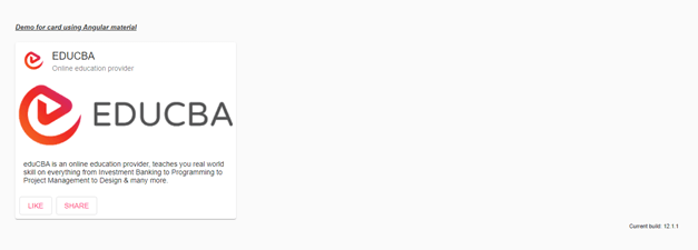
export class DemoMaterial {}2) demo.card.component.html code :
<h5><u><i>Demo for card using Angular material</i></u></h5>
<mat-card class="example-card">
<mat-card-header>
<div mat-card-avatar class="example-header-image"></div>
<mat-card-title>EDUCBA</mat-card-title>
<mat-card-subtitle>Online education provider</mat-card-subtitle>
</mat-card-header>
<img mat-card-image src="https://lh5.googleusercontent.com/p/AF1QipN_aupGaqTiv5_xbfKTl2qZz0XAJlGMt0WucgkU=w319-h100-k-no" alt="Photos of educba">
<mat-card-content>
<p>
eduCBA is an online education provider that teaches you real-world skills in everything from Investment Banking to Programming to Project Management to Design & many more.
</p>
</mat-card-content>
<mat-card-actions>
<button mat-stroked-button color="accent">LIKE</button>
<button mat-stroked-button color="accent">SHARE</button>
</mat-card-actions>
</mat-card>
3) index.html code :
<!DOCTYPE html>
<html lang="en">
<head>
<meta charset="utf-8">
<meta name="viewport" content="width=device-width, initial-scale=1.0">
<link href="https://fonts.googleapis.com/icon?family=Material+Icons&display=block" rel="stylesheet">
<title>Card demo using material</title>
</head>
<body class="mat-app-background">
<card-demo>Loading..</card-demo>
<span class="version-info">Current build: 12.1.1</span>
</body>
</html>
4) module.tc code :
import {NgModule} from '@angular/core';
import {MatCardModule} from '@angular/material/card';
@NgModule({
exports: [
MatCardModule,
]
})
export class MaterialCardDemo {}
5) demo.card.component.css code:
.example-header-image {
background-image: url('https://lh5.googleusercontent.com/p/AF1QipN4k7WvGz9Dqg7xEssSjMpCLjkOPwOQbFDUl5sj=w203-h201-k-no');
}
Output :
Conclusion
Using this, we can directly put our content inside the card. Also, the material provides default styling and design, making it more presentable to the user. It is very easy to use, handle, and maintain by the developers as well.
Recommended Articles
We hope that this EDUCBA information on the “Angular material card” was beneficial to you. You can view EDUCBA’s recommended articles for more information.

