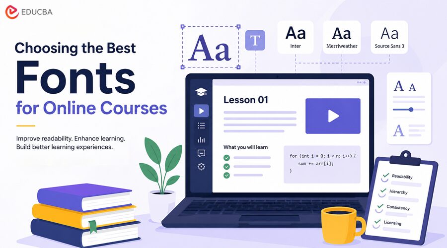
Typography is one of the easiest parts of educational design to underestimate. A course may have strong lessons, accurate examples, clear narration, and useful assignments, but poor font choices can still make the learning experience feel tiring, confusing, or unprofessional. Fonts affect how learners scan a slide, read a code example, compare numbers in a finance tutorial, follow steps in a software lesson, or complete a quiz on a phone. In online learning, typography is not only a visual decision. It supports comprehension, pacing, accessibility, trust, and course completion. A good educational font system should help learners focus on the material instead of the interface. It should make headings easy to scan, body text comfortable to read, tables clear, code distinguishable, and calls to action obvious. This guide explains how to choose fonts for online courses, tutorials, LMS platforms, video lessons, slide decks, worksheets, and educational websites without creating readability, consistency, or licensing problems.
Why Fonts Matter in Online Learning?
Online education depends on attention. Learners may watch a lesson on a laptop, review notes on a tablet, take a quiz on a phone, or read a transcript in a browser. Typography has to work in all those contexts. Poor typography increases friction. If body text is too small, learners skim less, if headings are weak, lessons feel harder to navigate. If code, formulas, captions, and definitions all look the same, the course becomes harder to follow.
Typography helps educational content by improving:
- Scanning speed
- Reading comfort
- Hierarchy between topics
- Consistency across lessons
- Clarity in tables and examples
- Accessibility for different learners
- Trust in the course provider
- Navigation inside an LMS or tutorial page
Typography as Part of Instructional Design
Instructional design is not only about lesson order and assessment. It also includes how information appears on screen. A strong font system helps separate:
- Concept explanations
- Definitions
- Examples
- Warnings
- Formulas
- Code snippets
- Quiz prompts
- Captions
- Downloadable resources
When learners can instantly recognize the role of each text element, they spend less effort decoding the layout and more effort understanding the subject.
6 Steps to Choosing the Best Fonts for Online Courses
The following steps will help you choose the best fonts for online courses, ensuring a professional, user-friendly, and effective learning experience.
Step 1: Prioritize Readability Across Screens
Readability is the first rule of educational typography. A course font may look stylish in a large hero banner but fail in long reading sections, quiz screens, or slide notes. For online learning, test fonts in the smallest and most practical contexts first. If a font works in captions, mobile paragraphs, labels, and tables, it will probably work in larger headings too.
| Learning Context | Typography Priority | Common Risk |
| Lesson page body text | Comfortable reading for long sessions | The font is too small or too condensed |
| Slide decks | Fast scanning from a distance | Thin weights disappear |
| Video captions | Clear shapes at small sizes | Decorative fonts reduce comprehension |
| Code tutorials | Distinguishable characters | Similar-looking 0/O, 1/l, or brackets |
| Finance tutorials | Clear numbers and symbols | Weak numerals make tables confusing |
| Quizzes | Direct question and answer hierarchy | Options look too similar |
| Mobile learning | Legibility on narrow screens | Line length and spacing become cramped |
| Certificates | Professional appearance | Overly casual fonts reduce credibility |
Readability Checks Before Publishing
Before using a font in a course, test it with real course material:
- Lesson paragraphs
- Module titles
- Video captions
- Definition boxes
- Tables and charts
- Quiz screens
- Mobile layouts
- Downloadable worksheets
- CTA buttons
A font should not be approved from a single preview word. It should be tested inside the learning environment where students will actually read it.
Step 2: Match Fonts to the Learning Format
Different learning formats need different typographic behavior. A coding tutorial, an Excel lesson, a marketing course, a design course, and a healthcare training module do not use text in the same way.
| Course Type | Font Direction | What to Watch |
| Programming/coding | Sans serif plus monospace font | Clear symbols, brackets, numbers, and indentation |
| Finance/ Excel | Sans serif with strong numerals | Tables, decimals, percentages, and formulas |
| Design tutorials | Flexible sans serif or editorial serif accents | Visual personality without hurting clarity |
| Business courses | Professional sans serif or restrained serif | Trust, hierarchy, and slide readability |
| Healthcare training | Humanist sans serif | Calm tone and accessibility |
| Language learning | Font with broad character support | Accents, diacritics, punctuation, and scripts |
| Data science/analytics | Sans serif plus readable mono | Charts, labels, code, and equations |
| Personal development | Warm sans serif or soft serif | Approachable tone and long-form readability |
Monospace Fonts for Technical Courses
Coding and data courses often need a monospace font. A good monospace typeface makes code easier to scan because every character occupies the same width. This supports alignment, indentation, and comparison.
For code-heavy lessons, check:
- Zeros and capital O
- Lowercase l, capital I, and number 1
- Braces, brackets, and parentheses
- Quotation marks
- Mathematical symbols
- Indentation at small sizes
A readable monospace font can prevent small but frustrating learning errors.
Step 3: Build a Simple Educational Typography System
An online course does not need many fonts. Too many typefaces can make lessons feel inconsistent and harder to navigate. A simple system usually works best.
| Role | Recommended Font Choice | Purpose |
| Course title | Primary brand font, bold or semi-bold | Recognition and structure |
| Lesson headings | Same family, strong hierarchy | Navigation through the lesson |
| Body text | Highly readable regular weight | Long-form learning |
| Captions | Slightly smaller but still legible | Video and image support |
| Definitions | Medium weight or styled text box | Concept emphasis |
| Code snippets | Monospace font | Technical clarity |
| Tables | Sans serif with clear numerals | Fast comparison |
| Quiz text | Clear, regular, and medium weights | Reduces confusion |
| Certificates | Brand font with formal balance | Professional finish |
A good typography system should answer three questions: What should the learner read first? What is supporting information? What requires action?
Hierarchy Rules for Course Pages
Use consistent styling for repeated learning elements:
- Large headings for new modules
- Smaller headings for lesson sections
- Bold or colored labels for definitions
- Monospace styling for code
- Consistent table fonts
- Clear button labels
- Readable captions under images and videos
When every lesson uses the same hierarchy, learners build familiarity with the course format.
Step 4: Compare Free, Commercial, and Custom Fonts
Course creators and learning platforms usually choose among free, commercial, subscription, and custom fonts. Each option can work, depending on the project size, budget, audience, and licensing needs.
| Font Option | Best For | Advantages | Risks |
| Free fonts | Small courses, prototypes, personal education projects | Low cost, fast access, easy testing | Overuse, unclear licenses, and limited styles |
| Open-source fonts | Public learning platforms, developer-friendly projects | Strong accessibility, broad availability | Still requires license review |
| Commercial fonts | Professional courses, paid learning platforms, branded content | Better family depth, support, licensing clarity | Requires budget and license tracking |
| Subscription fonts | Teams producing frequent content | Convenient access to many fonts | Access can depend on subscription terms |
| Custom fonts | Large education brands, LMS products, global platforms | Distinct identity, custom language support, long-term consistency | Higher cost and longer timeline |
For a single course, a high-quality free or open-source font may be enough. For a paid learning platform, a commercial font family often gives better control over branding, web use, slides, PDFs, and marketing assets. Teams comparing commercial font families can use independent foundries such as TypeType when they need fonts for course websites, interfaces, presentations, certificates, or future customization. The best approach is to test a font with real educational content before licensing it.
What to Test Before Licensing a Font?
Use real course assets, not placeholder text:
- Module titles
- Lesson body copy
- Quiz answers
- Certificates
- Chart labels
- Pricing pages
- Onboarding screens
- Email templates
- PDF worksheets
- Subtitles and captions
A font that works for a landing page may not work for an entire course library.
Step 5: Understand Font Licensing for Courses
Font licensing is especially important in online education because course content often appears in many formats: websites, videos, PDFs, slides, mobile apps, certificates, ads, and downloadable templates. A font license defines where and how a font can be used. A desktop license may allow a designer to create course slides, but it may not automatically allow embedding the font on a website or in a mobile app. A webfont license may cover a domain but not a downloadable course template.
| License Area | Course Example | What to Check |
| Desktop | Designing slides, PDFs, worksheets, certificates | Number of users and commercial rights |
| Webfont | Embedding font on course pages or LMS | Domains, traffic, pageviews, or usage limits |
| App | Font used in mobile learning app | App embedding rights |
| ePub / PDF | Downloadable textbooks or course packs | Embedding permissions |
| Video/broadcast | Course videos, ads, webinar recordings | Video or broadcast rights |
| Server use | Dynamic certificates or personalized worksheets | Server-side generation rights |
| Logo use | Font used in the course brand identity | Whether logo creation is allowed |
| Modification | Font edited for custom course branding | Permission to alter and rename |
Licensing Mistakes to Avoid
Common mistakes include:
- Using a personal-use font in a paid course
- Embedding a desktop font on a website without a webfont license
- Including font files inside downloadable templates
- Assuming a free font has no restrictions
- Using one license for multiple client projects
- Forgetting app rights for mobile learning
- Modifying a font without permission
- Failing to document license ownership
A licensing issue can become expensive after a course has already been sold, translated, or distributed through partners.
Simple Font License Folder
Every course team should keep a record of:
- Font name and version
- Source or foundry
- License file
- Invoice or receipt
- Allowed users
- Allowed domains
- Allowed apps
- PDF or ePub rights
- Video rights
- Modification rules
- Renewal or subscription terms
This is useful for designers, instructors, developers, legal teams, and future editors.
Step 6: Learn From Custom Typeface Cases
Custom typefaces show how typography can support large-scale educational and digital systems. Not every course needs a custom font, but these examples explain why serious organizations invest in typography.
1. Google Sans
Google Sans is Google’s current brand typeface and is available as a variable font with axes for weight, grade, and optical size. That matters for learning platforms because variable fonts can support different interface needs while keeping one consistent visual voice. The lesson for course creators: a flexible type system can work across headings, navigation, UI labels, and dense learning screens.
2. IBM Plex
The IBM Plex is IBM’s corporate typeface and an open-source project. IBM describes it as part of the IBM design language, and the Plex family includes styles such as Sans, Serif, Mono, and Condensed. This is useful for educational content because a large family can support explanations, code, editorial text, diagrams, and UI. The lesson for learning platforms: a type system with multiple related styles is often better than mixing unrelated fonts.
3. BBC Reith
BBC Reith was created as a custom font suite for the BBC. Dalton Maag’s case study explains that the BBC needed to reduce rising license costs and maintain a more consistent brand identity across many uses. The lesson for education brands: when content appears across websites, video, apps, documents, and broadcasts, custom typography can improve consistency and reduce long-term complexity.
Common Mistakes When Choosing Fonts for Online Courses
Many course typography problems come from small decisions that compound across lessons. Common mistakes include:
- Choosing a font only because it looks modern
- Using too many typefaces in one course
- Setting body text too small
- Using thin weights in slide decks
- Ignoring mobile readability
- Using decorative fonts for definitions or instructions
- Choosing a monospace font with confusing characters
- Using low contrast between text and background
- Failing to test numerals in tables
- Ignoring multilingual support
- Using unlicensed fonts in paid course materials
- Changing styles from lesson to lesson
The Biggest Typography Mistake
The biggest mistake is treating fonts as decoration instead of learning infrastructure. Typography affects comprehension, navigation, accessibility, and trust. If a font system cannot support lessons, quizzes, charts, transcripts, slides, videos, and certificates, the course experience will feel fragmented.
Font Selection Checklist for Learning Platforms
Before choosing a font, review this checklist:
- Is the font readable on mobile and desktop?
- Does it work for a long lesson text?
- Are headings easy to scan?
- Are numbers clear in tables and examples?
- Is there a suitable monospace option for code?
- Does the font support all required languages?
- Are captions and subtitles readable?
- Does the license cover web, video, PDF, app, and commercial use?
- Can the team document the license?
- Will the font system scale across future courses?
Quick Decision Table
| Platform or Learning Project | Recommended Fonts | Avoid |
| A personal tutorial blog | Free or open-source font | Overly decorative body fonts |
| A paid course website | Commercial webfont family | Fonts without clear web rights |
| A coding bootcamp | Sans serif plus monospace | Ambiguous code characters |
| A finance course | Sans serif with strong numerals | Weak tables and cramped spacing |
| A design course | Flexible sans with display accents | Too many expressive fonts |
| A mobile learning app | Commercial or custom UI font | Fonts not licensed for apps |
| A global LMS | Commercial or custom multilingual family | Fonts with limited language support |
Frequently Asked Questions (FAQs)
Q1. What fonts are best for online courses?
Answer: The best fonts for online courses are readable, consistent, and licensed for the course format. Sans-serif fonts often work well for digital learning, while monospace fonts are useful for coding and data tutorials.
Q2. Should online courses use free fonts?
Answer: Free fonts can work well if the license allows the intended use. Course creators should check whether the font is licensed for use in commercial courses, websites, PDFs, videos, apps, and downloadable materials.
Q3. Why does typography matter in e-learning?
Answer: Typography affects how easily learners read, scan, and understand content. It also supports hierarchy, accessibility, trust, and consistency across lessons, quizzes, slides, and mobile screens.
Q4. Do learning platforms need custom fonts?
Answer: Not always. Many platforms can use a strong commercial or open-source family. Custom fonts make more sense when the platform has a large brand system, many products, multilingual needs, or long-term licensing concerns.
Q5. What is the biggest font licensing risk for course creators?
Answer: The biggest risk is using a font in more formats than the license allows. For example, a font may be allowed in design software but not embedded in a website, mobile app, PDF, or downloadable template.
Recommended Articles
We hope this article on fonts for online courses provides valuable insights into creating clear, professional, and learner-friendly educational content. Check out these recommended articles to learn more about e-learning design, accessibility, and user experience.
