Updated March 6, 2023

Introduction to Seaborn barplot
A bar plot represents an estimate of the proportion of the total value of a variable or component which is plotted in vertical rectangular bars that shows the sum of the variable or a component that falls under a given range. Bar plot is a data visualization technique that shows the aggregate of a categorical variable or component. In this topic, we are going to learn about Seaborn barplot.
Creating Seaborn Barplot
Bar plot can be defined as a visualization method that represents a group through rectangular vertical bars in X axis by their actions in Y-axis. Usually, the aggregate of the categorical variable to be plotted is represented in the x-axis and their aggregate numerical value is represented in the y-axis. We can see the mean of the individual categorical features to be plotted along the y-axis. A bar plot represents a measure of the numeric variable’s central tendency with multiple dependent variables, e.g. a measure of alcohol consumption in a population, such as a national survey of drunk drivers, which can include a wide range of questions about alcohol consumption. It is also used in statistics to describe the “spread” of a population statistic. This means that the “spread” of the mean for the variable is larger than the “spread” of the median for the variable.
Seaborn is built on top of Python’s core visualization library Matplotlib. It allows developers to plot a graphical visualization using Python’s plotting language, and the code includes a tool to load it into R or Matplotlib. You can also use the data to understand how data is used, to understand your analytics project’s business or to gain a deep understanding of the different ways customers generate data. You can start by exploring the data using Pandas.
We have created multiple Barplots using the seaborn library with different data sets.
Syntax:
import seaborn as sns
import matplotlib.pyplot as plt
flight_data = sns.load_dataset("flights")
f = plt.figure(figsize=(8, 6))
fig = sns.barplot(x="year", y="passengers", data=flight_data)
Output:
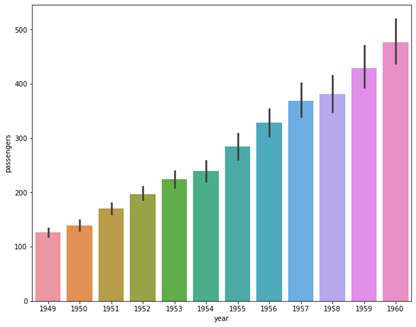
In the above example we have loaded the flights data set which represents the numbers of flights traveled in corresponding years and months along with the number of passengers present in it. We have used the variable Year that represent the years where the traveling took place with the number or passengers and plotted them in the x-axis and each bar represents each year from 1949 to 1960 where the number of passengers has been traveled. We have plotted the categorical variable “year” to the total passengers in each year. Here we can see that 1960 is the year that has highest number of passengers traveling on an average than any other years.
Syntax:
import seaborn as sns
import matplotlib.pyplot as plt
flight_data = sns.load_dataset("flights")
f = plt.figure(figsize=(8, 6))
fig = sns.barplot(x="month", y="passengers", data=flight_data)
Output:
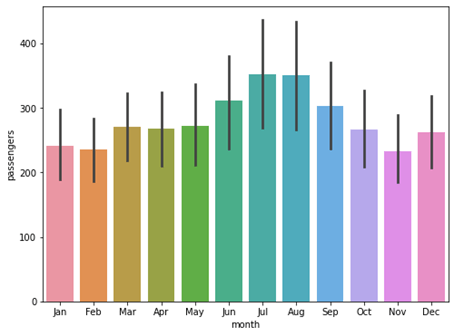
In this example, we have plotted the same bar plot with a difference in x-axis where we have plotted the month to x-axis to see which month has yielded highest passengers. We can see that July and August has yielded highest number of passengers while November has the lowest number of passengers.
Syntax:
import seaborn as sns
import matplotlib.pyplot as plt
penguin_data = sns.load_dataset("penguins")
f = plt.figure(figsize=(6, 4))
fig = sns.barplot(x="species", y="bill_length_mm", hue = 'sex', data=penguin_data)
Output:
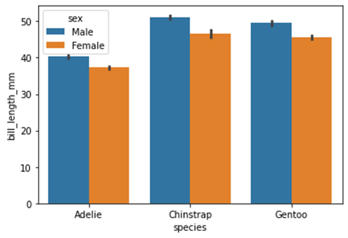
In the above example we have used a feature in seaborn barplot known as ‘hue’ which allows us to plot categories from a variable of the bar plot. We can use this feature to plot the categories inside the categorical variable. In the example we have loaded the penguins data set we have plotted the average bill length of different species of penguins in y-axis and their corresponding species in c-axis with representation to each sex which is male and female. We can see the average bill length for male and female for all three species of the penguins. Hue parameter allows us to individually plot the categorical values in separate colors.
Syntax:
import seaborn as sns
import matplotlib.pyplot as plt
penguin_data = sns.load_dataset("penguins")
f = plt.figure(figsize=(6, 4))
fig = sns.barplot(x="species", y="bill_length_mm", palette = "flare", data=penguin_data)
Output:
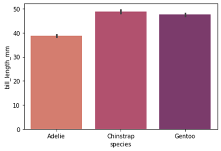
In the above example we have plotted the barplot with unique color palette using the palette parameter. This parameter allows us to plot the categorical variable in an increasing color tone where the categories are represented form lighter to a darker tone in ascending order of the numerically greater aggregate variable. Here Gentoo species has greater bill length compared to the rest of the species so it is represented in the darkest tone while days that received correspondingly lesser bill length species are represented in consequent lighter tones.
Syntax:
import seaborn as sns
import matplotlib.pyplot as plt
import numpy as np
penguin_data = sns.load_dataset("penguins")
f = plt.figure(figsize=(6, 4))
fig = sns.barplot(x="species", y="body_mass_g", palette = "flare",
estimator = np.mean, data=penguin_data)
Output:
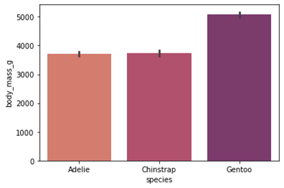
In this example, we have plotted the mean value of the total body mass of each species. We have using the numpy library to generate the mean of the numerical feature “body_mass_g” and plotted it along the y-axis and corresponding species on the x-axis.
Syntax:
import seaborn as sns
import matplotlib.pyplot as plt
penguin_data = sns.load_dataset("penguins")
f = plt.figure(figsize=(6, 4))
fig = sns.barplot(x="species", y="flipper_length_mm",
color="magenta", saturation=7, data=penguin_data)
Output:
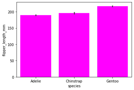
We can also plot the bars in same colors if we want using the “color” parameter where we can declare the color we wanted to plot. We have plotted the bar plot with same bar colors where the x-axis is represented with species and y-axis is represented with the flipper length of different species.
Seaborn comes with some very important features. First, the framework offers a very lightweight framework for building and developing distributed applications and infrastructure. Its power comes from the large number of modules, which are easy to maintain and use. Second, the package is very large, mainly based on python modules which are very widely used and widely tested. Finally, the package also supports writing the code in different programming languages (such as c, C#, Java, Python, PHP, and R).
Conclusion
In this article we have discussed about the seaborn Bar plot with various examples. We have plotted various Bar plots using seaborn library and numpy library and demonstrated different attributes and parameters to the barplot function. Seaborn is an open source library used in python programming language. It provides high quality API for data visualization. It consists of modules representing data streams, operations and data manipulation. Seaborn library along with Matplotlib is widely used around the data science community. We hope this article helps. Thank you.
Recommended Articles
This is a guide to Seaborn barplot. Here we discuss the seaborn Bar plot with various examples and we have plotted various Bar plots using the seaborn library. You may also have a look at the following articles to learn more –
