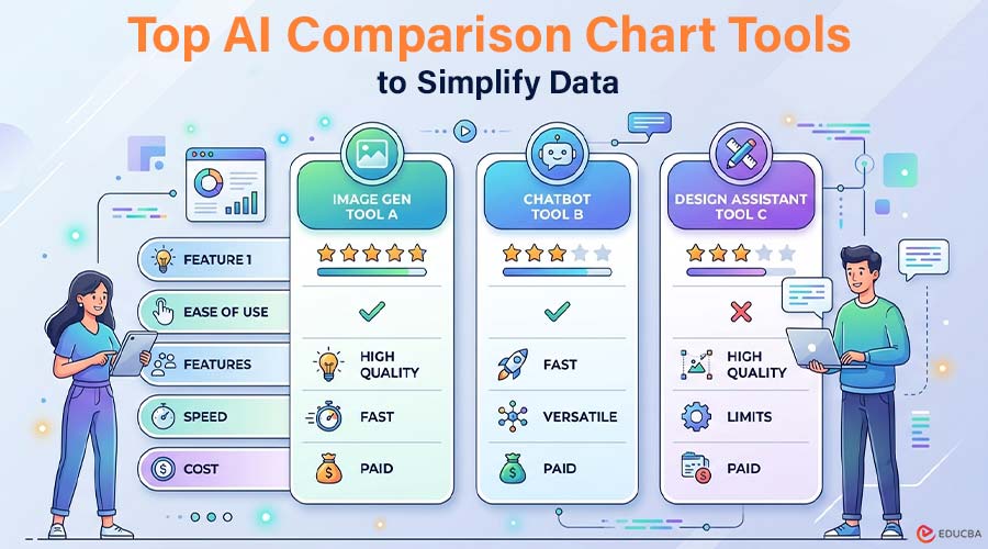
In a world overflowing with data, clarity wins. Whether you are comparing software features, product specs, pricing tiers, or performance metrics, an AI comparison chart can turn dense information into something instantly understandable. Thanks to the rise of infographic AI, creating polished visual comparisons no longer requires advanced design skills. Below, we explore four leading AI comparison chart tools in 2026, each offering unique capabilities for different use cases.
Top AI Comparison Chart Tools to Simplify Data
Explore the key tools below to create clear and effective comparison charts effortlessly.
1. Infograph.app
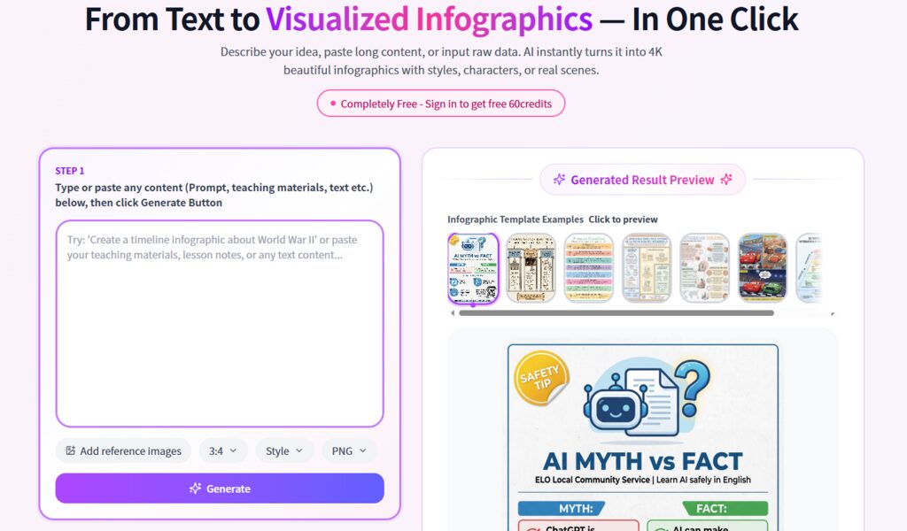
Image Source: Infograph.app
When it comes to generating a clean and dynamic AI Comparison Chart, this platform stands out for its streamlined experience and AI-first workflow. Rather than starting with a blank canvas, users begin with structured input and let automation do the heavy lifting.
Key Capabilities
- AI-powered chart generation from text prompts
- Smart layout suggestions optimized for comparison formats
- Automatic data structuring for side-by-side evaluation
- Clean, modern visual styles designed for business and marketing
- Fast export options for web, presentations, or social media
Unlike traditional design tools that depend on templates, this Infographic AI system focuses on understanding your data first—then determining the most logical visual arrangement.
Best For
- SaaS marketers comparing product tiers
- Content creators building affiliate comparison posts
- Startup teams presenting competitive landscapes
- Consultants delivering research summaries
- Educators explaining concept differences
Because the AI handles layout logic, users spend more time refining insights and less time adjusting alignment or spacing.
How Does it Work?
- Enter your comparison topic (for example, “CRM Software Comparison 2026”).
- Paste structured data or bullet-point features.
- Let the AI analyze the information and generate a draft visual.
- Adjust styling, fonts, or branding if needed.
- Export in your desired format.
The experience feels less like “designing” and more like collaborating with a visual assistant—particularly useful when creating multiple variations of AI comparison charts for testing or publishing.
2. Venngage
Image Source: Venngage
A long-established name in infographic creation, this platform has integrated AI features into its traditional template-driven ecosystem. It combines structured layouts with guided editing tools.
Core Strengths
- Extensive template library
- AI-assisted chart suggestions
- Brand kit integration
- Drag-and-drop editor
- Collaboration features for teams
Rather than generating visuals purely from prompts, the AI here enhances existing layouts. Users typically select a base template, then refine it with automated suggestions.
Ideal Audience
- Marketing departments
- Corporate communications teams
- HR departments creating internal reports
- Non-designers who prefer guided editing
How to Get Started?
- Choose a comparison template.
- Enter your data manually or upload it.
- Use AI recommendations to refine structure or wording.
- Customize branding elements.
- Download or share directly.
For teams that value design control alongside automation, this hybrid approach can be appealing.
3. Piktochart
Image Source: Piktochart
This platform focuses heavily on storytelling. Its AI comparison infographic tool helps translate analytical content into visually compelling narratives.
Notable Features
- AI infographic builder
- Presentation-ready layouts
- Interactive chart options
- Data visualization enhancements
- Collaboration tools
While it provides AI creation, it still supports manual editing. The platform focuses on visual storytelling along with clear comparisons.
Who is it Designed For?
- Educators and trainers
- Bloggers and media creators
- NGOs and nonprofit communicators
- Corporate storytellers
Workflow Overview
- Select the AI infographic option.
- Enter your topic and upload data.
- Review the AI-generated layout.
- Enhance with icons, charts, and brand elements.
- Export or embed online.
This approach works particularly well when comparisons need contextual storytelling rather than pure side-by-side technical breakdowns.
4. MyMap AI
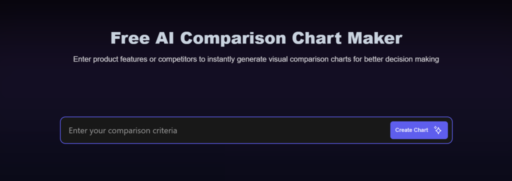
Image Source: MyMap AI
Positioned slightly differently, this tool blends visual mapping with comparison functionality. It is useful when you want to explore relationships before locking into a rigid grid structure.
Highlighted Capabilities
- AI-driven mapping and diagram creation
- Comparison chart generator
- Brainstorming and ideation tools
- Flexible layout structures
- Web-based collaboration
The system often begins with conceptual mapping, then refines into a comparison format—making it suitable for early-stage idea exploration.
Ideal Use Cases
- Product managers comparing feature roadmaps
- Researchers analyzing frameworks
- Students organizing topic differences
- Teams brainstorming positioning strategies
Basic Steps
- Input your comparison topic or concept.
- Allow AI to generate a visual map.
- Convert relevant sections into structured comparison blocks.
- Refine formatting.
- Share or export.
For users who think visually before structuring information into rows and columns, this flexible approach can feel intuitive.
The Rise of Infographic AI in Content Strategy
The evolution of infographic AI is reshaping how businesses present comparisons online. Instead of static, manually built tables, content teams can now:
- Generate multiple AI comparison chart variations in minutes
- Test layouts for engagement optimization
- Update visuals instantly when data changes
- Scale content production without adding design overhead
For SEO-focused publishers, affiliate marketers, and SaaS brands, this shift is significant. Search engines reward structured clarity—and well-designed visual comparisons improve dwell time and user engagement.
Final Thoughts
As competition grows across industries, comparison content has become a key part of digital marketing and educational communication. Effective AI comparison chart tools transform complex decision-making into quick visual understanding. Whether you prefer template-based systems, storytelling-focused tools, flexible mapping platforms, or AI-powered structured creation, today’s infographic AI tools offer choices for every way of working. The key is selecting the right AI comparison chart tool that aligns with your workflow, level of customization, and content goals—so you can focus on delivering insights that truly matter.
Recommended Articles
We hope this comprehensive guide to AI comparison chart tools helps you create clear, data-driven visual insights. Check out these articles for more tips and strategies to enhance your content and decision-making process.